Designing Systems, Part 3: Components and Composition
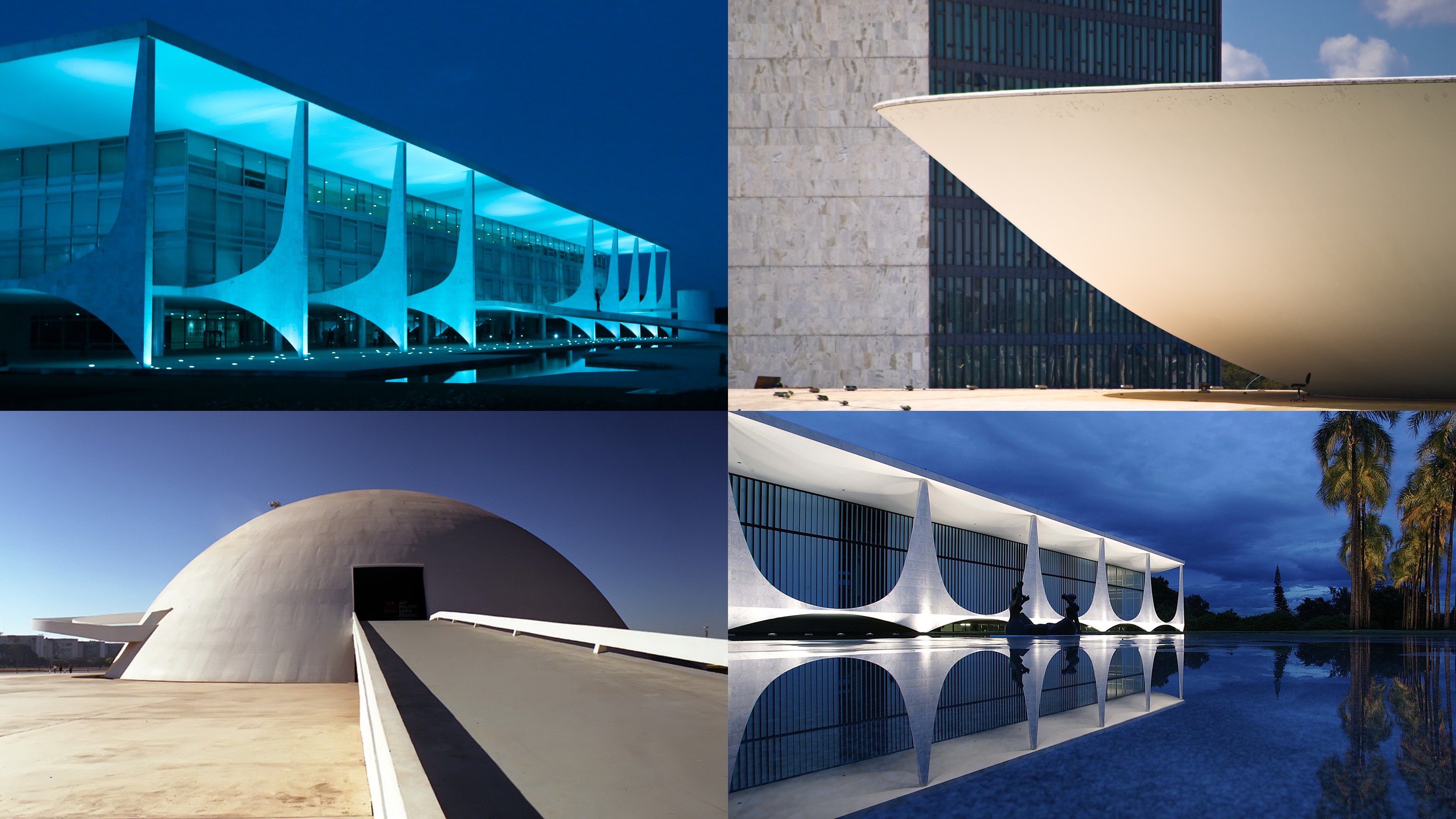
Common architectural motifs can be seen across many of Brasília’s civic buildings
The final part of a three-part essay based on the talk I gave at Smashing Conference.
When I visited Brasilìa in 2011, I observed the repeating architectural motifs used by Oscar Niemeyer across his different signature buildings. Common themes included:
- Contrast: elongated lines would sit alongside soft curves
- Suspension: buildings would appear to levitate in air, or float on water
- Reflection: be it in the surrounding water features or in symmetry
- Drama: long winding ramps would often ascend or descend into reception spaces
This use of repeating patterns is similar to the way we now build for the web. By piecing together reusable components in different combinations, we can create products that have a consistent and predictable feel.
How might we approach building components in the context of a design system?
Much like a design system, we can consider a front-end component as being made up of separate layers, or concerns.
I’ve found that thinking about my design as existing in broad experience tiers – in layers – is one of the best ways of designing for the modern web.
Component concerns
By taking each concern on its on, we can think about which guidelines and vocabularies in our design system are applicable.
Content
Reduce any webpage to its barest essentials, and you are left with text. Even the most complex applications rely on this for labels and messaging. This is why I like to start building components by writing plain text. I can use Markdown for a limited set of structural markers, and an ASCII-like syntax for forms control:
## Movie rating
The average rating is 4 out of 5 stars, from a total
 of [12 reviews](/reviews).

### Add your score
Your name: [           ]
Rating:    ( ) 1   ( ) 2   ( ) 3   (•) 4   ( ) 5

( Submit rating )
These constraints keep me focused on the content, its structure and order. I can also look to editorial style guides and tone of voice guidance should they be appropriate.
Meaning
The next step is to think about meaning. For this, I’ll look to any shared vocabularies that may help me describe a component. Of these there is one that is extremely well defined and widely understood: HTML.
By using HTML’s terse palette of elements, again forces me focus. HTML is often derided as being too limited, yet it’s worth reviewing the options available (and combinations thereof), especially given the range of elements now available with HTML5. On a recent project I used the meter element to describe a five-star rating:
<meter min="0" max="5" value="4">4 out of 5 stars</meter>
HTML helps us describe components in relation to a global vocabulary, but we will need to describe them in relation to local vocabularies, too. For this we can use the class attribute. Here we can also introduce established naming conventions; I currently use the BEM naming methodology and single letter prefixed namespaces:
<section class="c-rating">
  <h1 class="c-rating__title">Movie rating</h1>
  <span class="u-hidden">The average rating is</span>
  <meter class="c-rating__value" min="0" max="5" value="4">
    4 out of 5 stars
  </meter>
  <span class="u-hidden">from a total of</span>
  <a class="c-rating__reviews" href="/reviews/">12 reviews</a>
</section>
On the topic of naming, I also like to use naming meta patterns. These are repeated yet unrelated approaches for naming groups of elements. Here’s a common meta pattern I like to use for naming child elements:
.c-[module-name] {...}
.c-[module-name]__body {...}

/* Header */
.c-[module-name]__header {...}
.c-[module-name]__title {...}

/* Content */
.c-[module-name]__main {...}
.c-[module-name]__content {...}
.c-[module-name]__items {...}
.c-[module-name]__item {...}
I typically reference HTML element names in my class names as their usage in relation to a component is similar.
Leban Hyde refers to this as the workhorse with no name, while Dave Rupert calls a similar approach the every module ever scaffold. Patterns like this can make our code more predictable and easier to understand.
Presentation
Once I reach the presentation layer I begin to translate the visual design language into code. I will start by abstracting common design values into a set of variables:
// Colour Palette
$color-brand--crimson: #c00;
$color-brand--mustard: #fc0;

$color-neutral--darkest: #222;
$color-neutral--darker: #444;
$color-neutral--dark: #666;
$color-neutral--mid: #888;
$color-neutral--light: #bbb;
$color-neutral--lighter: #ddd;
$color-neutral--lightest: #eee;
I’m using colours as an example, but the concept can apply to other values such as typography and spacing.
Saving values as variables keeps our code DRY, but on their own, they lack meaning. Nathan Curtis notes that variables give us options, but they don’t give us decisions. Assigning these initial variables to a second named set, gives them context:
$color-text: $color-neutral--darkest;
$color-background--light: $color-neutral--darkest;
$color-background--dark: $color-neutral--darkest;
$color-link: $color-brand--crimson;
$color-link--hover: darken($color-brand--crimson, 10%);
$color-link--active: lighten($color-brand--crimson, 10%);
If we change our colour values later, we only need to change them in one place – hopefully! Something I’ve been doing lately is using Sass mixins to manage different typographic presents and sizes:
@mixin typeset($preset, $level) {
  @if ($preset == title) {
    font-family: $typeface-serif;
    font-weight: bold;
    letter-spacing: 0.0025em;
    text-transform: uppercase;

    @if ($level == 1) {
      font-size: 1em;
      line-height: 1.25em;
    }

    @if ($level == 2) {
      font-size: 2em;
      line-height: 2em;
    }

    ...
This approach means that I can reach a point where I am no longer giving rules intangible values, like this:
.c-module__title {
  font: bold 2em/1 Georgia, serif;
  margin-bottom: 1.5em;
  padding-top: 0.75em;
  letter-spacing: 0.0025em;
  text-transform: uppercase;
  color: #222;
}
but instead producing something more akin to a design specification, from which intent can be inferred:
.c-module__title {
  @include typeset(title, 2);
  margin-bottom: ($baseline * 4);
  padding-top: ($baseline * 2);
  color: $color-text;
}
This is similar to the system used at the Guardian. Guss is a set of Sass mixins and helpers that allow components to be described using a language familiar to everyone on the team, be they designers, developers, product managers or other stakeholders.
An example of Guss being used to describe a featured story item
There’s a temptation to over-use tools like Sass and other pre-processors, and I wasn’t so keen on them until I realised their true superpower: they allow us embed shared vocabularies in code.
Behaviour
As we reach the top of the stack, we can start to look at how our components behave. JavaScript isn’t my forte, so I won’t dwell too long on this, but even here, we can introduce naming conventions, and use similar concepts of starting simple and building an experience in layers.
There are a number of other aspects not touched on here which will likely transcend all three layers. For example, considering the accessibility of a component will involve thinking about the choice of language used, styling text so that it is legible and has sufficient colour contrast, and ensuring it can be successfully interacted regardless of input device.
Connections
That’s how I tend to approach building my components, and your millage my vary. But have we spent too much time discussing the complexion of components, while ignoring broader considerations?
Let’s return to Brasília. While Niemeyer’s buildings are gorgeous, they suffer from an emphasis on form over function. For example, the National Congress has a huge ramp at the front that would appear to be its entrance. In fact it’s purely decorative; a point reinforced by a barrier that sits half way up to prevent the public clambering onto the roof, which itself occupied by armed guards!
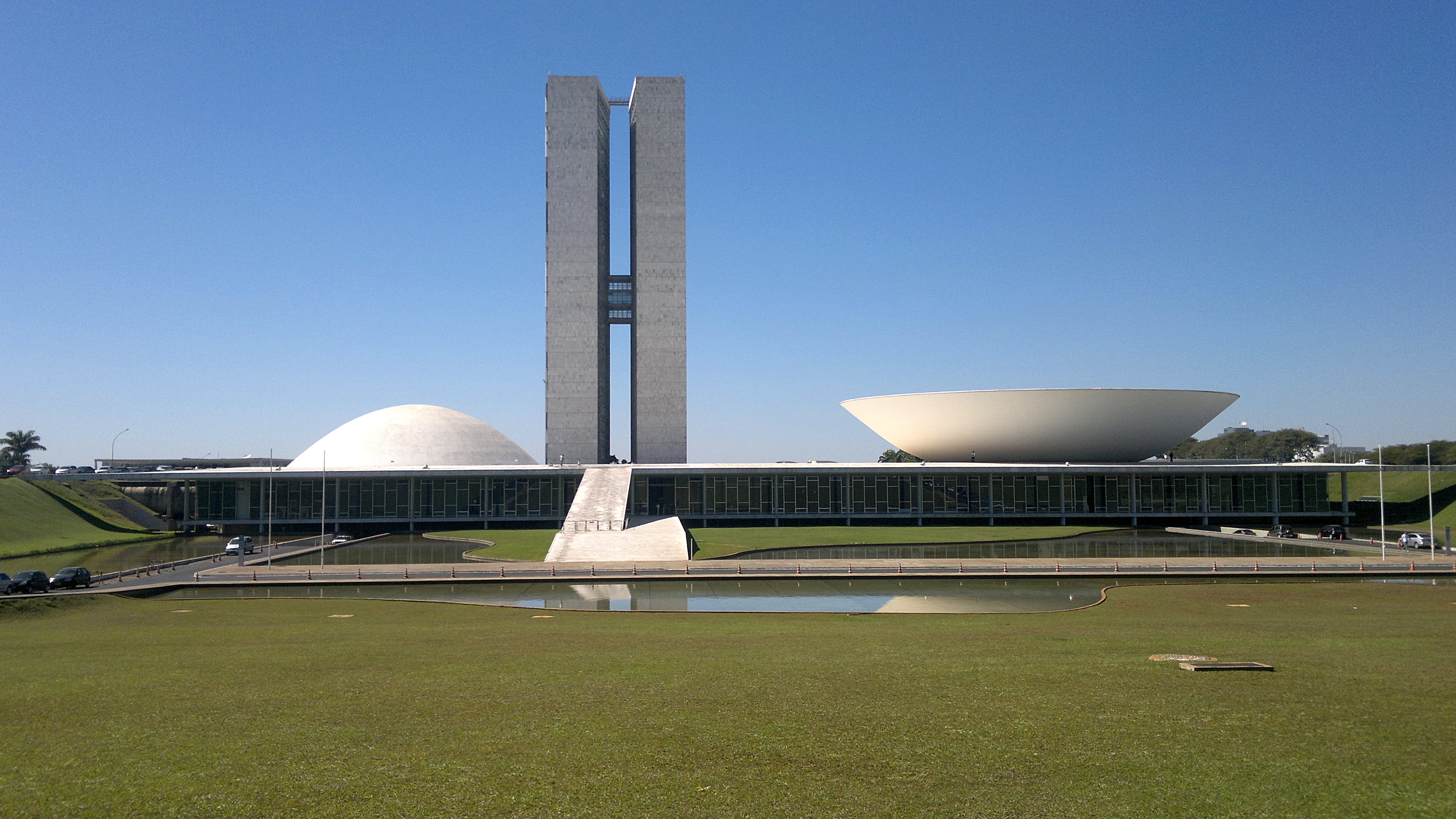
The National Congress building in Brasilìa. Photograph: Juniorseropedica
Costa’s layout suffers similarly. Along the city’s main axis exist large areas of green space. I’m sure these satisfied an objective of providing open areas for people to relax in, yet their simplistic placement ignores the fact that to reach them you need to cross six lanes of traffic.
Having experienced the city at ground level, I’m inclined to agree with architect Jan Gehl, who in Gary Hustwit’s 2011 documentary Urbanized stated:
Brasília was the ultimate modernistic city built on all the ideas of the modernistic manifests. It looks fantastic from the airplane, but if you are down at eye level on your feet going from one place to another, Brasília is a disaster. Every distance is too wide. Things are not connected.
An abiding memory of my visit to Brasília in 2011 was walking along its many grass verges, figuring out how to enter buildings or cross busy expressways. What the city achieves in elegant rationality, it suffers for in its sterile inhumanity. It brings to mind this quote by Finish architect Eliel Saarinen:
Always design a thing by considering it in its next larger context – a chair in a room, a room in a house, a house in an environment, an environment in a city plan.
In our discussion about components, we tend to talk a lot about chairs, yet neglect the rooms they sit in.
Object analogies
Actually, we don’t talk about chairs, but we do talk a lot about Lego. This modular toy system has proven to be a useful analogy for describing object-orientated programming: separate blocks that can be pieced together in a number of combinations. However, look closely, and you’ll find shortcomings in this comparison when talking about front-end components.
A Lego brick is…
- a composite, made of a single material, ABS plastic,
- static, its state doesn’t change under normal operating conditions,
- encapsulated, its colour or shape doesn’t alter depending on the bricks attached to it,
- and has clear affordances, you can understand its properties by looking at it.
A front-end component is…
- composed of separate concerns,
- dynamic, maybe intentionally through interaction, or by being affected by other factors,
- leaky: the first initial of CSS describes the complete opposite approach to encapsulation, with rules able to cascade throughout a document,
- difficult to reason with, especially if code is in separate files, with little or no documentation.
In our quest to build modular systems with a predictability like Lego, libraries and tools have sought to address these differences. Approaches to CSS deliberately undermine the cascade while React components combine HTML and JavaScript into a single JSX file. These approaches are understandable, and not necessarily wrong, but it does feel like we’re working against the grain of the of the web.
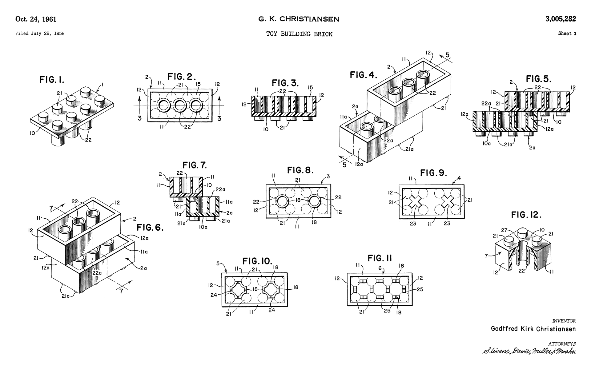
A section of the original Lego patent
Perhaps Lego is the right example, we’ve just been looking at the wrong aspect of it. The most important aspect of Lego is not so much the bricks themselves, but the system of tubes and stubs that holds them to together. New bricks have been added to the system over the years, yet a brick manufactured today will still connect with one of the first produced in 1958.
This leads me to ask: what are the equivalent concepts within the realm of front-end development? What methodologies might we uncover if we were to focus more on the relationships between components, rather than the components themselves? Who knows, maybe the cascade could become a powerful ally, rather than a pernicious foe.
I hope you have enjoyed this three-part series, borne from the talk I gave at Smashing Conference last year. The ideas I’ve outlined are of course subject to re-evaluation, so if you have any feedback, please do get it touch, either via e-mail or Twitter. Thanks for reading!