Designing Systems, Part 1: Theory, Practice, and the Unfortunate In-between
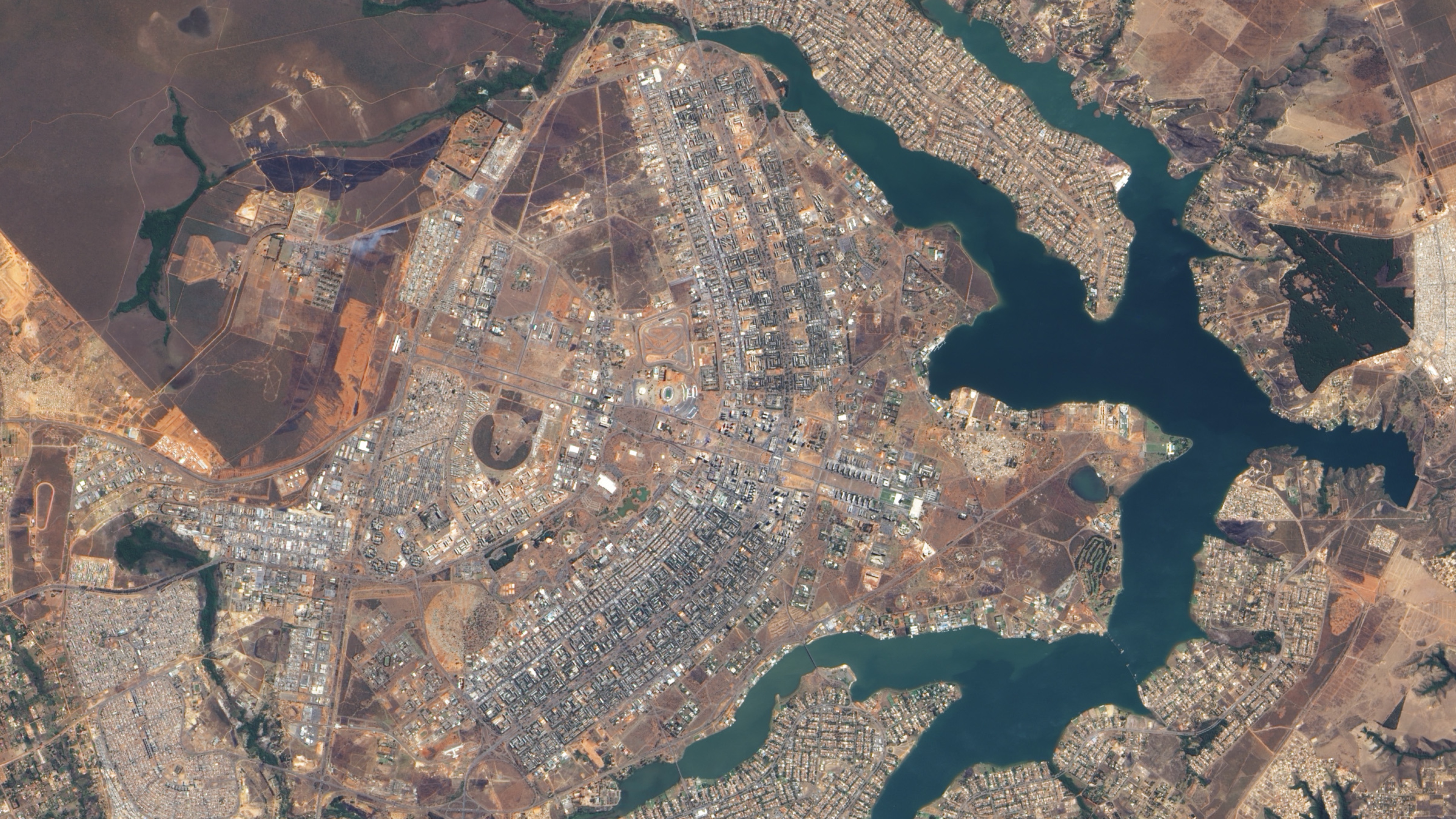
Brasília, seen from above, looks like a bird or a plane. Image: NASA Earth Observatory
Part one of a three-part essay based on the talk I gave at Smashing Conference.
Imagine you were asked to design a city. How might you layout its roads and major features? What shape might it take? Few people get the opportunity to address such questions, but the designers of Brasília certainly did.
Their modernist creation was to replace the Brazil’s previous capital, Rio de Janeiro. Its coastal location meant it was vulnerable to attack, and the country’s constitution had long stated that the capital should be located closer to the country’s hinterland. It wasn’t until Juscelino Kubitschek was elected President in 1956 that this aim would be finally realised. He had campaigned on a promise of “fifty years of prosperity in five”, and the creation of Brasilìa was a key pledge.
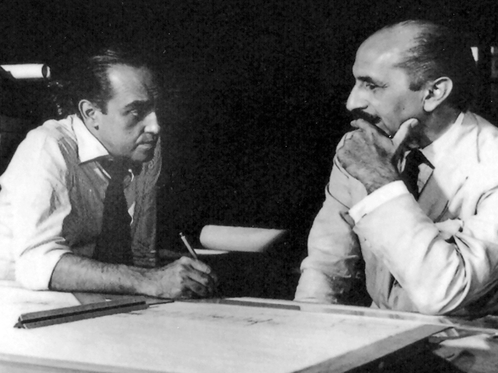
Oscar Niemeyer and Lucio Costa pictured in 1957
Kubitschek invited the architect Oscar Niemeyer to design the city’s civic buildings – the Presidential Palace, National Congress, Supreme Court and its Cathedral – and Niemeyer’s friend Lúcio Costa won the contest to arrange its urban plan.
Niemeyer and Costa had worked together on a number of projects already, and both were admirers of Le Corbusier, the Swiss-French architect and pioneer of modern urbanism. Le Corbusier believed good architecture produced good societies, and advocated ideas like organising cities around rigid zones within which different activities could take place. With Brazil’s vast and unpopulated interior as their canvas, Costa and Niemeyer used these ideas as the basis for their new city.
Beyond acting as a symbol for a braver, more optimistic age, they believed Brasília could transform Brazil’s heavily stratified society into a more egalitarian one. Within their model utopia, they envisaged governors and ambassadors living next to janitors and labourers, with everyone using the same entrances and sharing the same spaces. With Costa’s logical plan and Niemeyer’s distinctive buildings, Brasília is now considered a definitive example of 20th century modernist urban planning, and the city received UNESCO World Heritage status in 1987.
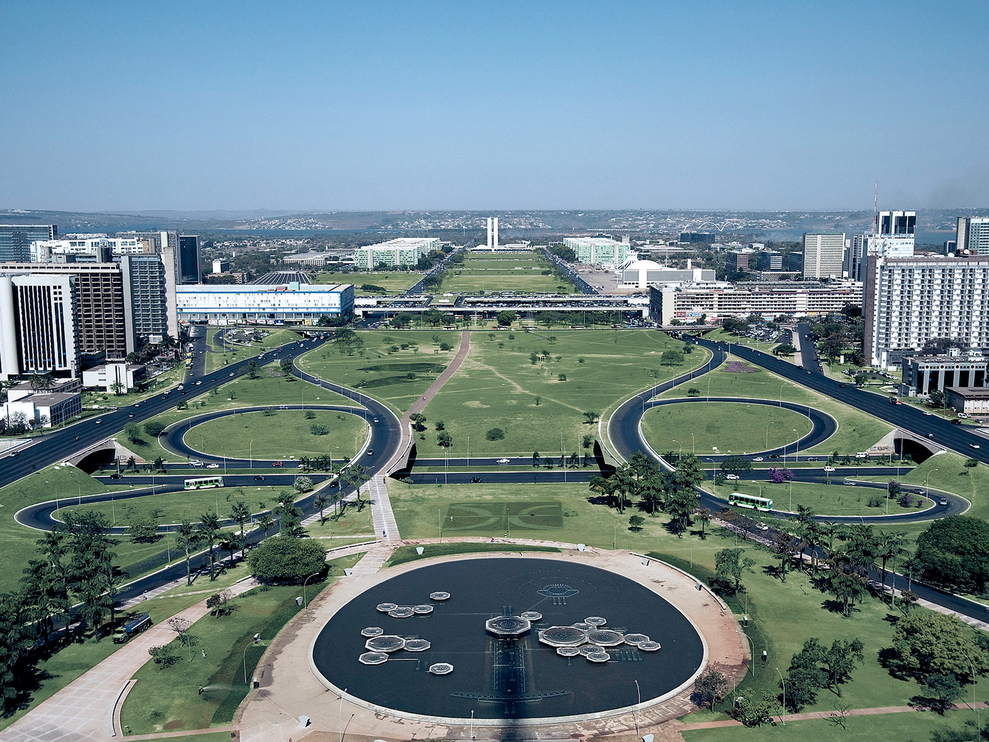
Brasília’s Monumental Axis, viewed from the Brasília TV Tower. Photograph: Siemens
However, Costa’s plan contained a fundamental flaw: its fixed layout limited the amount of residential space available. As people from across the country flocked to the city in search for work, its population grew rapidly, and Brazil’s deep class structures, subtly racial in origin, began to reassert themselves. The workers who had built the city were banished from it. After a long fight were they allowed to remain, but in distant satellite towns, away from the middle-classes in the city.
Reflecting on their plans, the art critic Robert Hughes said1:
Nothing dates faster than people’s fantasies about the future. This is what you get when perfectly decent, intelligent and talented men start thinking in terms of space, rather than place, and about single rather than multiple meanings. It’s what you get when you design for political aspirations and not real human needs. You get miles of jerry-built platonic nowhere infested with Volkswagens. This, one may fervently hope, is the last experiment of its kind. The utopian buck, stops here.
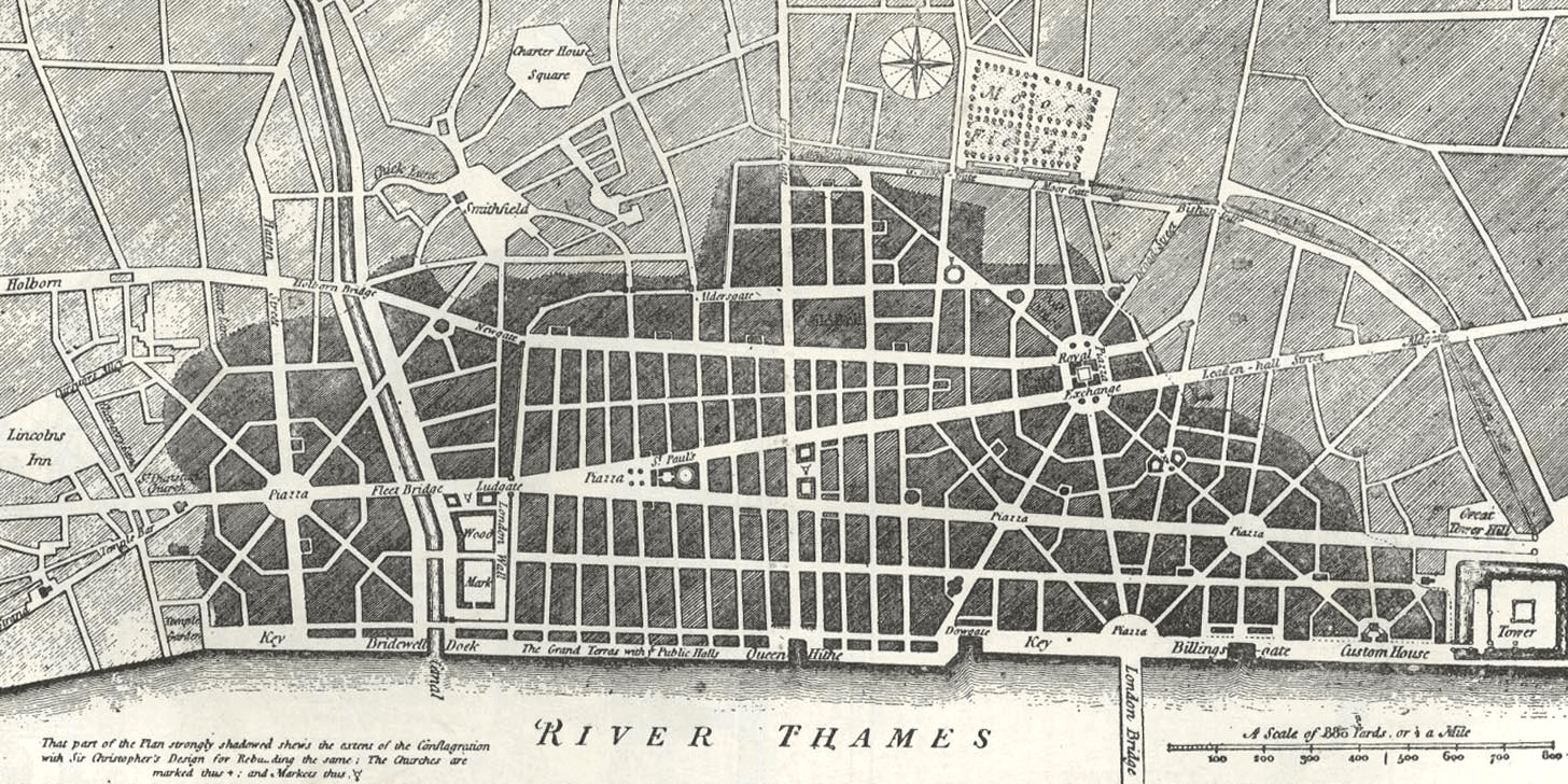
Sir Christopher Wren’s plan for the rebuilding the City of London after the Great Fire of 1666
Whereas Brazil’s barren central plateau served as canvas for Costa’s ego, the same might be said of Sir Christopher Wren’s plan for London. Ravished by the Great Fire in 1666, he envisioned the creation of a beautiful Baroque city, with wide sweeping avenues, grand Piazzas, and a street plan similar to that of Paris. Yet, London is a peculiar, unruly beast, and not even the great Sir Christopher Wren could tame it. Before he had a chance to enact his plans, residents were already rebuilding their properties, following the medieval layout as they did so.
If anyone could claim to have bought order to London, it would be a shy and retiring solicitor from Lancashire named Frank Pick. When Pick moved to London in 1906, the capital was home to over six million people, with its chaotic transport infrastructure run by a number of competing companies.
Pick was employed by one of these, the Underground Electric Railways of London (UERL). At great difficulty and expense, they had constructed three new tube lines and electrified the older steam powered underground District Railway. With few willing to use these new services, Pick was put in charge of their publicity.
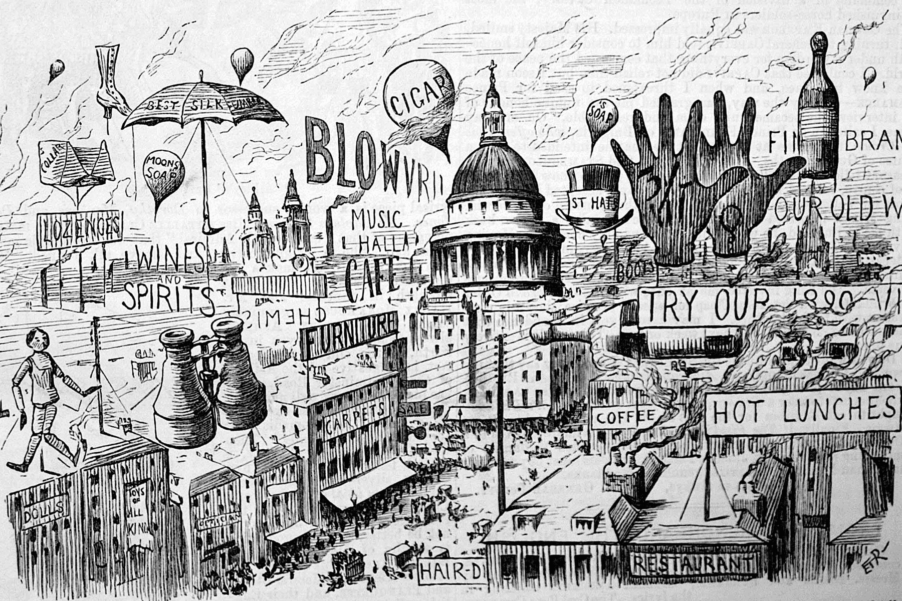
An aerial street scene of London with St Paul’s Cathedral surrounded by monstrous advertising signs (Punch Magazine, 1890). Illustration: Punch Limited
You might describe the prevailing aesthetic as eclectic, if you were being generous. The image above, published in the sartorial magazine Punch in 1890, will give you an idea of how people perceived visual communication around this period. London’s transport wasn’t immune. On underground platforms, signage and advertising was intermixed, with a variety of typefaces arranged in a hotchpotch manner. This not only made the network difficult to navigate, but it hardly inspired confidence in this new mode of transport either.
Pick’s first initiative was to improve the appearance of stations. He standardised the different poster sizes, limited their number, and arranged them on a grid. To ensure station names would stand out he placed large red circles behind name boards, a layout that would inform the design of the now familiar underground logo, the Roundel.
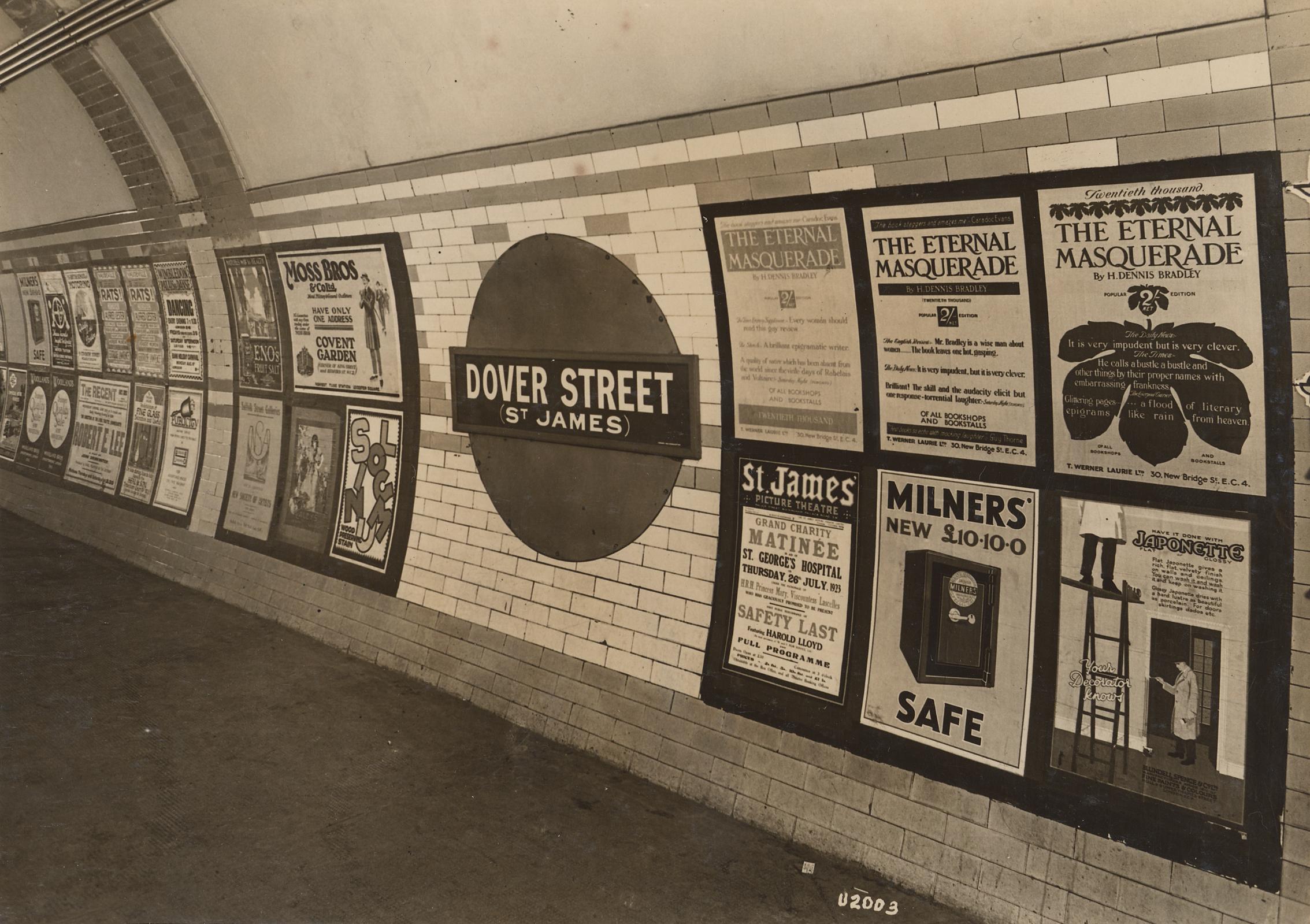
Dover Street (now Green Park) station in 1923. Photograph: Transport for London
Pick then commissioned artists to design beautiful posters. Rather than nag passengers, these would inspire, suggesting places in London people could visit and attractions they might attend. Pick thought art needed to come down from its pedestal and earn a living. These posters humanised the network, with people referring to the tube as London’s longest art gallery.
His next initiative was to commission a proprietary typeface the company could use to distinguish its publicity and announcements from that of other advertisers. In his brief to Edward Johnston, Pick stated that this new typeface should have the bold simplicity of the authentic lettering of the finest periods
and belong unmistakably to the twentieth century
.
Johnston sought inspiration for his typeface from hand drawn letters he had seen on the side of a tradesmen’s wagon, and its introduction proved to be a dramatic change. While his contemporaries derided his creation as a betrayal of well-designed lettering, by the centenary of its introduction in 2016, ‘London’s handwriting’ was being widely celebrated by the design community.
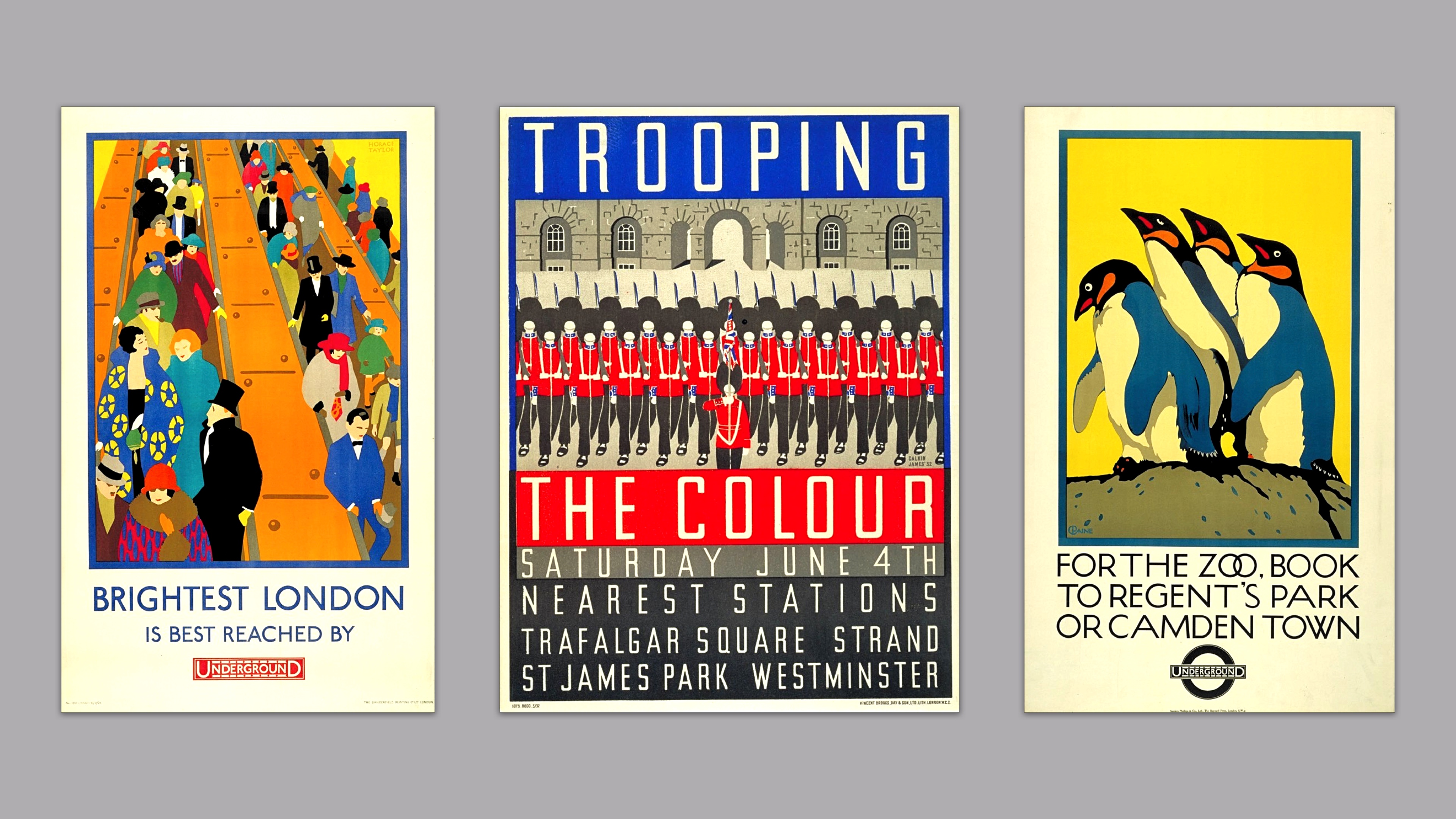
A selection of posters commissioned by Frank Pick. Brightest London is Best Reached by Underground (Horace Taylor, 1924), Trooping the Colour (Margaret Calkin-James, 1932) and For the Zoo Book to Regent’s Park (Charles Paine, 1921)
As UERL merged with its competitors to become the Underground Group, Pick rose through the ranks, and his influence grew. In 1927 he commissioned the architect Charles Holden to design a new head office at 55 Broadway, as well as a series of new stations for the extended Piccadilly line. By 1933, when the capital’s transit companies were combined into a public body – the London Passenger Transport Board – Pick was appointed its chief executive.
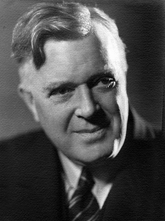
Portrait of Frank Pick (Howard Coster, 1939). Photograph: National Portrait Gallery
Pick would remain in charge until shortly before his death in 1941. During the 30 years he managed London’s transport, Pick had instigated what today we might call a corporate identity programme – dare I say, a design system – and its core tenets remain in place to this day.
In many respects, Frank Pick was the Steve Jobs of his time. Much like Jobs was driven by a desire to create insanely great products
, Pick was driven by his own over-arching principle:
The test of the goodness of a thing is its fitness for use. If it fails on this first test, no amount of ornamentation will make it any better; it will only make it more expensive, more foolish.
Every piece of work he commissioned, be it posters, typefaces, buildings and more besides, each needed to satisfy this test. Unlike Costa or Niemeyer, Pick wasn’t a designer or artist, so he used an evidence-based approach to understand what worked, and placed passengers at the heart of his plans. Pick saw the Underground not simply a machine for moving people, but something that could contribute positively to the urban environment and the communities it served.
75 years after his death, this ethos remains central to the design of London’s transport infrastructure. Pick’s legacy can be seen in the design of its newest additions, be it the city’s river taxis or its rechristened ‘Overground’ railway network.
Much like London, the web – perhaps the ultimate expression of human creativity in digital form – is also a chaotic and unruly place; Douglas Crockford once called the browser the most hostile software development environment ever imagined
.
Facing complex environments like this, its tempting to focus on rules and patterns, yet a system will only be deemed successful if consideration has been given to those who’ll inhabit the spaces it defines.
When designing for others, be they the residents of a city, passengers on a transport network, or customers using a website, we shouldn’t ignore chaos, but embrace its underlying complexity. For complexity is the only thing that will ground our decisions to reality, the unfortunate space that lies between theory and practice.
-
The Shock of the New: Trouble in Utopia, BBC2, 12 October 1980. ↩︎