Designing Systems, Part 2: Layers of Longevity
The second part of a three-part essay based on the talk I gave at Smashing Conference.
As consumers grow ever reliant on digital products and services, designers are being asked to create experiences that work seamlessly across a multitude of platforms, all without slowing delivery or impeding their maintainability. Design systems address this need.
But what is a design system?
 Definitions vary, and the term is used somewhat interchangeably with related concepts like style guides. In highlighting the difference between the two, Nathan Curtis arrived at one definition:
A style guide is an artifact of design process. A design system is a living, funded product with a roadmap and backlog, serving an ecosystem.
I consider a design system in a similarly broad terms, namely that of an holistic collection of guidelines, tools and other artefacts that help an organisation deliver coherent experiences.
I imagine a complete system consisting of four layers, each concerned with a particular role and purpose:
- Principles: A set of core values from which can inform subsequent design decisions.
- Guidance: Artifacts of a design process that document how these principles should be enacted.
- Tools: Models and frameworks that help practitioners implement guidance in a meaningful way and interact with any complex systems these define.
- Products: The resulting output of the system, whose use will feed back into the make up of the layers below.
Principles
In part 1, we saw how the artifacts commissioned by Frank Pick needed to satisfy his test of fitness for use, a principle that informed every aspect of London Transport’s corporate identity. We can use a similar model when crafting design systems. Experience designer Kate Rutter describes design principles as:
short, insightful phrases that act as guiding lights and support the development of great product experiences [that] enable you to be true to your users and true to your strategy over the long term.
Absolved of implementation or interface concerns, design principles can help stakeholders coalesce around a set of ideals and assumptions. In later stages, they can help teams make decisions, and later still be used to test whether products of the system meet these goals.
That said, it’s never too late to consider design principles. In fact, having an existing set of products might help designers seek out consistent themes, and examine what works and what doesn’t. The important thing to remember is that these principles should be unique. Everyone wants their product to be easy to use, what values make yours different?
Jared Spool has written about creating meaningful principles that can better inform design decisions, while Jeremy Keith maintains a collection of principles if you are looking for inspiration.
Guidance
 With a set of guiding principles in place, you can then look to the creation of guidelines. Artifacts of a design process, these document how different practitioners should embody these principles in their own work.
Designers will look to brand identity guidelines. These can cover everything from logo usage, typography and colour to texture, iconography, photography and more. A renewed interest in mid-to-late 20th-century brand manuals means we can refer to guidelines produced for the New York City Transit Authority, British Rail, Nasa and others. While brand consultants no longer deliver hefty tomes like this, the guidance they offer should be no less exhaustive.
Writers will seek out style guides. In the original sense of the term, these cover nomenclature and grammatical choices. Tone of voice guidelines are concerned less about words, more about sentences, and how an organisation verbally communicates with its customers. This guidance is especially useful since having a distinctive voice will help a product stand out from the crowd.
Developers may establish coding conventions. These ensure everyone contributing to a codebase is writing consistent, predictable and maintainable code. The correct answer to the question “tabs or spaces” isn’t your own personal preference, but what the team has collectively opted to use.
Naming things
Be they designers, writers or developers, craftspeople will find collaboration easier having agreed upon a clear set of rules and established a shared vocabulary that ensures everyone is using the same language.
In her article From Pages to Patterns, Charlotte Jackson describes a workshop exercise that encourages a collaborative approach to naming interface components:
- First, cut up an interface into its component parts, and group together those that appear visually similar.
- Have every member of the team come up with a name for each component, individually and in secret.
- Once everyone has thought of a name, reveal these to the group.
If multiple people suggest the same name for a component, this will likely be a good candidate. If not, the discussion that follows should prove just as fruitful.
Once you’ve decided what things are called, make sure these decisions are recorded. When I joined the Guardian, my colleagues would talk about pixies and super-pixies, bentos and mini-bentos and other odd names which gave little hint to their meaning (it turns out these were container types used on the homepage). While arriving at esoteric names like this can be fun and build camaraderie within a team, they inadvertently exclude those who join later. It’s for this reason that I recommend using obvious and descriptive terms whenever possible.
Building systems through collaboration
The idea of working together to build a shared understanding brings to mind Mark Boulton’s observation that effective design systems adopt Postel’s Law, such that by:
being liberal in accepting things into the system, and being liberal about how you go about that, ensures you don’t police the system. You collaborate on it.
The most recognisable piece of design created during Frank Pick’s leadership of London Transport, the Underground map, was not instigated by him or any other manager of the company, but put forward by Harry Beck, a young draftsman working on the network.
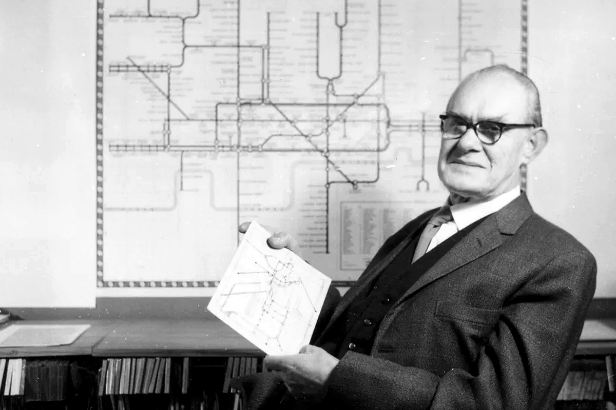
Harry Beck holds a copy of his diagram for the London Underground; he seems rightly chuffed with his idea!
Realising that passengers cared more about the connections between the various lines below ground than they did about the street layout above, Beck did away with geographical accuracy, instead drawing tube lines on vertical, horizontal and diagonal axes, marking the intersections with a diamond.
It’s not the features that matter, but the connections. I’ll return to that thought in part three.
Tools
 Guidance alone can’t help us build products. We need tools that go beyond this low-level direction (the ‘what’), and enable people to implement these rules in a meaningful way (the ‘how’). These are the concern of our next layer.
Two tools often mentioned when discussing design systems are visual design languages and component libraries. Understandably, it is the later of these that our industry has focused on lately as they help develop modularised front-end code.
Conceptual models
While these attract the most attention, it’s conceptual models that I find more interesting. As way of example, let me describe a model we used at the Guardian.
As part of an extensive redesign project, one goal was to improve the discovery of different content types. Achieving this meant taking into account a number of conflicting requirements. Readers wanted predictable means of finding their favourite topics and columnists, yet editors wanted to flag stories from across the website. While the design team wanted to create layouts infused with Guardian’s renowned graphic design values, the engineering team wanted to develop a product that wasn’t overly complex or difficult to maintain.
Somewhere in the middle, a solution needed to be found.
Enter, the container model. A systematic approach to page composition, this proposed that items (each representing a story) could be arranged into different horizontal slices, which themselves could be combined to create containers.

The container model: items, slices and containers
Building containers by combining items and slices allowed for an incredible range of flexibility and reduced the amount of code needed to support it. Each container could focus on a particular theme, say people in the news, the latest video content or a featured news story. Containers could also be shared across different pages and in varying positions, too. For example, the most popular stories container could be shown midway on the homepage, and also towards the foot of every article page.
This model went some way to addressing the flexibility desired, yet further models were needed to deal with the variation inherent to effective editorial design. Tonality, newsworthiness, curation, information density, pacing, device considerations… all presented the design team with an array of concerns that needed to be reasoned with.
A section front on the Guardian website
Working with so many moving parts became a struggle, and everyone on the team attempted to solve this puzzle in different ways. A solution was found eventually, although the imposition of a six-week deadline was the most effective tool in helping us reach a conclusion!
In 101 Things I learned in Architecture School, Mark Frederick describes a learning process which he calls the ‘three levels of knowing’:
-
Simplicity: the world view of a child, fully engaged in his own experience, happily unaware of what lies beneath the surface of immediate reality.
-
Complexity: the world view of an adult, in which there’s an awareness of complexity, but an inability to discern patterns and connections.
-
Informed simplicity: an enlightened world view, in which a person has developed the ability to recognise and create patterns within complex mixtures.

- Simplicity: 3 elements used to create 3 spaces;
- Complexity: 12 elements used to create 12 spaces;
- Informed simplicity: 3 elements combined to create 12 spaces.
This perfectly encapsulates the process we went though at the Guardian, and one I’ve experienced many times since. Only by working with the different pieces long enough, experimenting with various combinations, can you devise a system (or systems) that sufficiently model the underhand complexity.
Products
 Returning to the first part of this essay, systems need to survive contact with the real world. Writing about GE’s design system, Predix Jeff Crossman noted that:
A design system should not simply be a collection of user interface components along with some design theory. It should demonstrate how design patterns have been applied in real products and document how other teams have extended patterns for specific use cases.
Jeff makes an important point; the products of a design system will be the ultimate arbiters of its usefulness. Beyond the immediate success (or failure) of these products, as they evolve to meet the changing needs of our customers, so the systems supporting them will need to adapt also. The products that emanate from a design system are at the same time a constituent, living on its surface and feeding back to the layers below.
Accounting for change
Frank Pick’s successful management of London Transport was possible due to the support he received from the company’s chairman, Lord Ashfield. The departure of both Pick and Ashfield – plus growing private car ownership and declining passenger numbers – soon costs were being prioritised over quality, and a period of neglect followed.
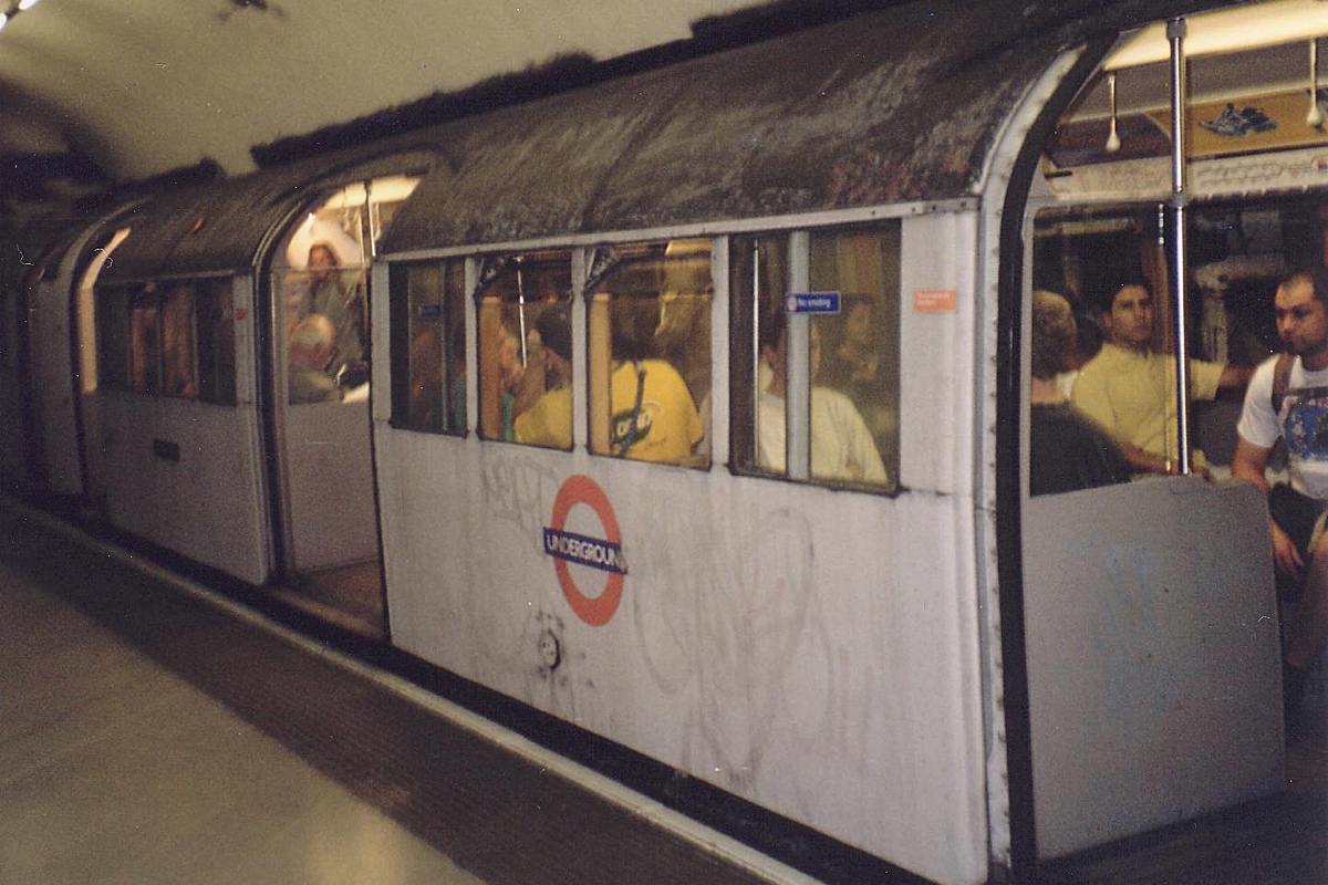
The Underground in 1997 – very different from how it looks today. Photograph: Kirk Bauer
Thankfully the last 15 years have seen these factors reverse, with the network again getting the attention it deserves. New lines are being built, while existing stations are being upgraded and repaired. Transport for London are managing this renewal by following the Station Design Idiom, a set of nine principles that underpin design across the Underground network. These are referred to on every project, be it a small-scale repair, a major refurbishment or a brand new station.
Included in the idiom is a new map that gives contractors a station-by-station guide to the different architectural styles used throughout the network. Paint colours and decorative materials should now match the architectural style of each building, rather than adhere to an overarching corporate look. By deliberately maintaining a diversity of styles, Transport for London have chosen to make the network’s design history an integral part of their design system. To me, this seems like a pragmatic approach.
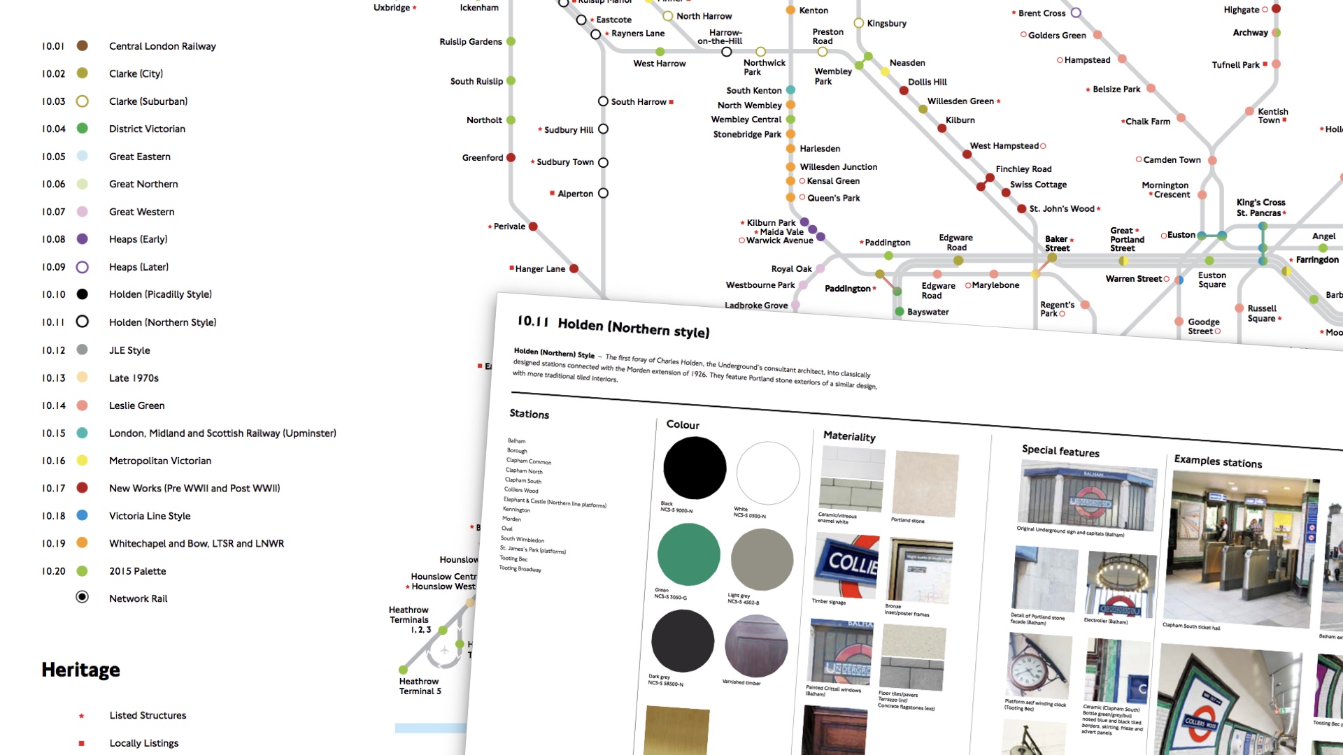
The Station Design Idiom map and flashcard
Shearing layers
 In How Buildings Learn, Stewart Brand expands upon Frank Duffy’s idea that different timescales can be seen to effect a building. Called shearing layers, he describes these as follows:
- Site: the geographical setting and legally defined location, whose boundaries and context will outlast generations of ephemeral buildings.
- Structure: the foundation and load-bearing elements. Perilous and expensive to change, they remain in place for decades, if not centuries.
- Skin: the exterior surfaces that change every twenty years or so, either to keep up with fashion, technology or because they are in need of repair.
- Services: the wiring, plumbing, fire sprinkler systems and moving parts like elevators and escalators.
- Space Plan: the interior layout, composed of walls, ceilings, floors and doors that will be adapted to meet the needs of the current tenant.
- Stuff: Chairs, desks, phones, pictures; appliances, lamps, hairbrushes, basically all the things that frequently get moved around.
Duffy summarised this view:
Our basic argument is that there isn’t any such thing as a building. A building properly conceived is several layers of longevity of built components.
We can view a design system in a similar way. At its core, a set of guiding principles provide the foundations upon which everything else follows. If conceived with care, while open to periodic amendment, these should remain largely unchanged. The next layer makes these principles applicable, offering guidance to different practitioners. Given the time and cost involved in their creation these will have a decent shelf life. The penultimate layer concerns tooling, and its here that fashion and current practice will inform outcomes. At the surface, the products borne of a system will change frequently as they are adapted (tweaked, edited, adapted) to meet the everyday needs of customers.
So, in answer to the original question – what is a design system – perhaps there is no such thing, just layers of longevity comprised of agreed conventions and tooling.