Fantasies of the Future
In an attempt to understand our work, digital designers may look towards architectural practice for inspiration. As much as we can learn from where architecture has been successful, we can also draw lessons from its failures, too. When the prevailing culture permits us to create products that can undermine and exploit users, might design systems help us protect residents of the digital spaces we’ve been asked to create?
Imagine you were designing a city.
How might you layout its roads and major features?
Would these make a shape?
What shape?
Perhaps that of a bird?

A city with such a layout exists. It is called Brasília, and it is the capital of Brazil. You might have thought Brazil’s capital was Rio de Janeiro, and indeed it was until 1960. A coastal city, Rio was seen as vulnerable to attack, and the country’s republican constitution – dating back to 1891 – stated that the capital should be moved to a more central location.
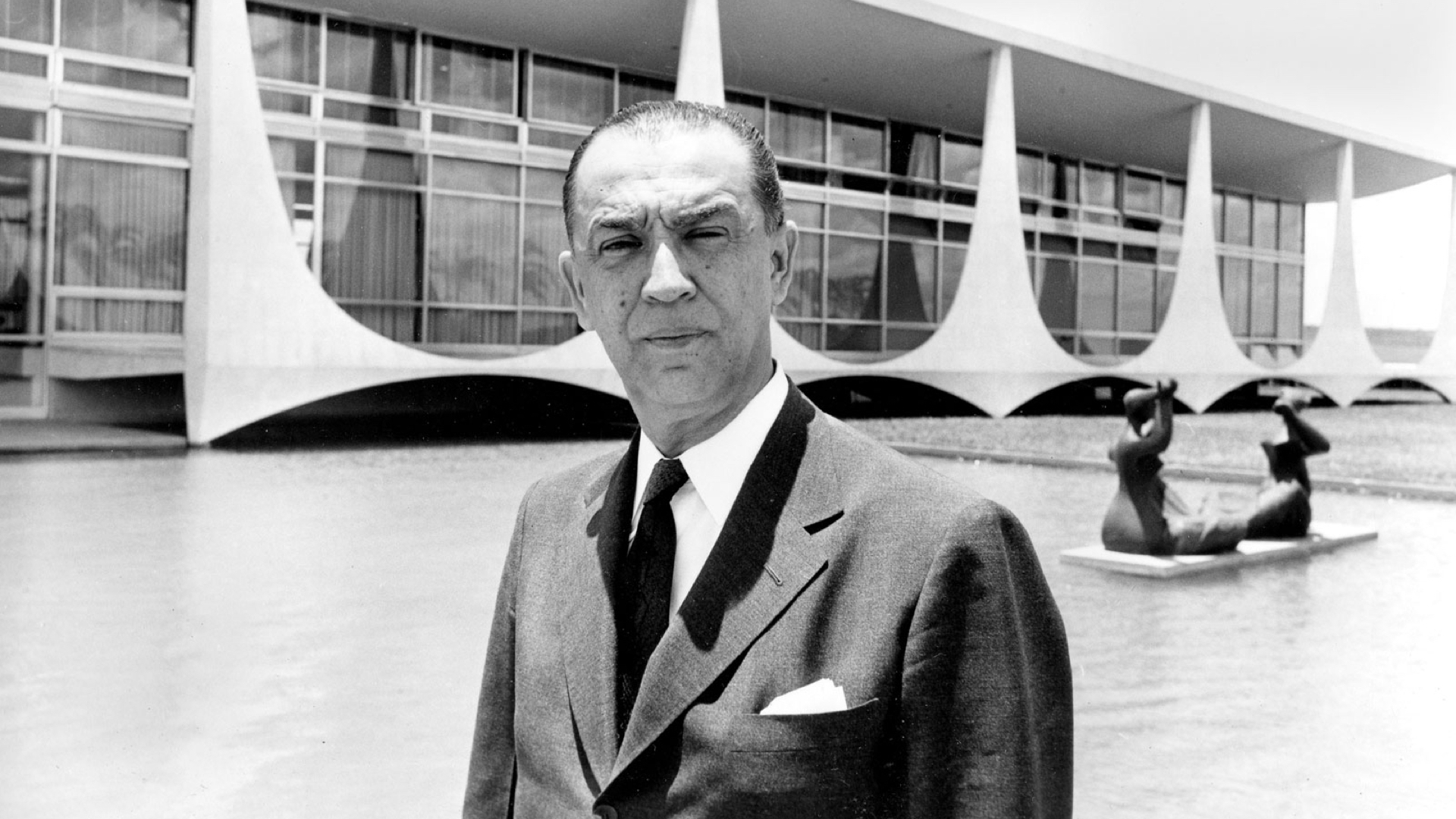
It wasn’t until Juscelino Kubitschek became President in 1956 however, that its construction would finally be ordered. His election campaign promised fifty years of prosperity in five
, and building a new capital was a key pledge.
While the constitution originally mandated moving the capital for defensive reasons, such a move made little sense in the 1950s.
Moving the city was more of a political gesture, a sign that the country was ready to move on from its colonial past. A modern new capital would launch Brazil onto the world stage as an optimistic and forward-looking power.
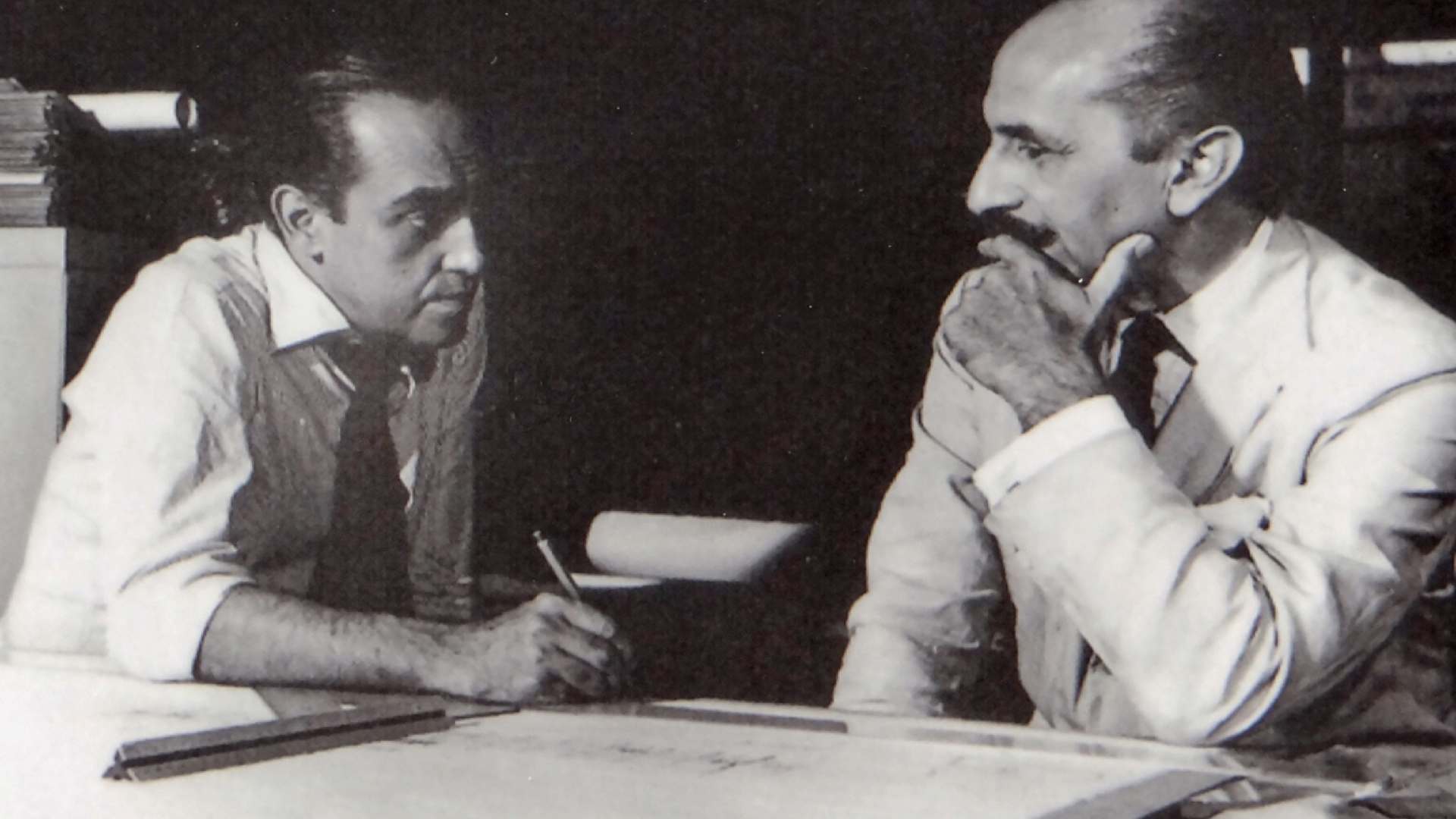
Kubitschek invited the architect Oscar Niemeyer to design the new capital’s civic buildings, such as the Presidential Palace, National Congress and Supreme Court.
Niemeyer’s friend, Lúcio Costa, won the contest to arrange its urban plan, and is the one responsible for the bird like layout.
Beyond acting as a symbol for a braver, more optimistic age, they believed Brasília could also transform Brazil’s heavily stratified society into a more egalitarian one. In their model utopia, they envisaged governors and ambassadors living next to janitors and labourers, with everyone using the same entrances and sharing the same spaces.
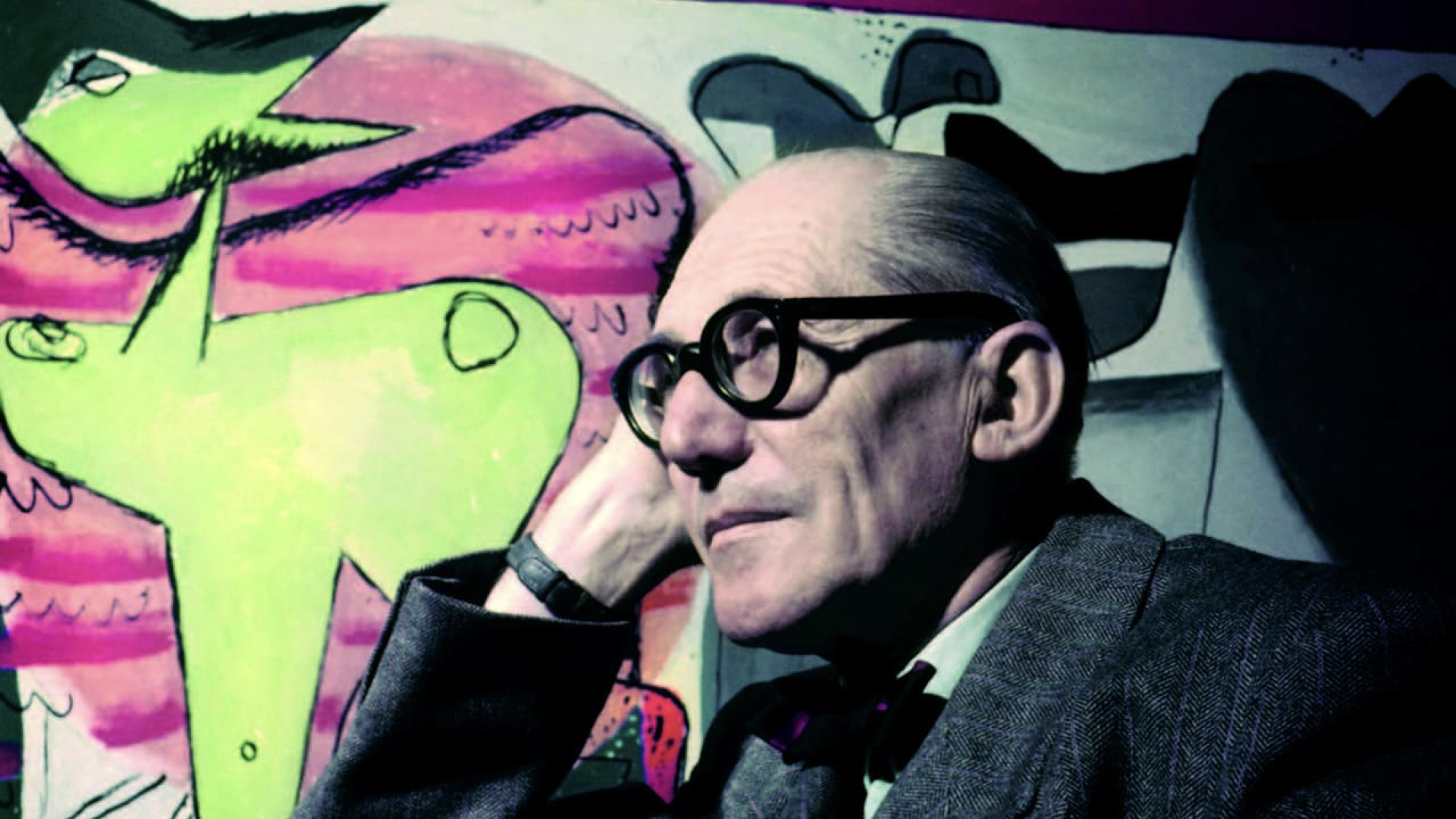
Niemeyer and Costa had worked together on a number of projects already, and both admired the thinking of their contemporary, Le Corbusier, the Swiss-French architect and pioneer of modern urbanism.
Le Corbusier believed good architecture produced good societies, and advocated ideas like organising cities around rigid zones within which different activities would take place, and lifting residential areas of the ground, to let cars and other services run underneath.
With Brazil’s vast and unpopulated interior as their canvas, Costa and Niemeyer set to work, and used some of these ideas as the basis for their new city.
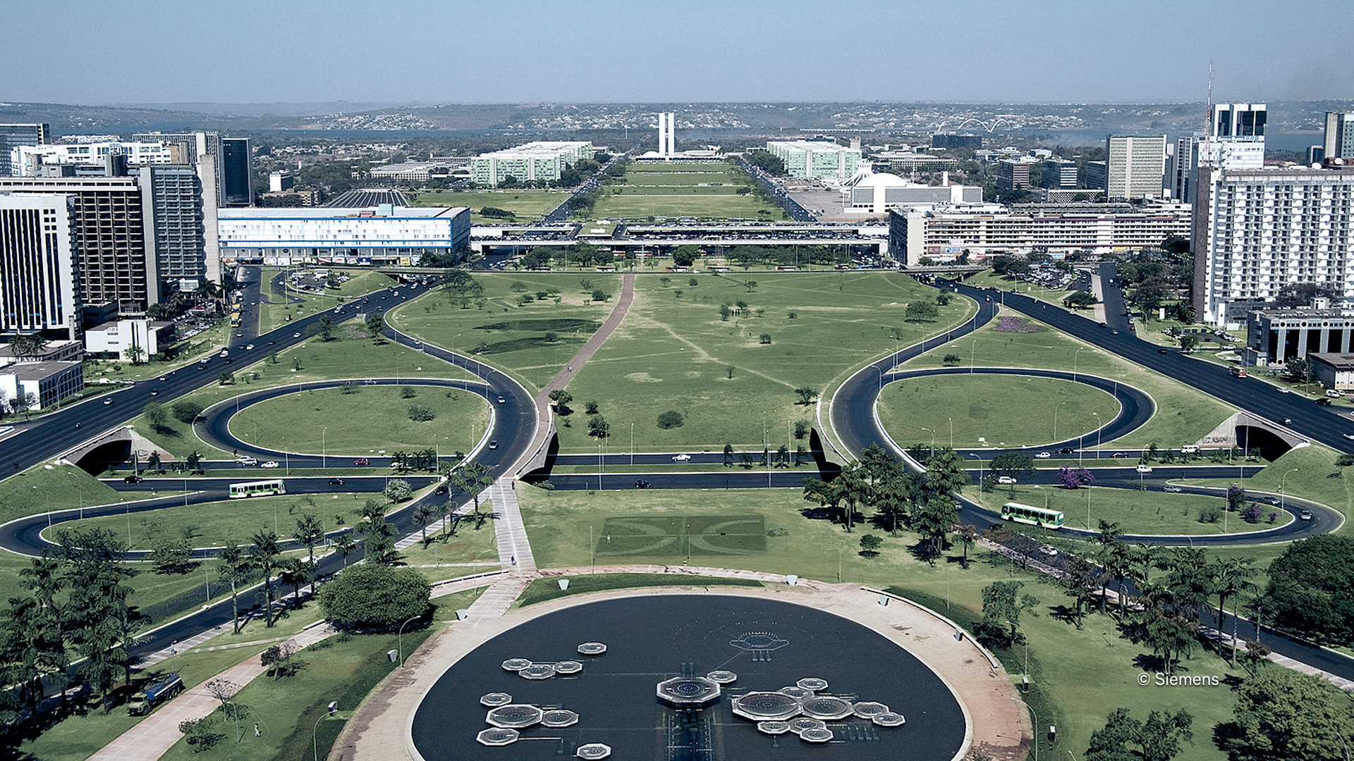
From Brazil’s barren central plateau, a new city emerged. And wow, what a city!
With Costa’s logical plan and Niemeyer’s distinctive buildings, Brasília is now considered a definitive example of 20th century modernist urban planning, and the city received UNESCO World Heritage status in 1987.
Yet as much as it is admired as a work of art, it fails as a place to live.
For example, Costa’s fixed layout limited the amount of residential space available. As people moved to the city in search for work, its population grew rapidly, and very soon, Brazil’s deep class structures, subtly racial in origin, reasserted themselves.
Workers who had helped build the city were banished to distant satellite towns, segregated from the middle-classes, and spending their meagre salaries on long commutes into and out of the city.
My brother lives in Brazil, and I asked him what the general feeling is towards Brasília. He told me that most consider it a city built for the rich by the rich. Quite different from the egalitarian aspirations of it’s two architects.
In 1980, the art critic Robert Hughes said…
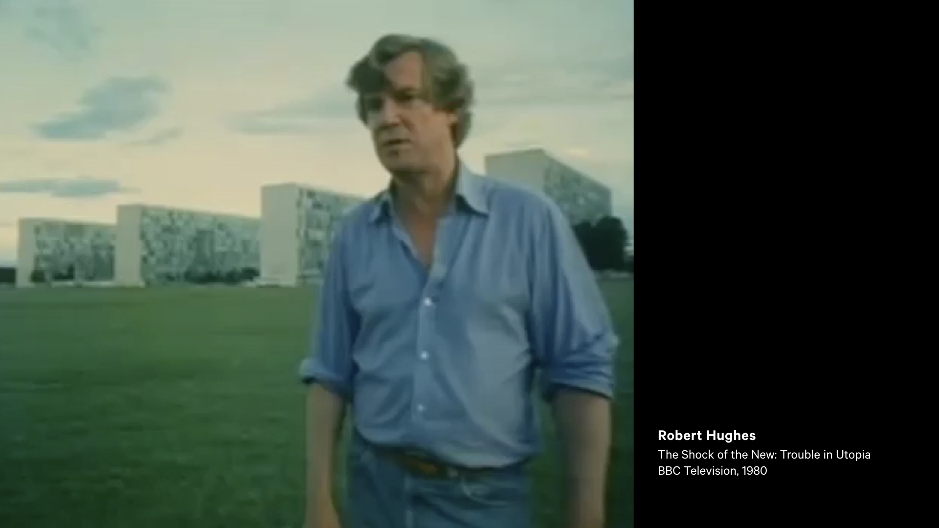
Nothing dates faster than people’s fantasies about the future. This is what you get when perfectly decent, intelligent and talented men start thinking in terms of space, rather than place, and about single rather than multiple meanings. It’s what you get when you design for political aspirations and not real human needs. You get miles of jerry-built platonic nowhere infested with Volkswagens. This, one may fervently hope, is the last experiment of its kind. The utopian buck, stops here.
There’s a lot to unpack in Hughes critique. But when I hear it, I wonder if similar criticisms could be levelled at our own work.
We’ve certainly adopted the modernist aesthetic, with the trend away from the decorative and experimental, towards the minimalistic and apparently materially truthful.
But have we also adopted the same detached optimism that failed the citizens of Brasília?
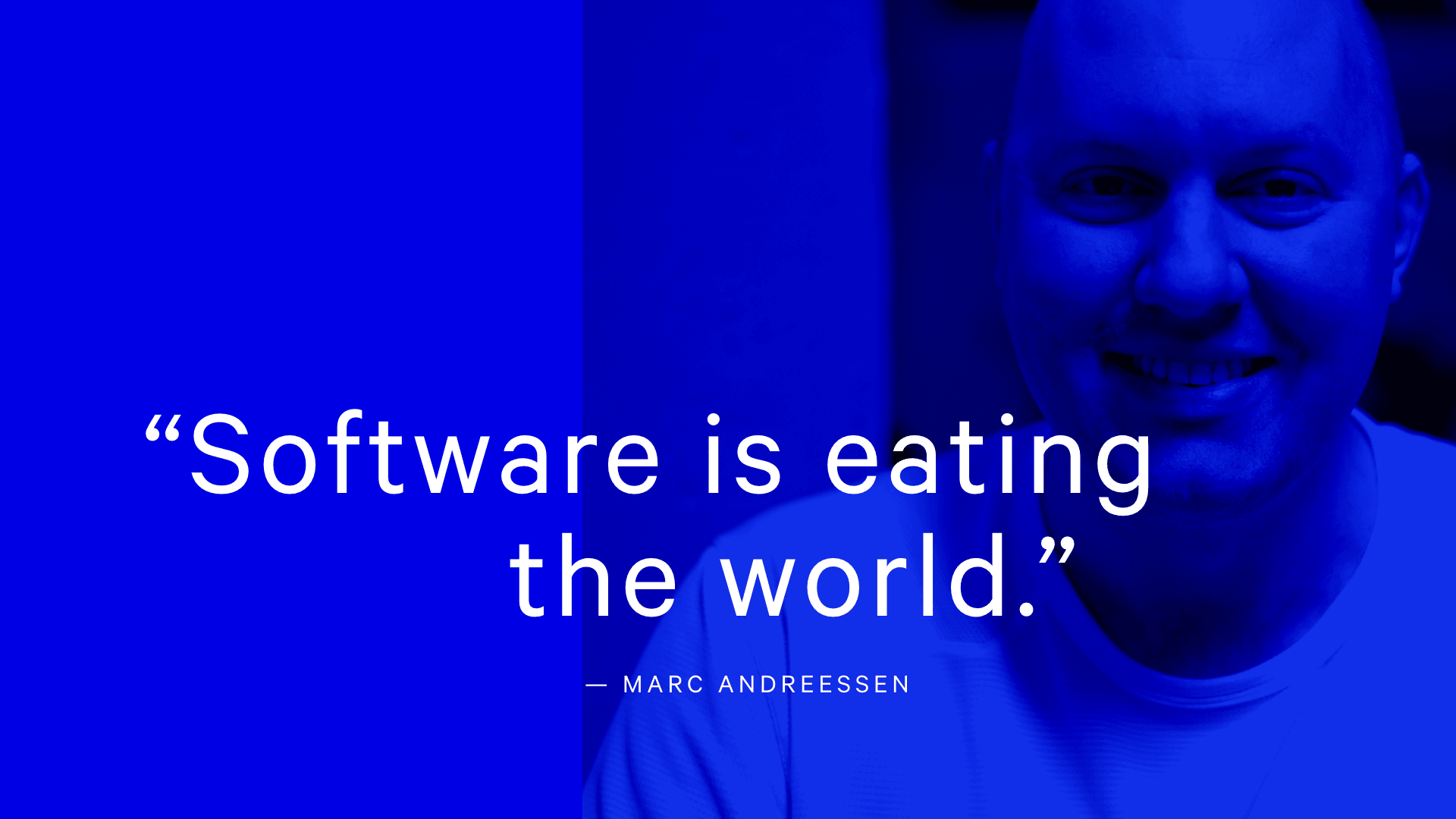
In 2011, Marc Andreessen penned an essay for the Wall Street Journal, in which he suggested every company needed to become a software company for it to remain relevant.
As the cost of hardware decreases, and processors become ever more powerful, services that have traditionally been delivered by other means are now being run by software and provided online.
We’re in the midst of an economical and technological shift in which technology companies – fuelled by network effects and limitless venture capital – are taking over large parts of our economy.
Given this emphasis on technology, Silicon Valley has become an outsized influence. And so has its culture, one that stands at the altar of computation, where the only law that matters is that of Moore, and everything can be reduced to a series of ones and zeros.
Given the abundance of technology, the distinguishing factor has become design. No longer considered simply an act of applying a veneer towards the end of a product’s development, design is now seen as integral part.
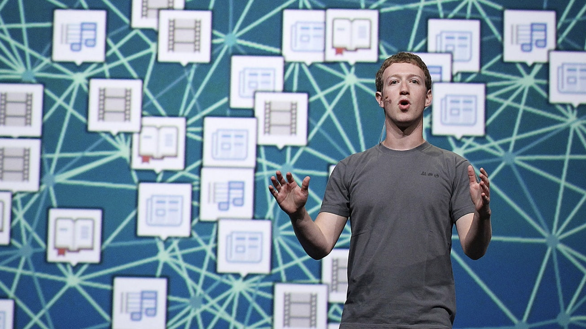
Those working in the industry are told their work can make an impact on millions, if not billions of people’s lives. People often cite this as a reason for choosing to work at companies like Facebook and Google.
This is an idea I find deeply distressing, although I appear to be in the minority that think so.
Designers now have a seat at the table. That some of the biggest players in the valley remain led by domineering CEOs with engineering backgrounds, I wonder if designers have as much influence as they like to think.

There is no better example of this than the Yahoo logo. It’s former CEO, Marissa Mayer, famously talked about how she and a small team of in-house designers came up with it in an afternoon – and you can tell! I wonder if they tested 41 shades of purple, too?
Needing to qualify subjective decisions is not a new problem designers have had to face, and many have made post-rationalisation an art form in and of itself.
That not a day passes in which a new logo isn’t justified in terms of how it fits within a grid, is indicative of a trend in which design needs to be seen as somehow mathematically pure.

And yet design can be an incredibly intuitive act. It involves making decisions that seemingly go against logic, but make sense when you consider how the humans perceive things.
Take this simple example of a play icon. The triangle looks off-centre, but if we inspect its position, we can see that it’s actually centred. A designer, exercising her own judgement, will move it slightly to the right, to make the composition feel balanced.
You might be thinking, surely we can use AI and machine learning etc. to solve such decisions now? So here, a computer could understand where the mass of the triangle sits within the circle, and adjust its placement accordingly.
Now, it’s certainly true that many decisions may not be as subjective as designers like to think. But would it not be a damning indictment of our species if we were to surrender individualism and creativity to algorithms and machines?
Another example of how software engineering practice has led the way is around workflow.
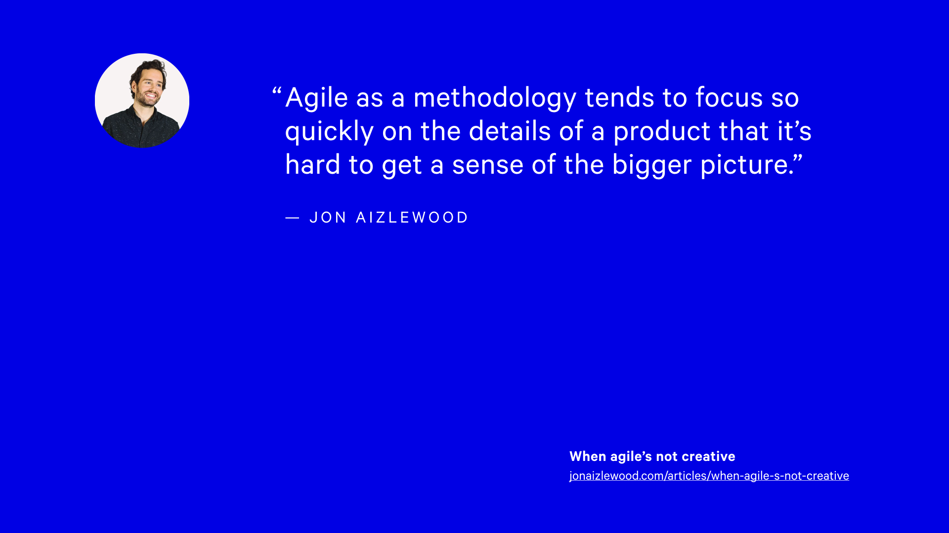
The Agile Manifesto is a product of software delivery, and its a process in which designers are often asked to slot into.
Designers (like my former colleague Jon Aizlewood) will talk about the difficulty of making decisions, or being able to look holistically at problems, when such a process demands small pieces of separated work.
Now, let’s not get into arguments about agile! But again, it’s indicative of a trend. Ideas around minimal viability and company principles such as “move fast and break things”, or “always be hustling” typically prioritise speed of delivery, the side-effects often being at the expense of quality, or taking the time to consider the consequences of releasing a particular feature.

Then there is this compulsive deference to data.
There is a spectrum between having data inform design rather than dictate it – yet the trend is towards collecting more data, not less.
Yet, having more data may actually limit the options available. It can lead us towards making incremental changes, and optimising within local maximums, rather than seeking out entirely new approaches.
Let’s also not forget, that when designing at the scale of populations, its easy to make generalisations. When users are reduced merely to data-points, real-life situations are seen as edge cases.

You may argue this is a simplistic outlook, and you’d be right! Nothing is black and white but shades of grey. But that’s kind of my point.
Clearly, the pendulum is swinging from a spec-driven waterfall process in which developers are asked to chop up pristine Photoshop comps thrown over a wall by interaction-illiterate designers, towards a more collaborative, systematic and rationalised approach. And that’s great, it really is!
My fear is this pendulum may start to swing too far in the opposite direction, if it hasn’t already.
The shadow Silicon Valley casts over those building digital products is long and unavoidable. It’s become the invisible hand that shapes our tools and defines the boundaries within which we practice. It forces us to concern ourselves with the road ahead when sometimes, we need to pull over, and take a long hard look at where we’re headed.
In an attempt to understand our work, digital designers will often look towards architectural practice for inspiration.
Those familiar with the history of responsive design will know that Ethan arrived at that name after looking at responsive architecture, which seeks to design buildings that react according to their environment and adapt to the needs of those inhabiting them.
Indeed, much of the thinking around design systems and software architecture can trace it’s history back to the writing of the architect Christopher Alexander, who coined the term ‘pattern’ in relation to a broader language for design thinking.
As much as we can learn from where architecture has been successful, lessons can be drawn from its many failures, also.
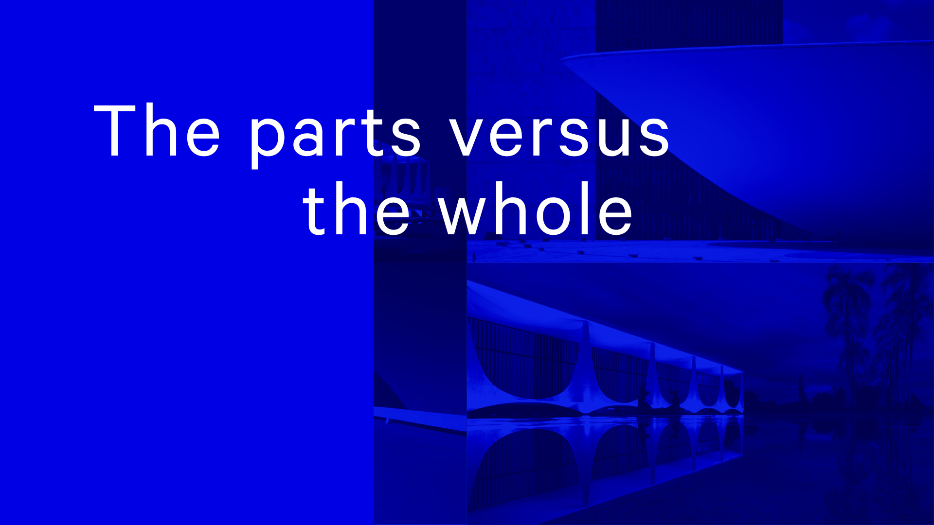
Let’s consider the parts versus the whole.
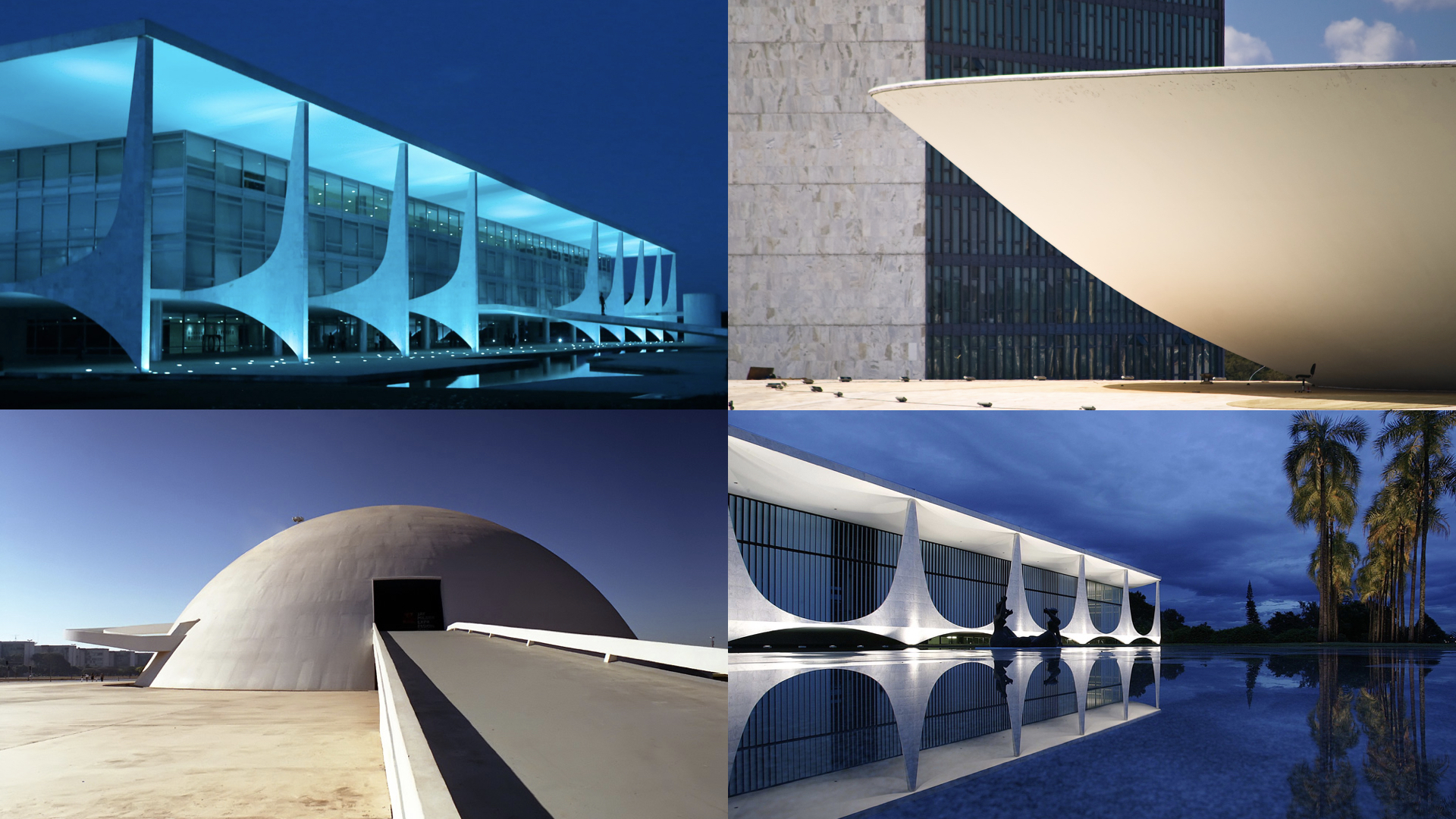
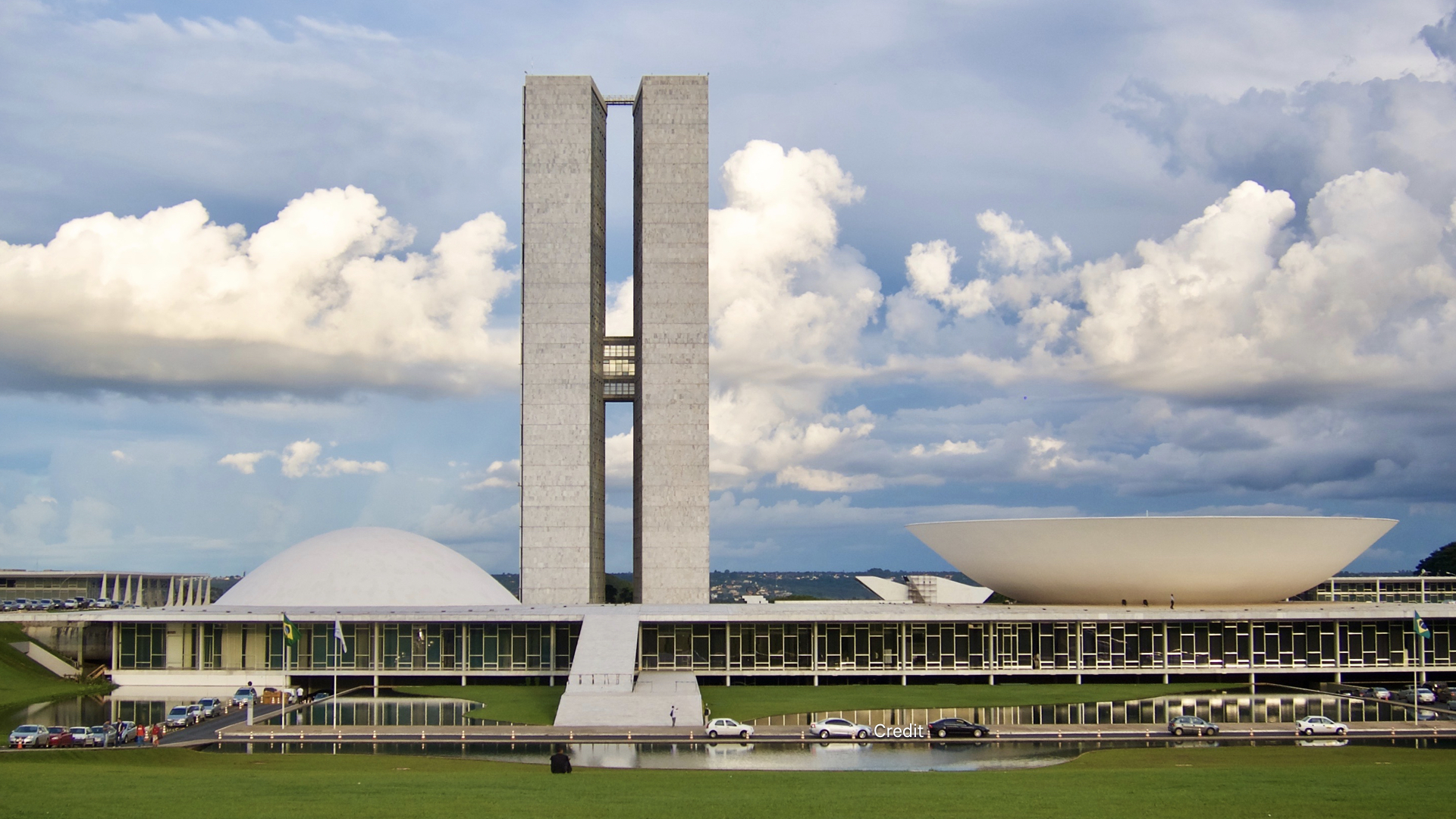
I had the good fortune of visiting Brasília in 2011. While I was there, I observed a number repeating architectural motifs used by Niemeyer that lend the city it’s unique identity…
- Wing-like supports that suspend buildings in air
- Reflection in water
- Slopping (and often dramatic) entrances
- And Niemeyer’s signature bold use of curves, often used in contrast with elongated straight lines
As a city designed to invoke a modern, forward looking Brazil, these motifs helped give this new capital it’s very distinctive, identifiable and cohesive presence.
While Niemeyer’s buildings are beautiful objects, they tend to suffer from an emphasis on form over function.
For example, this building, the National Congress, has a huge ramp at the front. It looks like the entrance, but in fact it’s purely decorative; a point reinforced by a barrier that sits half way up it to prevent you climbing up onto the roof, which is occupied by armed guards!
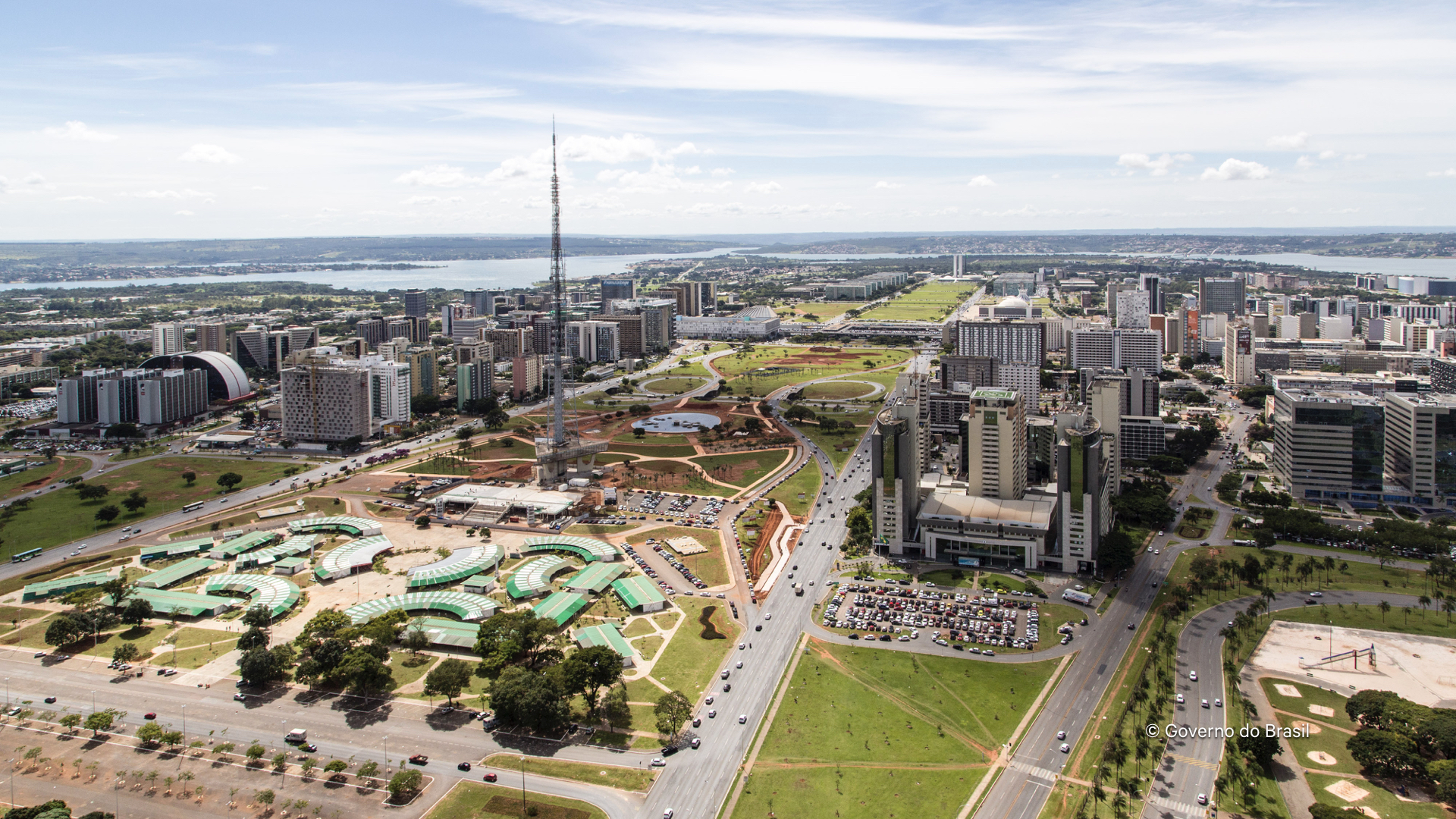
Costa’s layout also suffers similarly.
Along the main axis, there are these large lawns. While I’m sure these satisfied an objective of providing open space for people to relax in, their simplistic placement neglected the fact that to reach them, you need to cross six lanes of traffic.
Built around the car, distances between different buildings are great, and everything feels disconnected. Things make sense in isolation, but they don’t quite work when put together.
Which brings us to the patterns we use.
Brad Frost’s Atomic Design is a popular model for thinking about the construction of UI. To his credit, he takes into account templates and pages – the end product which an organisation is ultimately looking to have delivered.
And yet the focus always seems to be drawn to the smaller parts rather than the whole. I’ve heard more discussion about whether something is an atom, molecule or organism, than that regarding templates or pages. While the metaphor helps at one level, if hinders understanding at another.
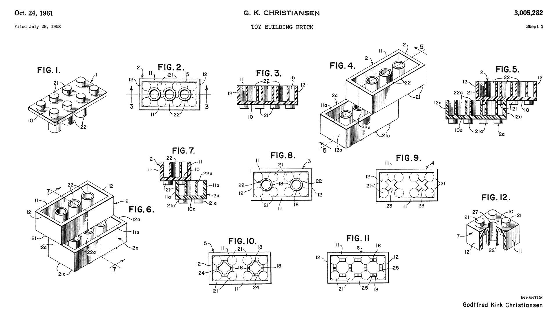
And so to our favourite analogy, Lego.
While it works as a useful means of communicating the idea of a modularised, extensible, controlled system, two important aspects are often missed:
- There is an enormous variety of different brick shapes, many of which are quite bespoke.
- The reason this variety can exist, is due to the predictability of the underlying system of tubes and studs which allow different shaped bricks to connect. One of the first bricks produced in 1958 will connect with one produced today.
What are the underlying methods that enable a predictable means of connection in our work? Is it perhaps story, which we heard about earlier today, or something more tangible?
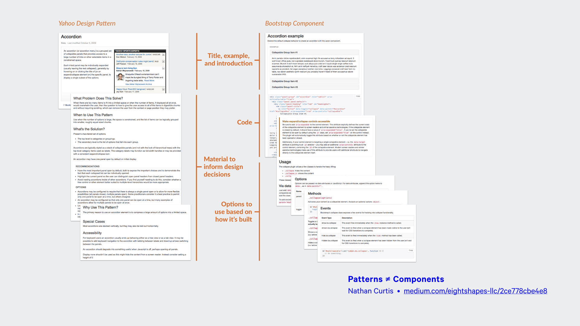
If I’m honest, I think the discussion around design systems is starting to suffer a little from a lack of clarity. Terms like “style guide”, “component library” and “design language” are used interchangeably, when more formal definitions are possible. Yes, naming things is hard, but maintaining the same name for things appears to be harder still!
This confusion also affected our understanding of patterns and components – there’s a difference!
- A pattern is a generalised set of abstract principles and guidance, required to solve a particular problem. More documentation than code, they are the why.
- A component is a specific instance of a user interface, implemented in code and user-facing. They are the what.
Most of the “pattern libraries” that are shared are in fact component libraries. Domain-specific entities, they are possibly less useful outside the organisations that built them than pattern libraries, which can help others solve problems that are conceptually similar.
I wonder if this confusion has bled into our tools?
Whenever I look to create and document a design system, I end up using tools like Fractal, Fabricator or Pattern Lab. Designed primarily around a single entity, the component, their ergonomics sub-consciously encourage a modularised approach, and a strict focus on code. That’s to be expected of course, but it’s worth remembering.
I know Vitally Friedman has talked about presenting design systems with an interface that begins by showing template examples from which you can zoom down to the individual components. There’s some milage in that idea, I think.
As the line between component libraries and much broader systems for design continues to blur, we need to ensure our tools are up to the job. Do we adapt component-based tools to take into account for wider concerns, or look to new tools?
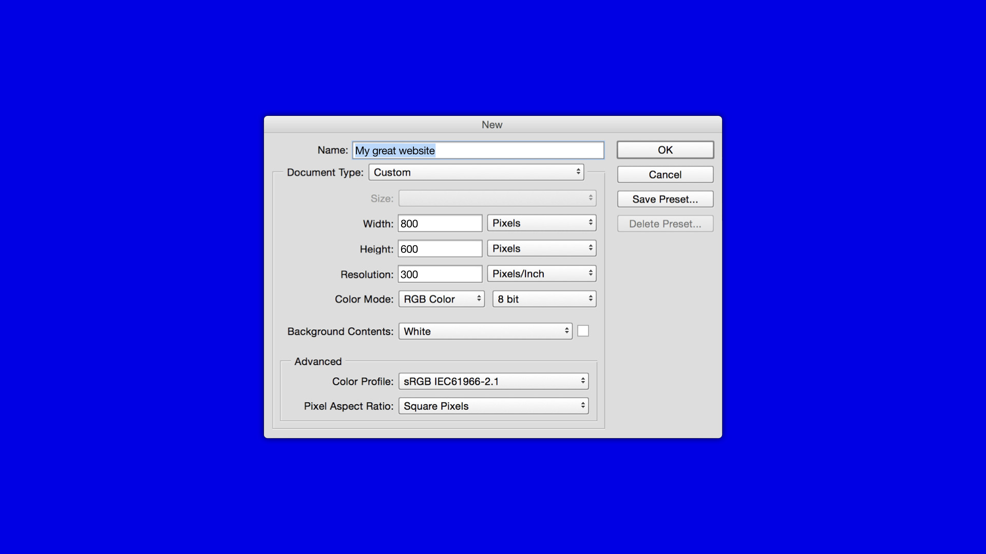
I’m reminded of talks Jeremy has given in the past where he mentioned how, that the way Photoshop would ask you for image dimensions before starting work on a new document, framed our early approach to web design.
We need to be careful we don’t make similar mistakes when building tools to construct design systems; small choices may have larger impacts than we might imagine.
Consistency has come up a few times today, but what do we mean when we say this?
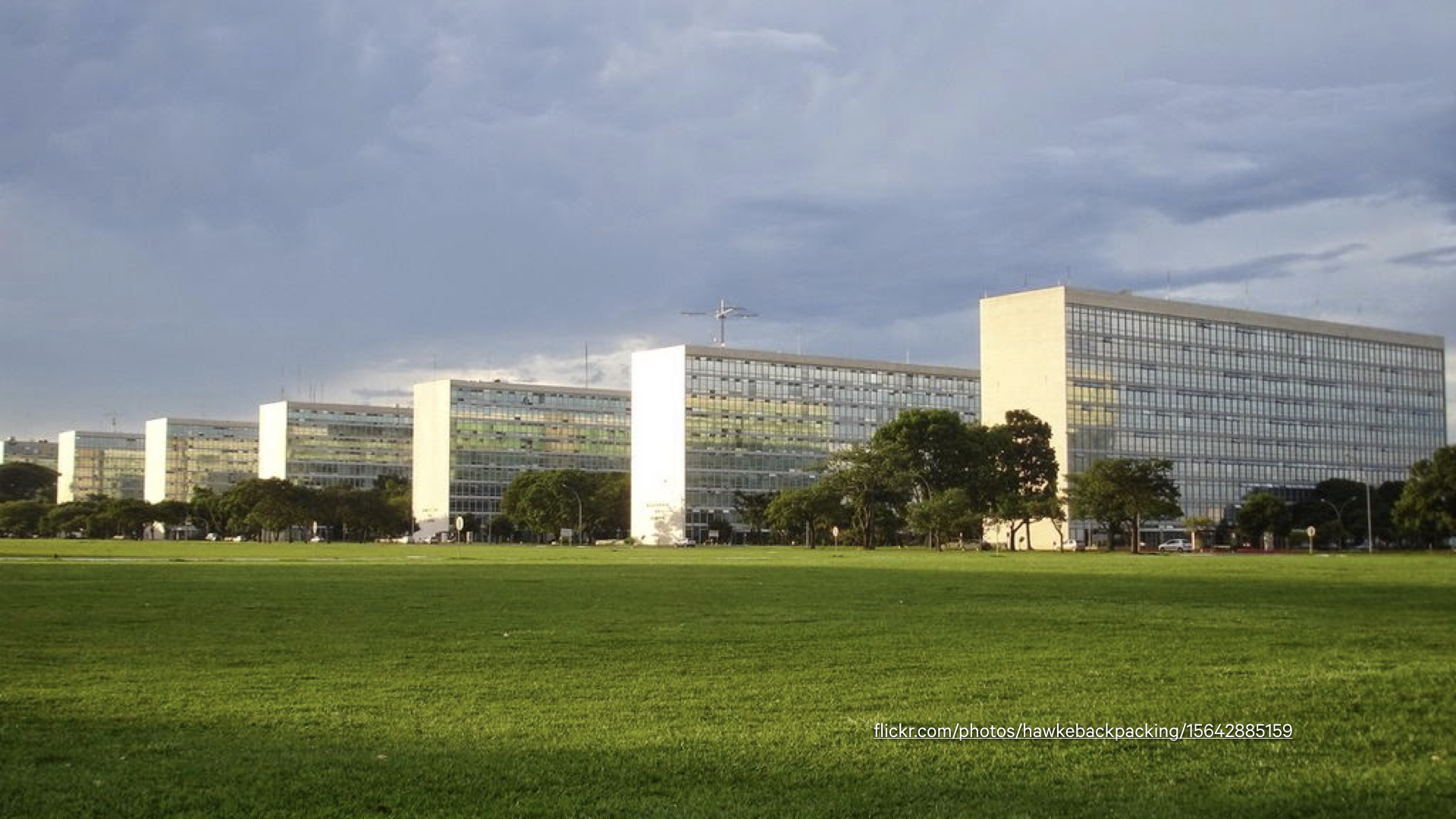
While people with minimalist sensibilities like myself can enjoy the design of Brasilia from a distance, for residents, it’s seen as a somewhat sterile and inhumane place to live. Many tend to leave the city at weekend for the more vibrant and lively cities of Rio and Sao Paulo.
Modernist approaches espouse rationalism and formality, yet humans tend to be attracted to things that are slightly off-balance, not symmetrical.
Is the desire to achieve rigid conformity ill-placed?
Design systems are advocated in part because they encourage consistency, both in terms of code and visual appearance.
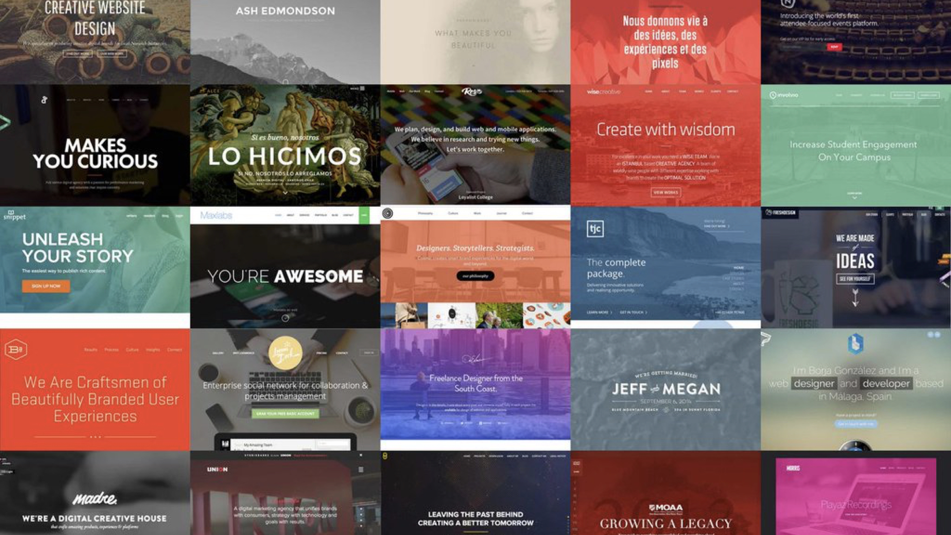
If everyone is looking to the same sources of inspiration, relying on the same frameworks, is it any wonder we’re at the point where websites are becoming sterile imitations of each other?
Are we starting to confuse consistency with coherence – with conformance even?
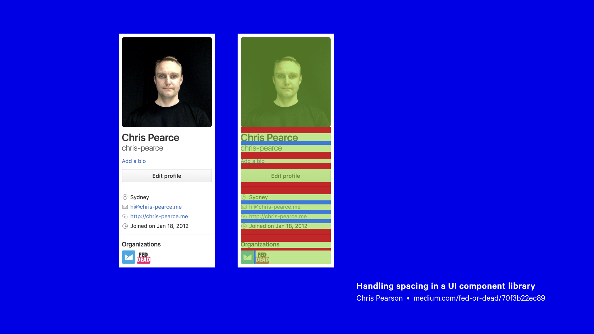
Chris Pearce wrote about systematic ways of approaching vertical space between components. It’s a really great article, and it’s quite detailed, outlining three different approaches to managing space in a componentised system. All have three have their drawbacks, and all introduce a degree of complexity.
But as I read this, I couldn’t help thinking this might be an example of taking things too far. Is complexity the price we need to pay to achieve consistency?
What struck me about the particular example Chris cited however – this profile block – was that such complexity can be avoided if the right questions are asked.
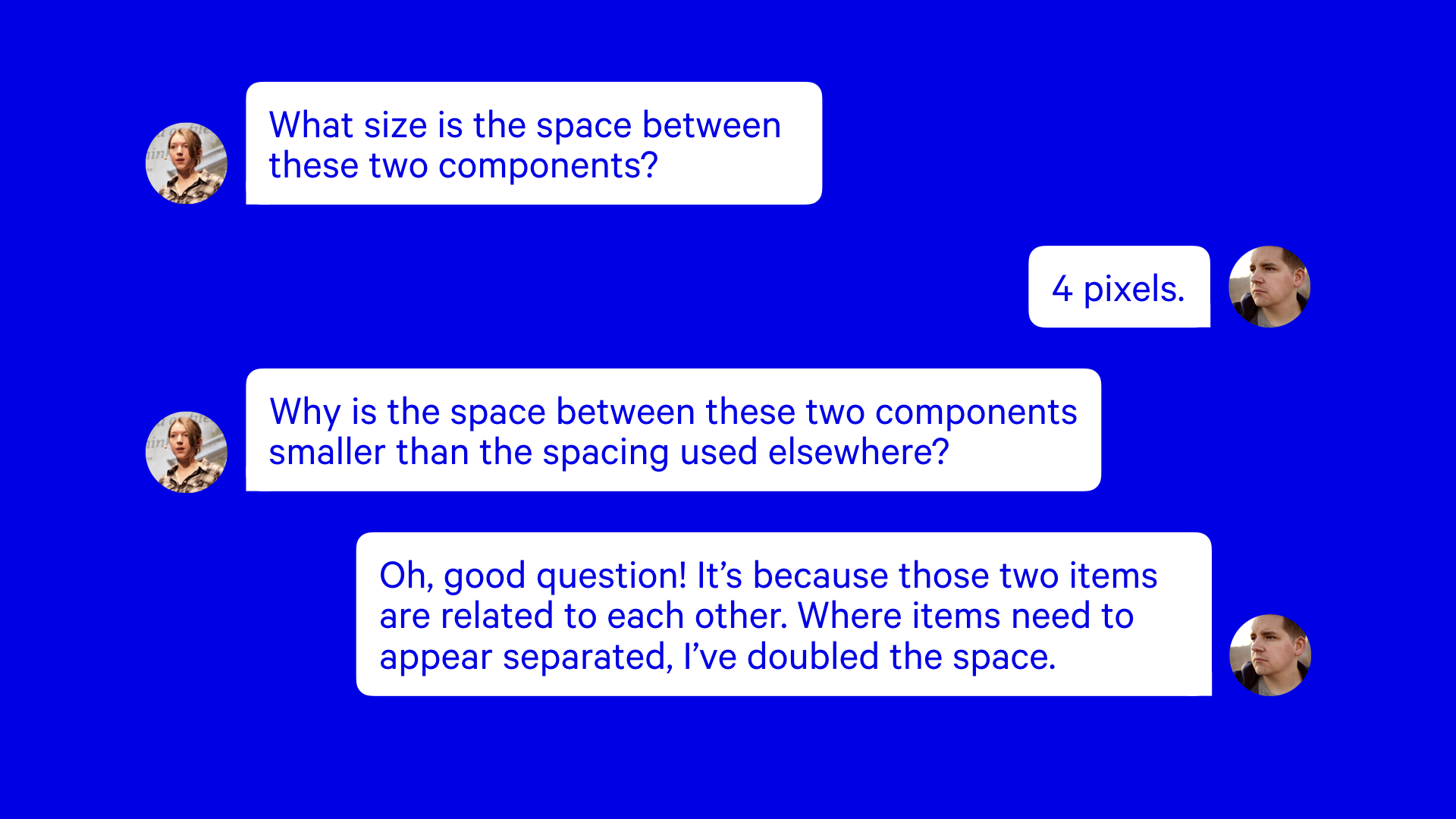
There is often a dance between developer and designer, in which the developer is eager to replicate the work of the designer, taking their work as gospel.
If emphasis is placed on simply replicating how something looks, then the opportunity to understand any of the reasoning behind it is lost. Yet if questioning is less focused on what something looks like, but why, the designer may provide a reasoning, and that can be built into the system.
I think this is the most fruitful type designer/developer collaboration; questioning each others assumptions and decisions, both sharing responsibility for the final result.
Consistency helps interfaces be predictable and understandable. Yet much of this can come from design fundamentals – colour, hierarchy, layout – and other aspects, like well written copy.
I’ve lost track of the number of times in user testing, where I’ve presented a series of screens for which I’m painfully aware numerous visual discrepancies exist, and yet users have paid no attention, so focused are they on the task in hand.
Returning to the example of Lego, the consistency lies in the stubs and tubes, as well as a limited palette of brick colours, and a set of standardised measurements which all bricks must adhere to. Beyond that, anything goes.
Finally, I want to talk about when systems fail us.
With local authorities facing housing shortages after the Second World War, many of Le Corbusier’s ideas caught the imagination of town planners. They looked to high-density building types, be they tower blocks, or ‘streets in the sky’; sprawling estates in which homes could be accessed via raised decks.
The motivation behind these building projects was well intentioned; modern buildings would be a drastic improvement over the squalid slums they replaced.
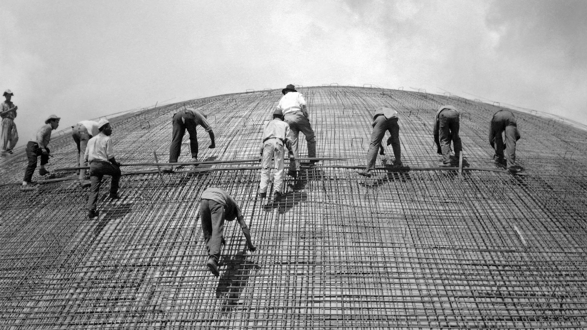
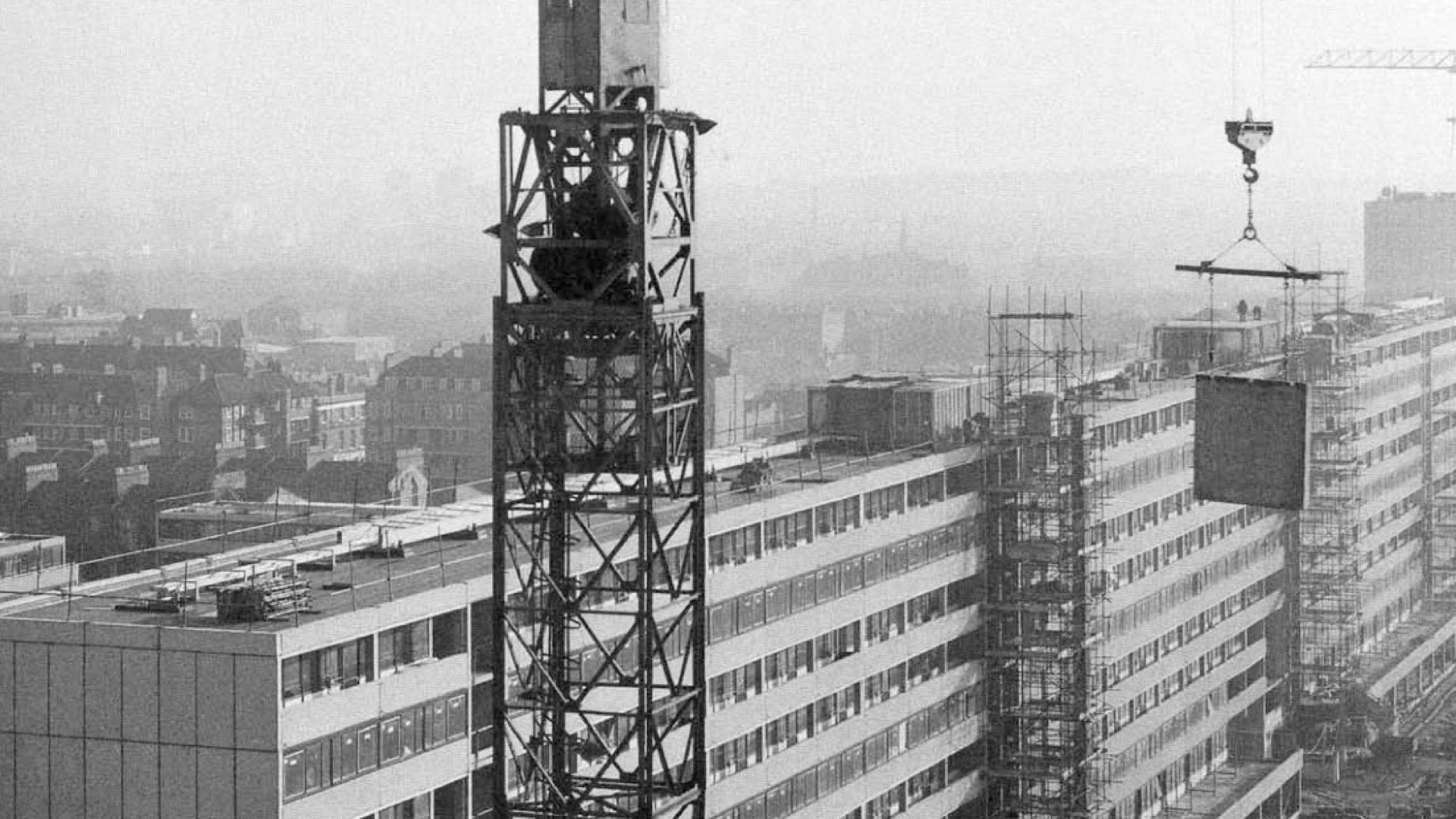
The need to be build these new estates quickly, efficiently and cheaply, saw engineers look to modular building systems. One such technique, the Large Panel System, involved casting large concrete prefabricated sections and bolting them together on site.
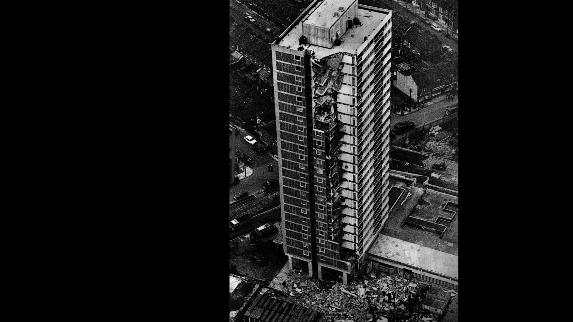
This was construction method used at Ronan Point.
On 16 May 1968, an entire corner of this building collapsed in on itself, after a resident lit a match to light her stove for a cup of tea. This sparked a gas explosion that blew out the load-bearing walls which supported the four flats above. As these collapsed, so did the floors below, leaving 4 people dead and 17 injured.
The Ronan Point disaster has echoes of the more recent tragedy at Grenfell Tower. Both events were the result of a failure within the design of a particular component, or series of components, be that weak joints between prefabricated panels, or the combustibility of the materials used in cladding.
To understand why those components were chosen in the first place, you need to understand the culture in which those decisions were made. If a culture priorities speed, cost and appearance, over quality, value and suitability, then we need to be mindful of the middle-to-long term effects these decisions may have.
While the components and systems we build may not lead to physical harm, we know all too well that digital products are capable of causing mental harm and distress.
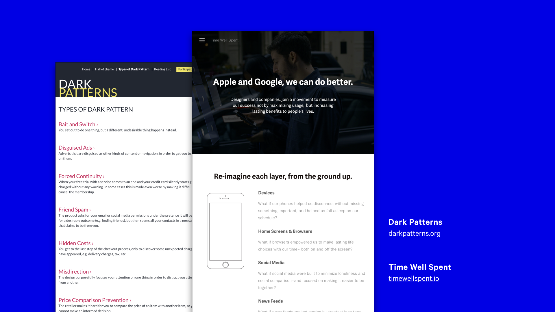
Thanks to projects like Dark Patterns, which document how interfaces deliberately trick users into doing things they might not otherwise do, we have a pretty good idea what user-hostile design looks like.
Newer initiatives are raising awareness of the dangers of building products that constantly require our attention. Time Well Spent asks designers to think about how we might rethink our products and the ways we measure success, to empower users rather than continually exploit them.
There is an assumption that by breaking systems down in to smaller pieces, we can make them more maintainable, robust and fault tolerant. I’m not sure that’s entirely true.
Just ask anyone that had the left-pad module as an npm dependancy in their project recently.
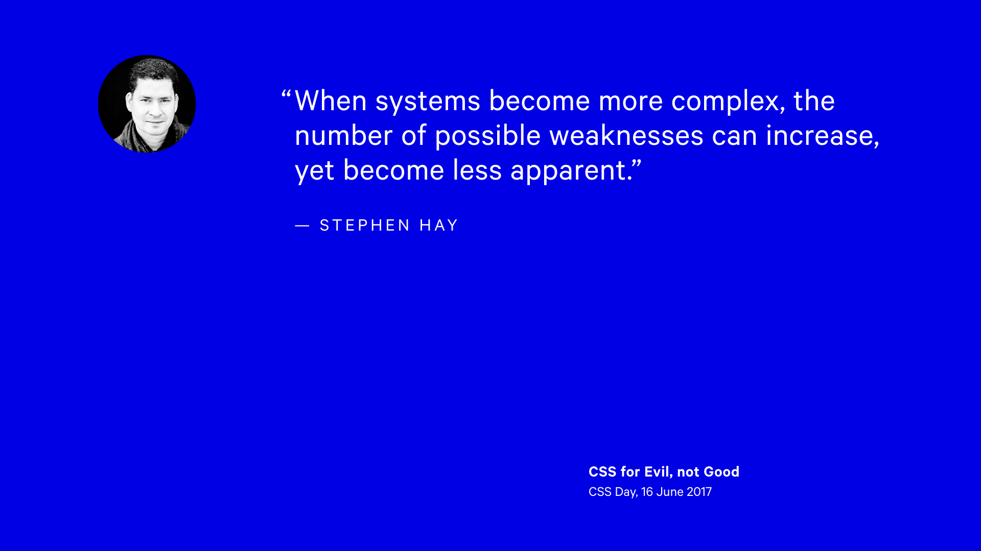
At CSS Day a few weeks ago, Stephan Hay talked about how CSS can be used for evil. In his presentation, he noted that when systems become more complex, the number of possible weaknesses increase, yet become less apparent.
The more I work with design systems – and listen to others talk about them – the more I realise design, certainly in a visual sense, is a relatively minor concern. More often, the system is the primary aspect. This introduces questions about process and organisation, about interactions between individuals and teams, about accountability and best practices.
Design systems are an attempt to add a layer of logic and reasoning over a series decisions made by complex, irrational, emotional human beings. As such, they are subject to individual perspectives, biases, and aspirations.
How does the culture in which they are made effect the resulting design?
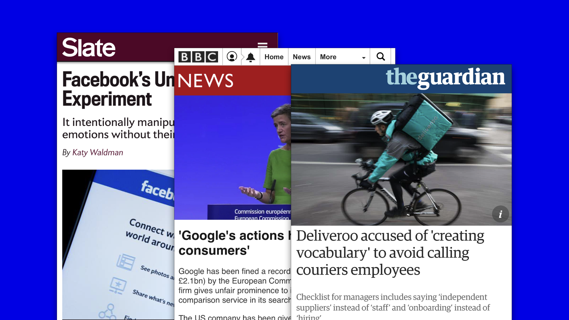
How do you advocate for user agency in a culture that permits manipulating peoples emotions without their consent?
How do you approach the design of a search result component within organisation that has a habit of abusing its near-monopoly position to distort markets in its favour?
How do you craft tone-of-voice guidelines, in an company that also produces guidance on how to refer to employees such that their rights can be undermined?
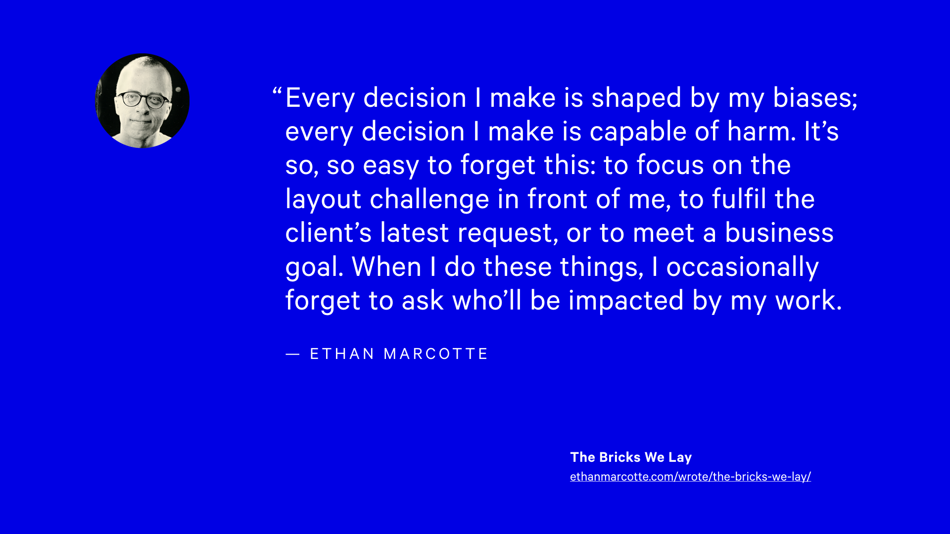
Every decision I make is shaped by my biases; every decision I make is capable of harm. It’s so, so easy to forget this: to focus on the layout challenge in front of me, to fulfil the client’s latest request, or to meet a business goal. When I do these things, I occasionally forget to ask who’ll be impacted by my work.
Style guides mandate the right way to use a logo for example, and give strict guidance about sizing and presentation.
Components can be designed in such a way that only certain variations are possible.
What if design systems, beyond aesthetic and code concerns, also took it upon themselves to provide guidance about how to craft interfaces that treat users with respect? What if they even made it harder to create such interfaces?
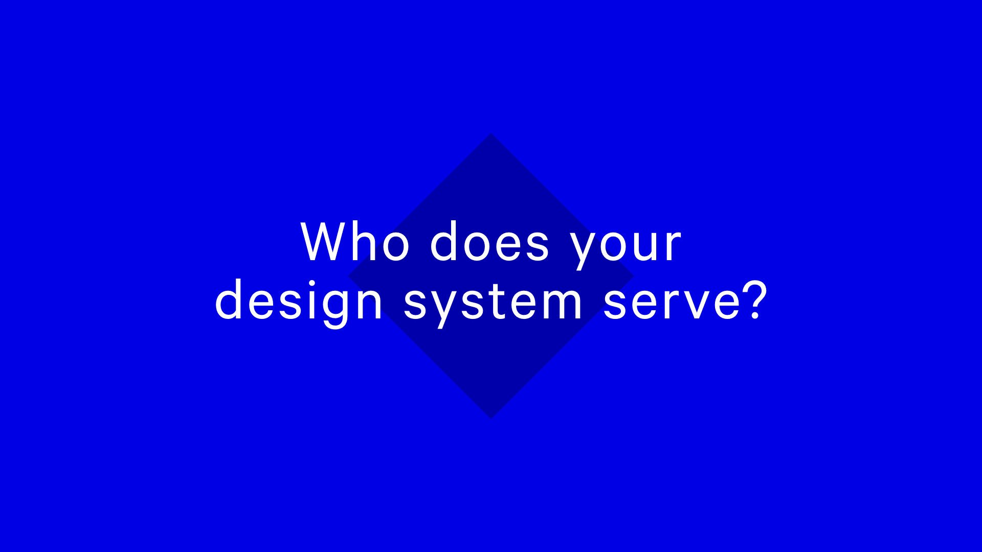
I’ll leave you with this final question: who does your design system serve?
Is it ultimately an inward looking tool created in service of organisational interests? Where focus is drawn down to the parts at the expense of the whole? Is it just the latest shinny thing to play around with to distract from bigger, uglier problems?
Or does your design system encourage you to look outwards. A tool concerned not only with aesthetics, but ethics; the invisible yet inevitable choices we make everyday that effect the lives of those occupying the spaces we create?
The choice is yours.
The buck, stops here.