The Web Native Designer
The APA represents publishers who produce magazines and editorial content for brand-based consumer magazines. This ‘Digital Breakfast’ event focused on the theme of Web Design Trends.
I had intended to reprise a previous talk about styleguides, but as I reviewed my slides, I started to think more about today’s theme: Web Design Trends.
Always a popular topic, discussion often revolves around new technologies and the latest fashions. Watching the latest trends can be fun, but be careful not to focus too much on what everyone else is doing. While can be helpful to learn about HTML5 or the latest JavaScript libraries, you should be thinking about design in terms of a particular project or brief.
So today I will focus on the underlying trends around how we work, how we communicate with clients and our colleagues, and how we’re starting to respect the web as a medium in its own right.
For much of its short existence, the web has been treated as if it were the printed page, and you can see this is some of the terms we use. Words such as ‘page’, but also phrases like ‘above the fold’. Such misappropriation isn’t new. During the early development of television for example, it was often referred to as ‘radio with pictures’.
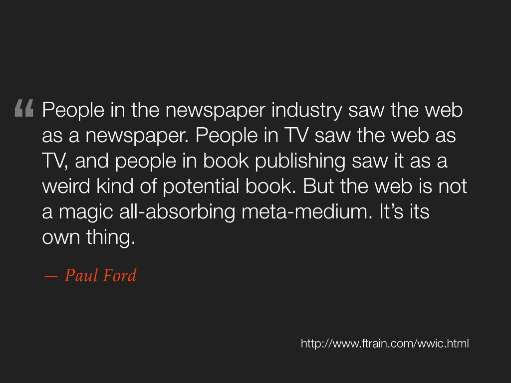
In a recent article, Paul Ford wrote:
People in the newspaper industry saw the web as a newspaper. People in TV saw the web as TV, and people in book publishing saw it as a weird kind of potential book. But the web is not just some kind of magic all-absorbing meta-medium. It’s its own thing.
There is now a growing acceptance that the web works best when it’s treated on it’s own terms.
I believe there are three particular aspects of the web that I think make it unique.
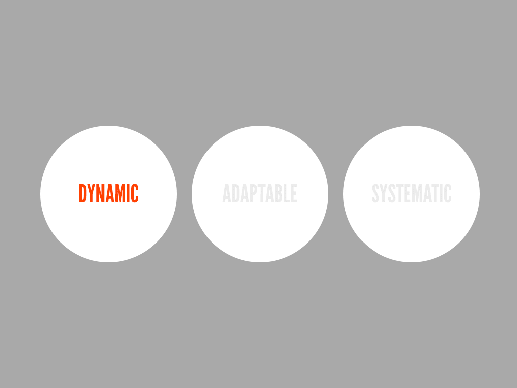
It’s dynamic. Clients often commission redesigns once every two or three years, but this is to ignore a fantastic opportunity, as the web gives you unparalleled access to your users, meaning you can get a tremendous amount of feedback (either directly or indirectly) about how your site is performing and how well it meets their needs. Such dynamism has its downsides too; we have yet to think of any reliable method of preserving historically relevant content. The web almost exists with a complete ignorance of the past.
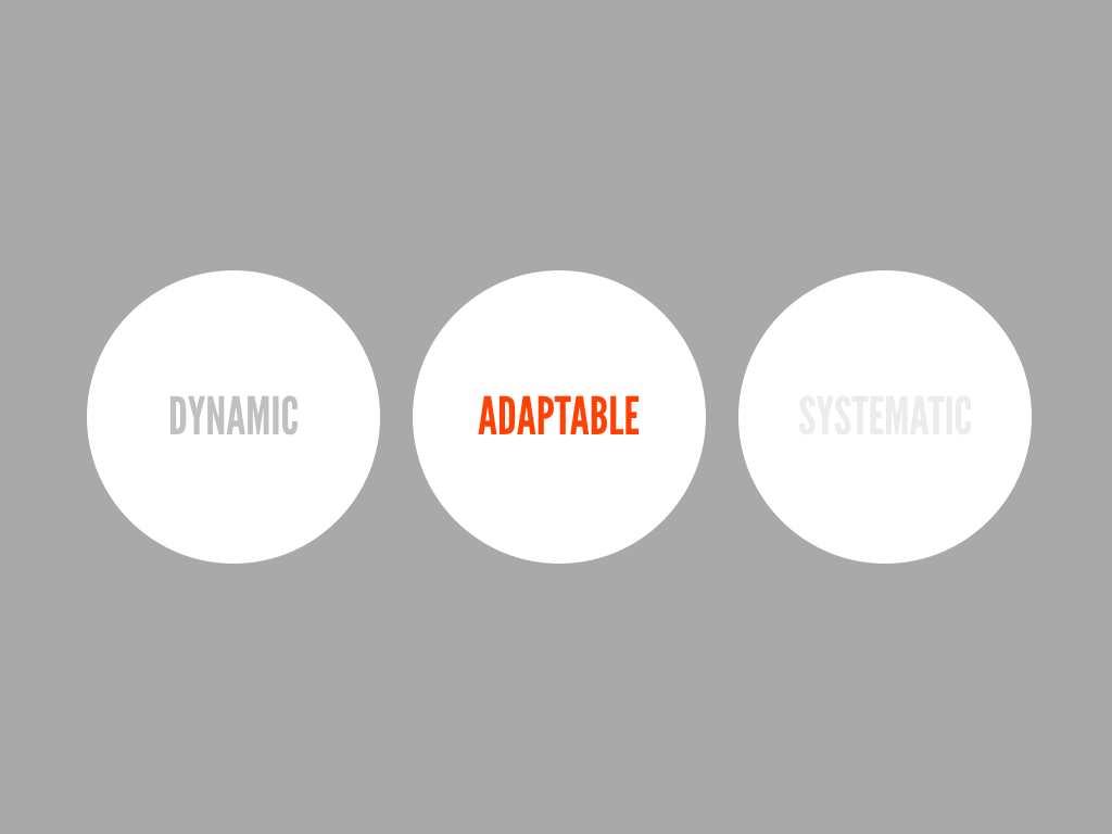
It’s adaptable. The fluidity of the web is an important aspect for designers to recognise. Many have felt this all too acutely when trying to design websites that maintain pixel level precision across different browsers. The web works best when you embrace its fluidity. As we see a proliferation of devices with varying design constraints, we’re now seeing this fluidity as a strength, not a weakness.
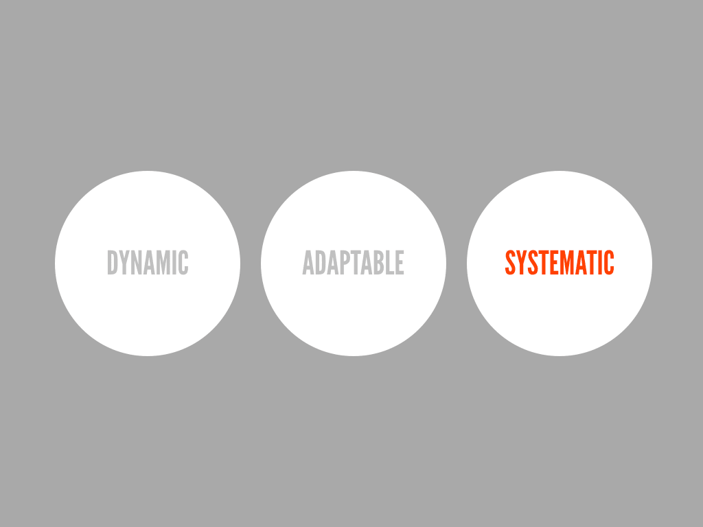
It’s systematic. Fundamentally the web is a technology, borne of logic, rules and systems. There are key concepts such as URLs and hypertext that we need to understand and design for. The web is not only a visual medium either. Indeed it’s quite possible that most content isn’t consumed by humans at all; think of Google’s spidering tools, or assistive software such as screen readers, none of which pay credence to visual design.
In A Dao of Web Design, Jon Allsopp wrote:
It’s time to throw out the rituals of the printed page, and to engage with the medium of the web and its own nature.
You might think this is a recent article, but Jon wrote this in 2000 – it’s taken us almost a decade to recognise his foresight.

So while it may have taken us some time to get here, as the web has matured, so have us practitioners. We have built up a body of experience, and our methods are undergoing a period of reappraisal. We have studied and applied techniques that have existed in print and assessed how well they apply online. We’ve seen how users react and interact with websites, and starting to get a better understanding of the platform we design for.
Content. While in many cases content is still an afterthought, with existing copy dumped into a template, designers are starting to recognise its importance. First, we need to write copy specifically for the web. This doesn’t mean less copy, but the right amount should be presented at appropriate parts of a user’s journey. Large amounts of copy should be easy to skim, with headings, lists and breaks used to chunk-up content.

As much as long form copy is important, as the web is an interactive, communicative medium, so microcopy plays an important role too. These little pieces of text can indicate a desired behaviour, or give a website its own personality and tone of voice.
We can also see content appear outside the context of the website, thanks to RSS readers and tools like Readability and Instapaper that remove surrounding distractions (and design) from a text.

Layout. Grids have long been a fundamental tenant of print design, but only recently have web designers started to learn about how they work and embrace them in their own work.
It’s thanks to the web that this knowledge has been so easily shared, benefiting developers as much as designers, who have created frameworks that make implementing grid-based designs easier.
Yet these grids still assume a fixed width. This print-based assumption doesn’t align well with the flexible and fluid nature of the web, leading web native designers to think about how grids and layouts can adapt to differing device constraints, be that width, font-size, resolution or a host of other variables.
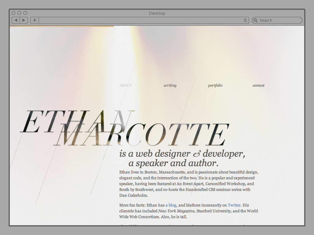
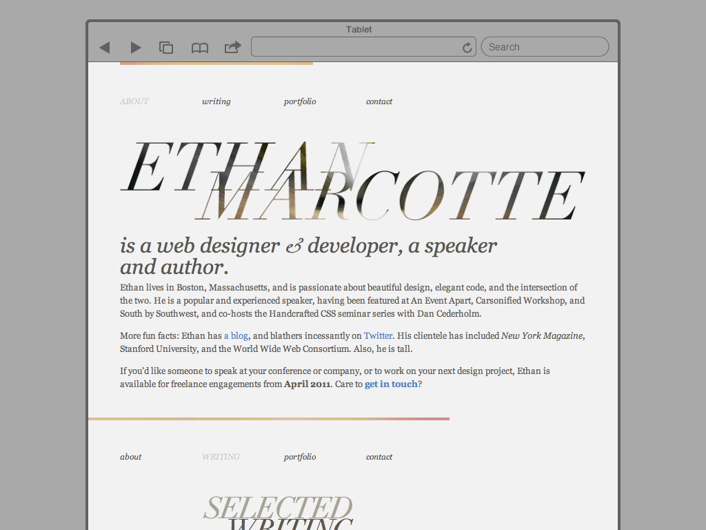
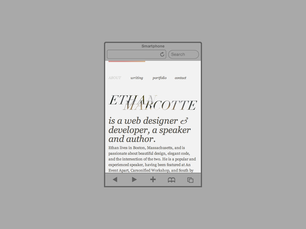
New techniques like Responsive Design are being advocated by designers like Ethan Marcotte. His website provides a good example of how this approach works, with its layout and other aspects of its visual design changing depending on the constraints of a device.
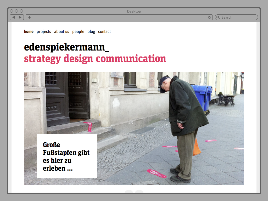
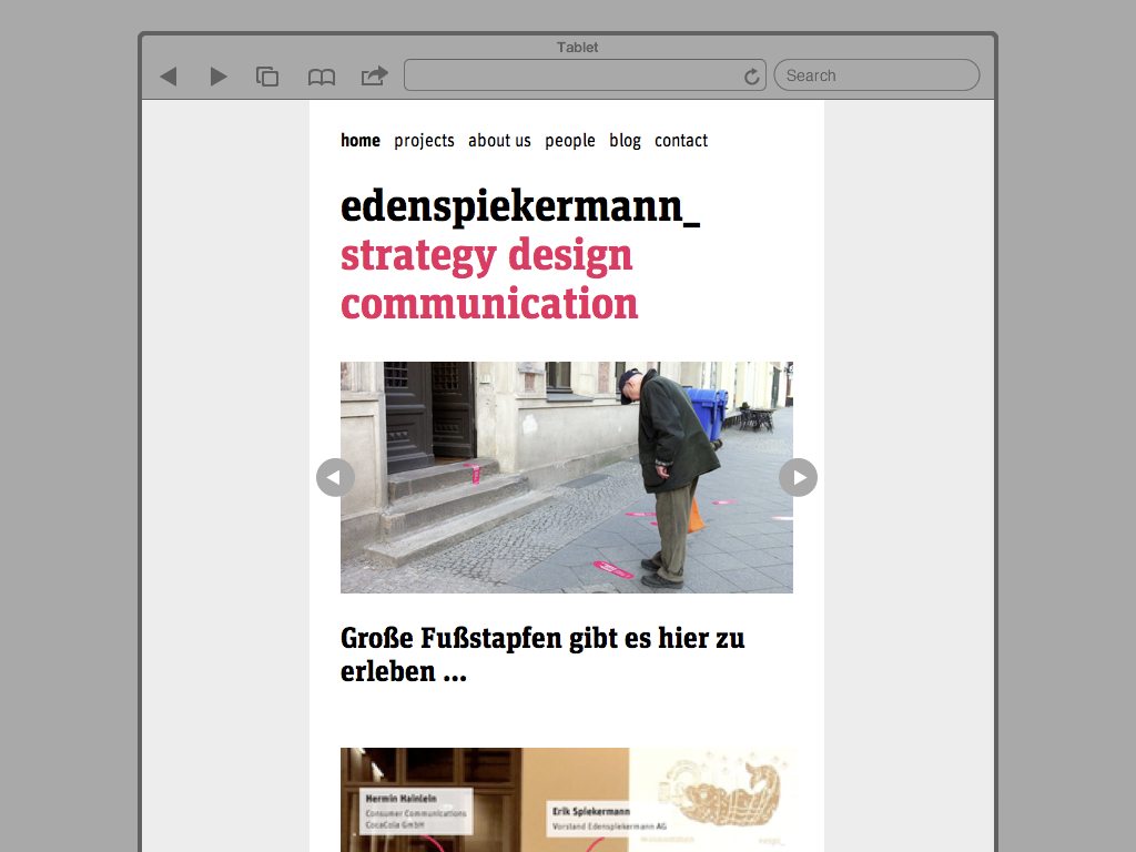
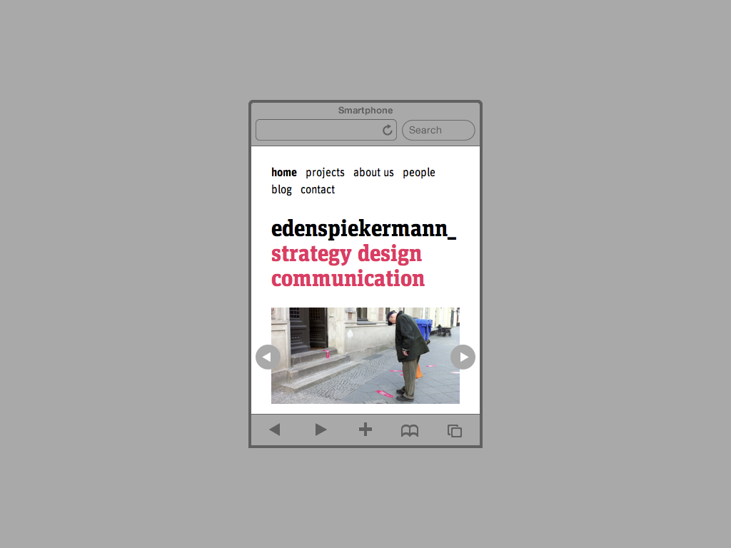
The Eden Spiekermann website is another example I’m fond of.
There are plenty more examples on the mediaqueri.es website. Note that these layouts haven’t been designed to fit a set of predefined widths. Rather, they have been designed to adapt to the space available. This content-out approach not only suggests a key change in how we approach design on the web, but again reinforces the importance of content.
You can also see how a strong visual language, from which a palette of elements can be chosen from, is essential for designs that can appear in a number of different formats.
While we have only started to appreciate the inconsistent and adaptable nature of web layouts, we’ve learnt to appreciate this more with web typography. Here we face a limited font choice, with perhaps only six web safe fonts that can be used with any certainty (and even then there can be issues with rendering consistency).
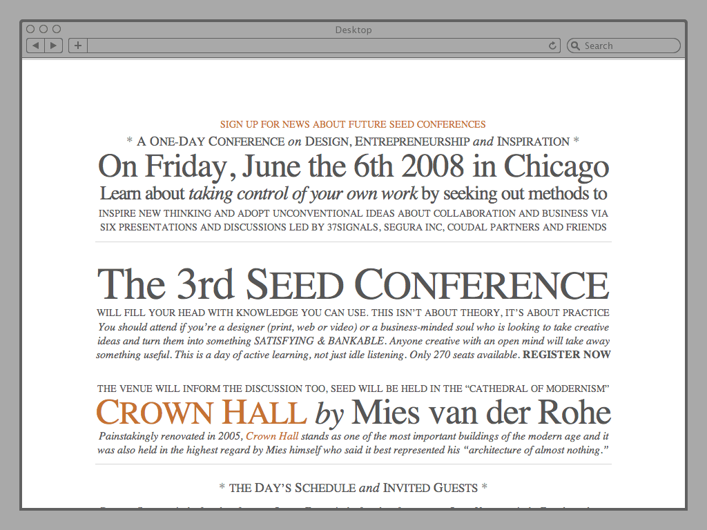
This limitation has encouraged us to concentrate on the aspects of typography we can control; capitalisation, kerning and leading. The 2008 website for the Seed Conference is still probably the best example of this.
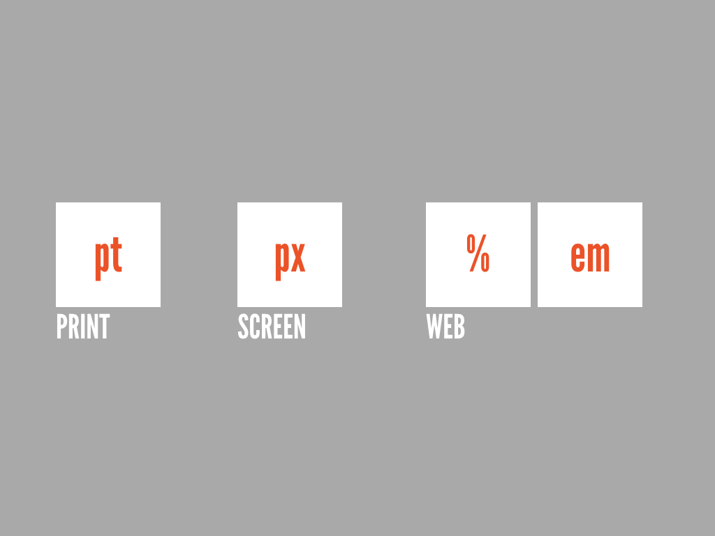
We also think in a web native way in terms of the units of measure we choose to use. Where print uses fixed point sizes, and screen design uses fixed pixels, the web works best when you use relative units like the em (relative to the base font size) or percentages (where a width is relative to its parent container).

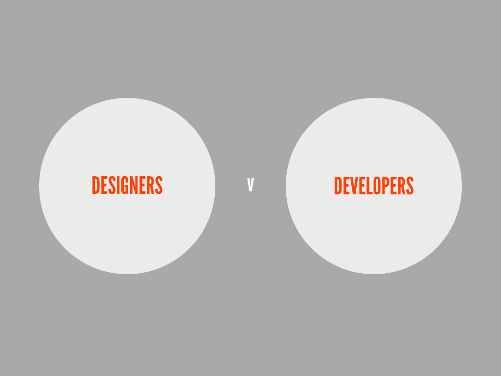
Now, you might be getting an appreciation of not only the different challenges we face designing for the web, but the number of different specialisms that apply. And yet, practitioners are often dived into just two camps – designers and developers – between which unnecessary boundaries have been placed.
This is a false division. Any boundaries should be removed.
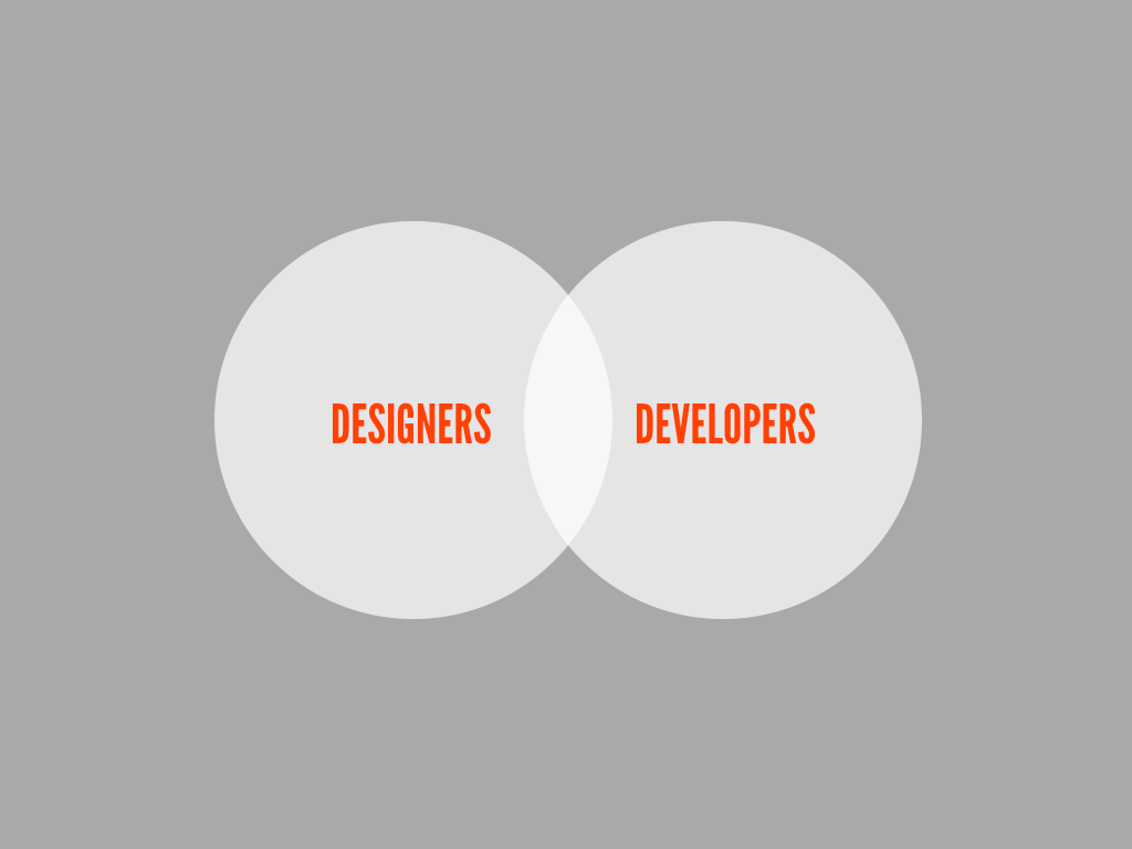
As much as a visual language has to be developed, a database needs to be designed. In fact, I would go so far as to suggest these terms are interchangeable, each as necessary as the other. Development is the act of reproducing a design.
Rather than be divided into two camps, instead the different specialisms should be encouraged to atain a broad understanding of all aspects of web design. For example, a developer can know as much about good microcopy as a designer has an understanding of databases.
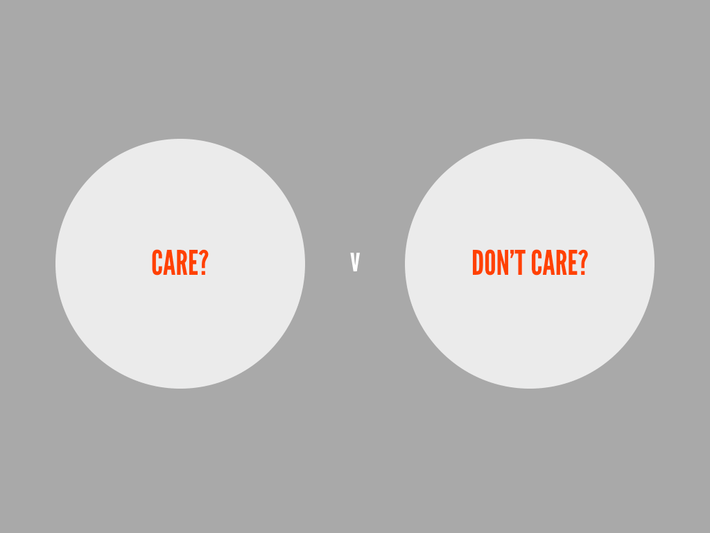
When I was preparing this talk, I actually started to think perhaps there is a division, between those who care, and those who don’t. Designers will often ask for more time to complete a project, whilst developers will want to ship a product as soon as it works. However, if left to designers in search of unattainable perfections, products would never ship. Developers might cite budgets and timelines, but this is often a result of processes that place all responsibility for delivery on their shoulders, often without them having little understanding of a project or involvement early on.
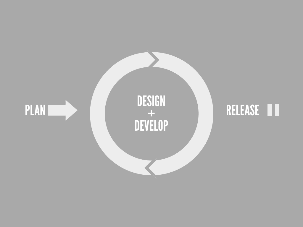
Some companies are now taking an agile development approach, where designers and developers ideally work side-by-side working on small iterations that be can be tested and improved upon – although in my own experience I have yet to see this grand unified theory work in practice.
The fact is that no process is foolproof, and certainly when there is limited communication between everyone working on a product. The best projects occur when everybody is involved at every stage, each understanding the goals of the project and the problems that need to be solved.
This is especially true when building websites, and certainly when designers use static visual mock-ups that convey no sense of the interactivity or flexibility required on the web. That’s why communication between those designing and those implementing is crucial. As we wish to create more responsive websites, designers need to be involved in assessing how well a design adapts. Yet they can’t reasonably design every variation without seeing it behave in the wild. A designer/developer partnership is essential.
This is why I think style guides can be an important addition to how we work on the web; especially on big projects with a large number of stakeholders. When it’s important to ensure a universal understanding amongst many people working on a project, such guidelines can ensure consistency and promote a common working language.
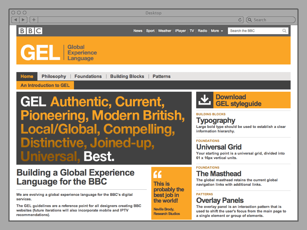
One example I’ve been following with interest is the BBC’s Global Experience Language, a set of guidelines for anyone creating digital experiences for the BBC on the web. This project is founded upon ten design principles that summarise the common goals and priorities, which can be used to weigh up design choices that might arise later in any given project.
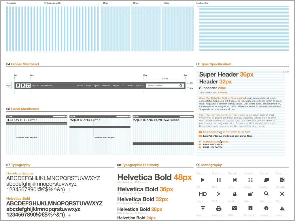
There is a common visual language, consisting of font usage, grids and layout variations and a predefined set of icons to choose from. An interesting aspect of this project is the cultural map; key parts of the website adhere to these guidelines closer than websites for programmes which need to reflect their own brand guidelines as well.
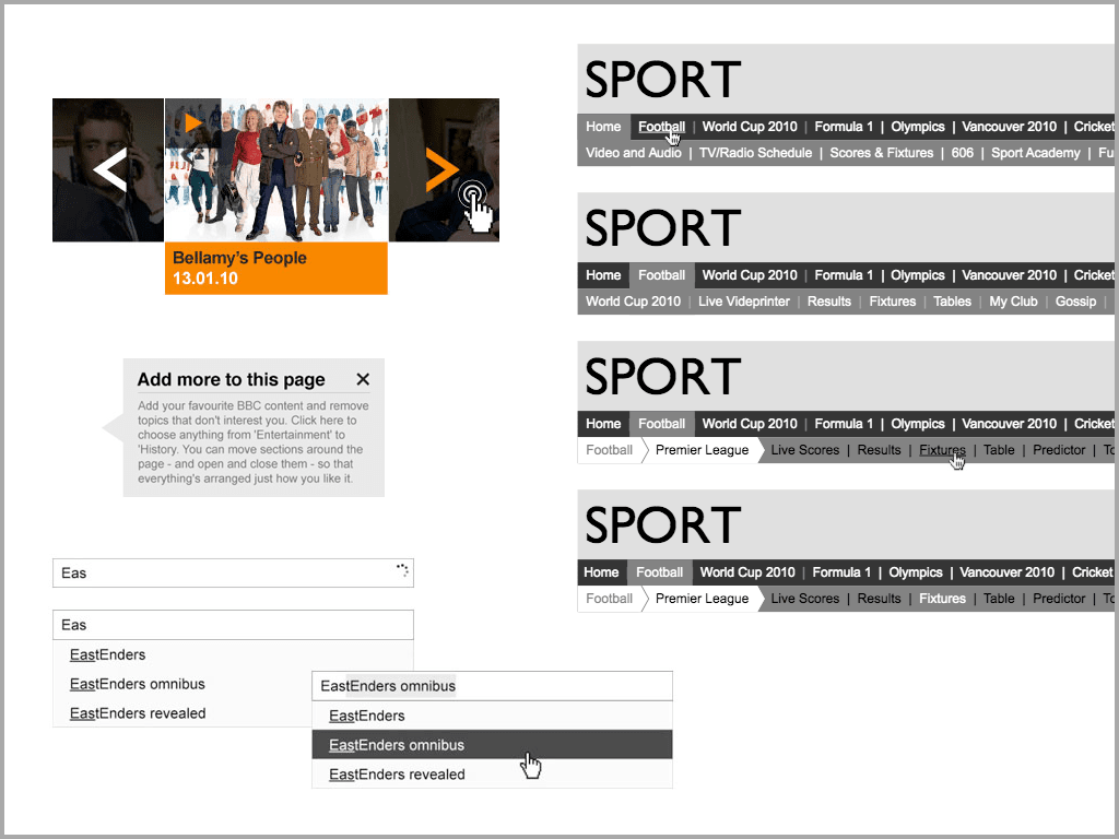
There is also a pattern library, which documents different interactions and behaviours of common elements to be used across the site. This library which can be added to as new components are found to be needed across a their different web properties.
These all build towards a common foundation which can provide an element of predictability; developers can build with a set of known assumptions in mind and separate agencies or groups can build different websites yet have them work as part of a greater whole.
Whilst the GEL guidelines still advocate a fixed width, as I mentioned earlier, such a strong visual language is essential when creating websites that can appear in different contexts.
It’s only a matter of time before the BBC embraces responsive design, especially as creating bespoke websites for different devices will soon prove too costly.
In essence, GEL is an example of systems level thinking. Design principles define common goals whilst a visual language and design patterns provide building blocks from which new websites can be created. And once we start to think in terms of systems, so designers can become native to the web.