Styleguides for the Web
Our industry has approached a turning point in how we develop websites. As the number of devices we need to accommodate increases, so the flexibility and adaptability of our designs needs greater consideration. Yet at the same time, designers wish to maintain creative control over a project. By clearly communicating the fundamental aspects of your design during the different stages of a project, your vision needn’t get lost in the transformation from static comp to dynamic, every changing website.
At this year’s dConstruct conference, John Gruber talked about his ‘Auteur Theory of Design’:
The quality of any collaborative creative endeavour tends to approach the level of taste of whoever has control.
For most web design projects the person who has control is the client, although when working with large organisations it is rarely one person but a number of stakeholders. In fact, I would argue that in most cases, it’s members of the development team (often working within tight budgets and time constraints) that really dictate the quality of the final product.
John uses his theory to explain why, while both Apple and Microsoft employ talented designers and engineers, it is widely accepted that Apple design better products. John’s theory suggests that the CEO’s taste and appreciation for design will ultimately dictate the quality of their company’s products.
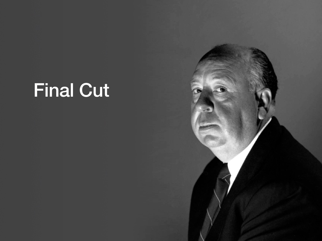
Before reaching this conclusion, John made a comparison with the film industry. While the director is seen to be the author of a film, often meddling studio executives determine the final cut, and thus the quality of the film. Some directors are given a clause in their contract that allows them to have the final cut – the film they turn in is the film that gets released.
In the studio era, no director enjoyed this privilege. Given that a film is made in the editing room, Alfred Hitchcock storyboarded his films before shooting, meaning they could only be edited one way that made narrative sense.
In an era when no directors were given final cut, Alfred Hitchcock found a way to achieve it all the same. And that is what I’ll be advocating today; finding ways to exert creative control and lessen the impact later decisions may have on the quality of the final product.
Branding agencies achieve control by producing styleguides; documents that explain how a brand is constructed, often using examples of how to use – and how not to use – the various brand assets they’ve created. These may include the following guidance:
- Logo: Positioning, variations, sub-brands…
- Colours: Primary palette, accent colours…
- Typography: Fonts, alternatives fonts to use when brand fonts are not available…
- Copy: Tone of voice, product names, capitalisation…
- Illustration: Illustrative style, iconography…
- Photography: Photographic style, cropping, positioning…
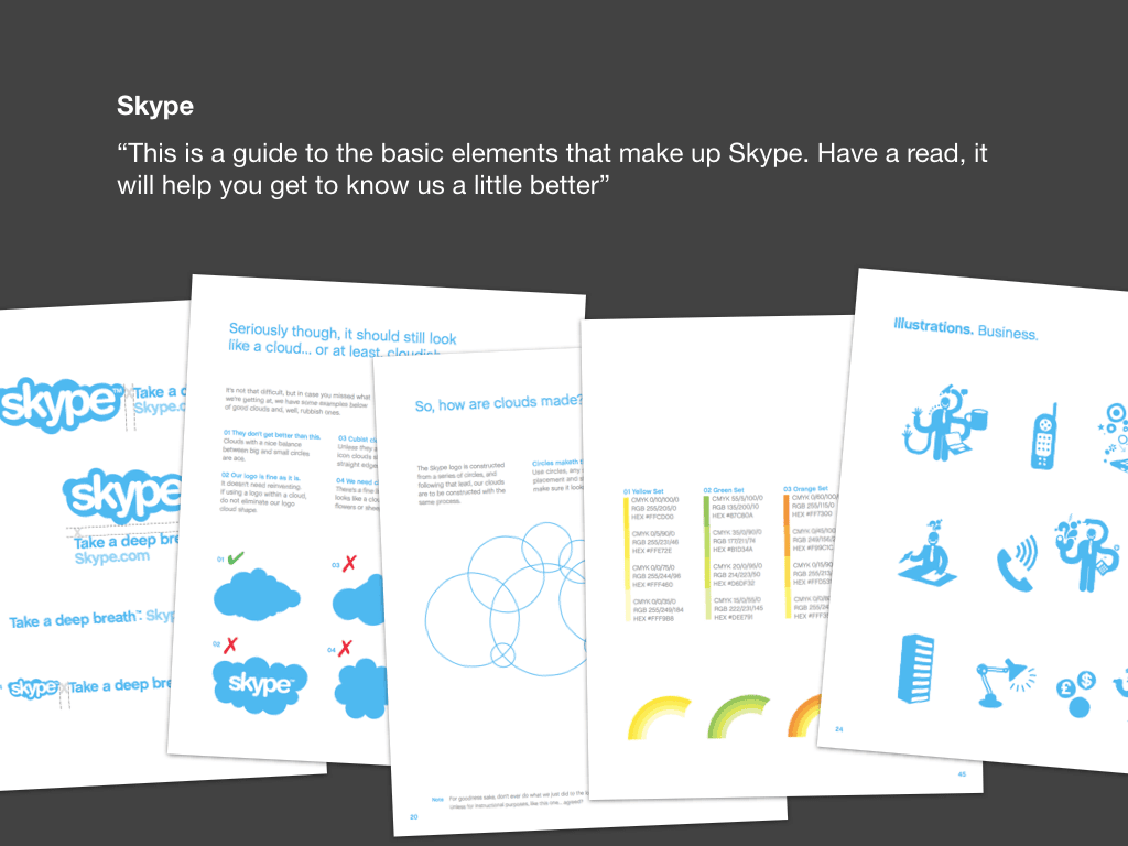
I’ve been collecting styleguides for a number of years, partly as I’m interested in branding and corporate identity, but also to refer to when creating my own guidelines. One of my favourites is that created for Skype.
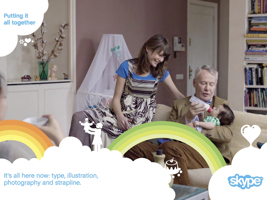
As a brand made up from a number of different elements (the logo, clouds, rainbows, illustrations and sometimes photography), it would be easy for the brand to become diluted should these not be consistently applied. Skype’s guidelines explain how each component is constructed before providing examples. The visual styleguide, How We Look, is accompanied by a separate document, How We Think, which focuses on messaging and tone of voice.
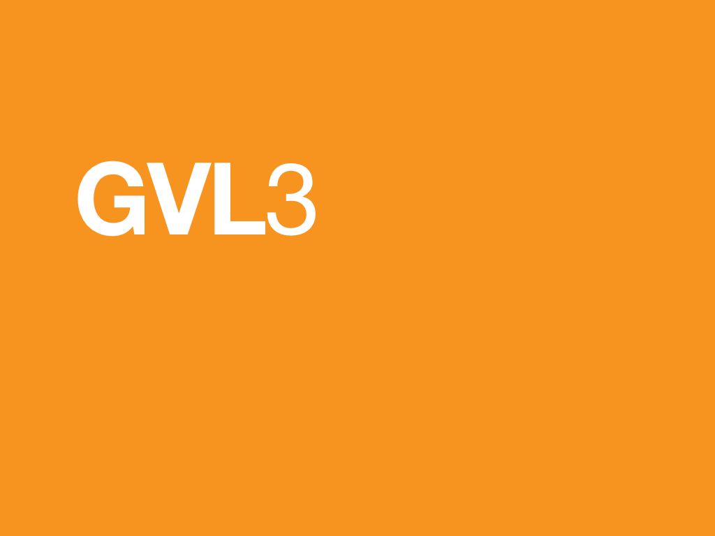
Until recently I hadn’t found many examples of styleguides designed especially for the web. However, in February, the BBC announced it was updating its global visual language; GVL3 would use an underlying design philosophy to produce a set of world-class design standards that designers across the corporation would work to. Nine founding design principles (which I’ve written about previously) where distilled into the essence of a new visual style.
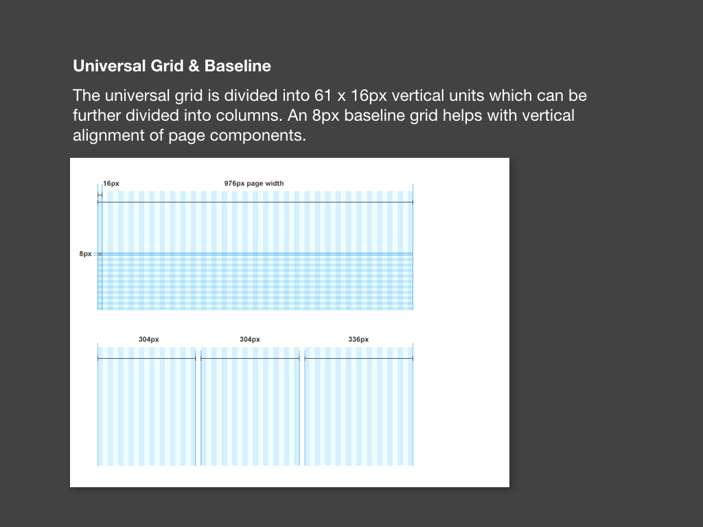
Universal Grid and Baseline: Page layouts based on a grid divided into 61 x 16px vertical units (which can be further divided into columns) and an 8px baseline grid to help vertically align page components.
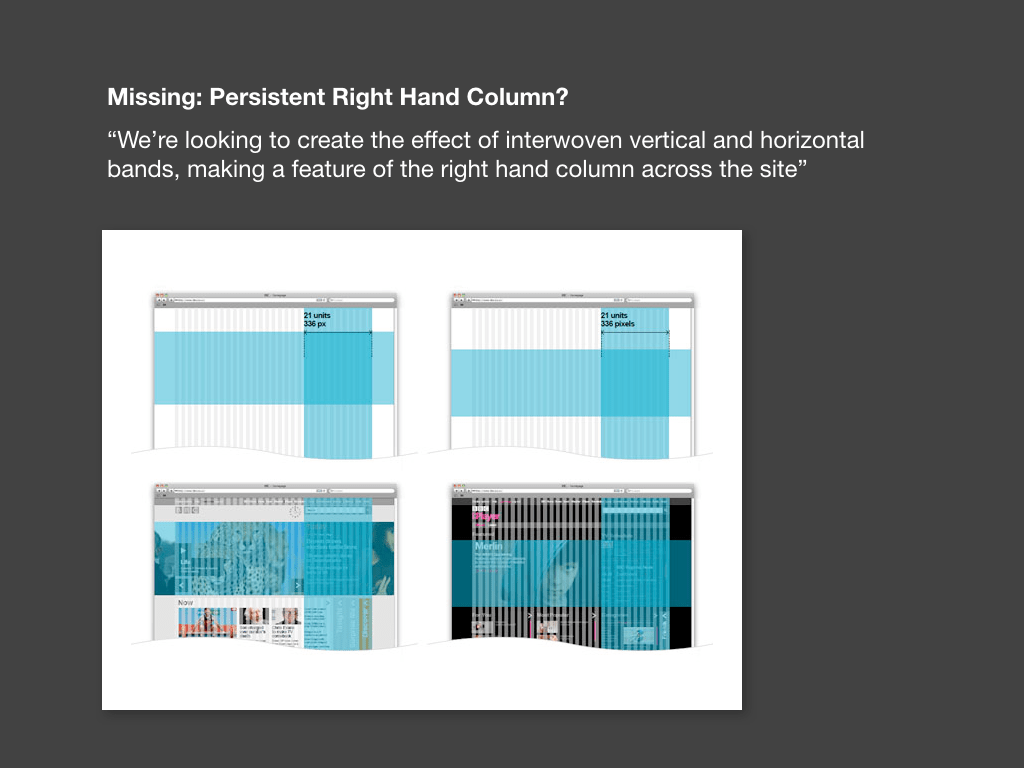
The original announcement talked about using interwoven vertical horizontal and vertical bands, and showed examples of a persistent right-hand column, yet this never materialised.
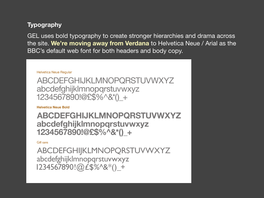
Typography: Bolder typography, stronger hierarchies, a defined set of font sizes and a move away from Verdana to using Helvetica Neue/Arial for both headers and body copy. The corporation’s brand typeface, Gill Sans, can now be used in masthead areas too.
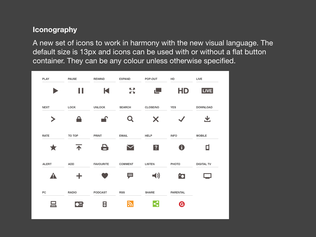
Iconography: A bespoke set of icons was created to use across the site, based on the proportions of Gill Sans.
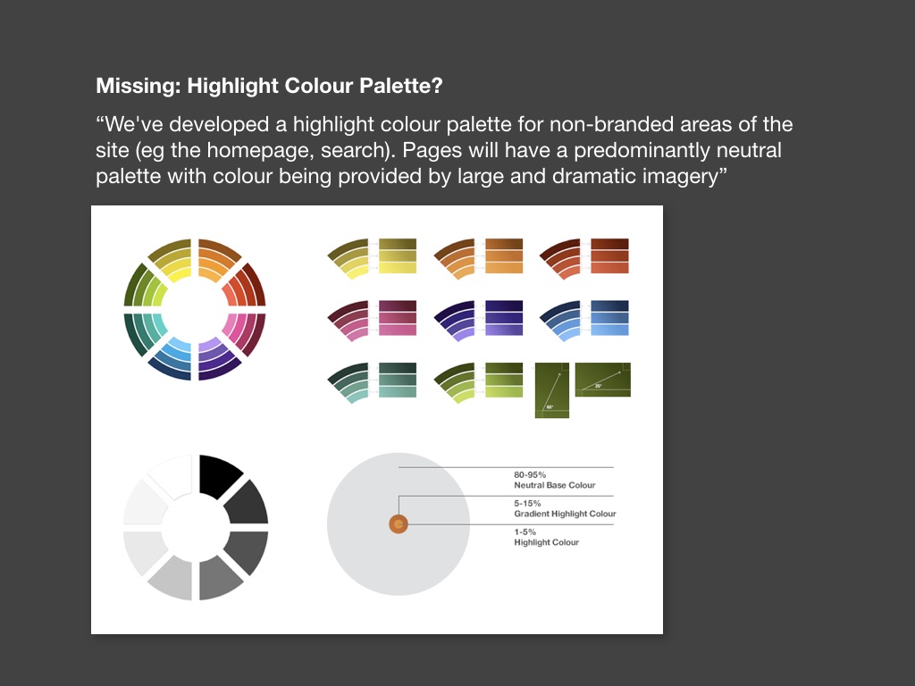
Colour Palette: A colour palette was created for use in non-branded areas of the site (such as the homepage and search pages). This has yet to appear in the final guidelines, but may do when these non-branded areas get redesigned.

When GVL3 was finally released in July, it’s name had changed to GEL (Global Experience Language), an acceptance that the web is equally as much about interaction and behaviour as it is visual design.
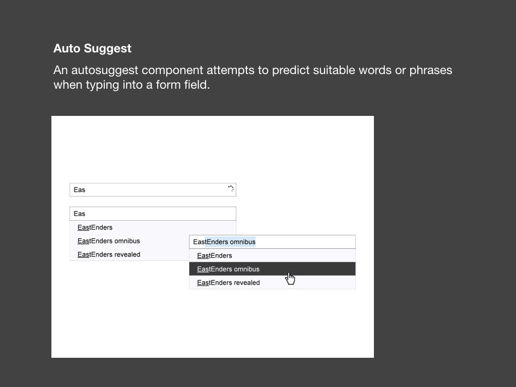
The guidelines now included a pattern library documenting key interactions used across the site such as auto suggest in search fields…
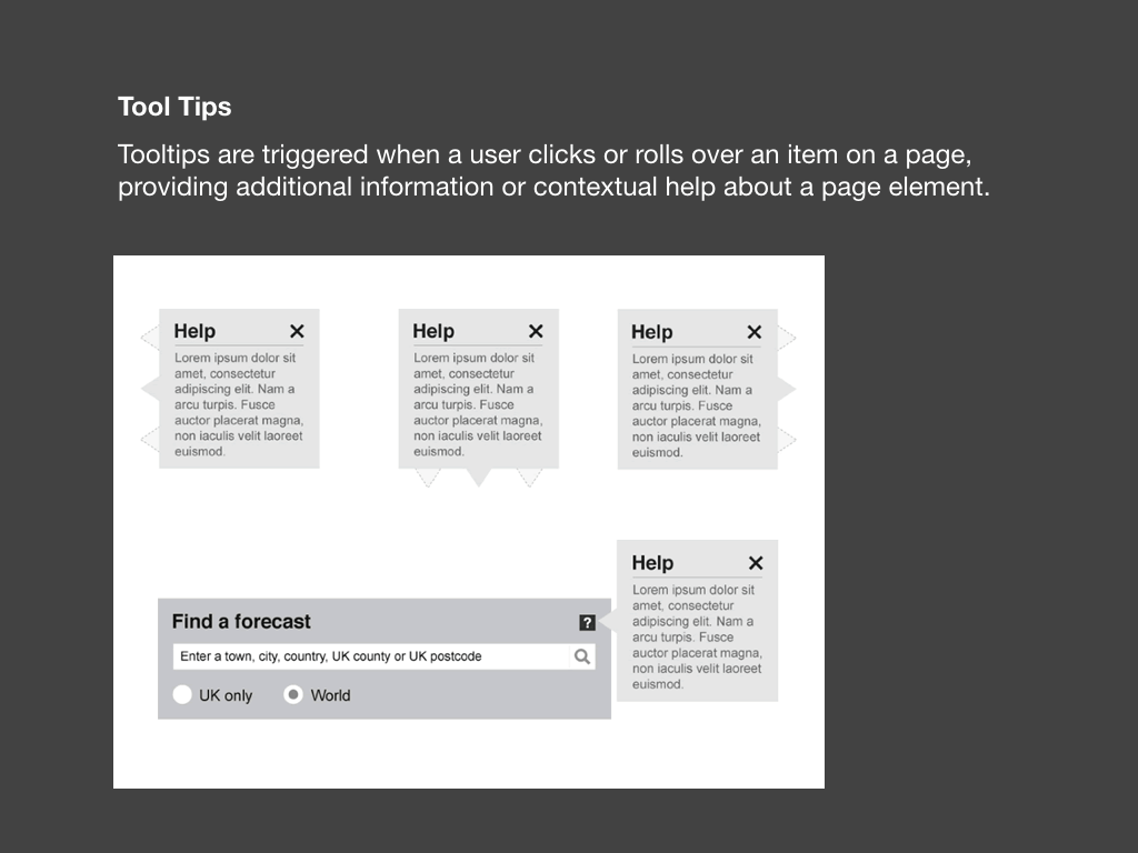
Tool tips…
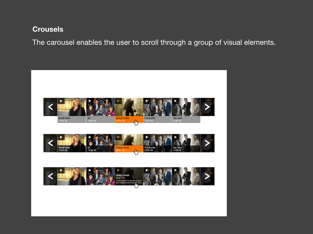
Carousels and photo slideshows.
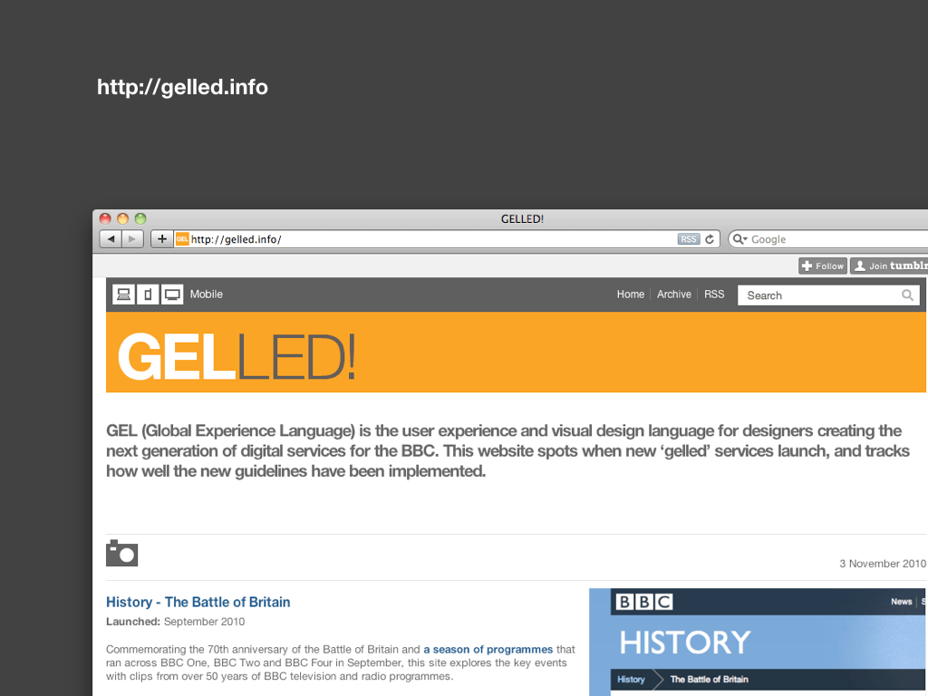
After many years being critical of the visual design of bbc.co.uk, GEL exceeded my wildest expectations, and I’ve been following the roll out of ‘gelled’ websites on a dedicated website.
Over time I hope to look in greater detail at how this design language is being adopted. I’m also interested to see how the BBC manages to ensure conformity across the site while allowing for enough flexibility for different brand and design requirements.
The GEL guidelines will eventually expand to cover mobile and IPTV, although the guidelines don’t yet cover any aspect of responsive (or adaptive) design.
This has been a hot topic this year, although there’s too much to cover today. Instead I encourage you to read these excellent articles:
- A Dao of Web Design by John Allsopp
- Responsive Web Design by Ethan Marcotte
- Responsive Enhancement by Jeremy Keith
As layouts become more adaptable, flexible and context specific, so individual components will become the focus of our design. It is therefore essential to get the foundational aspects of our designs right. Styleguides allow us to do that.
So, how can we use a styleguide driven approach during the design process? It’s usually at the points where designs are handed over between different people and teams that the details can get lost, so I will focus on those exchanges.

Branding agencies often create styleguides to document how a brand should be used, although they tend not to offer much guidance around web usage, meaning we need to fill in the gaps ourselves.
I sometimes see brand guidelines suggest system fonts for web usage. While these may be helpful when creating font-stacks, the brand typeface might be available to use with @font-face (licences permitting), or more suitable alternatives may be found on services like Fontdeck or Typekit. Guidelines might stipulate font sizes, but on-screen we may need larger text to improve legibility.
Colour palettes may not specify RGB colour values, so we’ll have to figure these out ourselves. Is the palette even suitable for online use? Yellow on white might look great in print, but on the web we need to consider accessibility issues such as text contrast.
Guidelines might also suggest positioning and minimum sizes for logos. For example, Channel 4’s guidelines stipulates that it’s logo should be positioned in the middle right, but this is unlikely to work online. Most logos are now designed to work on screen and at small sizes, but this isn’t always the case, either.
By all means, read the brand guidelines and understand why decisions have been taken, but use common sense and be prepared to bend the rules when necessary.

When I design websites, I often build a pattern library in my head as I go. I’ve now started to document these alongside my layouts, pulling together a page that lists these different components. Creating this page forces you to think about a design and helps you apply styles consistently. It can also be used as a starting point for front-end development, and to compare the final build with the original design.
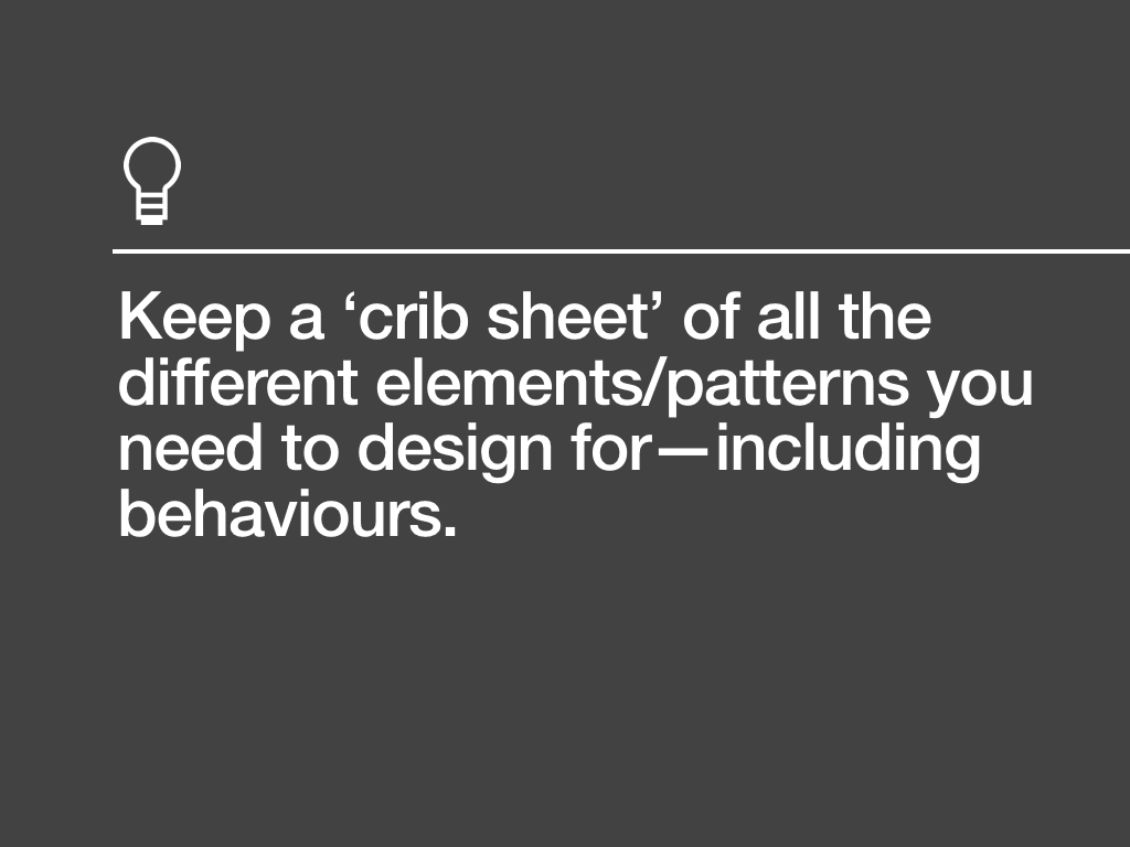
To make sure I’ve got everything covered, I refer to a crib sheet. This includes:
- Grids: Columns, baseline, key divisions…
- Typography: Headings, body copy, captions, lists, tables…
- Colour: Primary and secondary palettes, gradient ranges…
- Messaging: Success messages, error handling…
- Form Elements: Buttons, text inputs, menus, checkboxes…
- Links & Navigation: Hover, active, disabled and selected states…
- Images: Dimensions, margins, placement, usage…
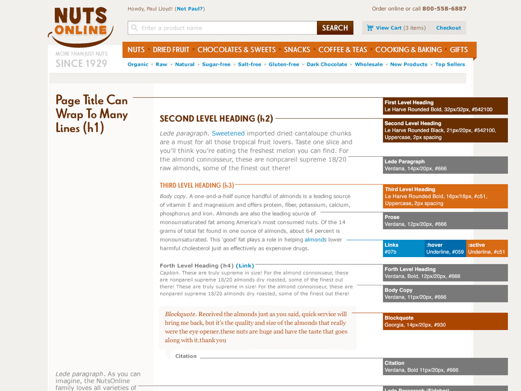
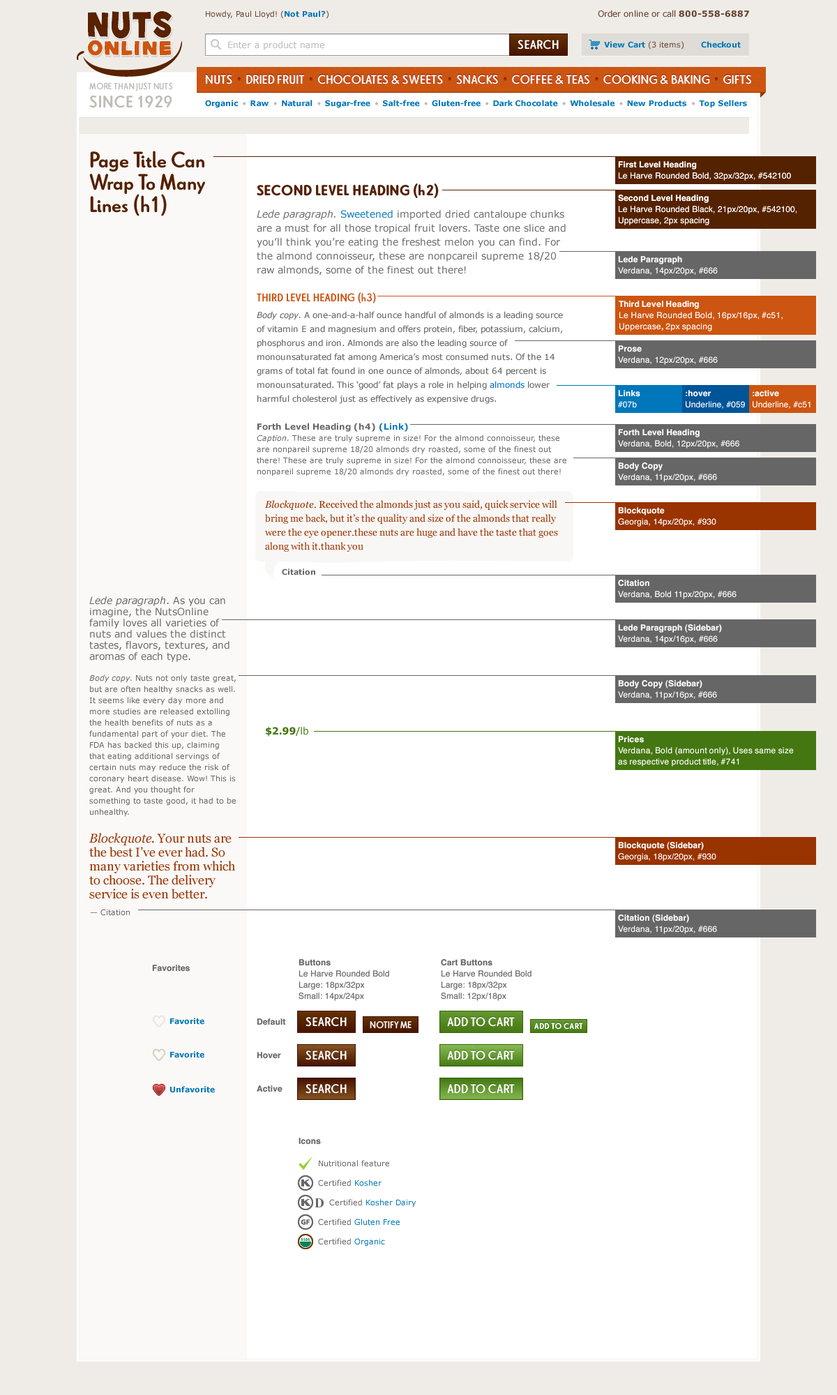
And this is the styleguide I created for Nuts Online.
Such pages can be relatively lightweight, and sometimes it doesn’t make sense to include all components listed in my crib sheet.
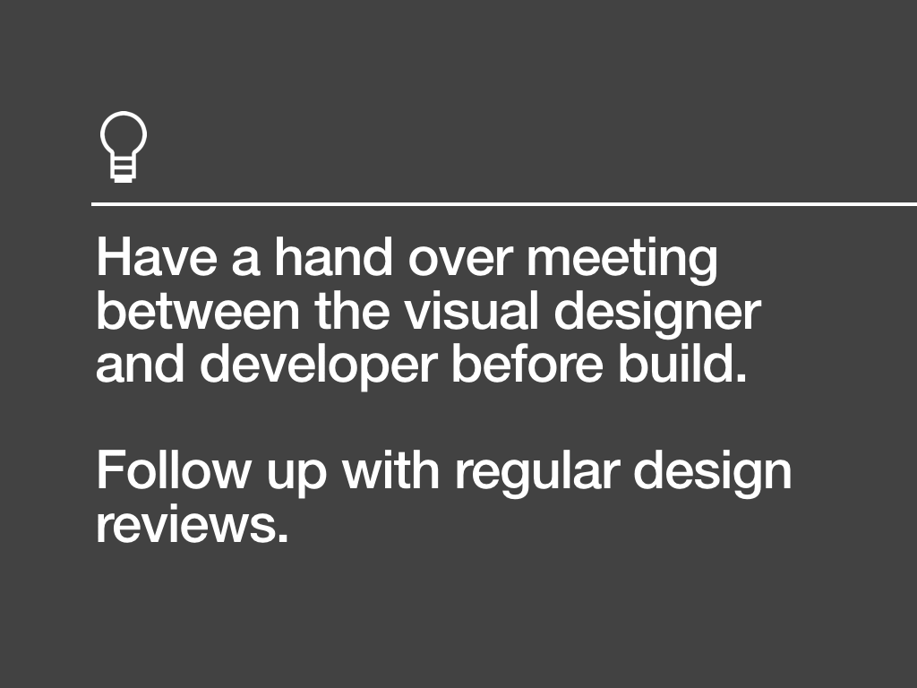
Creating documentation cannot be relied on by itself; it’s impossible to convey the subtleties of an interactive medium in a flat design file. Having a handover meeting between the designer and front-end developer before commencing build, followed up with regular design reviews, will ensure the design is understood and any issues that may arise can be easily solved.
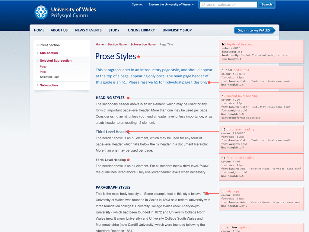
When handing a design over to a remote team of developers, I tend to document more of my design, possibly even formalising it a little too. This is the styleguide I created for the University of Wales, where I tried to use CSS notation to bridge the gap between design and code.
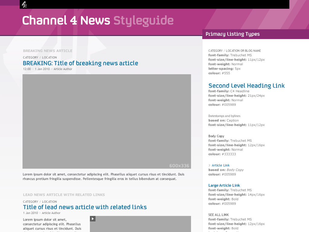
I created a number of similar pages for Channel 4 News, too.
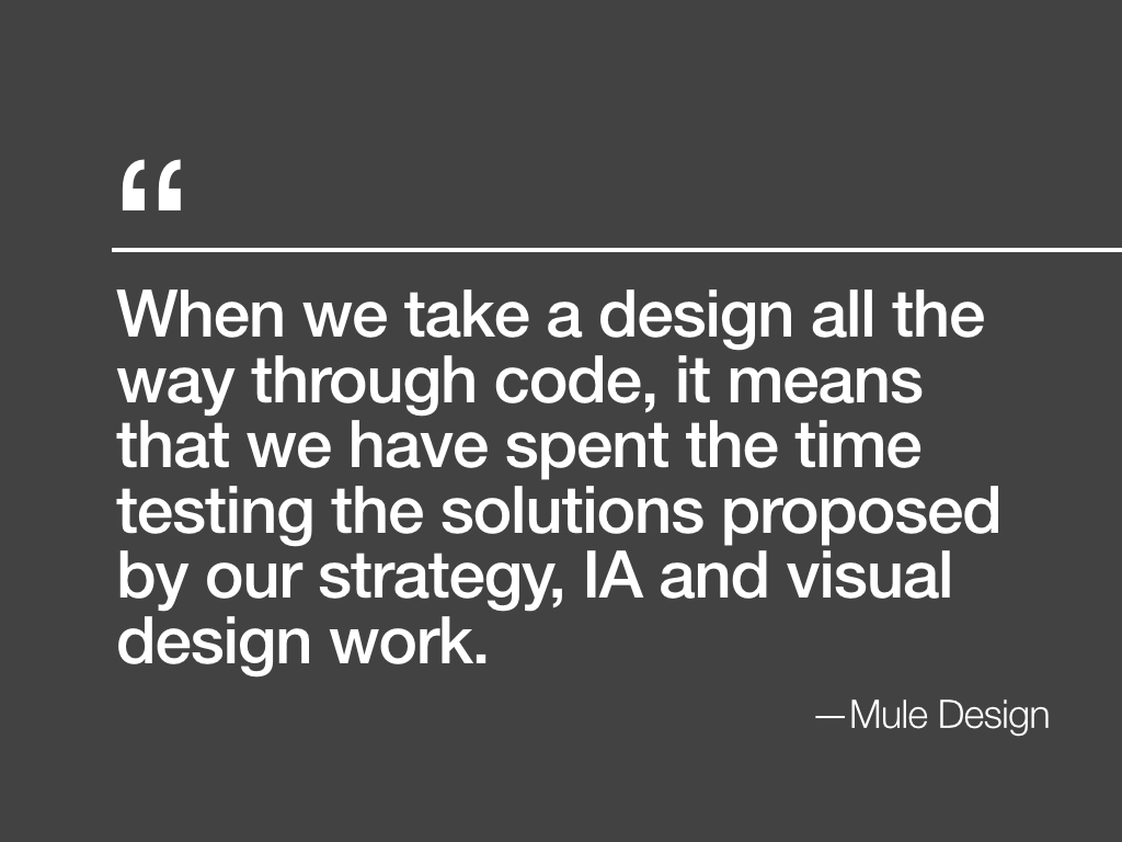
Earlier this year, Mule Design’s David McCreath wrote about why they don’t deliver image comps to clients:
When we take a design all the way through code, it means that we have spent the time testing the solutions proposed by our strategy, IA and visual design work.
This is an approach I fully endorse, and one I’d like to see Clearleft and other web design agencies adopt too.
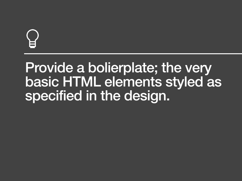
Even in situations where you’ve been asked to design up to the point of a flat image, I think it’s a good idea to deliver a baseline set of styles in a HTML file, too. I have in mind building a common HTML boilerplate file that I can easily style to match any design provided in such image comps.

The final point of handover is between a front-end and back-end developer.
At Clearleft, rather than deliver an inflexible set of static pages, we present our code as a series of modular components (a ‘pattern portfolio’) that can be assembled into different configurations and page layouts as required. We often provide a number of reference pages created from these components too.
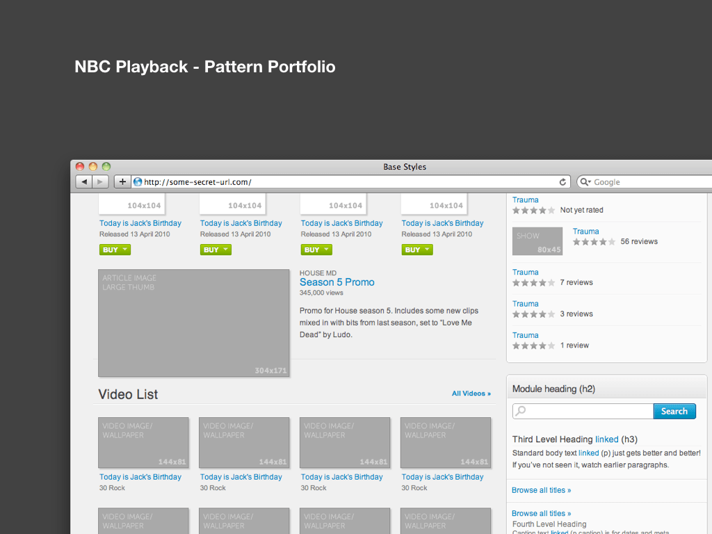
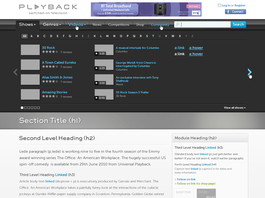
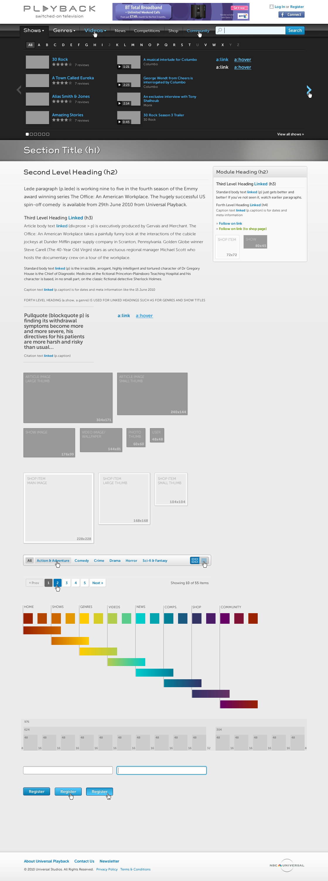
Here is a screenshot of the pattern porfolio we created for NBC Playback.
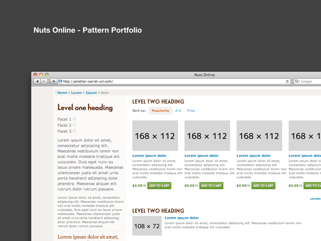
And the here is the pattern porfolio we created for Nuts Online.
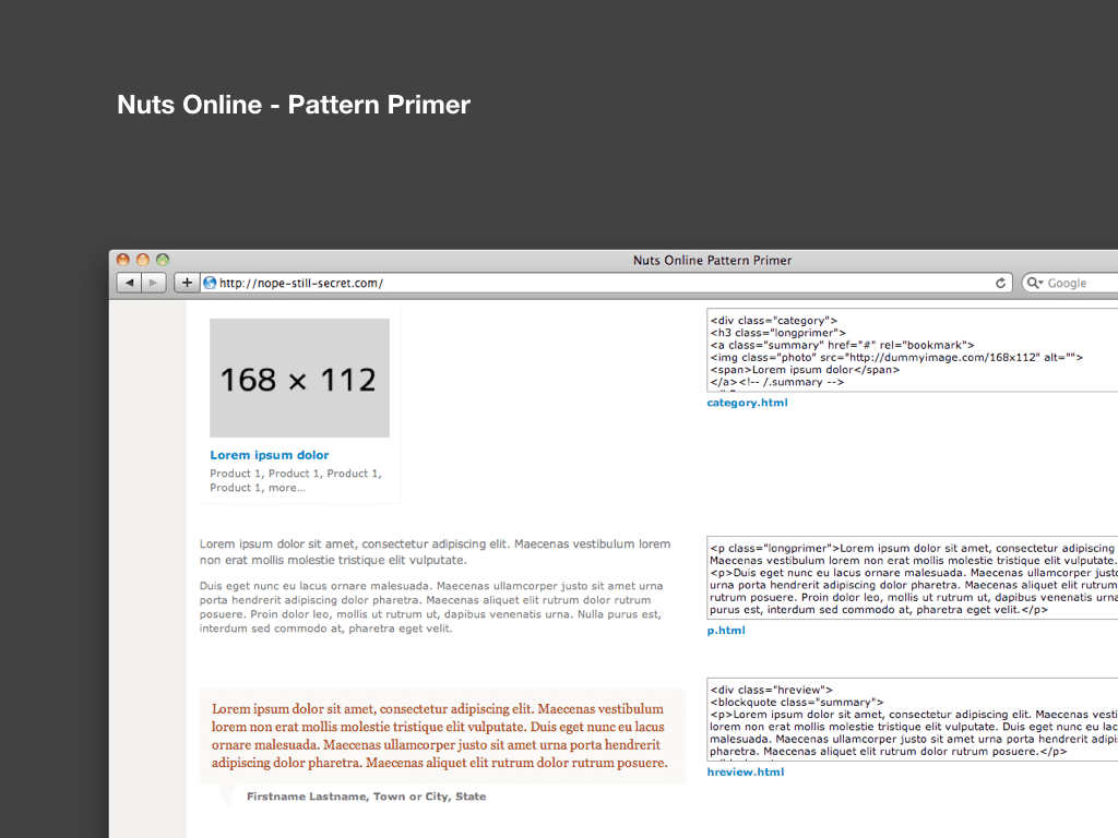
Such systematic thinking was instigated by Natalie, yet this is something we continually iterate upon; Jeremy now includes a ‘pattern primer’; a collection of markup snippets that can be used anywhere in a site. This seems very much in the spirit of Alfred Hitchcock.
If I have learnt anything from working in large distributed teams, it’s that communication is key. The techniques shown here are only part of that equation, and should be adapted to suit each project.
This is only a selection of tools and processes we can use. Indeed, I think as a community we should not only share how we generate ideas and produce design concepts, but also discuss how we communicate these ideas with clients and developers. There is still so much to learn.
While much of this talk has focused on the styleguide as a deliverable, I hope the underlying theme has been to underline the importance of communicating the complexities inherent within an interactive medium like the web. Simply presenting flat image comps is by no means enough – it’s only the start.