Responsive Principles
Responsive web design has engendered a wider conversation about how we build products that accommodate an increasing breadth of connected devices. This talk suggests a framework within which we can model this continuing discussion, and outline the principles needed for our work to better respond to a rapidly changing world.
In his article, The Web’s Grain, Frank Chimero remarked that:
Technology only adds more—it is never this or that; it is always this and that.
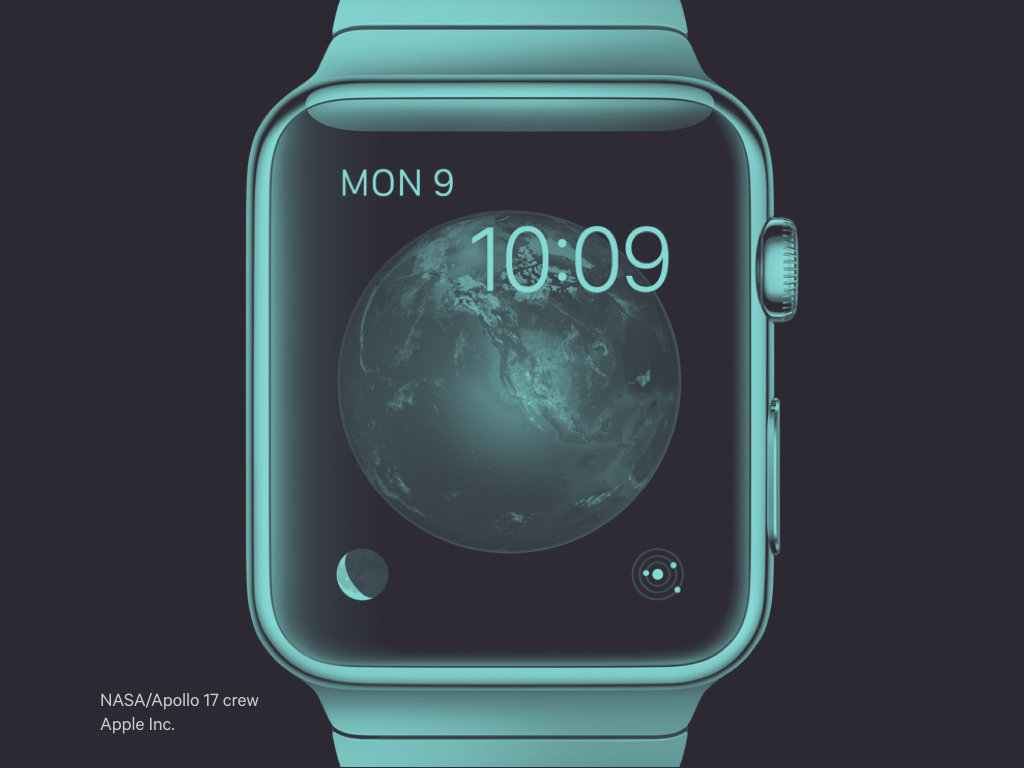
On average we pick up our phones 221 times a day. How many of those interactions are of value?
Smart watches promise to reduce this burden. Yet again, technology promises to solve the problems introduced by technology.
Do smart watches really solve a pressing need? Has our obsession with devices become a distraction?

2° celsius is the politically agreed figure for how much more the planet can warm post industrialisation, without facing disastrous consequences (the temperature has already risen 0.8°C within that timescale).
Computer models calculate that even if we stopped producing CO² now, the temperature would likely still rise another 0.8°, as previously released carbon will continue to overheat the atmosphere. Scientists predict the planet warming by 4° by the end of the century, maybe more.
At the G7 meeting earlier this week, leaders agreed to stop burning fossil fuels by 2100. By then, it will be too late.
You a probably asking at this point why I am talking about climate change at a CSS conference?
Firstly, keeping this issue in mind may put today’s conference into perspective; there are greater issues that need solving beyond CSS.
But as I am going to talk about principles today, I thought it was important to share some of my own.
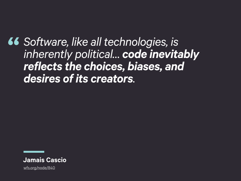
In his article The Singularity Needs You, Jamais Cascio provided one of my favourite quotes about technology:
Software, like all technologies, is inherently political… code inevitably reflects the choices, biases, and desires of its creators.
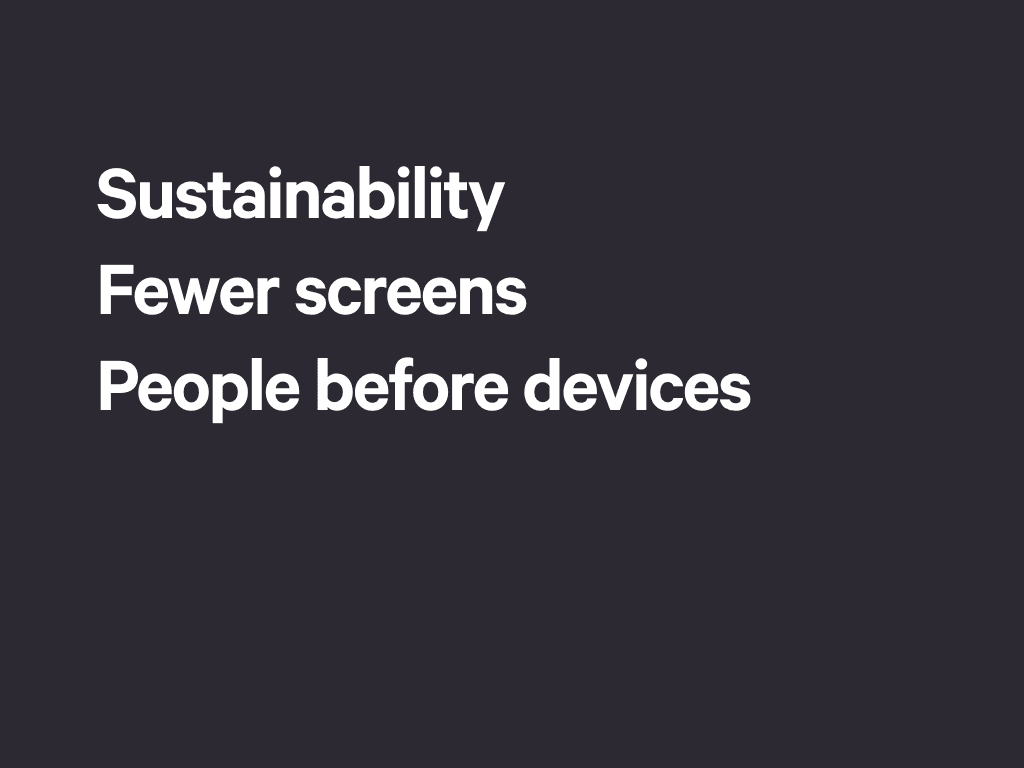
So, here are some of my own choices and biases:
-
I try to live sustainably, and favour building products that last.
-
I’m generally of the option we should be creating a world with fewer screens, fewer interactions and less needless distraction.
-
I prefer to think about the needs of users. If their device happens to be part of that consideration, so be it, but it’s not my primary concern. I prefer to think of an internet of people, not an internet of things.
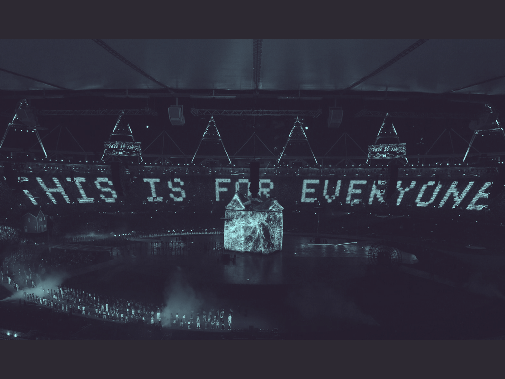
Thankfully, these choices align well with those of the web. At the opening ceremony of the Olympic Games in London three years ago, Tim Berners-Lee spelt this out in just four words:
This is for everyone
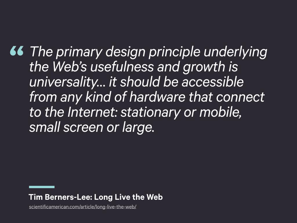
Tim later expanded on this point in an article for Scientific American:
The primary design principle underlying the Web’s usefulness and growth is universality… it should be accessible from any kind of hardware that can connect to the Internet: stationary or mobile, small screen or large.
Universality – or universal access – is the web’s killer feature. By their very nature, this is something native platforms cannot provide.
Responsive Web Design gets us a little closer to this vision.
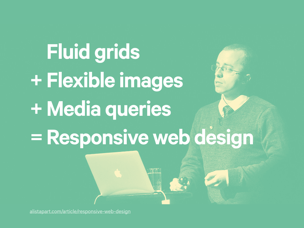
This is an approach that combines three simple techniques to produce something greater than the sum of those parts.
Ultimately, it’s simply a front-end tool within an suite of tools we can use to build websites. And yet, to build a responsive website means engaging designers, researchers, content strategists and even our clients in its creation.
Not since the move away from table-based layouts or the adoption of web standards, has our industry undergone such radical realignment of both thought and application.
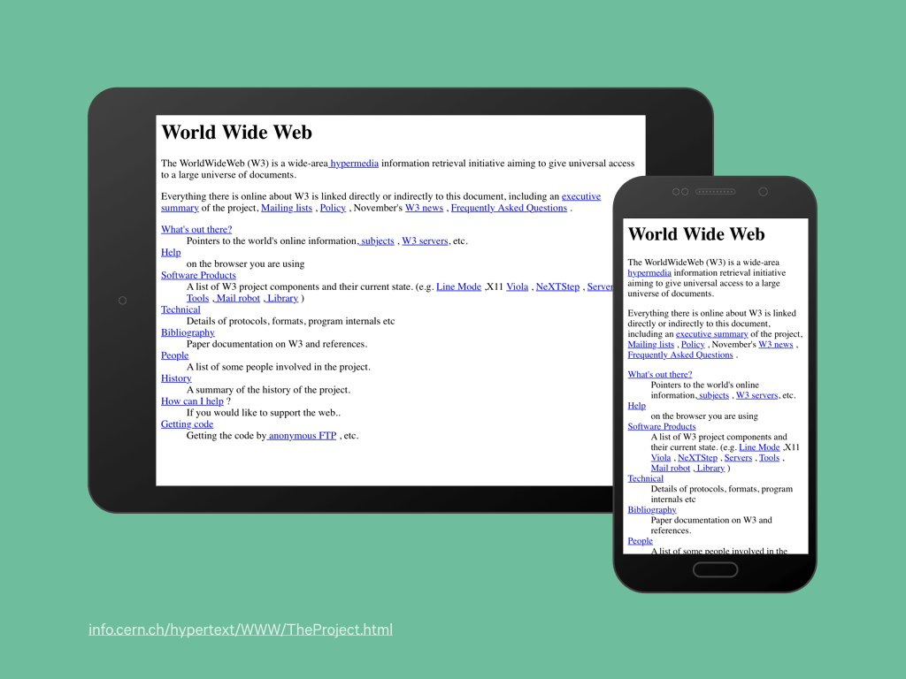
Given this upheaval, we needed to collectively convince ourselves this was the correct approach, worthy of continued investment and investigation. We looked at the first website, and told ourselves, hey that’s responsive – we were right in the first place!
Yet while this first humble exercise in HTML does have responsive characteristics – its layout responds to the width of the viewport – it doesn’t use media queries, include images or have a grid. By definition it’s not ‘Responsive’.
But there is something about this website that I find magical. It has endured. It has shown great adaptability, while remaining relevant and accessible. It speaks to that sustainable quality I mentioned before.
So… on the one hand we have this strict definition of responsive, on the other we have sites that display responsive characteristics.
We might also talk about responsive typography and responsive content.
Performance considerations have become part of the discussion too: how can we make a responsive site actually… er… responsive! If a site has a fluid layout, but requires a user to download 20Mb of assets, can we still consider that site to be responsive?
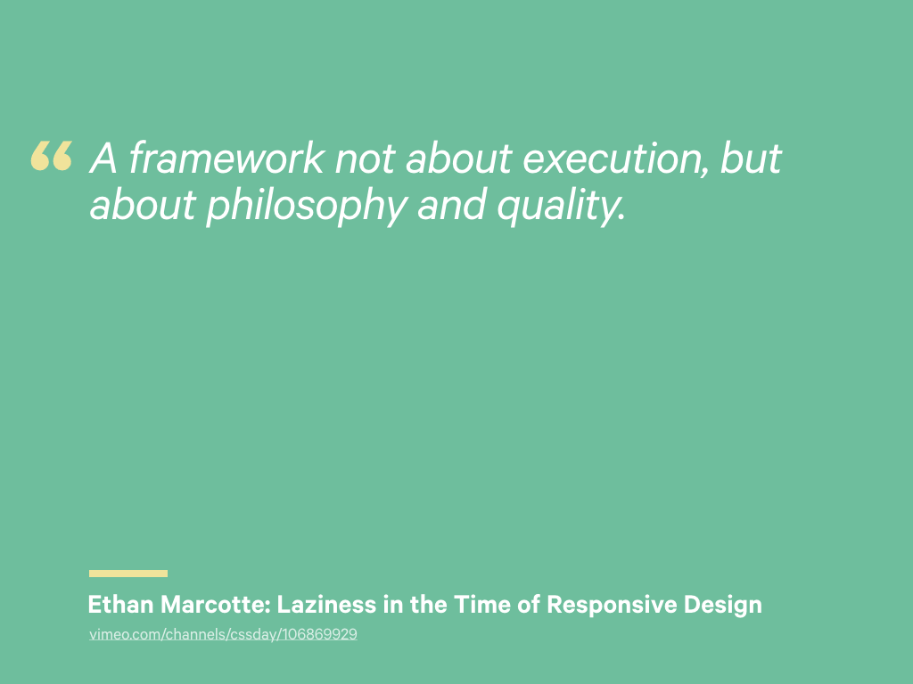
Last year, on this very stage in fact, Ethan spoke about the need for:
A framework not about execution, but about philosophy and quality
Such a framework could help us frame the ongoing discussion about our practice and act as a reference point for measuring the appropriateness of our work. I love this idea. So, perhaps foolishly, I’m going to attempt to provide you with one today.
I believe we can form the beginnings of this framework by creating an agreed set of overarching design principles.
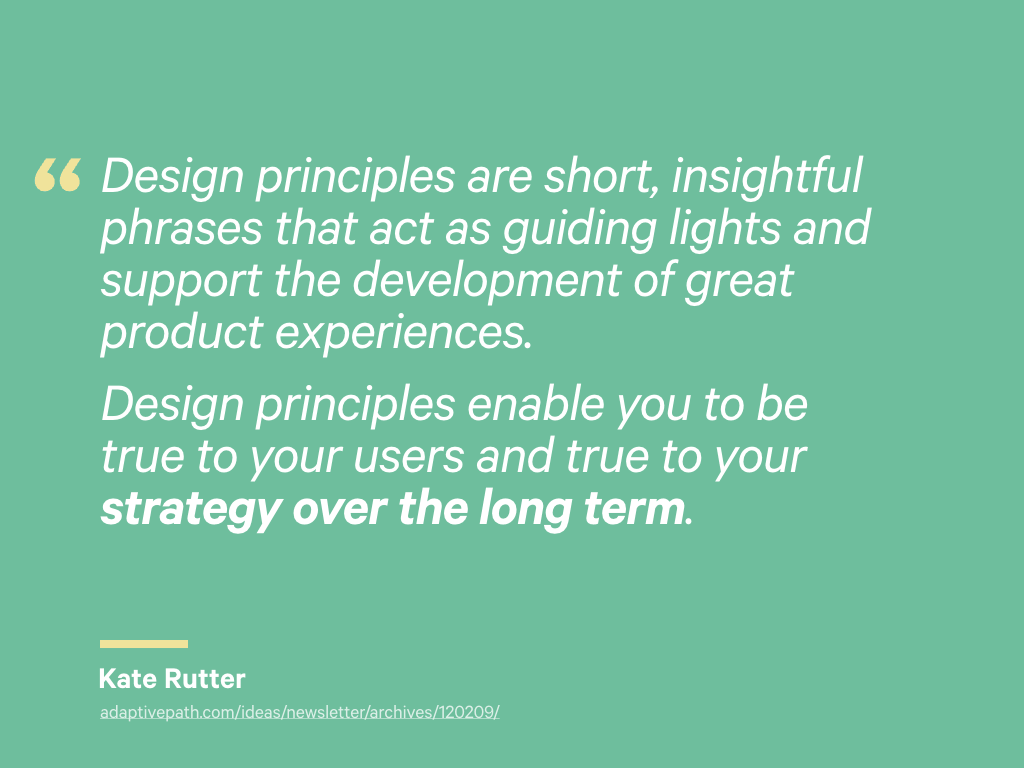
You may be familiar with this concept. Organisations like Facebook and Google use them to define the characteristics of their products and organisations. Kate Rutter describes design principles as:
…short, insightful phrases that act as guiding lights and support the development of great product experiences. Design principles enable you to be true to your users and true to your strategy over the long term.
Remember, our long term strategy is universal access. This is for everyone.
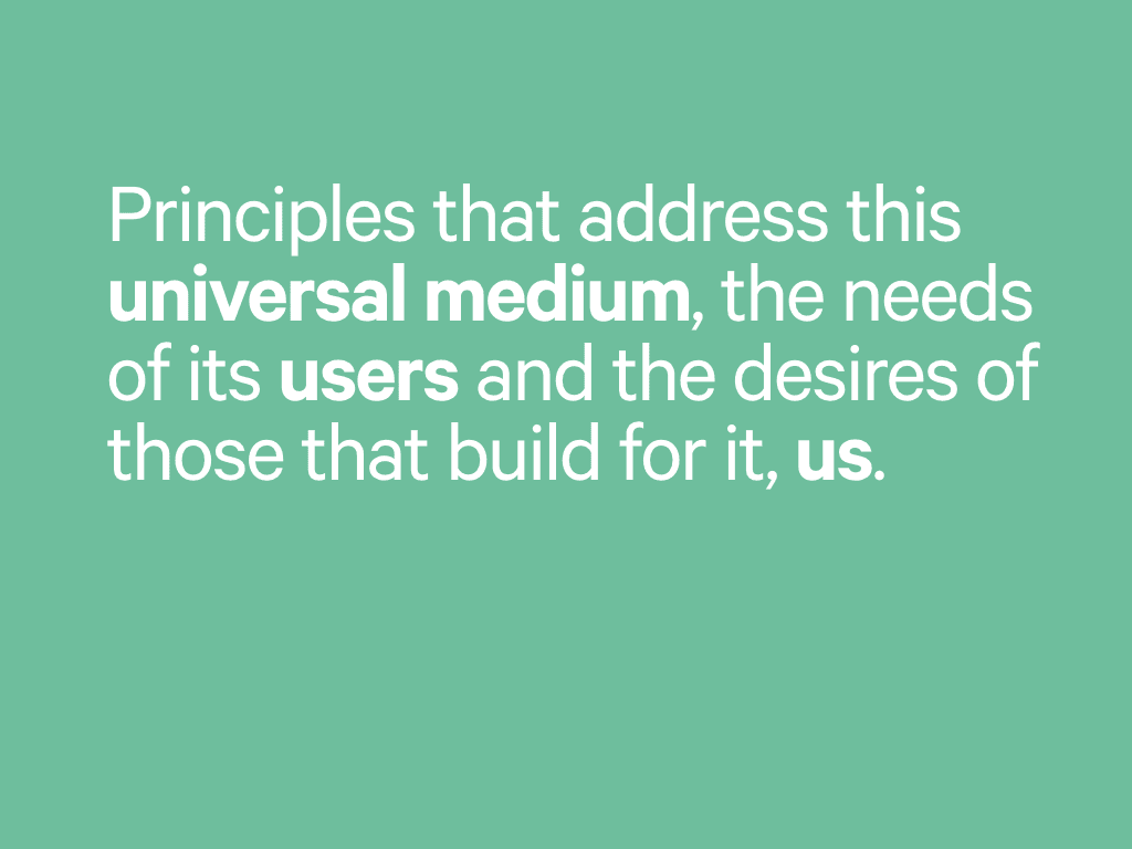
The principles we create need to be in service of this grander vision, and they need to address three primary concerns:
- The nature of the medium
- The desires of those who use it
- The requirements for those that build it, us.
To judge their suitability, I will reflect on the discussions that have taken place over the last five years, and support each principle with an example or two from my own experience.
So, let’s begin.
Given the multiple avenues that can be explored when a design needs to incorporate a range of concerns – context, content, device capabilities – where to begin has confounded opinion.
This is the concern of our first principle.
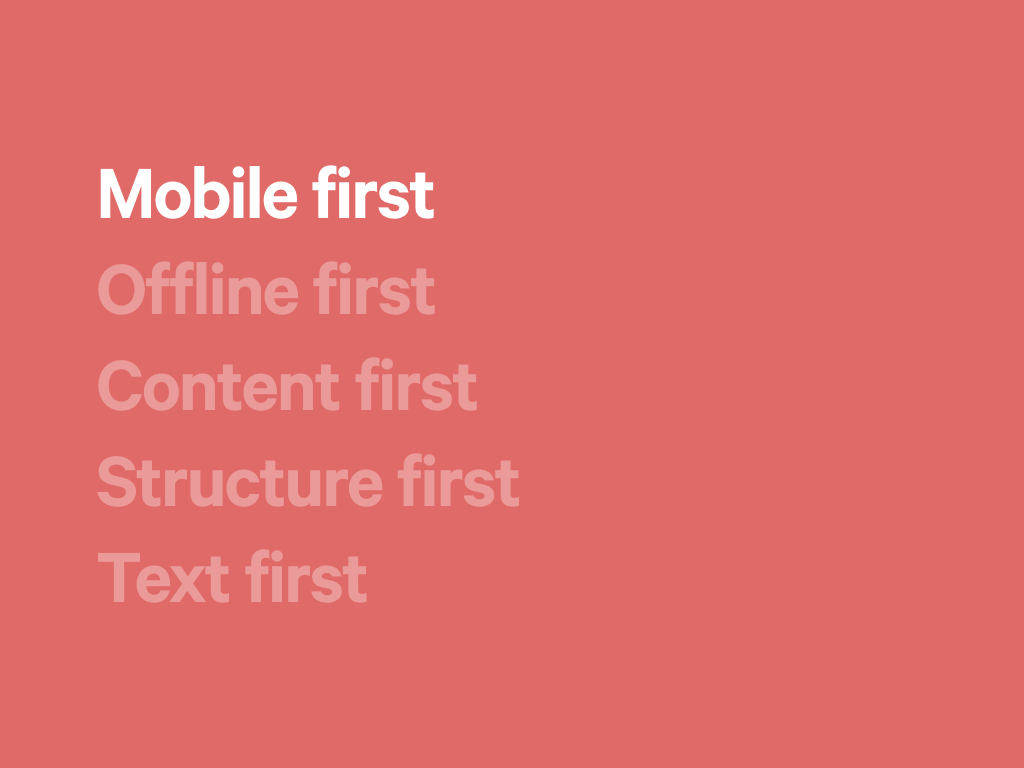
In 2009, Luke Wroblewski put forward the case for designing websites mobile first; that is, considering the capabilities and features of mobile phones, before considering how an experience may manifest itself within a desktop browser.
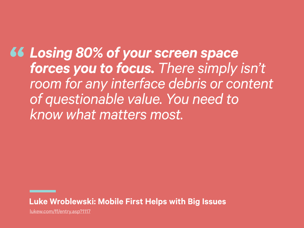
This approach was partly driven by the rapid growth of mobile, but it also had a side benefit. Luke stated that:
Losing 80% of your screen space forces you to focus. There simply isn’t room for any interface debris or content of questionable value. You need to know what matters most.
Thinking mobile-first requires us to undertake prioritisation exercises, and to make decisions about which parts of an interface are critical or not. The non-critical parts can be loaded later, perhaps conditionally – or not at all.
Luke’s article was introduced when smartphone displays were small and the market was still developing.
Today, manufacturers compete by increasing the size and density of their displays while improving the speed of the processors that power them. Tablets have become a third type of device class, and the definition of mobile growing increasingly vague.
Another tenet of mobile-first was recognising the additional capabilities these devices have: location, multi-touch, cameras and a multitude of other sensors. As a proxy for constraint, mobile has been spoiling us.
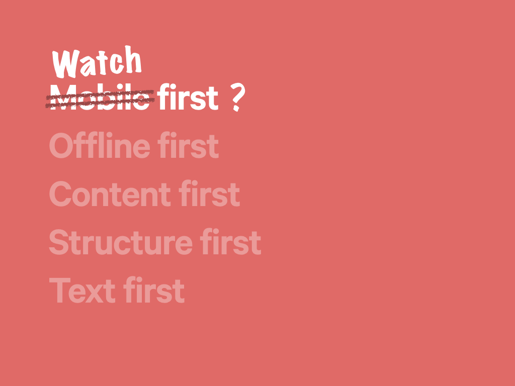
It might be tempting to suggest we now think watch first. In terms of screen size, this would reset at least one constraint.
However, having our thinking revolve around the size of a screens makes the assumption that every device consuming our content will include a display, or that visual affordances alone will suffice. That’s not always true; it certainly isn’t how search engine spiders experience the web, for example.
To build truly universal and accessible websites, we need to look beyond visual design.
Maybe we shift our attention away from devices, and look instead to the network as our primary constraint, and design for the resulting scenarios?
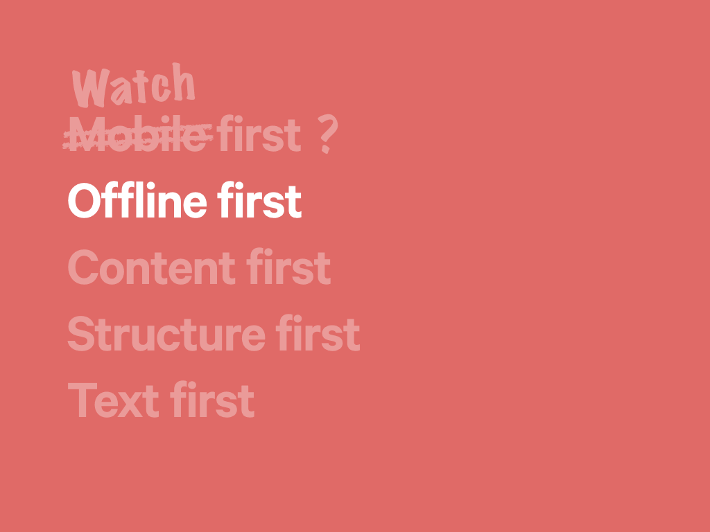
This is the thinking behind offline first. This takes into account the fact that a connection to the Internet is not always present (or reliable), and design from that position upwards.
As much as I like this approach, I think it’s concerned more with robustness and reliability than it is adaptability.
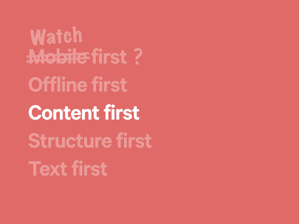
Maybe we start with content? After all, for years we’ve repeated the mantra that ‘content is king’, only to draw rectangles and pour in placeholder text.
Given that interfaces need to adapt their design to meet the available screen real estate, content is now the one aspect of a page that remains relatively constant. Content can no longer be considered a commodity.
Mark Boulton went as far as to suggest that we design from the content out, rather than the canvas in.
However, as much as we would love to have content in place before we design a page, this is can be unreasonable request.
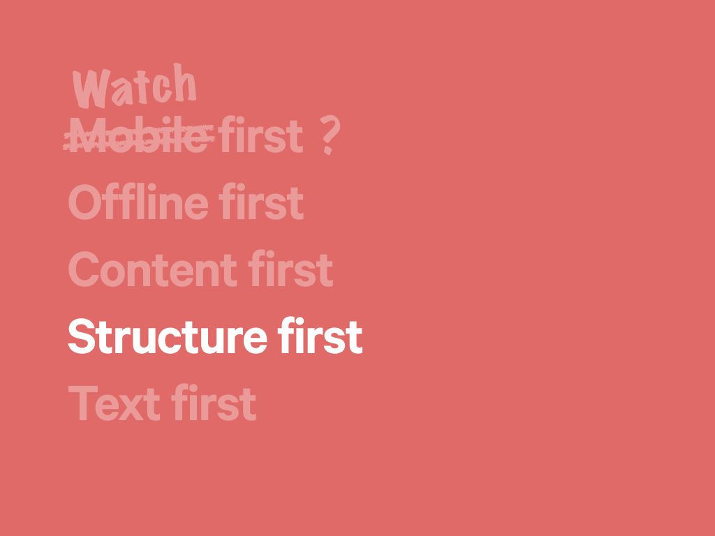
Mark later clarified his position, suggesting we consider Structure first. Content always. By evaluating the type of content we need (what task it needs to perform, or information it should convey), we can start by using content representative of the final form. Meanwhile, we can help clients think about their more detailed requirements.
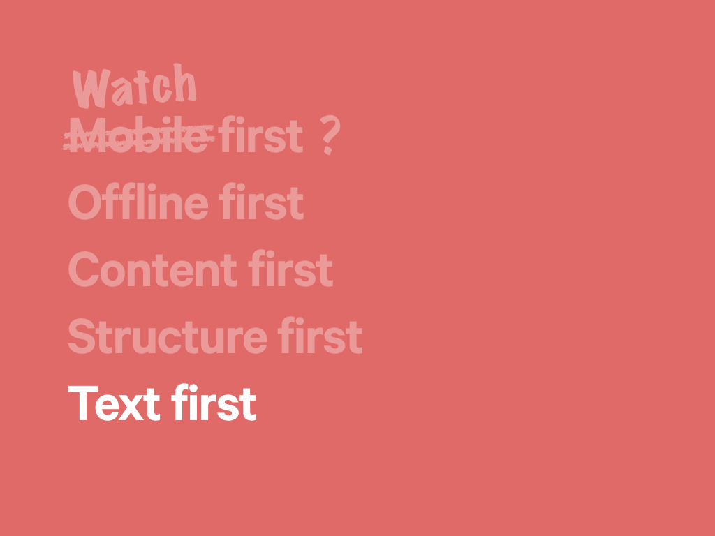
This focus on content means we can start designing text first, and this is an approach I often employ in my own work.
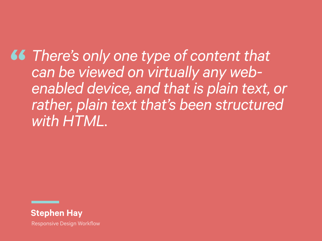
This is an approach advocated Stephen Hay. He wrote:
There’s only one type of content that can be viewed on virtually any web-enabled device, and that is plain text, or rather, plain text that’s been structured with HTML.
Given that other media types we use on the web can also be represented by plain text – images can include descriptive alt text, videos can provide transcripts – thinking this way can help us build products that are accessible from the very start.
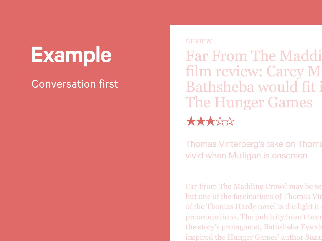
I’ve recently started to take this approach a bit further, by thinking about how an interface might be read out as part of a conversation.
What questions might a user be asking? How might I structure a response?
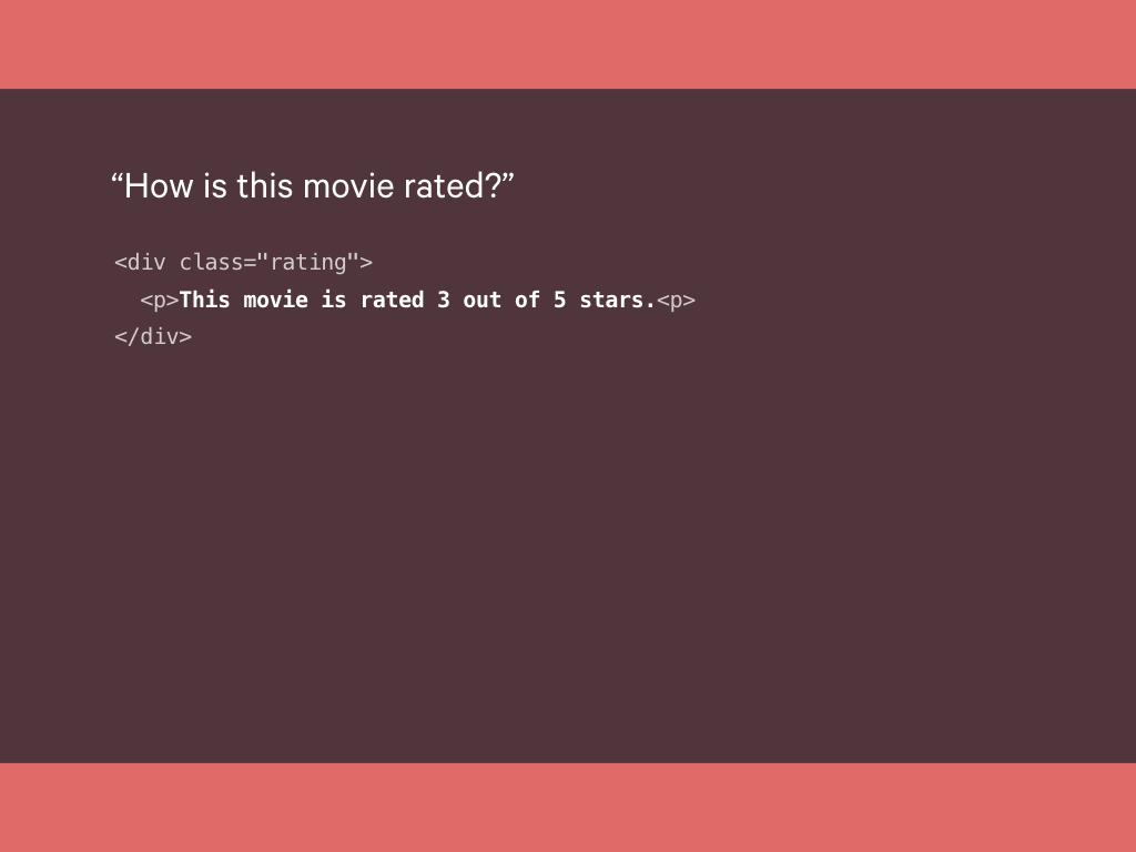
Let’s imagine an article reviewing a film. A key piece of information here is the rating the reviewer gave.
With our graphic design hat on, we might think about this purely in visual terms: the rating shown as a series of stars, with the filled in stars representing a rating.
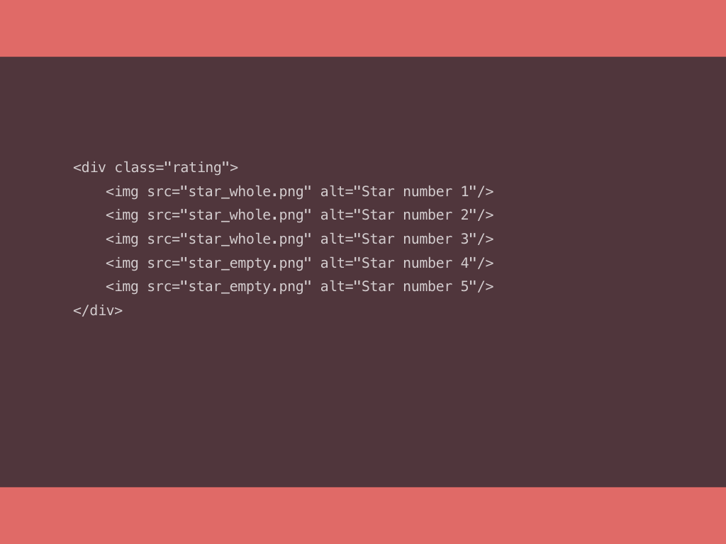
We could mark this up as follows.
This markup is based entirely on the visual representation, making an assumption about the capabilities of the device consuming this content.
Unsurprisingly, this is not very accessible, either.
What if we were to think of this page as a conversation instead?
A user might ask: “how is this movie rated?”
Our marked up answer would then be as follows:
“This movie is rated 3 out of 5 stars”
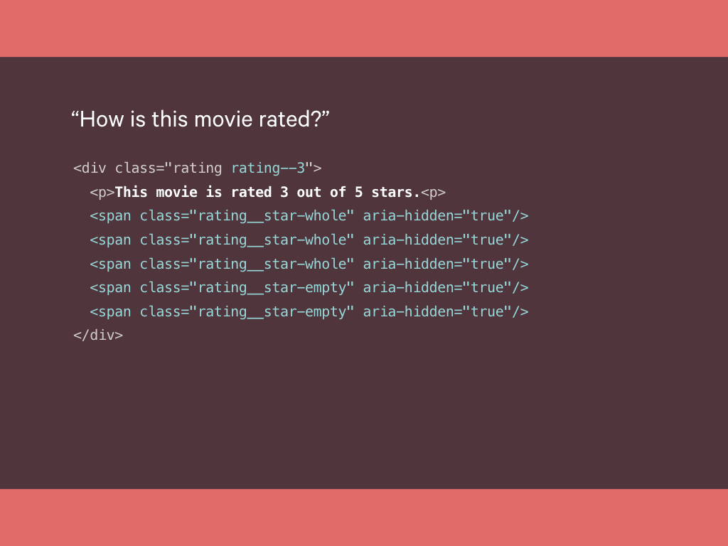
Additional markup then allows us to add extra visual embellishment.
Here, empty spans are used as styling hooks (which we might inject later with JavaScript), with ARIA attributes to ensure these are not parsed by accessibility software.
This simple piece of markup, demonstrates a layered experience; a core piece of content that allows for a degree of enhancement.
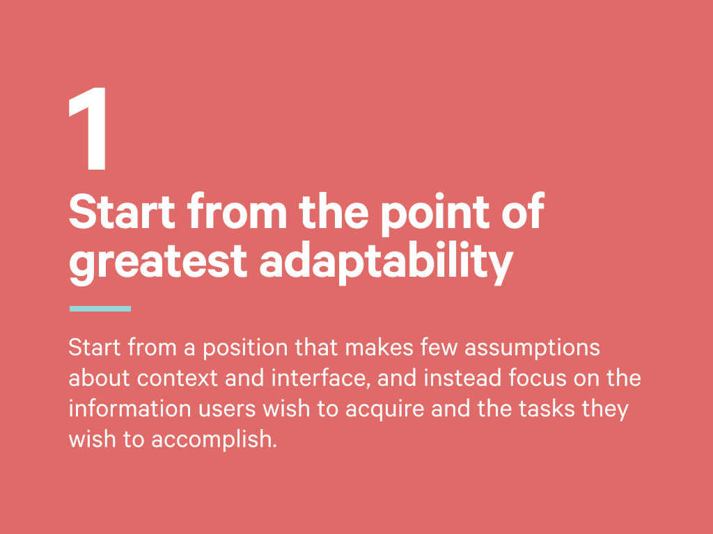
Our first principle can be summed up as follows:
Start from a position that makes few assumptions about context and interface, and instead focus on the information users wish to acquire and the tasks they wish to accomplish.
The fluidity of the device landscape can be frustrating, but this fragmentation is a reflection of human diversity and consumers exercising their right to choose. This diversity is the concern of our second principle.
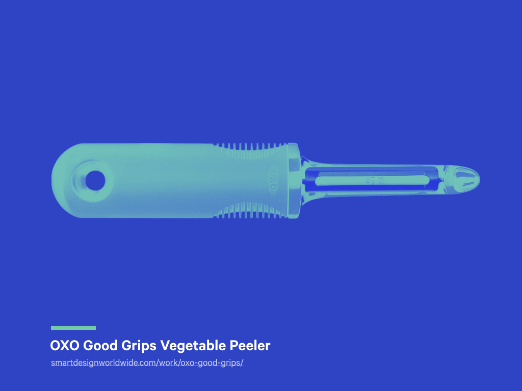
This is a vegetable peeler. It was designed in 1990 by Sam Farber, a veteran of the kitchenware business. He spotted an opportunity when he saw that his wife, Betsey, an arthritis sufferer, struggled to use a conventional metal vegetable peeler.
He prototyped a number of handle designs, trying to create one with a more comfortable grip. Perhaps unsurprisingly, those without arthritis enjoyed using his peeler as well, and this peeler went on to win design and business innovation awards.
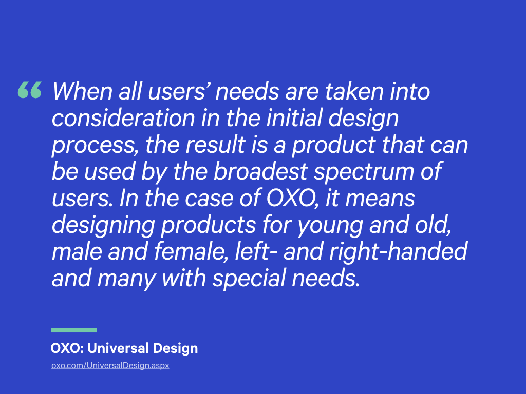
He went on to found OXO, a consumer goods company founded on the principles of universal design. OXO say:
When all users’ needs are taken into consideration in the initial design process, the result is a product that can be used by the broadest spectrum of users. In the case of OXO, it means designing products for young and old, male and female, left- and right-handed and many with special needs.
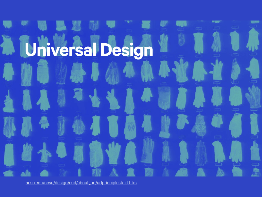
Universal design has greater recognition within architecture and product design fields, but I think it can apply to products built with pixels as well. When you look at the principles of universal design, they include recommendations like:
- Eliminate unnecessary complexity
- Minimise repetitive actions
- Arrange information consistent with its importance
Universal, accessible design is just good design, full stop.
You can see similar principles reflected in the design of the web.
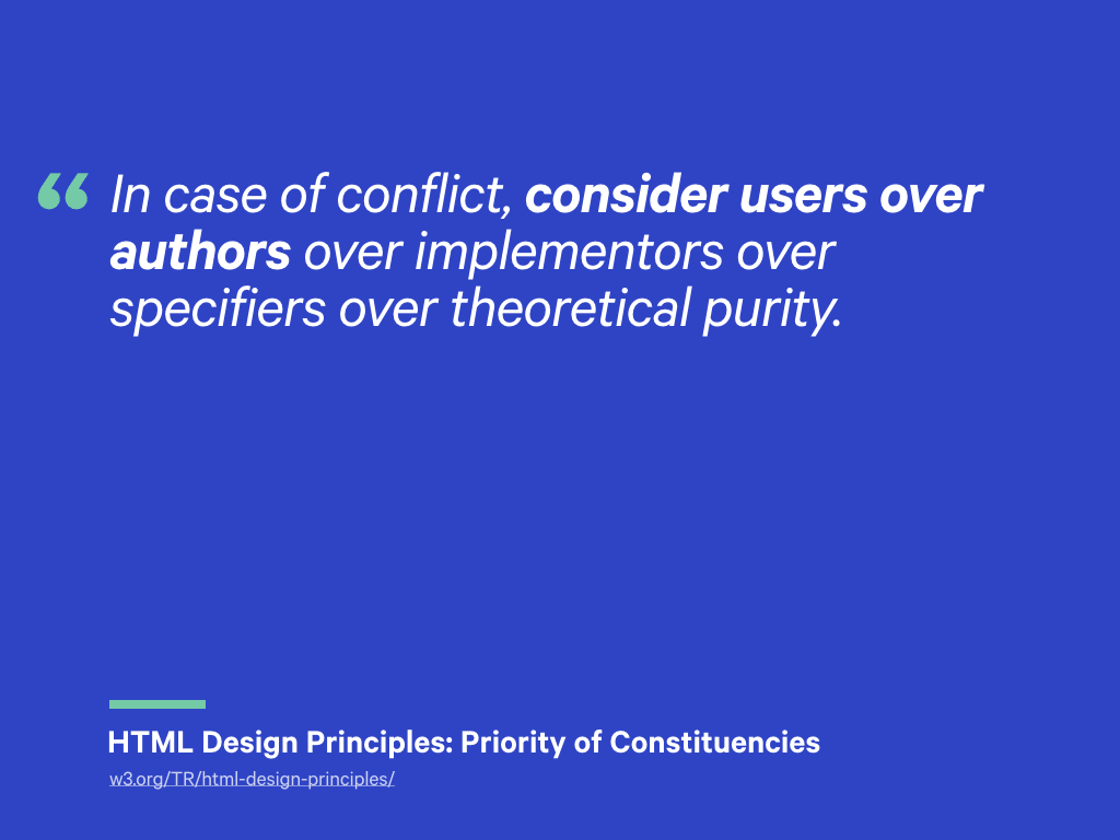
One of my favourite parts of the HTML5 specification deals with how authors should assess additions or changes to the specification. It is called the priority of constituencies, and states:
In case of conflict, consider users over authors over implementors over specifiers over theoretical purity.
This is a principle we can and should use in our work, too.
Too often we see technology choices made that prioritise developer convenience over user experience.
The rise of front-end MVC frameworks that require users to download many bytes of JavaScript before they can use an application are one such example.
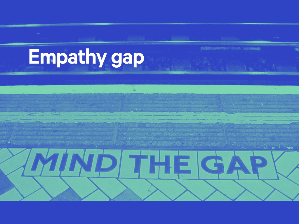
Choices like this are made because their is an empathy gap between two of those constituents: users and ourselves.
Sitting at a large high-resolution Apple display, with a new laptop and super-fast broadband connection, it can be difficult to visualise a user experiencing the resulting product on a low-powered mobile device on an unreliable 3G connection.
Practising user-centred design helps us bridge this gap. By running activities like user research and usability testing, we can learn how users interact with our products and help us understand whether we are serving their needs.
Involving clients in the design process, we can learn about their requirements, and also uncover insights they’ve gleaned about their customers, too.
Involving different disciplines (developers, researchers, other practitioners) early in the design process, can ensure that this learning is a shared among everyone responsible for building a product.
This can also create a collective responsibility for ensuring aspects like performance and accessibility are considered as key attributes of the final outcome; nobody can plead innocence!
But, there’s another aspect effective, empathetic teams that is often overlooked…
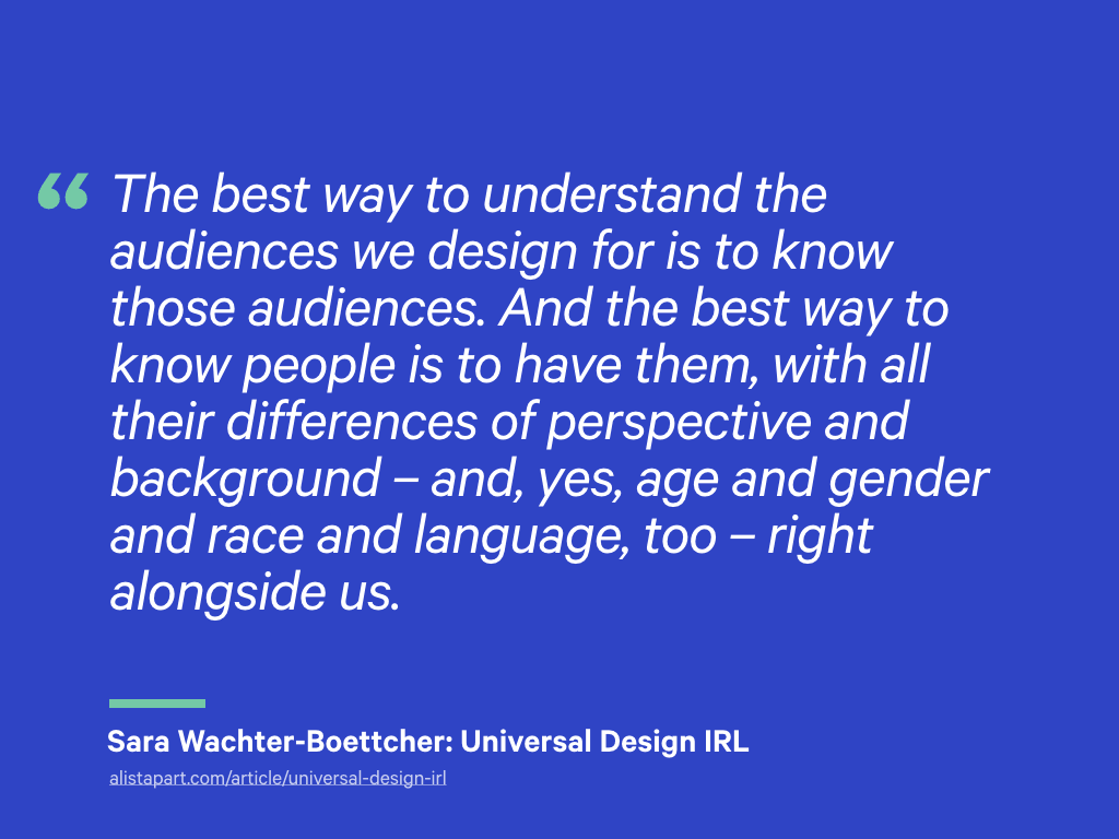
In her article Universal Design IRL, Sara Wachter-Boettcher states:
The best way to understand the audiences we design for is to know those audiences. And the best way to know people is to have them, with all their differences of perspective and background – and, yes, age and gender and race and language, too – right alongside us.
Our community has become increasingly concerned about the diversity; the people we see, hear and work with.
Once your eyes have been opened to its monoculture, our white, male dominated industry becomes hard to ignore. This is a problem, and it is one worth fixing.
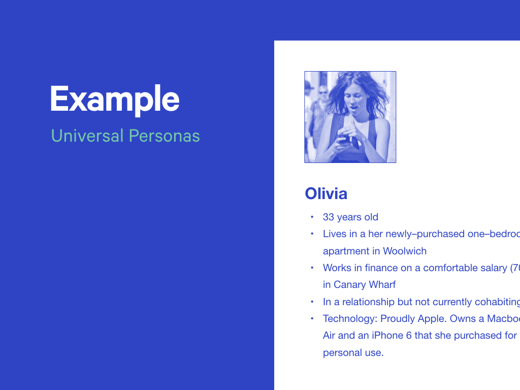
How else can we involve universal design principles within our day-to-day work?
On a recent project, even though we acknowledged early on that visitors to a website included a large number of middle-aged users with poor eyesight.
This wasn’t represented in the user personas we had created, which formed the basis of follow-on design exercises.
How we could factor accessibility issues into this tool?
It might be tempting to create a separate persona, one exhibiting several disabilities. However, personas need to be grounded in a degree of reality, and backed up with research, so such a persona could be easily dismissed.
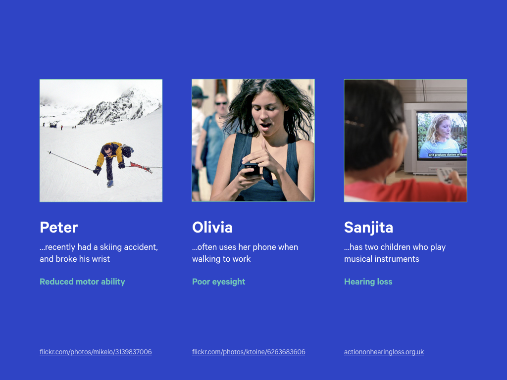
Instead, we can give enhance our existing personas by giving them short-term disability concerns:
-
A persona could have recently broken their wrist in a skiing accident, meaning they have temporary motor restriction in that area.
-
Another user may access websites on her phone while walking in bright sunlight, so be similar to a user with poor eyesight.
-
Maybe one lives in a loud household, so exhibits the same characteristics as someone with hearing loss?
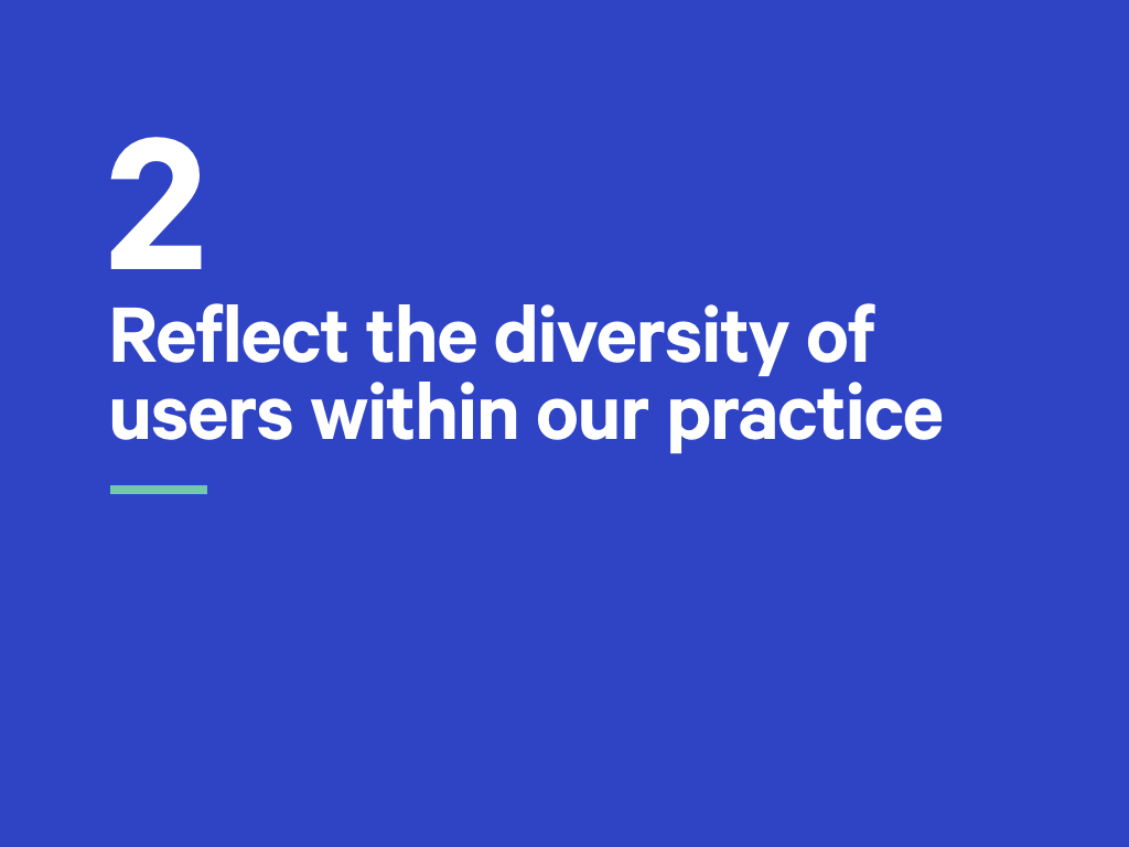
So our second principle reads as follows:
The web is accessed by users with individual needs and desires. Multi-disciplinary and inclusive teams working together have a better chance of reflecting this diversity.
Previously all you needed to build a website was a text editor and a working knowledge of HTML and CSS.
Now you need to understand a multitude of other tools and concepts.
Our third principle concerns itself with those who build the web, and how they might navigate this elaborate landscape.

We have seen the growing use of automation within front-end development. It’s easy to be dismissive of these tools, but they do have many benefits:
- Pre-processors allows us to modularise our CSS and use features like constants.
- Testing our code for errors helps us build more robust products.
- And optimising assets can make these products faster.
Some view this as maturity, others as madness. Whether we’ve become too reliant on these tools is open to debate. And while they do have many benefits, they come at a cost…

Complexity.
Now, I’m broadly comfortable with this trend towards engineering, away from any previous notions of craft. But, introducing a succession of tools into our workflow makes it harder for other members of our team to contribute, especially if they assume a level of pre-existing knowledge.
Example: Sass can act as an interface between designers and developers, ensuring named elements of a visual design language are shared across a project. At worst, it turns a declarative language into a programming language, removing a key design feature of CSS.
In many ways, our third principle is an extension of the second.
Previously I stressed the importance of building empathy for users of our products; here that user is another member on our team.
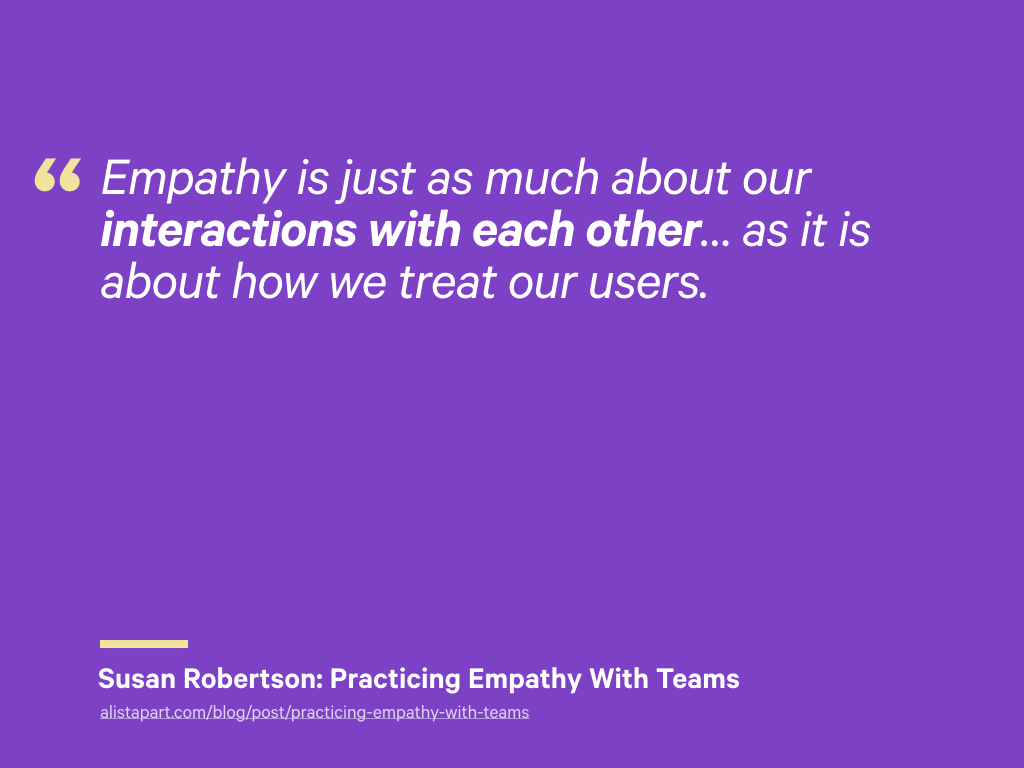
Susan Robertson recently wrote about working with other people in her team, noting that:
Empathy is just as much about our interactions with each other… as it is about how we treat our users.
While complexity can be unavoidable, we should seek to reduce the opacity of the systems being used. Without doing so we risk leaving colleagues behind with further opportunities for collaboration missed.
Of course, this works both ways: designers need to make their work accessible to developers too.
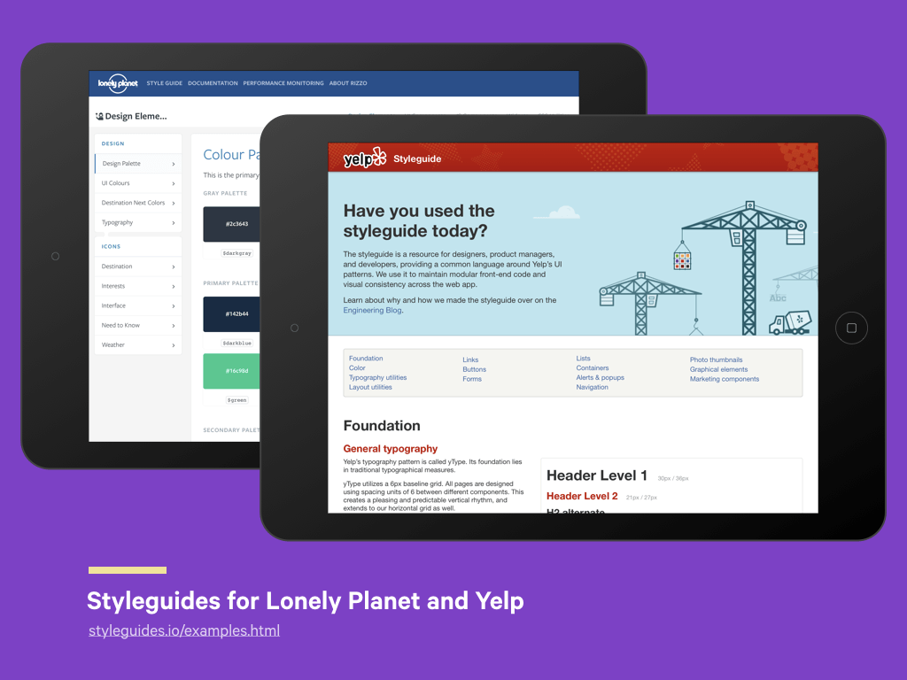
One practice gaining momentum is the creation of style guides that document a visual design language. I find this development exciting as it suggests there is a maturing relationship between the disciplines.
It also suggests an agreed understanding that, given the multi-device environment we now design for, we can no longer design static pages.
Instead we need to design fluid components able to adapt to different variables that work as part of a broader system.
Modular design is a widely accepted software engineering practice.
Tim Berners-Lee considered “Modular Design” and “Being part of a Modular Design” necessary principles of good design.
Modular design invokes principles like DRY (Don’t Repeat Yourself), the single responsibility principle, and object-oriented design methods. These principles have been advocated for many years, especially by people like Nicole Sullivan and Harry Roberts. It’s worth noting how they arrived at these recommendations; they are a product of working in large, often distributed teams.
We can debate the pros and cons of such engineering approaches, but again it’s worth recognising the benefits:
-
Reusable classes make for robust, maintainable systems that are easier to understand.
-
Naming methodologies like BEM make it easier to understand what each piece of CSS does – it also makes it easier to choose names!
Some don’t like BEM because they get caught up on double hyphens and underscores that some flavours use. Understand the motivations behind an approach before getting caught up on implementation details, which you can always adapt to your own tastes.
And remember our constituents: consider authors over theoretical purity!
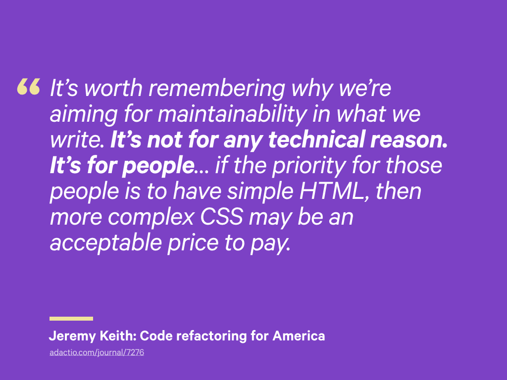
Last year, Jeremy Keith talked about refactoring the code he and Anna Debenham developed for Code for America.
They used an object-orientated approach which made heavy use of classes. However, the code for these components was being copy-and-pasted by volunteers who had a more basic understanding of HTML and CSS. Adding complexity to the HTML was hindering their ability to create pages.
Jeremy and Anna refactored these components; while the CSS was more complex and defensive, it allowed for far simpler HTML:
It’s worth remembering why we’re aiming for maintainability in what we write. It’s not for any technical reason. It’s for people… if the priority for those people is to have simple HTML, then more complex CSS may be an acceptable price to pay.

I believe that by approaching the design of websites in a more modular way, we can invoke ‘it depends’ more liberally than we might otherwise.
If each component in a system is designed to be truly self-contained, this frees us up to use whatever approach is most appropriate.
We needn’t get into arguments about whether OOCSS is the right approach or not; or whether we should embrace the cascading nature of CSS, or ignore it by using a more BEM-like approach.
It really does depend!
Let’s look at an example.
Here, we will take a page, and for each component, identify it’s role:
- Does it convey information (does it have document-like attributes)?
- Is it used to perform a task (does it have application-like attributes)?
- Is it part of the user interface, maybe providing a means of navigation?
We can then choose an appropriate—but possibly different—approach to CSS.
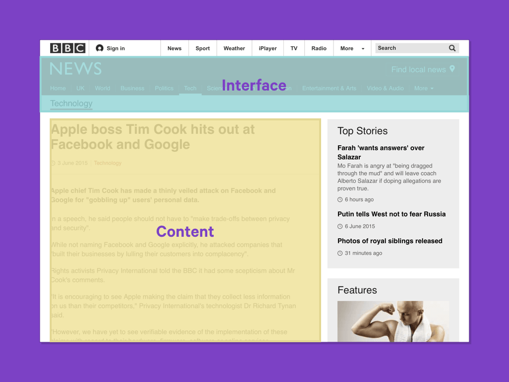
Looking at the BBC News website, we can broadly identify two types of component being used:
- Interface elements like the primary navigation. Likely to remain unchanged, their design determined by those who build the product.
- Content on the other hand, may be input via a CMS or come from a third party API, and therefore generally be more fluid and unpredictable.
Knowing this, for the navigation, we can use an object orientated approach with a BEM naming method, and use shared utility classes like clearfix.
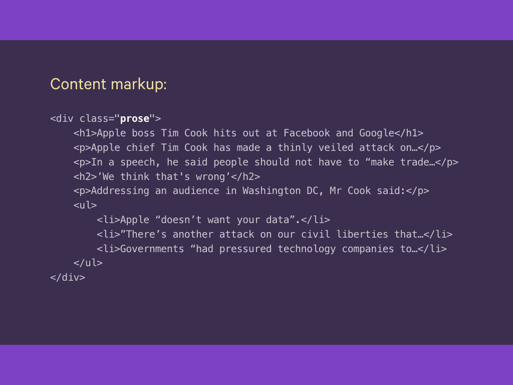
The content component contains markup, perhaps output from a CMS or API, so relying on the cascade may be more appropriate – not least because we can’t add any classes to the marked-up content.
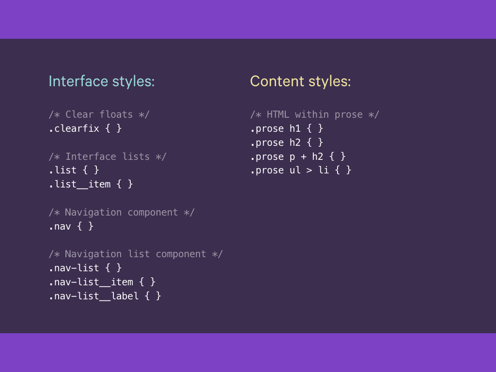
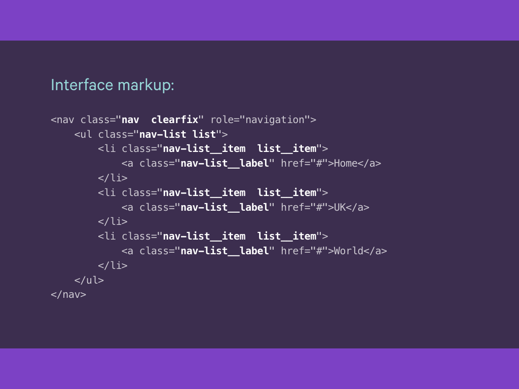
This navigation component uses classes for each part of the component, parents and children.
However the content component uses a more defensive approach, and uses different CSS selectors, which are often needed when dealing with the unpredictable nature of such content.
For a system to be maintainable, robust and error-free, anyone contributing to it should understand the consequences of changing an aspect of it.
Code is read more often than it is changed, so it should be documented or, better still, self-documented whenever possible.
While using different CSS methodologies within the same system affords us greater flexibility, it also introduces a degree of fragility.
How do you know which approach is being used, when?
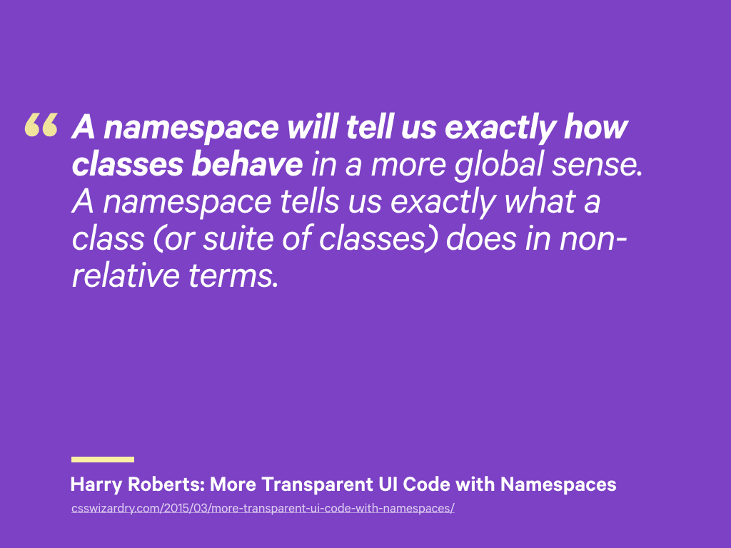
One way we can self-document code, is to use namespaces. I’ve recently starting using an approach advocated by Harry Roberts.
A namespace will tell us exactly how classes behave in a more global sense. A namespace tells us exactly what a class (or suite of classes) does in non-relative terms.
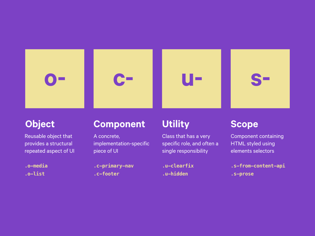
His post goes into more detail than I am able to here. But, what I like about this approach, is that recognises the multiple ways CSS may be used in a project and allows us to identify them.
- Object: Reusable structural objects (Don’t repeat yourself)
- Component: Implementation specific pieces of UI (Modular design)
- Utility: Classes with a single specific role (Single Responsibility Principle)
- Scope: Classless HTML (Be liberal in what you receive…)
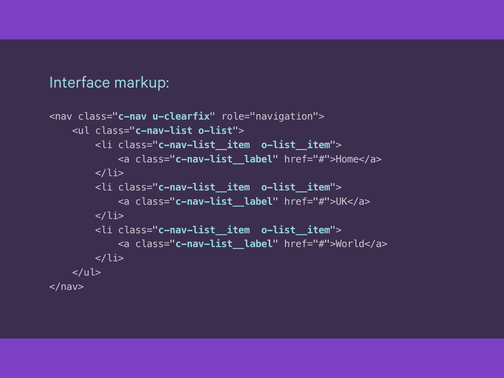
Returning to our earlier example, we can now update it as follows:
Our navigation component uses the list object pattern and the clearfix utility.
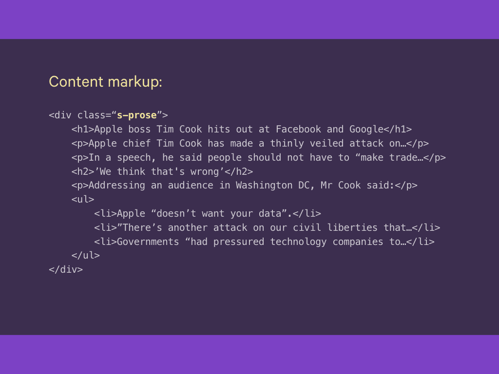
And this is our content markup.
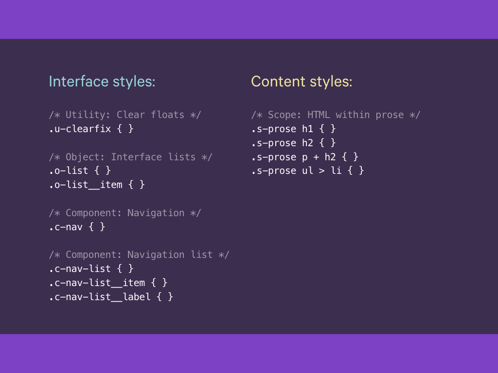
And these are the associated styles.

We can take a similar approach to images.
The discussion around responsive images has largely focused on how to serve images based on the size of the viewport. It has rarely focused on the different types of imagery we use on the web; not all images are created equal.
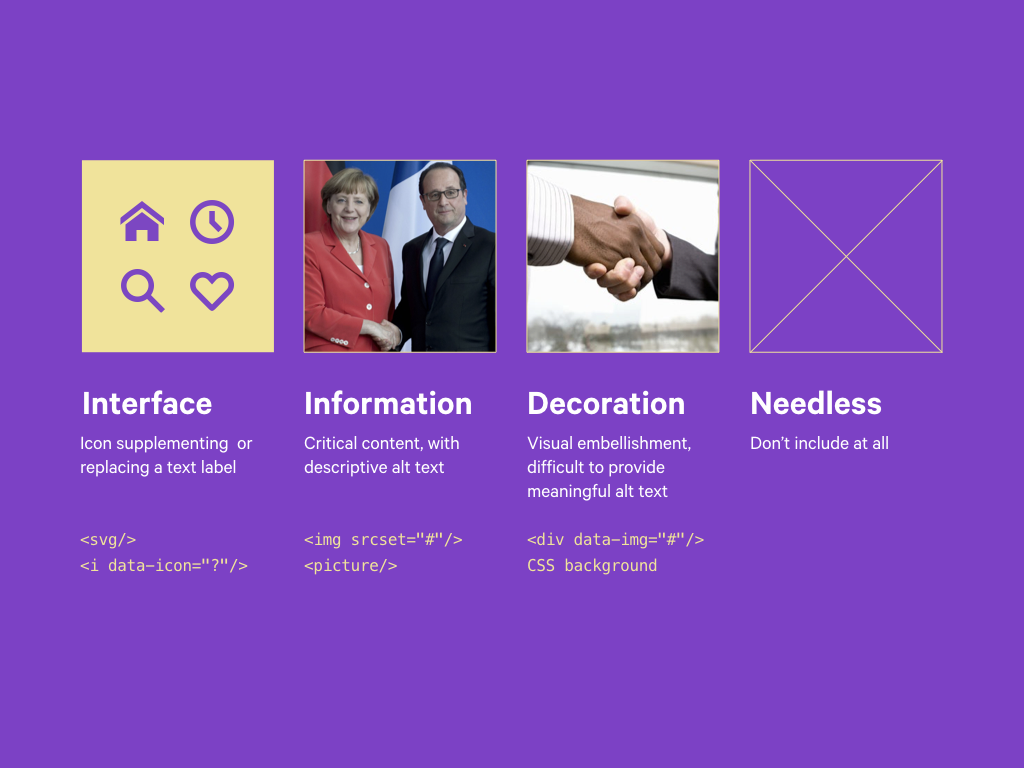
Thinking in a more modular way, we can invoke ‘it depends’, and use different implementation techniques for our images, depending on their purpose:
- Some add visual affordances to interface elements, icons perhaps that supplement or replace text labels – SVG/icon fonts
- Some convey information, (easy to provide meaningful alt attributes) – image or picture elements
- Some are decorative – CSS background or injected later with JS
There is actually a fourth option that is often overlooked: we just don’t include an image at all.
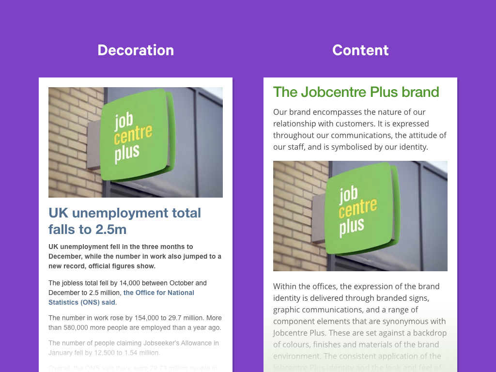
The implementation we choose depends just as much on the surrounding context as it does upon the actual image.
Take for example, this image of a Jobcentre Plus sign.
-
In the UK, you often see images like this used on news stories talking about the latest employment figures. We might consider it decoration; it conveys no information, beyond perhaps reinforcing what the story is about.
-
Were the same image to appear on a page about the Job Centre Plus brand, this image provides essential information.
These are just a few examples, but there are many more. So to recap, this is our third and final principle:
Given the complexity of the technology we use to build the web, aim to keep things simple. We can achieve this by building modular systems, made up of discrete, self-documented components that can be adapted and improved over time.
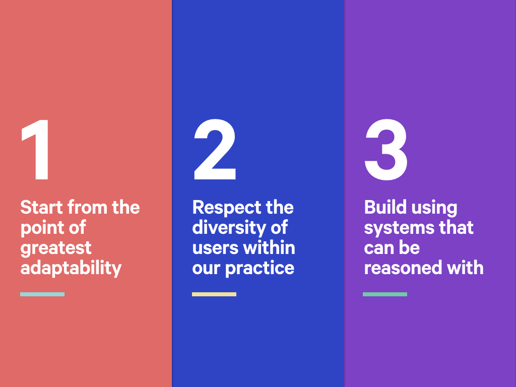
So, to recap:
-
We may not know how reliable the network will be, or what features a user agent will support, but by starting from a foundation that makes few assumptions, we can deal with this landscape.
-
Through research and user centred design, we can can get to know our users, and better still, reflect their diversity within our own teams.
-
By recognising the needs of everyone on our team, we can build systems that everyone can understand and contribute to.
Each sees a shift in focus, from technology to users. Hopefully these can help us build more sustainable products that everyone can enjoy.

Somebody asked me the other day, why this talk is not called responsive web design principles, but responsive principles.
While these three principles are designed to endure, we should also recognise that our industry, and indeed the world we live in is rapidly changing.
That means, even these principles need to be responsive to change. And that’s what I encourage you to do; change them. These principles are available on Github, so please summit issues against them! Or use the hashtag #RWDPrinciples to continue the discussion. I look forward to hearing your suggestions!