Keep Up!
Aquent Gymnasium is an online learning platform that offers free courses for designers looking to improve their web development skills. This is a transcript of the talk I gave at their UK launch event.
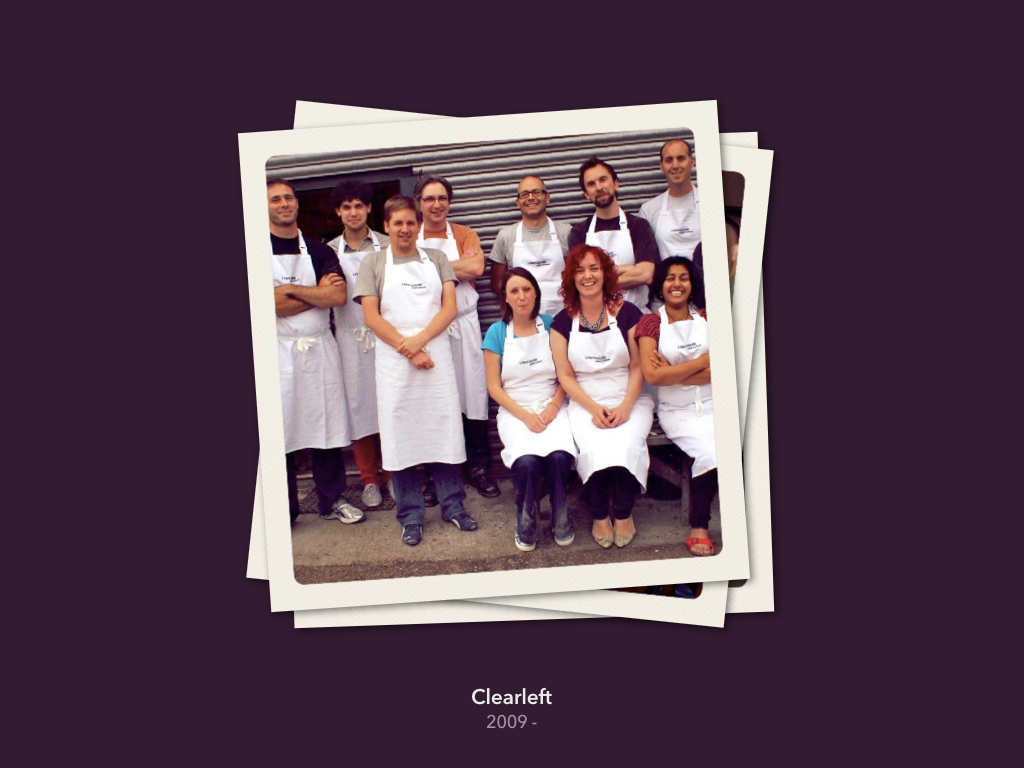
In 15 minutes I hope to give you an insight into the many opportunities and challenges facing web designers in 2013. But first, a little bit about myself.
I currently work at a user experience design agency in Brighton called Clearleft. We are a small agency that work with big clients such as the BBC, NBCUniversal, Channel 4 and Mozilla. We also work with smaller start-ups and charities like WWF, UNICEF and 38 Degrees. My title is senior visual designer, but I try to position myself at the intersection of both graphic design and front-end development.
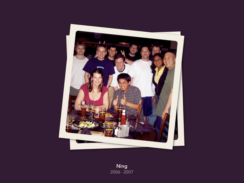
Prior to joining Clearleft I was lead designer at Ning, a start-up based in Palo Alto, California. I worked there during 2006-7, when a lot of the companies we know today were just getting started. Working in the Valley was an amazing – and at times eye-opening – experience.
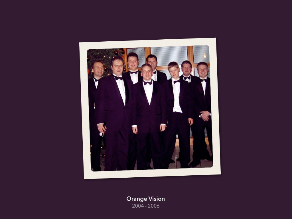
However, my journey began almost ten years ago at Orange Vision, a tiny web design agency based in Lichfield, Staffordshire.
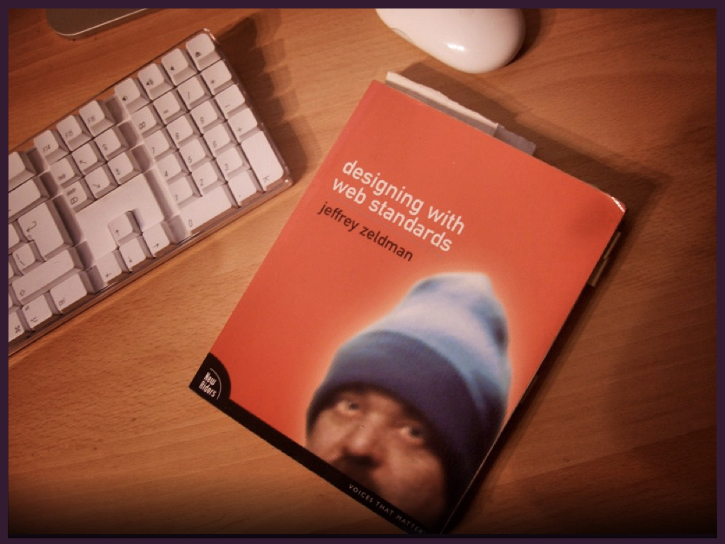
I started in the summer of 2004, just as support for web standards was gaining traction. One of the key ideas behind this movement was the separation of presentation from content: developing highly semantic HTML pages styled separately with CSS. Designing with Web Standards by Jeffrey Zeldman was my bible.
One of the reasons I decided to join Orange Vision was because their website used CSS as opposed to older techniques that involved tables, inline style declarations and 1x1 pixel ‘spacer’ images. Soon after joining, I learnt that they had actually stolen another agency’s website, changing just the logo and some copy! Thus much of my early work was spent updating existing sites, swearing under my breath as I used the outmoded practices favoured by my new employer.

When the time came to build a new site from scratch, I saw this as an opportunity to show my colleagues how to build a website the right way. In just a few days, I had built the entire website, and looked forward to launching my first commercial site built using web standards.
However, the weekend before the launch, my boss noticed that it looked different in Netscape 4 (which had a small percentage of users at this time). Judging this to be problematic, he ripped the site apart and rebuilt it using tables.

When I came in on Monday morning, I was devastated! With no version control, everything I’d done had gone. Of course, this situation could have been avoided had I communicated my intentions better, and explained how we would support older browsers.
Over time, I was able to persuade the company to adopt web standards. This wasn’t hard; maintainability, speed, accessibility and search engine optimisation were frequently brought up during debates. When @media 2005 was announced, me and two colleagues were even allowed two days off to attend. This story has a happy ending.
I find it telling that I started my career having to make such a strong argument for keeping up. Before Orange Vision, I built websites for a hobby, and had already seen the web change significantly in a short amount of time. It seemed obvious that to gain (and maintain) employment, I would need to stay relevant and embrace change. Yet upon meeting a group of people focused on meeting client expectations – concerned about getting work out of the door – I saw how easy it is to fall behind.
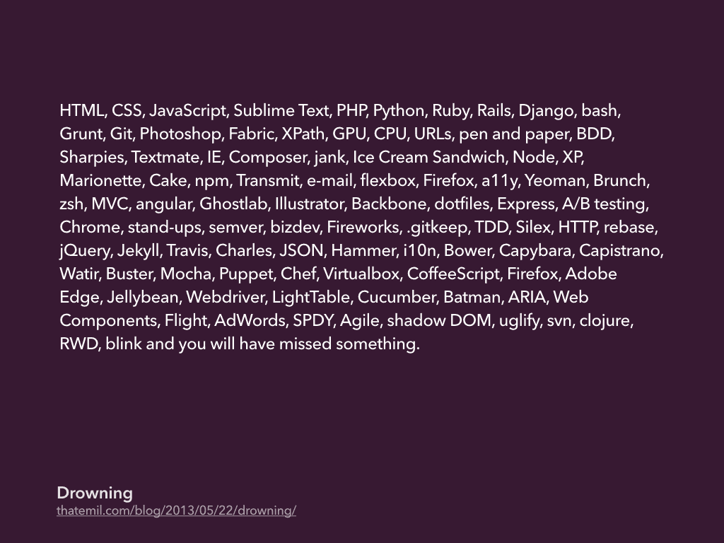
Keeping up can feel like an uphill struggle, perhaps even more so today. In a blog post entitled Drowning, my friend Emil attempted to list all the languages, frameworks and applications needed to do his job. No one can hope to learn – let alone master – all this.
Study Emil’s list more closely though, and you’ll realise it consists of a number of highly specialised frameworks. I suspect many will have gone out of fashion in a year’s time.
Our industry tends to get distracted by such new things, often at the cost of mastering the underlying protocols and technologies of the web that have served us well for decades, and will continue to do so.
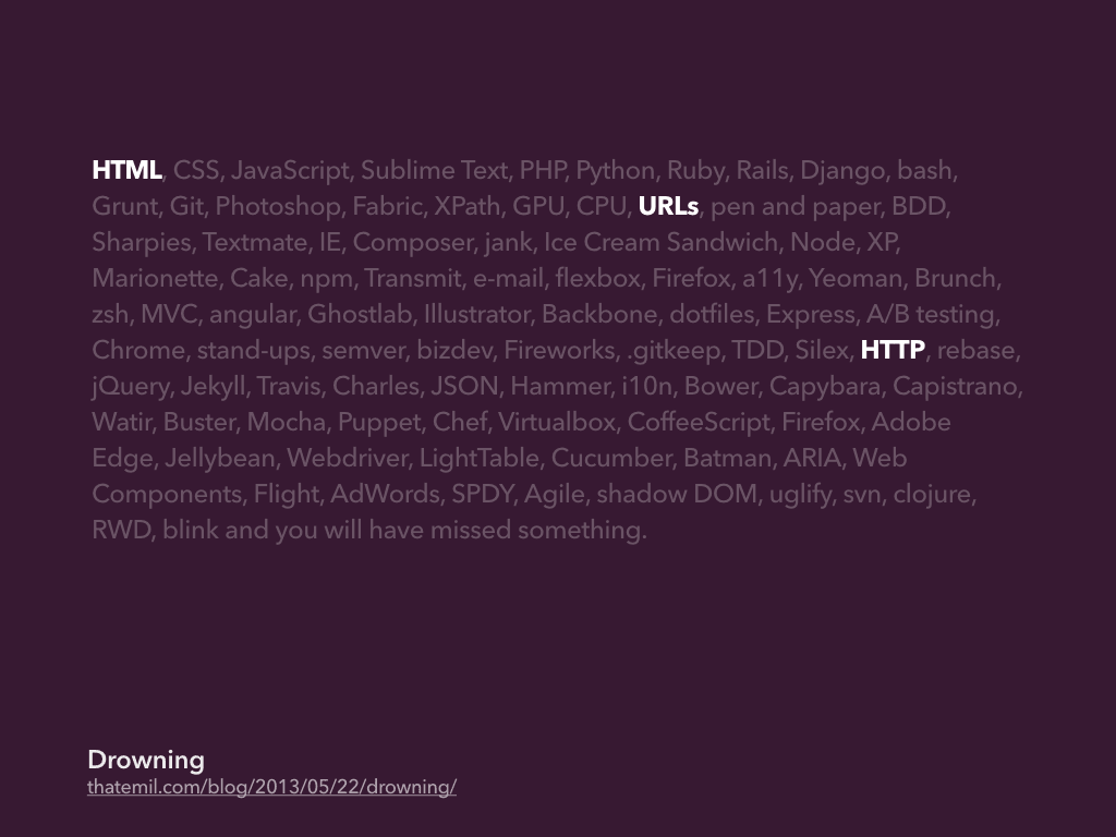
If you are new to the industry – or even if you are not – you should take time to properly understand the platform we are building upon. Learn how HTML helps us to structure content in a meaningful way, even when devoid of any presentation or behaviour. Think about how to construct human readable URLs. Recognise the difference between GET and POST HTTP request methods.
Understanding these basic components will not only make you a smarter developer, but it make it easier to spot technologies that will likely stick around.
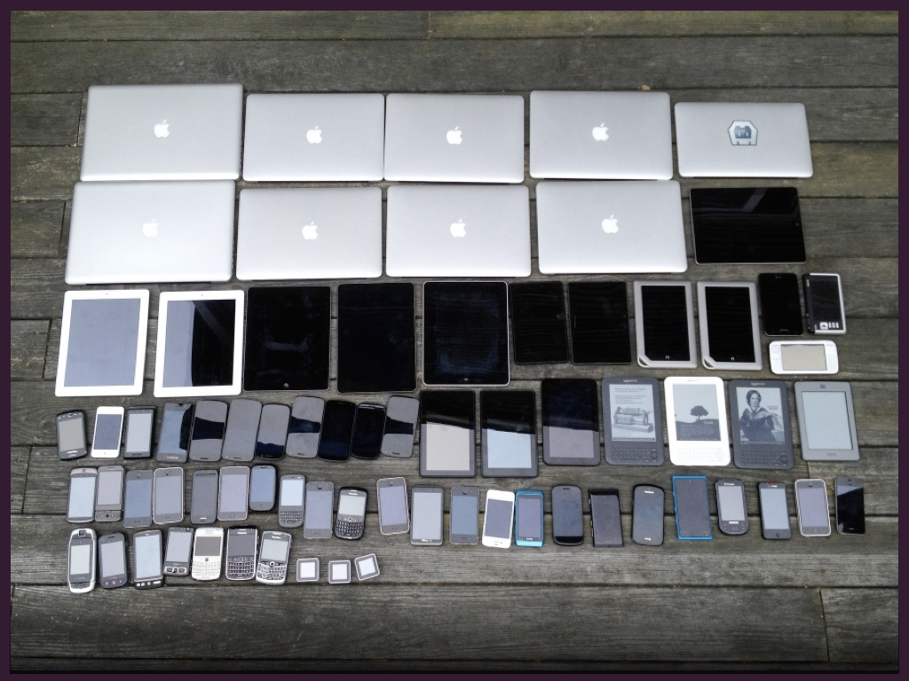
The move to web standards seemed like such an upheaval at the time, but it pales in comparison to the challenges we’re facing today. Back then, we had to support just a handful of browsers. Now our products need to work across a range of devices, each with different features and capabilities.
This photo shows just a subset of the devices we need to cater for. It doesn’t show a television, or any game consoles – who knows if we’ll soon be talking about web-enabled iWatches! Such is the range and diversity of connected devices, it’s senseless targeting a particular subset, particularly as user habits continue to change. Terms such as ‘mobile’, ‘tablet’ or ‘desktop’ have become almost meaningless.

Given this diversity, you would do well to understand progressive enhancement. Sometimes seen as making sure websites work when JavaScript is disabled, it’s actually about building robustness into our products. We need to ensure products can still be used if a user agent doesn’t support a certain feature, or if an unreliable connection has caused a script to stop working. Think of progressive enhancement like an escalator; if it breaks, it can still function as a flight of stairs.
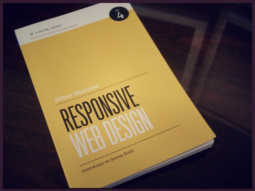
It is perhaps not surprising then, that many of our best practices are a flavour of progressive enhancement. Responsive web design – especially when coupled with a mobile-first approach – is essentially progressive enhancement for layout.
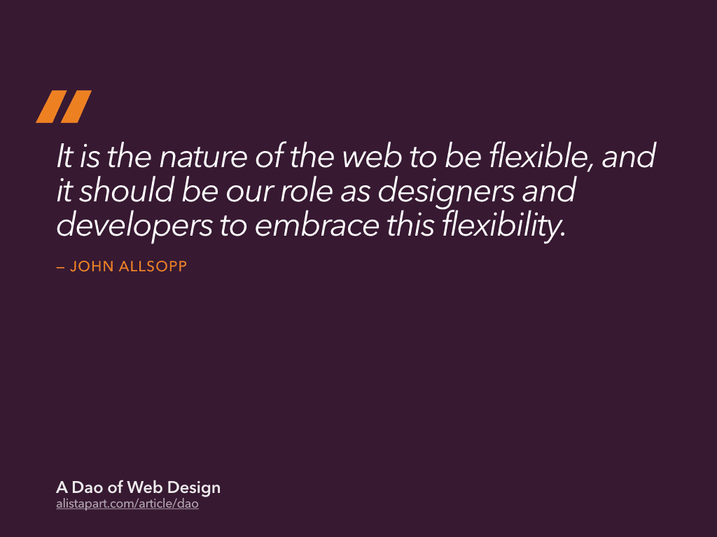
While responsive web design may seem like a trend or just another buzzword, the approach it advocates maps extremely well to the fluid and adaptable nature of the web. This is something John Allsopp wrote about thirteen years ago in A Dao of Web Design:
It is the nature of the web to be flexible, and it should be our role as designers and developers to embrace this flexibility.
It is our responsibility to understand the platform we are designing for, and pick the right tools for the job.

There are always those that fail to understand the web. They can be seen trying to make the web behave like something it isn’t. If you are trying to make a website behave like a print magazine or a native application for example, you are probably doing something wrong.
Yet, it feels like we are entering a period of enlightenment, a renaissance even! We have come to recognise the unique characteristics of the web, and in doing so, attempting to solve problems nobody has encountered before. I mean, how on earth do you design something that can be infinitely adaptable?
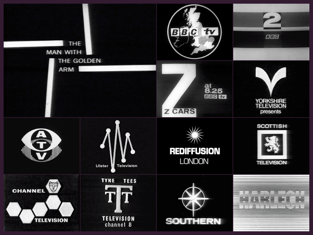
Although there a challenges specific to web design, there is much we can learn from other industries. For example, the issues we face are similar to those television graphic designers experienced during the mid-sixties. At that time, television was a crude medium; low-definition, black and white. Using high contrast illustrations and bold type, and influenced in part by optical and pop art fashion of the time, its designers arrived at an aesthetic suited to these limitations. We need to be thinking about the web in a similar way; what aesthetic approach is appropriate to the web?
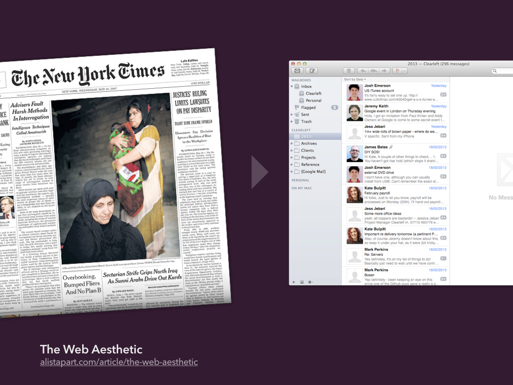
As we move away from trying to replicate print, I believe we are starting to see a shift towards interfaces influenced by native applications and other digital software. While our work is no longer constrained by the dimensions of the page, it remains constrained by the capabilities of the network; porous and unreliable as it often is. Websites need to be responsive both in terms of appearance and speed.
I was asked to speak to you tonight as someone working at the bleeding edge of the industry, but with only 15 minutes available, I can only scratch surface. It’s difficult to explain the myriad challenges and complexities we face as an industry in such a short space of time. I will be around for the rest of this evening, so if you would like to chat to me, please come and say hello. Before I finish, there is one thing you should know…
I don’t know how to design a website
At least, I don’t know if there is a right way – or if there ever will be. My process is ever changing. I make mistakes and change my mind. I’ve grown to feel comfortable with this state of unknowing, the constant reinvention of what I do. Because, if you think you know how to design a website, chances are, you probably don’t.