Undersold
Last week the John Lewis Partnership unveiled a new look for John Lewis and Waitrose, with the name of each chain to now be suffixed by ‘& Partners’, emphasising the organisation’s ownership model. Underwhelmed but what I initially saw, unbeknown to me at the time, this was another identity from a team at Pentagram to elicit an assured ‘meh’. Now, with more information available about the project, I shall turn the annoyance meter to ‘writing a blog post’ and explore what I dislike about it.
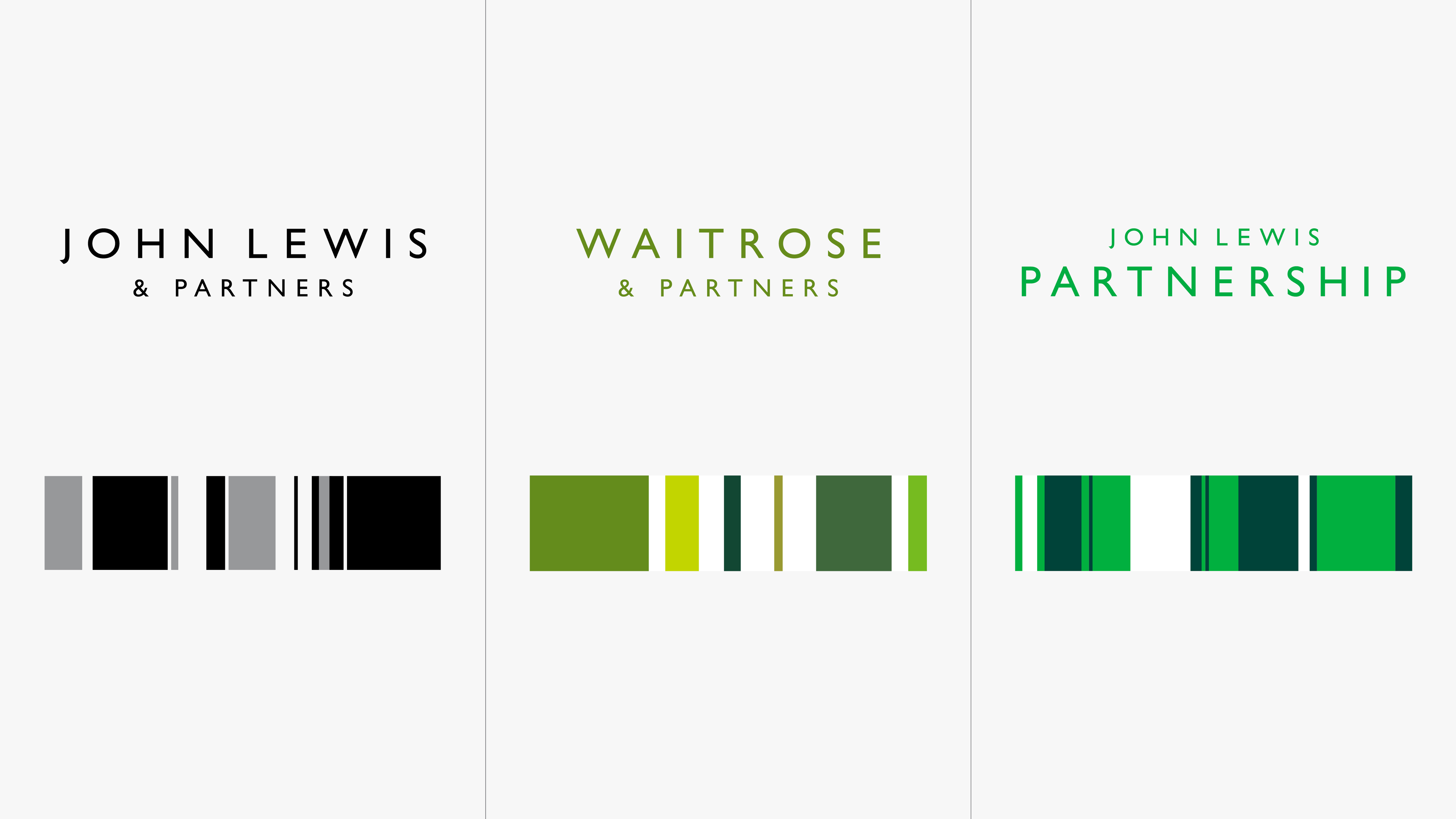
New logos and ‘brandlines’ for John Lewis, Waitrose and the Partnership. Image: Pentagram
Firstly, the naming strategy. Including ‘Partners’ in the store names seems like a smart move, although I wonder if this was backed up by research suggesting consumers are unaware that these stores are employee-owned. However, people will still refer to the stores by their shorthand, and adding additional words to the logo makes them less readable when reduced to smaller sizes. Given that on the day the rebrand was announced, it was discovered that 270 jobs were being cut, with more staff likely to be outsourced, the brand starts to attain a degree of hypocrisy.
Looking at the logos, I despair. Previously, each chain used a customised version of Gill Sans, with ascenders featuring angled cutoffs. The effect was to create something that felt familiar, but unique; timeless, yet modern. Retaining Gill Sans but rending the new names in uppercase is route one stuff; wholly unoriginal, and only serves to reduce their readability further. And when every other department store has slavishly adopted a monochrome colour palette, John Lewis sheds it’s dark green and follows suit. Never has an industry been so mundane in its collective approach to brand identity.
The ‘brandlines’ were inspired by a Peter Hatch pattern created for the John Lewis Partnership in the 1960s.
Lloyd Northover’s intriguing diagonal motif has been replaced by a new ‘Brandlines’ concept, inspired not by Spin’s idents for Channel 4 (1999-2004), but by the lively diamond pattern Peter Hatch created for the Partnership in the 1960s. This pattern remains engaging sixty years later, yet when turned into a series of vertical bars, the relationship is lost. Rather than enliven, these insipid lines suck the life out of everything they touch, not least the logos where they are used as holding shapes.
It’s easy to critique without context of course, and the more I look at this work the more it grows on me. Retaining Gill Sans and much of the previous colour palette means the ensuing brand is a fitting continuation of John Lewis’s rich brand history. But perhaps its partners would have better served had Pentagram retained aspects from the company’s more recent history, refining what already existed rather than adding more to the canon.