Shipped!
Given the obsessive compulsive behaviour I exhibit when it comes to tinkering with this website, I’ve started to question whether I have an addictive personality. In what has become a familiar pattern, having decided to embark on a redesign last February, I then spent the following 18 months iterating and iterating. During this period, other projects fell by the wayside as I got distracted by yet another feature addition, performance improvement or design detail.
This year’s Indie Web Camp in Brighton was the latest deadline I’d set for myself to launch the damn thing. Wanting to play with webmentions, and with Jeremy on hand to provide adequate peer pressure, this was the spur needed to push me across the finish line. What I launched felt pretty embarrassing, so I’ve spent last week revising and polishing to the point that I can finally say: “okay, you can look now”.

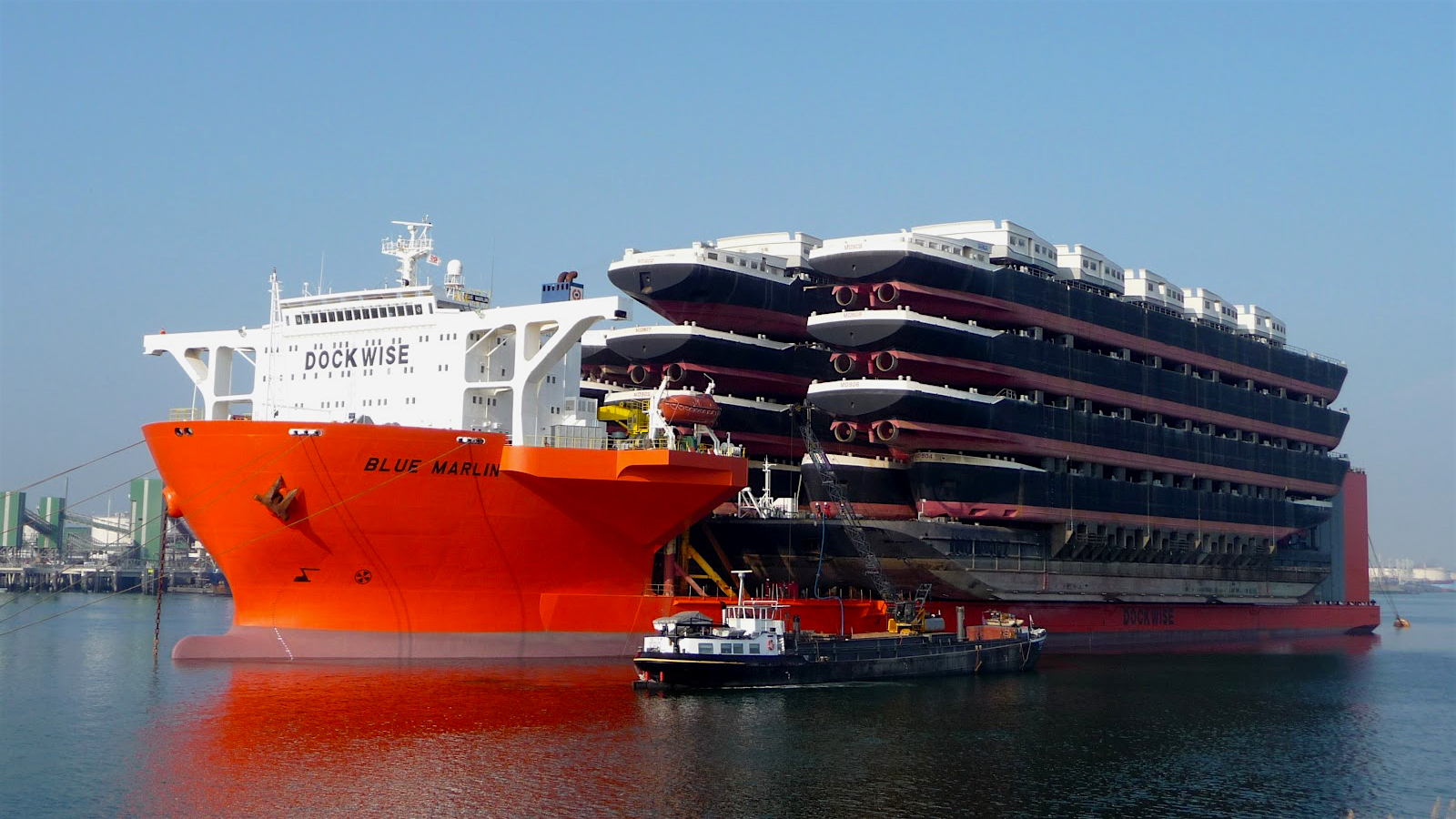
The MV Blue Marlin, a ship that can ship shipping ships
Moving on from Movable Type
The previous version of this site launched in July 2011, and while it’d seen many improvements over that time (not least in terms of performance), the publishing platform I was using – Movable Type – was burdensome: just publishing a new post meant rebuilding three different sections of the site. I’ve used Movable Type for almost a decade, but in that time the community has diminished and the product is no longer open source or designed for personal publishers.
One of the reasons I liked this platform however, was that it generated static pages. People used to laugh at this feature, but today static site generators are in vogue. After researching the many different options available, I decided to use Jekyll. Not only is this software actively developed, but I find it to be incredibly configurable and – once I get the hang of Ruby – infinitely hackable.
Since making this choice, Jekyll has matured considerably, and the team is not far from launching the next major version, Jekyll 3.0. All that’s missing is smarter pagination options and faster rebuild times; even with the new incremental generation feature, rebuilds can still sometimes take around 180 seconds.
A European flavour
While I briefly considered maintaining the previous design and just updating the CMS, a long list of accumulated grievances meant a new design became my preferred option.
I’ve radically simplified what I had before, placing particular emphasis on typography. A long time admirer of Kris Sowersby’s work, I’ve treated myself to a selection of his fonts: Tiempos Text is used for body copy and paired with Calibre for headings and titles. His foundry doesn’t provide WOFF 2.0 webfonts yet (a format that produces files ~30% smaller than WOFF 1.0), but hopefully that’ll change once this format gains wider adoption. Surprisingly, including both fonts in the same passage of text requires adjusting their relative sizes, leading to some pretty irksome CSS.
Ignoring for a moment their antipodean origin, these fonts hopefully give the design a more European flavour, one partly inspired by the many leaflets and brochures I’ve picked up on my travels across the continent.
I was keen to try using whitespace rather than horizontal rules to separate content, and have greater contrast in the type scale to indicate page hierarchy. Colour is restrained but no less subdued; purples and pinks being suitably hipster enough to satisfy current design trends. Oh, and I have a new logo… which I’m mildly ambivalent about, if I’m honest.


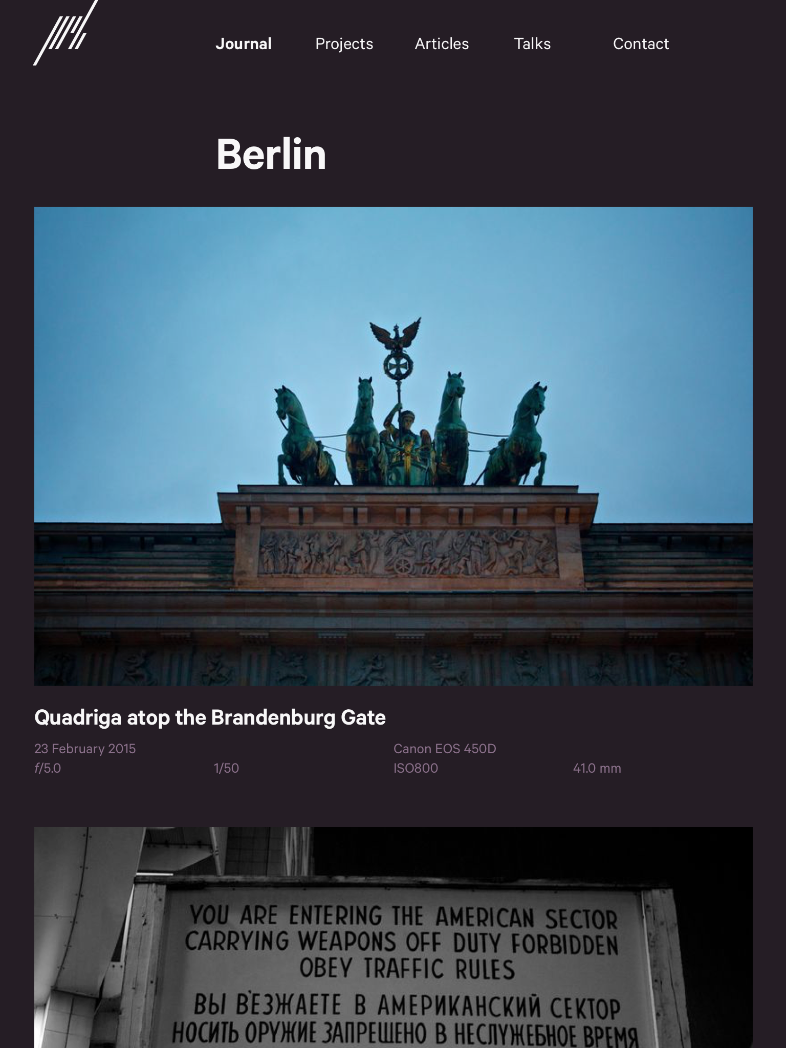
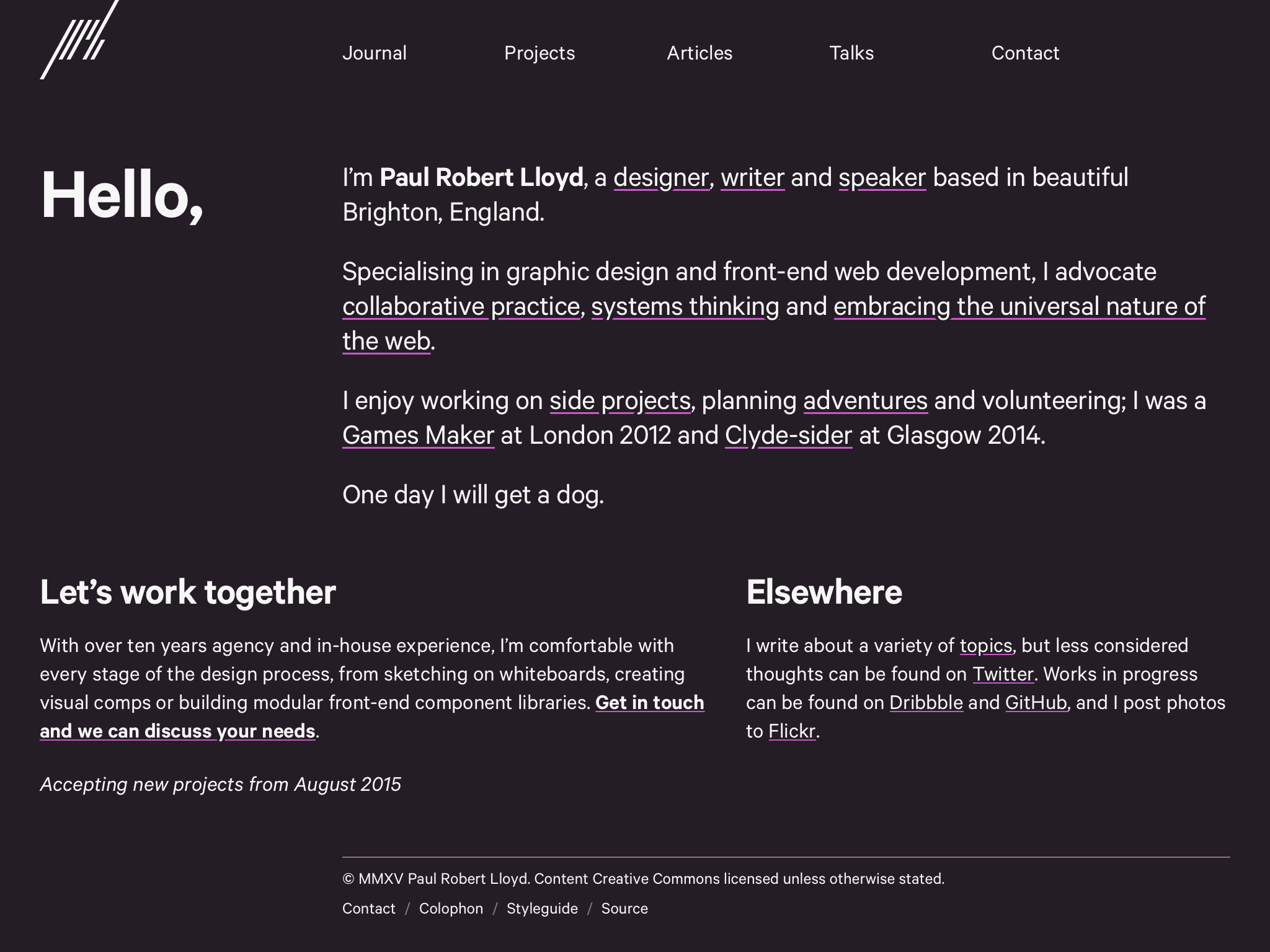
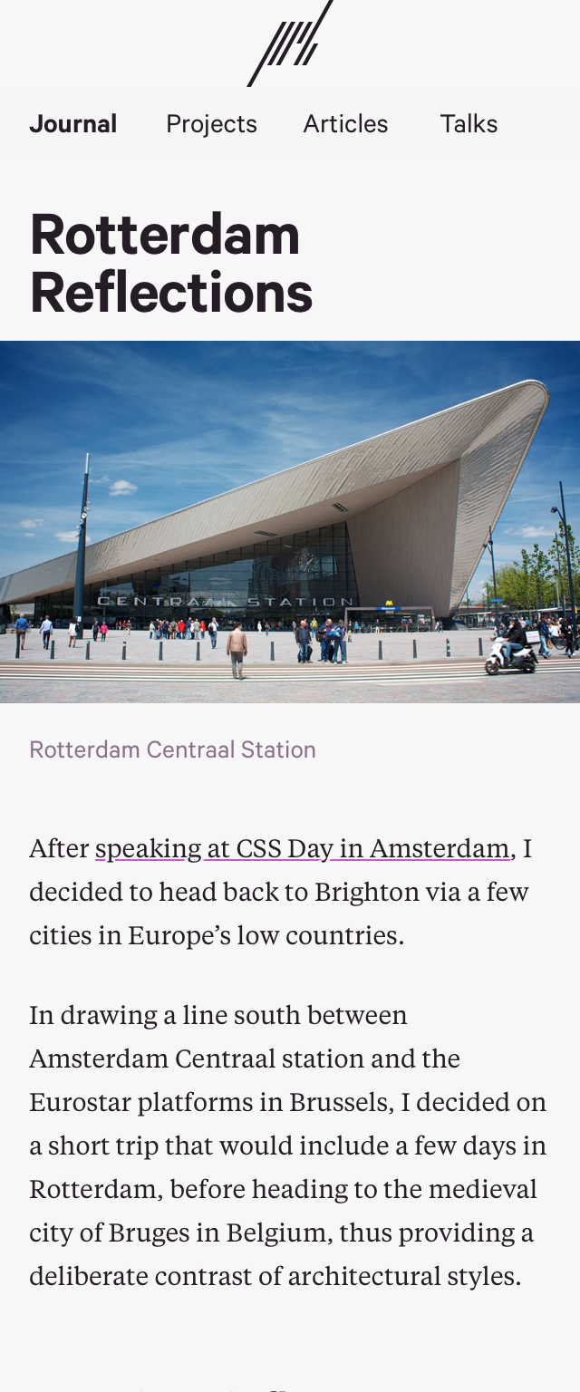
Design viewed on tablet and phone
Content first
Content has been a big focus of this redesign. With the help of Owen Gregory, project case studies have been completely rewritten. While they currently lack enough supporting artefacts, their revised copy better describes the underlying design process.
Since I’ve become a regular speaker, alongside a collection of published articles there’s now an archive of previous talks, too.
A combination of Jekyll plugins and Kramdown has enabled greater automation when writing: code examples are now syntax highlighted, different layouts are readily available for laying out photographs and I no longer need to manually markup footnotes.
I’ve also added support for photo galleries. Originally intended to form part of a dedicated photos section, for now these are listed alongside journal entries. Should I decide to move away from Flickr, this functionality may support the transfer of more photos away from that service, but for now, such posts will feature a selection of photos from a particular trip or event.
Comments
In the course of rebuilding this site, I read numerous articles that went something along the lines of: “I moved from WordPress to Jekyll, but as this doesn’t support comments I’m now using Disqus”. While Disqus is a quick and easy means of adding comments to a site, having a third-party host parts of my site wasn’t acceptable to me, nor was the JavaScript dependancy.
In what was a convoluted and time consuming process, I exported my comments from Movable Type and saved them as YAML files inside Jekyll’s _data folder. New comments can be accepted on a per post basis, but this involves little more than providing readers with a dedicated e-mail address, while publishing a comment requires adding and/or updating a YAML file. This process could be automated, but seeing as I rarely accept comments anymore, it seemed like wasted effort. Besides, webmentions (once I’ve added support for them) should plug the gap.
Site archives
As part of the transfer of content from Movable Type to Jekyll, I undertook an audit of URLs, in particular the location of archived versions of this site. For a long time I considered moving every piece of content that appeared on my previous site (‘LloydyWeb’, cringe) over to this domain, but in doing so, found myself rewriting content – rewriting history, almost.
In the end I decided that the archive for paulrobertlloyd.com should extend back to when I moved to this domain (and not include earlier entries as had been done previously), while content originally published on LloydyWeb should be available at lloydyweb.paulrobertlloyd.com. For those interested, these URLs cover the following periods:
- https://paulrobertlloyd.com – September 2008 - present
- http://v2.paulrobertlloyd.com – July 2004 - July 2015
- http://v1.paulrobertlloyd.com – July 2004 - June 2011
- http://lloydyweb.paulrobertlloyd.com – July 1999 - December 2007
Everything else
Those are the headline features, but there are a number of other notable changes as well:
-
Pages are now served over a secure HTTPS connection. I wrote about this and the possible downsides, earlier in the year.
-
Since I’m serving static pages, I decided to give nginx a whirl. Goodbye
.htaccess! -
The code for this site is now versioned, and better still, publicly available on GitHub. If you spot any issues, please let me know.
-
Following on from the excellent article by the folks over at Filament Group, I’m now loading web fonts asynchronously using FontFaceObserver. Hopefully this means no blank pages while webfonts are downloading.
-
Following current best practice for pages served over HTTP/1, critical CSS is inlined on initial page load.
-
Responsive images are used throughout the site, thanks to the new
srcsetsyntax, the Picturefill polyfill and a heavily customised version of the jekyll-picture-tag plugin (which I hope to contribute changes to at some point). -
Related to the previous point, high resolution images are stored alongside other site assets, and can be converted and scaled server-side using Converjon.
-
Microformats have returned, as I make my website more indie web friendly.
-
Support for Twitter cards.
-
Using a cookie-less domain for YouTube embeds.
-
Credits and attribution links added to photos, where relevant and possible.
-
Ability to link related posts together as a series (particularly useful for travelogues).
-
A more extensive style guide providing details of the component and utility styles used to build pages.
There’s much more I wish to do, but for my own sanity, it’s probably best I take some time out before embarking on adding more features. Topping that list includes adding visual examples to case study pages, providing full support for webmentions and animated transitions. All in good time.
Thanks
I should mention those who have helped and inspired me on this long journey. Owen Gregory deserves credit for supplying his editing chops, not least for ensuring I avoided using phrases like ‘the final solution’. Sites built by Dan Eden, Jason Garber, Mark Trapp (who built an early archive plugin) provided numerous ideas for how I could use Jekyll to its fullest. Alfred Xing also answered my request for an official archive plugin for Jekyll.
Matthias Vogelgesang’s excellent research on how to use Kramdown with Pygments (a long standing issue with Jekyll) lead me to release my first Ruby Gem… made instantly redundant once the issue was resolved.
Finally, a huge thank-you to the team working tirelessly on Jekyll, led by Parker Moore. Here’s to just as much shipping of Jekyll as there is me hacking upon it.