Jake Archibald: Building SVGO’s Missing GUI
Having spent many hours simplifying, optimising and minifying SVGs, typically using a combination of tools and services, I was overjoyed to learn that Jake Archibald had taken it upon himself to build a web-based interface atop SVGO.
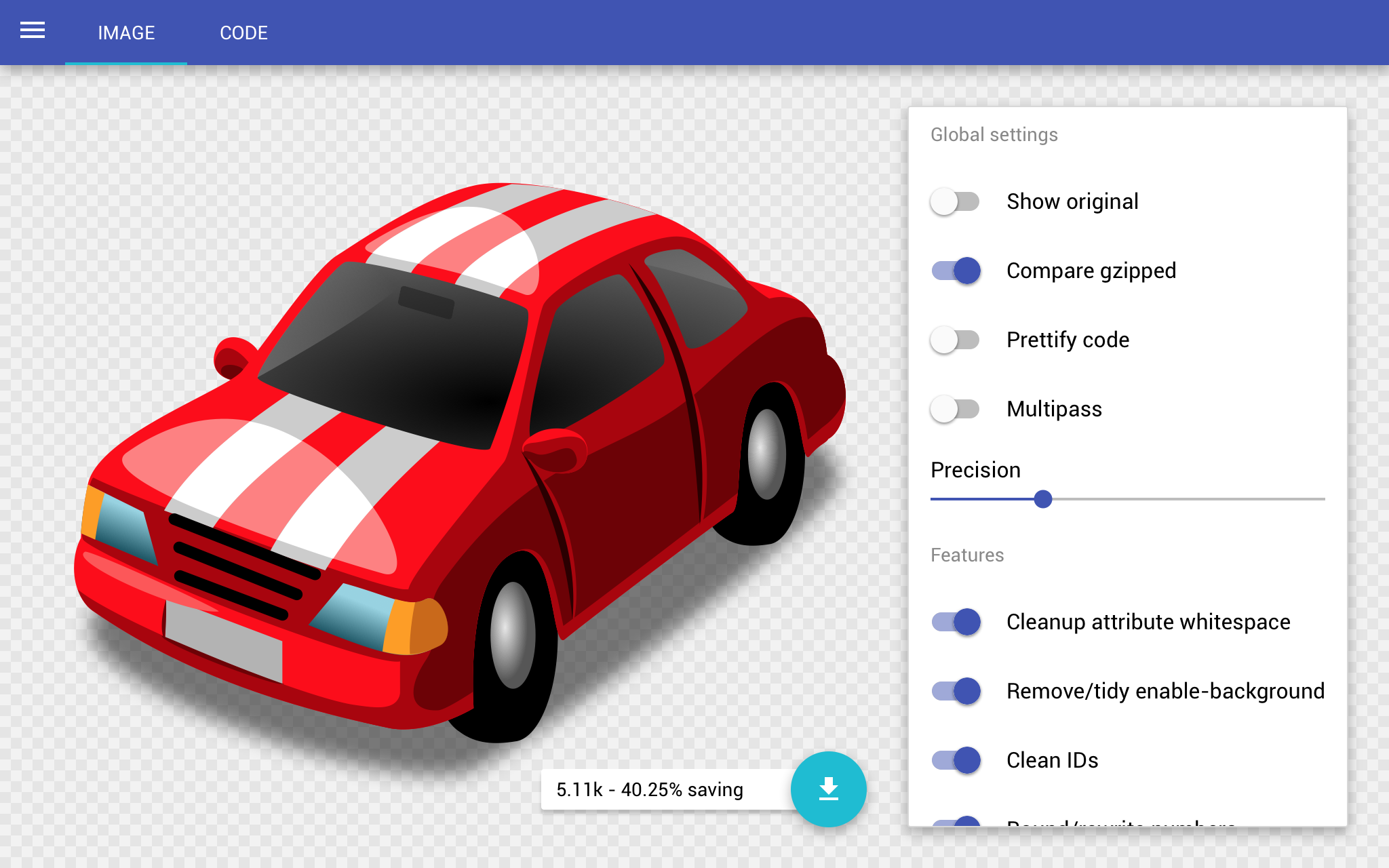
SVGOMG is easy to use and surfaces the range of optimisation options offered by SVGO. But beyond the obvious utility, it stands out as an example of how to build a ‘web app’ (whatever that means) in a responsible and accessible way. I asked Jake a few questions about how he went about designing and developing this application.

SVGOMG is easy to use and surfaces the range of optimisation options offered by SVGO
Paul Lloyd: SVGOMG has a truly native app feel. What obstacles did you overcome (if any) to make it work seamlessly on the web?
Jake Archibald: It was easier than I expected, but I think I was expecting it to be impossible. I was surprised at how much I used flexbox, and how stable it is across modern browsers. Pretty much all of the layout is flexbox driven.
All the heavy lifting, such as SVG parsing and minification, happens in web workers, so the UI stays responsive. But the rule for runtime performance is still “if you paint, you lose”, so I had to spend time ensuring everything that moved had its own GPU layer and used simple transforms. There’s one downside to this, if you zoom the SVG preview in Chrome/Safari you start to see pixels. Still looking for a way to fix this that doesn’t kill performance.
I developed entirely in Chrome (disclaimer: I work at Google), then bug fixed in other browsers afterwards. Firefox pretty much worked straight away, in fact the issues were mostly down to stricter spec compliance. IE was okay, the bugs were mainly in newer and lesser used features such as blob URLs. The biggest disappointment was Safari.
I was shocked how much hacking Safari needed to get basic features working. Smooth scrolling within an element still needs a custom property, which will simply stop working when combined with other properties like CSS animations. Every tap in iOS Safari comes with a 300ms delay. You can work around this with Fastclick, but even the authors admit it’s a hack. I also found that features like IndexedDB disappear if the site is launched from a home screen icon. I hope Apple step up their game here!
PL: One of the most pleasing features of the app is how it adapts to different screen sizes. Did you make any adaptions to your initial design/concept to achieve this?
JA: I’m terrible at design. I don’t know what I’m doing. I really don’t. [Google’s] Material Design helped me a lot by telling me what to do. In the cases where Material Design didn’t have rules, I spent a long time sketching and throwing stuff out.
Unlike a lot of apps, the settings need to be visible alongside the output. It’s kinda tough to fit it all in on mobile, but I decided to split the output almost 50/50. The settings go at the bottom of the screen so you don’t cover the output with your hand while interacting.
PL: What progressive enhancement techniques and approaches did you use to ensure the widest possible usage for the app?
JA: In terms of features, there are a couple of polyfills that are brought in dynamically for the browsers that need them. IE needs a Promise polyfill, Safari needs Fastclick.
I stuck to enhancing existing browser features rather than reinventing anything. The switches are all checkboxes underneath, styled using <label>s. I couldn’t style <input type="range"> how I wanted, so it’s just a series of divs, but there’s a real range input overlaid at opacity: 0, so you interact (with keyboard, mouse or touch) with the real thing, but the <div>s listen to events and provide the visual output.
I thought about making the site work without JS by doing the SVG work on the server, but this would be slow and a maintenance burden. I’m a strong believer in progressive enhancement, but also that each phase of the enhancement needs a user. Working without JS benefits older browsers, but as a site targeted at developers I figured I could safely leave older browsers behind.
PL: You are a big proponent of web performance. What steps did you take to make the app feel speedy?
JA: Although I have no intention of making the site work without JS, I still render before JS is available. In fact, it gets to first render with only 5k of HTML with some inlined CSS and SVG, the main scripts and CSS are all loaded in the background. This means the site appears to load in 1.5s even on 3G with an empty cache, and most of that is DNS and SSL.
The opening screen is really simple, so doing that in 5k wasn’t a challenge. It really bothers me that so many sites wait on JS for their first render, some even require their JS to make further requests before rendering. This pushes 3G render time towards 10s – as a mobile user I know I wouldn’t put up with that.
The main JS is 15k, but doesn’t include the parts that parse and minify the SVG, that’s loaded as an extra phase in the background. It’s great because interactivity lands really quickly, and the user doesn’t notice the extra loading. If the user manages to select an SVG before that script is available, the loading of that script appears to be part of the processing time.
I also used ServiceWorker to make the whole thing work offline. Working offline is a pretty cool feature, but I’m mostly doing it for performance. Subsequent visits to SVGOMG render almost instantly, whatever connection the user has. Given the variations in mobile connectivity, that’s really valuable!