British Government Identity, Revisited
Recently linked to from Brand New, Regierungen und ihre visuellen identitäten (Governments and their visual identities, the original article is in German) compares the visual identities of six European governments. Achim Schaffrinna:
On one side are the governments of Germany, the Netherlands and Great Britain, which give the impression of unity owing to standardised identities, on the other side Austria and Poland, whose logos act like a multi-coloured heap. France is somewhere in between.
(Excuse the poor translation.)
That the British government stands among those countries with a unified system brings me great joy, as you will know if you read my 2009 entry bemoaning the lack of such co-ordination. Since my wish has been granted, Achim’s article reminded me that I should probably provide a follow up.
Wishful thinking
In my original post I imagined what a unified identity for HM Government, its departments and agencies might look like:
Maintaining the coat of arms is probably a requirement for any future identity work, although it requires simplification; it clearly doesn’t resize well or reproduce cleanly enough on screen. While Gill Sans is often considered the de facto font for anything British, I would love to see a custom typeface designed in the same vein as that for the Dutch government.
Seeing the identity now in use, we can see that I was at least half right:

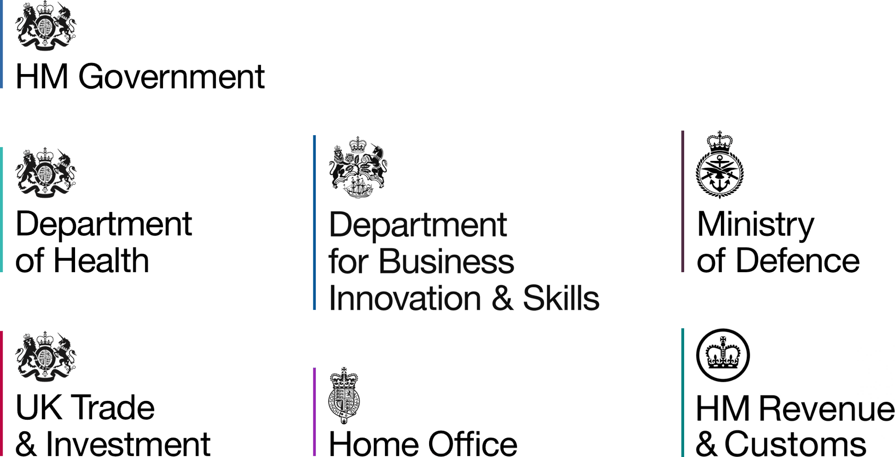
Logos for HM Government, Department of Health, UK Trade & Investment, Department for Business Innovation & Skills, the Home Office, Ministry of Defence and HM Revenue & Customs
Most departments use the royal coat of arms, however historic crests and symbols have been retained by certain organisations. While this might go against the notion of a single identity, I like that, in part, it represents the sometimes archaic nature of our democracy and its formation; for example the Department for Business Innovation and Skills can trace its origins to the Board of Trade, a committee of the Privy Council.
Each department maintains a degree of autonomy by using a different coloured bar to the left of the mark, typically derived from a previous logo. Some may wonder why, like say in Germany or Spain, the colours of the national flag haven’t been incorporated. Again, due to the nature of this country’s governance (some departments have jurisdiction over only certain parts of the Union; education and health are devolved matters for example), such a design would be misleading.
Rule, Helvetia!
With little room for manoeuvre over iconography or colour, the remaining aspect of the identity to which some creativity could be applied is around the choice of type. While I may have been optimistic in hoping for a custom typeface to be commissioned (a time consuming and expensive proposition), I can’t help feeling anything but massively underwhelmed by the choice of Helvetica.
A simplistic argument might suggest that a Swiss typeface is inappropriate for an exclusively British identity (cough). Instead, rather than the typeface’s origin – which given its ubiquity is lost on most anyway – it’s the neutrality of this face that concerns me most, especially given the already unremarkable lock-up. While I accept that Helvetica’s utilitarian appearance may be appropriate for government, this identity should also convey something about the nature of the country being governed, too.
The typeface chosen for the project that necessitated the need for a unified identity, GOV.UK, uses a typeface that would fit the bill perfectly: Transport. Quintessentially British, this font was originally designed for use on the new road signage developed by Jock Kinneir and Margaret Calvert in the early 1960s. In fact, GDS worked with Margaret Calvert and Henrik Kubel to produce an updated version, New Transport, which includes additional weights and optimisations for screen.
While Transport shares a similar ubiquity to that of Helvetica, it does so in a way that’s unique to this country and its urban landscape.
Perhaps this mismatch is merely the result of poor co-ordination between different projects, timescales and stakeholders. Or maybe there was a desire to use a typeface already installed on the computer of every civil servant.
That the logo for GOV.UK, originally set in Gill Sans, now uses Transport is evidence that nothing is set in stone. I’m sure that as GOV.UK grows to encompass every facet of government, Transport will become the de facto font face of state. Perhaps only then will Helvetica be supplanted, and I can write another blog post thanking civil servants for fulfilling a (design-related) wish.