Visual Design Explorations
Since Mikey joined us in February, the number of designers working at Clearleft is at an all time high. As the company grows, we want to maintain the same level of knowledge sharing and collaboration that happened more spontaneously with a smaller team.
With that in mind, we’ve been experimenting with weekly design reviews (almost) every Friday. Scheduled just before lunch, rumbling stomachs ensure these don’t drag on. After saving examples of our work to a shared Dropbox folder, Me, James, Jon and Mikey sit around the television screen, taking it in turns to talk about what we’ve been working on, problems we’ve encountered, and any new tools or techniques we’ve discovered. This takes place in an open part of the office, and anyone is free to attend.
I’m finding these review sessions immensely rewarding; it’s a great way of gaining a better insight into how each of us works. A few weeks ago I shared my findings of using Sketch as a replacement for Fireworks. I love it, but think I’ve got some work to do before convincing the others to switch.
As a number of new projects have kicked-off recently, and with my own thoughts turning to the design of this year’s dConstruct website, much of today’s discussion was about our initial design explorations. In turn, we looked at tools and techniques that can help us do this, weighing up the pros and cons of each.
Mood boards

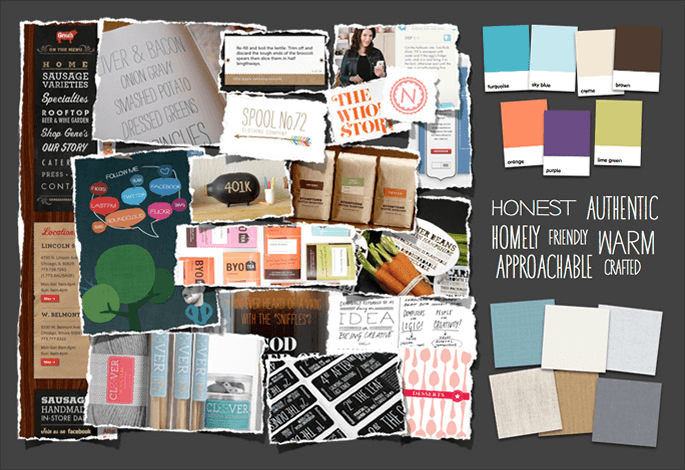
Mood board for Family Nest
A tool typically used by interior designers, mood boards can be a great way of exploring different thematic approaches and stylistic treatments. These can be put together really quickly, as much of their content is sourced from existing work. They can be created digitally or simply by cutting up magazines and other print work and sticking them to some card.
We tend to use mood boards when there’s not a sense of any brand positioning or identity. However, they can feel quite removed from the web; when clients are eager to see something more relevant to the final outcome, presenting these becomes tricky.
Style tiles

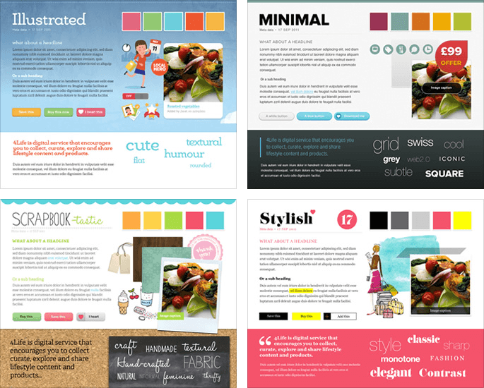
Style tiles for Channel 4 Scrapbook
Style tiles are intended to fall somewhere between mood boards and full mockups or comps. Devised by Samantha Warren, she describes them as:
…a common visual language between the designers and the stakeholders and provide a catalyst for discussions around the preferences and goals of the client.
We used these on a few projects last year, and love how this process puts an emphasis on involving clients in the design process.
We’ve found aligning visual design with words that evoke emotions relevant to a particular style really helpful. Style tiles also help us think about how particular design elements may appear on the final site, without committing to a layout—something we need to bare in mind given there’s no canonical layout.
Although unintentional, style tiles have started to feel a little too prescriptive (maybe even ‘productised’), raising interesting questions about how processes are best shared within the community. That said, the style tiles website is a great resource for anyone looking to instigate a more collaborative process with their clients.
Element collages

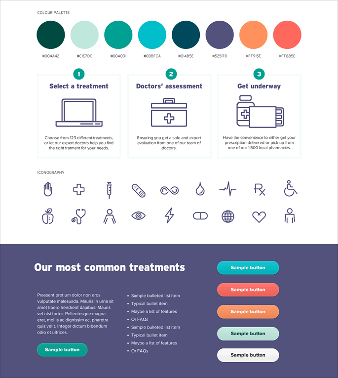
Element collage for a current project
Recently we’ve been using something a bit more akin to element collages, which Dan Mall wrote about last year:
An element collage allows me to document a thought at any state of realization and move on to the next.
Although we want to be careful not to get to drawn into designing particular layouts, we also need to make sure we’re not ignoring the relative positioning of elements and overall visual hierarchies, which become more important as a viewport increases.
Jon has been using this approach as he explores the design direction and overall brand positioning for Fine+Rare. He soon realised that by presenting these elements together vertically, some stakeholders mistook the output for a web page. He is now using a long, wide horizontal canvas to mitigate against this. He’s also scaling up certain elements, so that the discussion revolves around the overall visual aesthetic, rather than the pixel precision and font sizing of certain components.
This elemental approach can also set the scene for later design phases, where we start to think more about individual patterns.
The right tool for the job
Regardless of any particular process or tool we may choose, it’s interesting to note that our visual design explorations are now happening alongside the research and ideation phases undertaken by our UX colleagues. Having front-end developers be part of the same conversation, helps massively too.
As we continue to review our processes to ensure they better reflect the unpredictable nature of the web, we’re finding that our processes are becoming less predictable too.
While striving to create engaging and enticing visual designs that delight users, we also have to think about how these early explorations are communicated with our clients. Any process needs to acknowledge the relative design literacy of project stakeholders, ensuring the correct expectations are set early and that everyone is comfortable with the messy process of designing a website.
This entry originally appeared on the Clearleft blog