The Web Aesthetic

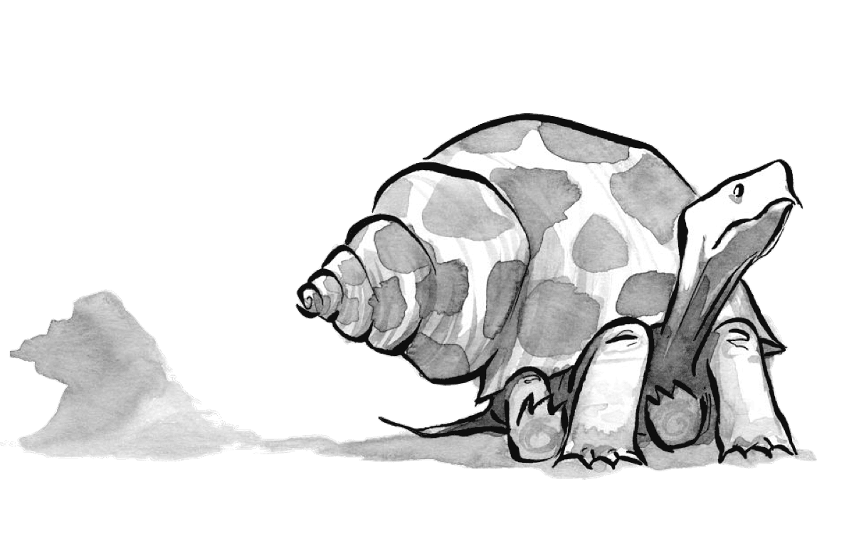
Illustration: Kevin Cornell for A List Apart
At the beginning of this year I was struck by a realisation, prompted in part by the discussions around responsive images but also the artistic ingenuity of the image optimisation techniques being used by Jeremy. If the capabilities of a medium can dictate how we design for it, how might the visual aesthetic of the web change if we were to acknowledge its nature and embrace its constraints?
Shortly afterwards, and with eerie coincidence, Anna introduced me to Rose Weisburd, who was looking for writers for A List Apart. Nine months later, and after many weekends hunched over my laptop in coffee shops around Brighton, I can now point to an article authored by me on this esteemed publication: The Web Aesthetic. From the introduction:
Today, when every device begs to be connected, it has become easier – almost necessary – to accept the adaptable nature of the web. Responsive web design is an emerging best practice, and our layouts are becoming more flexible. But often, innovation is focused on technical implementations while the visual aesthetic remains ignored. To put it another way, we’re embracing “responsive” but neglecting the second part: “design.” Now is the time to seek out an aesthetic that is truer to the medium.
Like many great endeavours, this wouldn’t have been possible without the assistance of others. Rose encouraged me to flesh out some of my earlier thoughts while Sara Wachter-Boettcher helped me hone the resulting words into something more readable. Jeffrey Zeldman contributed a few ideas too. I’m also indebted to my colleagues at Clearleft, whose wise council allowed me to formulate and evaluate these ideas in the first place.
Reaction
Beyond having an article published in A List Apart, it’s been incredibly fun reading the responses to it. Not only were these thoughtful and largely supportive, but some even expanded on my initial premise.
David Bushell’s flattering follow-up post touched on an aspect of the web I was unable to cram into an already wide-ranging article:
Perhaps the mistakes made time and time again in website design are not due to ignorance but to the fact that the medium is inadequate for what is being asked of it?
Or on the contrary, as Paul suggests and I’m inclined to agree, perhaps we’re asking too much to begin with. Instead of trying to shape the web into something it’s not we should instead identify the true “web aesthetic”. When we try to achieve this however, we are faced with an uneasy truth; the web changes as much as it remains the same.
Others pointed me to a piece by Allan Grinshtein. Contributing to the ongoing debate regarding skeuomorphic design, he wondered whether a flat design aesthetic was more suited to the web. His thoughts echoed mine:
Designing for the web is the most rewarding when we can create solutions that are custom fit for the problem. We borrow metaphors from physical objects but we refrain from copying. Copying inevitably introduces unwanted design problems, and the better the copy the bigger the problems.
Justin Reynolds provided a wonderful summary of both my article and the companion piece written by Dave Rupert: Mo’ Pixels Mo’ Problems. Drawing connections between the two, he concluded:
As so often with seemingly insoluble problems the difficulties are of our own making: we already know the solution, it’s just that we persist in refusing to acknowledge what’s already in front us.
Or, as Dave suggested in his own article:
Just use your brain. I’m not sure our industry says this often enough. You’re smart, you make the internet, and you can make good decisions. Pay attention to your craft, weigh the good against the bad, and check your assumptions as you go.
The advent of responsive design has forced us to reassess many long held assumptions. Perhaps that’s why now is such an exciting time to be a web designer.