Material Thinking

Olympic Cauldron design by Heatherwick Studio
Earlier this month, Team Clearleft headed up to London for a day of design related exhibitions: Bauhaus: Art as Life at the Barbican and (after a ride across the city on a ‘Boris Bike’) British Design 1948-2012 and Heatherwick Studio: Designing the Extraordinary at the V&A. I spent a considerable amount of time taking in each word and every example of work. Inspiration was to be found in abundance; no doubt exaggerated by the euphoria of the Olympics and an opening ceremony that showed Britain at its creative best.
Heatherwick Studio
The centrepiece of the games was the highly original and beautifully symbolic Olympic Cauldron, so I was excited to see the scale model featured in the Heatherwick exhibit. Until this point, I hadn’t made the link between this studio, lead by Thomas Heatherwick, and other objects I’ve long admired. From East Beach Cafe in Littlehampton to the UK Pavilion at the Shanghai Expo; from London’s new bus to the short-lived B of the Bang sculpture in Manchester, this small studio is responsible for a huge range of wonderfully imaginative creations.

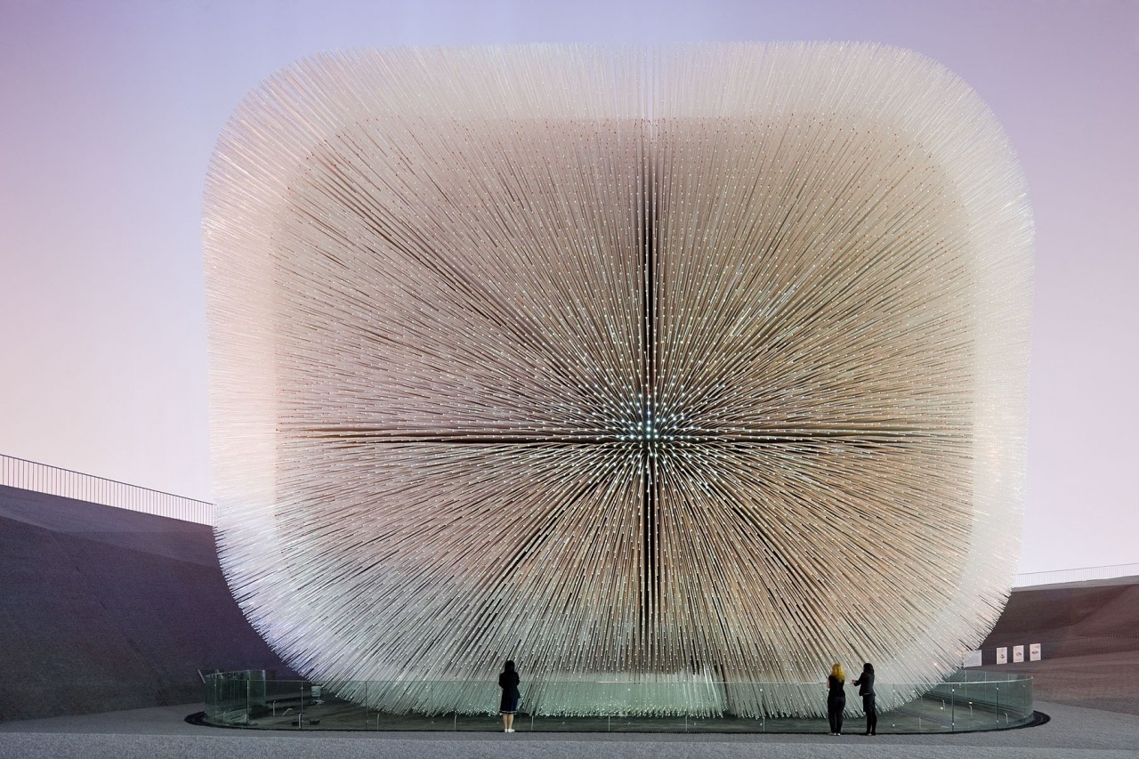
The UK ‘Seed Cathedral’ Pavilion for the Shanghai Expo held in 2010
Their work feels futuristic yet timeless; from bridges that roll up into themselves, doors without hinges to molecular structures suspended in the air; every piece oddly coherent with nature. The sense of care and craft is also hard to ignore.
Much of this has evolved from a deep understanding of the materials being used; learning how far they can be pushed or discovering ways they can be combined. In fact, many projects were the result of such research, conducted separately without any project in mind.
The materials of the web
It wasn’t difficult to find parallels between the work of this studio and the practice of web design. Recently I’ve been thinking about the need to better understand how the web works and behaves; how it’s constructed and the principles that should be respected, before we can truly design for it. As such, this exhibition was instructive viewing.
It seems we’re increasingly ignoring the underlying characteristics of the web as we rush to build products, often from the top down. I’ve seen countless examples where content exists only in JavaScript; remove that capability from a device and the experience falls apart. Such is the adaptability of the medium, there’s also a temptation to mimic the look and behaviour of other platforms, yet this produces forms that feel distinctly out of place.
The advent of responsive design has forced us to revisit existing assumptions, to think about what the web is and how we should design for it. Deep down, we always knew linear workflows and static image comps weren’t suited to this messy, unpredictable and ever changing medium, but only now are these realities becoming harder to ignore.
We’re at a turning point in the development of our profession. Just as the true nature of the web is being reaffirmed, so too is the desire to focus on the latest technology and trends. Yet now is the time to re-engage with the medium; to understand its strengths and weaknesses; where it might break if pushed too far. To think about its natural attributes and how we might take advantage of them.
With this in mind, I’m proposing a talk for next year’s SXSW Interactive conference called Web Native Design.
This will be an evolution of previous talks I’ve given, but given the desire to better understand the technical underpinnings of the web, I’ve invited my former colleague, Andy Hume, to contribute as well. There is often talk of greater collaboration needed between designers and developers, and this presentation will aim to make that real.
Rather than talk about responsive web design, we thought it would be useful to take a step back, and actually talk about why such an approach makes sense in the first place. We’ll look at the pieces that comprise the web – HTTP (the how), URLs (the where) and HTML (the what) – and talk about how we can utilise them to build solid web products that are future friendly. We’ll also look at how the web aesthetic might change should we consider the needs of the platform.
It might be a bit hand-wavy in places, but we hope it will be one of the more useful talks you’ll see at next year’s SXSW – it could even reframe the other talks you might see. If you like the sound of that, then please vote for Web Native Design on the SXSW Panelpicker.