Flipping The Bird
With a worsening financial crisis and continued destruction of the world’s natural resources, there are undoubtedly more important things to worry about than Twitter’s slightly tweaked bird logo. Yet here we are.

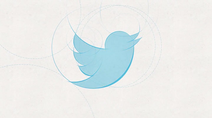
The new Twitter logo
Ironically, I’ve only written this post due to the restrictive nature of Twitter. While the 140 character limit is reason for the service’s popularity, all too often it encourages users to post pithy tweets, me included. Indeed, I’m finding Twitter to be a platform that increasingly stimulates egocentric behaviour: follower counts and the highlighting of ‘interactions’ just two examples. These exist to encourage more tweeting of course, for apparently there’s value in pith. If you’re not paying, you’re the product being sold, repeat until fade. I digress.
Twitter has a new logo. Doug Bowman, Twitter’s Creative Director, provides the introduction:
Our new bird grows out of love for ornithology, design within creative constraints, and simple geometry. This bird is crafted purely from three sets of overlapping circles – similar to how your networks, interests and ideas connect and intersect with peers and friends. Whether soaring high above the earth to take in a broad view, or flocking with other birds to achieve a common purpose, a bird in flight is the ultimate representation of freedom, hope and limitless possibility.
Oh, please.
Unable to resist the urge to draw circles and lines over a design, such silliness now comes with added PR spin. If there’s one thing that irritates me about rebranding exercises, it’s ascribing values – of which there are always three – to a logo, after the fact.
Only if you ignore the flowery introduction and read Bowman’s responses to questions about the change, do you discover more meaningful motivations. For example, the angle of the bird not only gives the logo a more optimistic feel, but it also fills a square better (a problem I’m far too familiar with). The redrawing allows for better downsizing too, apparently.
Still, where the previous logo had character and charm (the quiff was a beautiful touch), this revision perhaps better reflects the company as it stands today: slicker, more corporate, and balding. No place is this better reflected than in the company’s stringent new ‘Trademark and Content Display Policy’, for which Gawker provides a helpful summary:

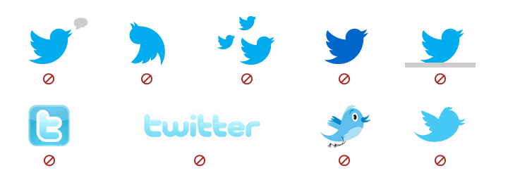
Twitter bird usage guidelines
Per the illustration, you absolutely cannot:
- add a gray speech bubble next to the bird that makes it appear as if the bird is talking or smoking hookah
- make the bird be upside down
- reunite the bird with his bird family
- change the bird to a better color
- give the bird a small gray ledge on which to perch
- transform the bird into a bubble letter “t” or the word “twitter”
- give the bird eyes and legs and a song in his heart
- make the bird look the way he used to even though no one would notice
You must also use the right blue, yet nowhere is the value of this colour stated. I’m all for providing brand guidelines (Dribbble provide a great example) but push too hard, and you risk coming across as overly controlling or even litigious.
Over on Brand New, Armin Vit notes a far bigger change:
The real story here is that Twitter has dropped its name from the logo. Twitter has achieved in less than six years what Nike, Apple, and Target took decades to do: To be recognizable without a name, just an icon.
Really? I’d suggest the opposite is true. Surely part of this exercise is an attempt to reclaim a brand the company has lost ownership of – mainly through earlier light touch policies regarding use of their identity and API. I’ve lost count how many times I’ve seen Twitter represented by a glossy letter ‘t’ icon, one that predictably follows a more appropriate icon for Facebook. It would seem that banishing the wordmark was the only weapon left in their arsenal. How else could they persuade brands to stop using an icon that’s no longer relevant?
While not immediately enamoured by the logo, I’m sure I’ll warm to it over time. By which point, it’ll be updated again. With over $1 billion in venture funding, Twitter is getting good at spending other people’s money.