Kiwibank: Standing Up for Something New
Banks aren’t the most likeable organisations, but I’m developing a soft spot for Kiwibank, a New Zealand-based bank competing against larger Australian-based rivals. Their latest advertising campaign suggests they’re willing to stand up for something new “and even a bit crazy”, and in the world of banking, a responsive website is just that. With mobile traffic pushing past 10%, they asked Springload to help them become device agnostic.
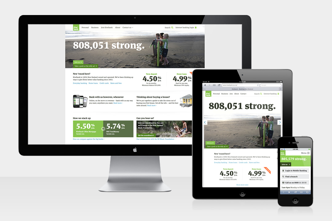
The new Kiwibank homepage viewed on different devices
Bron Thomson, Springload’s founder and Managing Director told me how they created Kiwibank’s new responsive website.
Paul Lloyd: Why did you take the responsive approach?
Bron Thomson: Kiwibank has this fantastic ambition to be a digital leader among New Zealand companies – not just banks. There’s a roadmap of digital initiatives that are pretty revolutionary, and with mobile traffic pushing past 10% of Kiwibank’s total traffic (and set to overtake desktop traffic in the coming years), the decision was made to go device agnostic. The fixed-width desktop paradigm has run its useful course – last year, we noticed that 20 people tried to join Kiwibank from their Playstation 3.
PL: Only the home page is responsive currently. What challenges did this create, and how are you managing users expectations during the transition?
BT: Working on a content-rich site of this scale is kind of like painting a boat – you’re never really finished. With that in mind, Kiwibank’s social media team have been really open with customers about the changes we’re making (and why). We started going responsive last year on some key inside pages – the Join page, First Home Buyers Guide, and the Ways to Bank section.
In the past we’ve run beta versions of the Kiwibank homepage to showcase new ideas, however the latest refresh was deployed virtually overnight to co-incide with a new brand launch involving a dozen or so other agencies.
There’s always an understandable reaction when you change one of New Zealand’s most loved brands, we’re listening to user feedback and continually working on making the experience better. Kiwibank’s challenger-brand ethos puts us in good stead to keep pushing the web experience further.
PL: Is this the first responsive site Springload have worked on?
BT: We’ve tested a range of approaches over the last couple of years: Specific m-dot sites in jQuery mobile (festival.co.nz), PhoneGap wrapped web apps (the Kiwibank mobile banking app and some internal tools), and we’re delving into native iOS as well. These are all valid, but quickly get quite complex. You end up with two or three different sets of device-specific logic, which is a maintenance nightmare. We’re pretty convinced that a responsive approach gives the widest number of people a great web experience regardless of how they access it, and simplifies content management for the site owner.
Another responsive project we’ve finished recently is klim.co.nz for type guru Kris Sowersby.
PL: Was there anything you learnt whilst designing/building this site?
BT: Content is really, really important. We’ve banned Lorem Ipsum in the office, and we try not to have a typical client/agency relationship – the Kiwibank copywriting team come and work at Springload HQ a couple of days a week. They also enjoy our beer.
We built a number of our own tools to make going responsive easier for ourselves, check out Responsinator. We’ll be sharing some of the other tools and plugins on our blog, stay tuned to @springloadnz.
It’s worth noting that there are no real magic bullets. We use a combination of server-side device detection, media queries and JS capability detection to decide what gets rendered to the page. We try and avoid polyfilling (preferring progressive enhancement where possible) and we’re using CSS transitions rather than jQuery to handle animation.
PL: How has the design process changed to encompass a responsive workflow?
BT: One of the key changes has been to start the whole team (designers, developers, front-end devs) on the project at once. Even before the designs were finished, we needed a slick front-end framework, and the back end guys had to wrestle the IIS/ASP classic server into submission too. Having the whole team locked-down on the project made the decision making process much snappier and enabled us to solve problems without calling too many meetings.
Photoshop is getting opened a little less – we mock up key navigation assets and a refined visual of a desktop and mobile template. From there, we’re learning the most by getting into the browser, and refining specific elements as we go.
We have to test more devices, more often. For instance, the stylesheet that’s rendering 3D, hardware-accelerated transitions on an iPhone also has to fix the box model in IE7. We made the move to Sass to help our front-end developers organise some of this complexity, and it’s working a treat.
I review Kiwibank’s new responsive design alongside dConstruct 2012 and Zurb in the July issue of .net Magazine.