Inspiring Nobody
In 2007, soon after the unveiling of a much criticised emblem, the official website for the London 2012 Olympic Games looked like this:
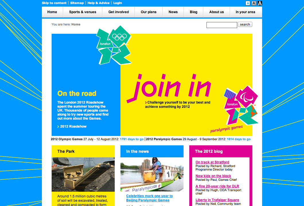
Regardless of your thoughts on the logo, the overarching brand and associated design language was energetic, brave and innovative. This is what the same website looks like today:
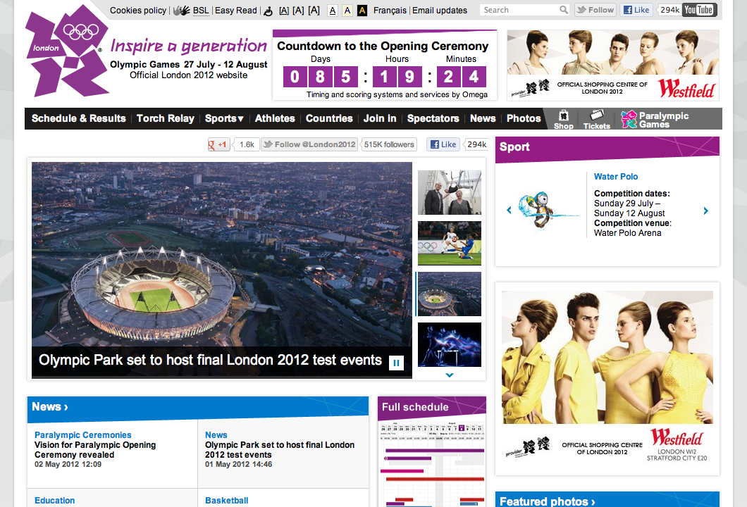
Apologetic, safe and secretly hoping nobody notices that it’s been redesigned. Take away the logo, and this could be the website for any large corporation – probably one doing business ten years ago.
This isn’t an entirely fair comparison of course. The objectives of the site in 2007 were massively different from what they are today, just a few months out from the Opening Ceremony. Yet while much of the energy of the brand has been maintained elsewhere (the dynamic pictograms are a particularly good example), online, it’s been increasingly watered down.
I’m sure an interesting concept for this iteration of the site was proposed at some point, but several rounds of groupthink have resulted in a site lacking any character or charm. Photos are constrained by a nest of rigid modules, while brighter colours have been exchanged for duller hues. Any white space has been sacrificed for the benefit of social media buttons and partner advertising. Nothing dares to be prominent, for fear of offending.
With exciting developments taking place in the field of web design, it’s disappointing to see the biggest cultural event of our generation represented online by such a confusing mess. Rather than showcase British interactive design talent, this site proudly flies the flag for the status quo.
The 2012 games are meant to ‘inspire a generation’. Don’t expect to find any inspiration here.