After Gowalla
Over the past few years, I’ve often meant to write about the location-based social network Gowalla. Recently acquired by Facebook and with closure imminent, now is my last opportunity to do so.
The eye of the beholder
 Gowalla was a service that entertained and mystified me in equal measure. Had I written those earlier posts, I could point to a story about how my fondness for a product gradually became an exercise in frustration.
I first heard about the service when I was asked to include it in my social media icon pack. Clearleft was one of the few companies in the UK to be granted a custom stamp, and for a long time Brighton remained a stronghold whilst its main competitor, Foursquare, gained traction in London.
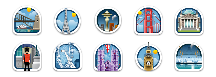
The team behind Gowalla had a great reputation. In addition to founding the successful agency Firewheel Design, they had created well regarded services like IconBuffet and Blinksale. With Gowalla, they appeared intent on building something with greater impact. The new service had one simple goal: to encourage people to leave their desks and explore the world. By checking into spots, users would be rewarded with beautifully created stamps and you could pick up virtual items along the way too.
It worked! I remember visiting nearby cities in the hope that I could add new stamps to my passport or find items missing from my collection. Yet a recurring question would be asked every time me and my colleagues checked into the same spots at lunchtime: “Why are we actually doing this?”. Having checked in once, there was little incentive to do so again.

A small selection from the thousands of exquisitely designed location stamps you could earn on Gowalla
Gowalla vs. Foursquare
Foursquare’s approach was very different. Here, you earned points not stamps, so the aim of the game was abundantly clear; earn more points than your friends. Therefore it made sense to check-in to the same spot – especially if you wanted to snatch a coveted mayorship! I found this approach rather crass, but it proved to have popular appeal.
Foursquare was attracting more users, but it was Gowalla that excelled in terms of interface design. As Foursquare rapidly iterated, Gowalla lurched from one expansive redesign to another, each accompanied by updates to the iPhone app that were buggier and more unstable than the last.
Before long, Gowalla’s beauty was merely a thin veil concealing a product that lacked direction. A final redesign saw the service transition towards a socially curated travel guide, but this came at the cost of virtual items, a differentiating feature that users cared about. As I ventured around Canada in October, it was Foursquare that proved more suitable as a travel guide, so I deleted the Gowalla app from my iPhone. The next time I would log into the website would be to delete my account.
My love of Gowalla died just months before it did.
Gowalla was acquired by Facebook in December, and much of the team is headed to California. I invested a lot of time and energy helping the company curate it’s database of spots, yet it was all for nothing. Here was a valuable lesson; care not about a social network, for a social network does not care about you. Obvious in retrospect of course.
It’s tempting to accuse the founders of selling out, but given the failure of the product (and the need to satisfy their investors), I suspect they had little choice but to join Facebook. The same fate awaits many other start-ups. Indeed, Facebook’s dominance can be traced by observing the increasing prominence of their account linking and sharing buttons on other social sites.

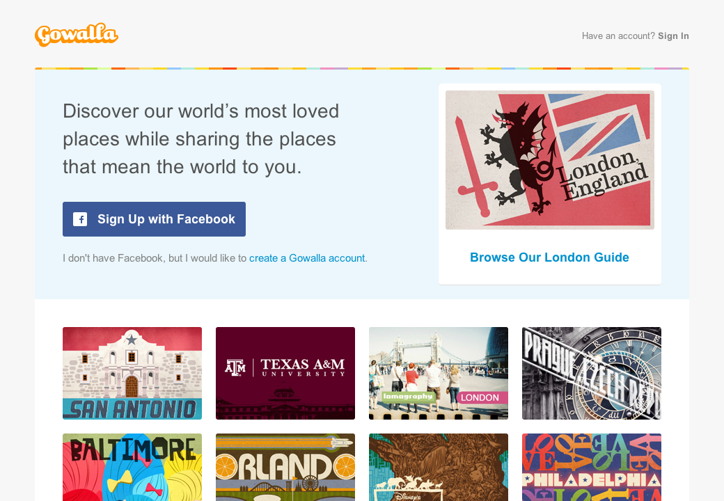
The Gowalla home page in January 2012. The growing prominence of Facebook account linking and sharing buttons on Gowalla hinted at its eventual fate.
It’s very pretty, congratulations
Unfortunately, Gowalla is the latest in a long line of respected design agencies and design-focused product companies that have closed down, shuttered their products and moved to Palo Alto. The desire to work at Facebook is easy to understand. Few companies can offer the same complex and interesting design challenges. Even fewer can provide an audience of 800 million people (and counting).
This intake of designers has been building products like Timeline, and no doubt many are working on the rumoured ‘Facebook Phone’. They are producing examples of enchanting interaction design, and much more will follow. But when you consider the motives underlying these products (in the case of Timeline the collection of data from your life pre-Facebook) you have to question the role of design at this company – and others.
It’s easy to get carried away by aesthetics and interactions, but we need to ask whether they bring with them any value. An app to rate sandwiches does little to further society. A feed reader isn’t going to bring you closer to your children (probably quite the opposite). As Mike Monteiro rightly stated:
We have more processing power, affordable tools, and combined intelligence right this very minute than at any point in the history of design. We are using it to build shit. It’s time to aim higher. Let’s find problems to solve that actually improve people’s lives. Whether it’s figuring out a better way to access medical records, figuring out how 14 year olds can stop carrying forty pounds of textbooks back and forth to school every day, or a reservation system for the communal rooftop farm in your building, there has got to be something more beneficial to society than the next Facebook clone.
I believe designers – and certainly the most talented – should be solving real problems, not sugar coating pointless or vile business models.
Perhaps we can take solace in the fact that the designers at Facebook have been asked to solve a problem that can’t be solved. Let them struggle to confine mankind to programatic logic. That humans are inherently complicated gives me hope that we will move past the rigid confines of Facebook. I just hope we have something valuable left behind once we do.