UNICEF UK
Mobile-first redesign for leading children’s charity
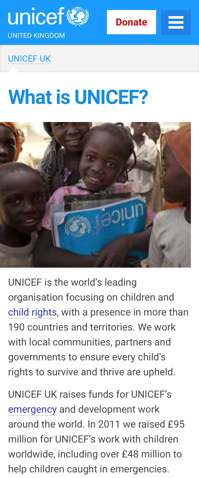
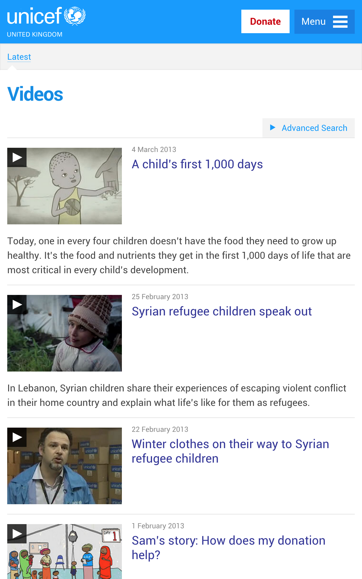
UNICEF UK raises funds to protect children and the defend their rights worldwide. With mobile devices accounting for 20% of site visits and growing, a limited mobile version of its website had been produced, yet much of the information about their vital work remained on a desktop-orientated site.
Given a constrained budget, the software that managed content on the desktop was to be retained, meaning the mobile site would have to replicate the same pages and information architecture. Working alongside Ben Sauer at Clearleft, my primary task was to ensure this content and architecture could be understood by users on smaller screens. The site also needed to degrade gracefully on older mobile devices, and take into account the often imperfect nature of cellular connectivity. Put simply, we needed to employ mobile-first design principles with desktop-first content, rationalising and simplifying where possible.
Searching for patterns
We asked key stakeholders on the project to dissect the homepage and a key internal page, placing component parts in order of importance. Working with UNICEF’s content editor, we pulled out common patterns, noting those which were essential and those that were superfluous. The relevant patterns were then sketched on a whiteboard where we imagined how they would adapt on smaller screens. These were then used as the basis for the front-end build. This pattern-based approach allowed us to simplify what was already there, rather than start again from scratch.
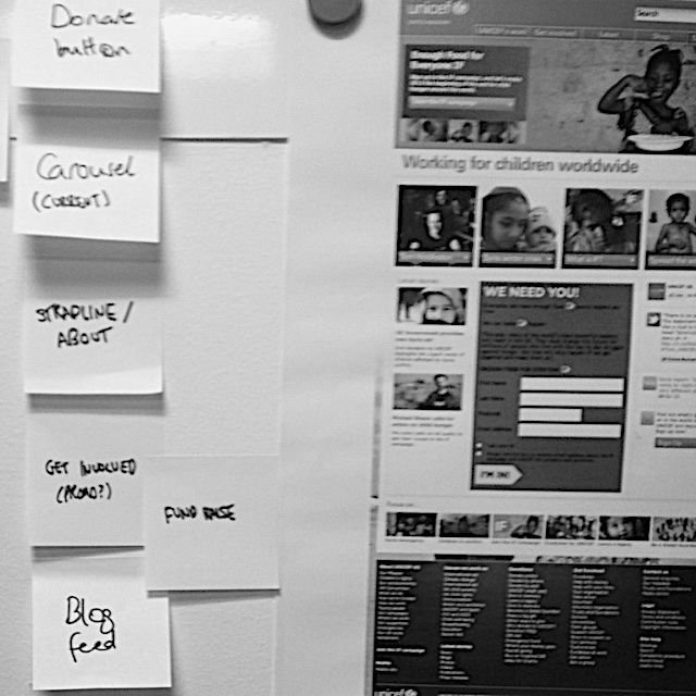
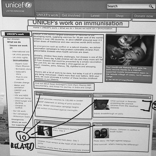
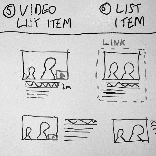
Prioritising homepage components, highlighting common patterns on desktop site and breaking them down into responsive patterns we could use on the mobile site
Translating UNICEF’s brand guidelines to the web
We placed considerable attention on ensuring the performance of the site didn’t suffer at the cost of excessive design. UNICEF’s brand guidelines helped in this respect, with the identifiable logo, cyan brand colour and emotive photography combining to create a strong identity.

The brand guidelines suggested using Verdana for digital applications, but I opted to use the Roboto typeface instead. Close in appearance to UNICEF’s brand font Univers, Roboto was specifically designed for Android, so we knew it would render well on mobile screens. Its condensed nature also allowed for more comfortable line lengths on narrower screens.
Navigation
We experimented with different ways of simplifying wayfinding around the site. By removing layers of navigation and advocating the inclusion of more links within body copy, we were able to reduce unnecessary interactions and invoke fewer taps. Moving the breadcrumb navigation to a slide-out menu meant users could orientate themselves within the site.
Mobile-first design
The underlying design language encompassed a variety of content types and clearly delineated between areas of navigation and content. Although a mobile-focused project, we had a secondary ambition to design an experience that was better than the desktop site – even on larger screens. In time, it is hoped this responsive mobile design will form the foundation of a fully responsive site, accessible from all devices, large or small.