The Week
Award-winning iPad app for weekly current affairs magazine
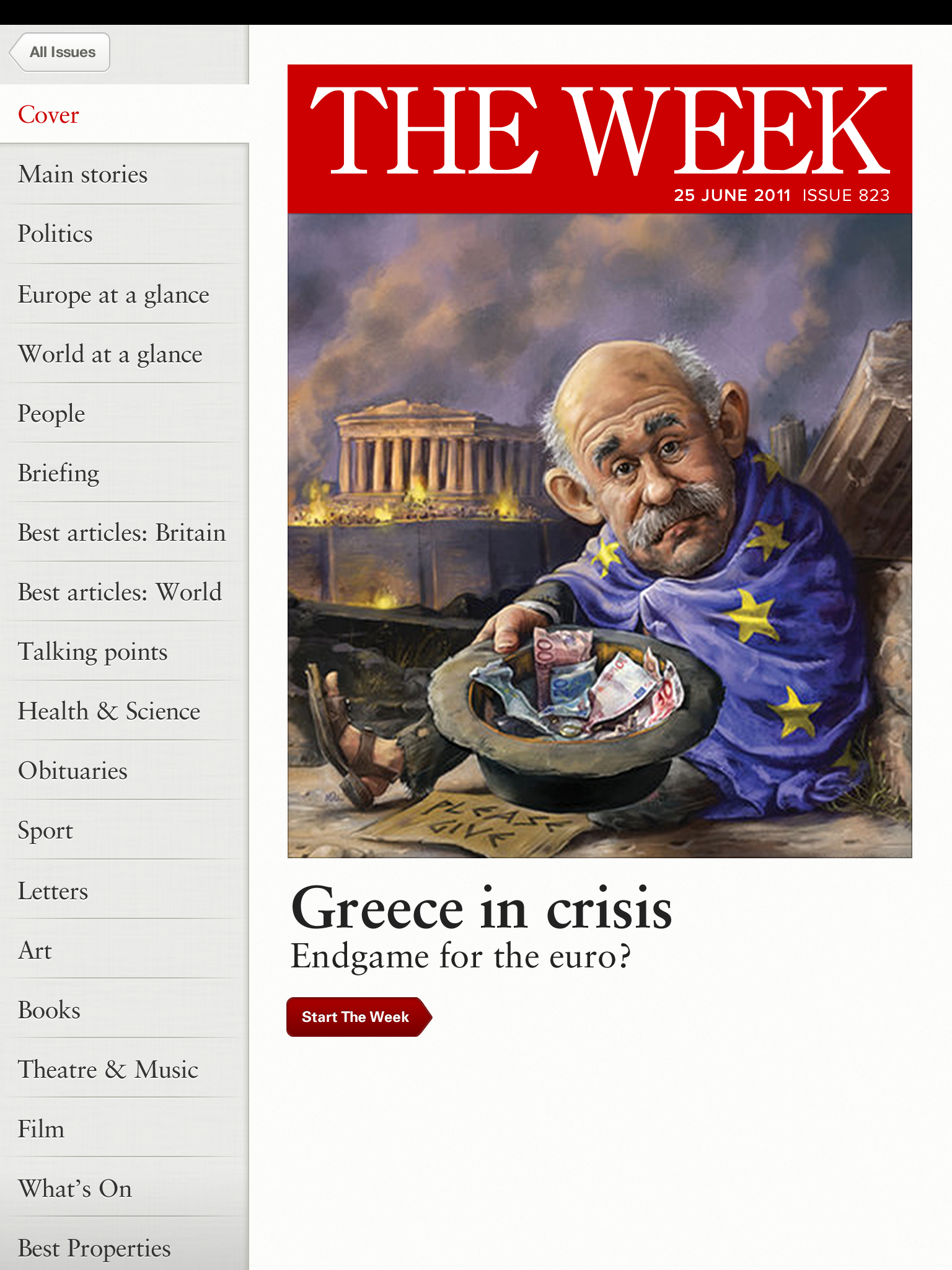
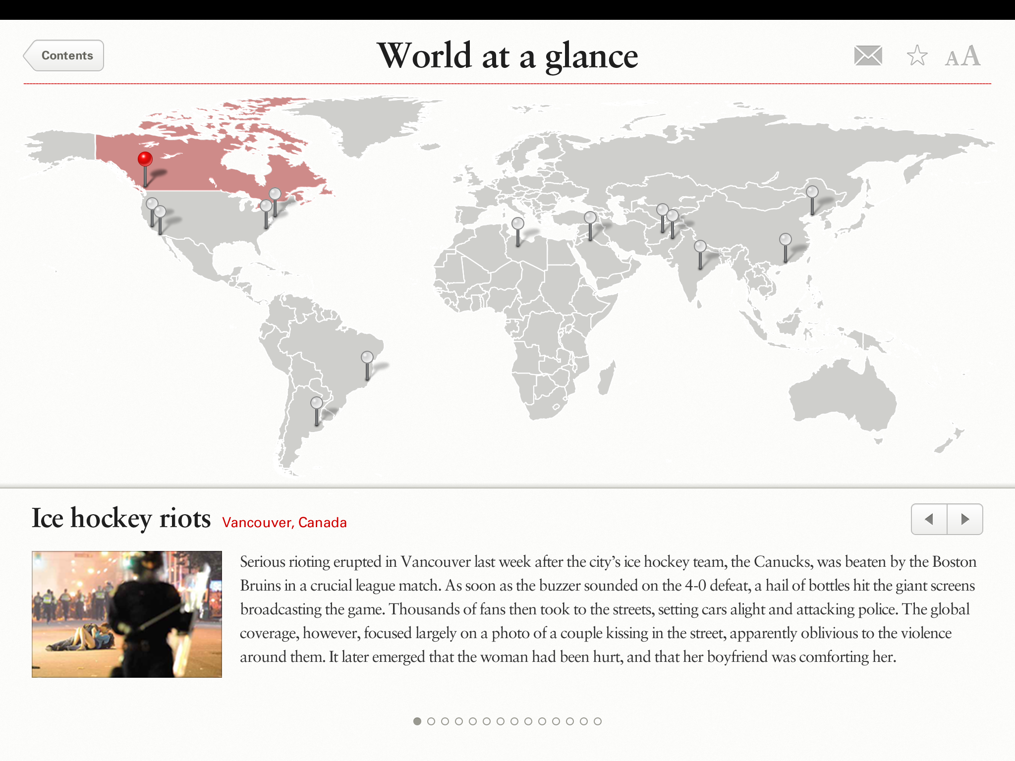
The Week condenses the week’s news into lively and informative editorial, giving readers an insight into the most vital stories. With over 183,000 subscribers, it’s the UKs most popular weekly subscription magazine.
Part of this success can be attributed to its rigorously consistent editorial format which readers describe as familiar, reliable and intuitive. Working with Harry Brignull at Clearleft, we were tasked with bringing this much-loved publication to a new generation of tablet users, retaining the best qualities of the print edition while also creating a product true to the best abilities of the iPad.
Prototyping
A highly iterative approach saw the design evolve over the course of the project. Starting with paper sketches before creating quick, low-fidelity click-through prototypes in Keynote. Throughout this process, we used real content from the magazine to ensure our design would meant the demands of the content it would need to deliver. By forming a close working relationship with key stakeholders across the business - including both commercial and editorial teams – meant we were able to take into account differing requirements and manage expectations.
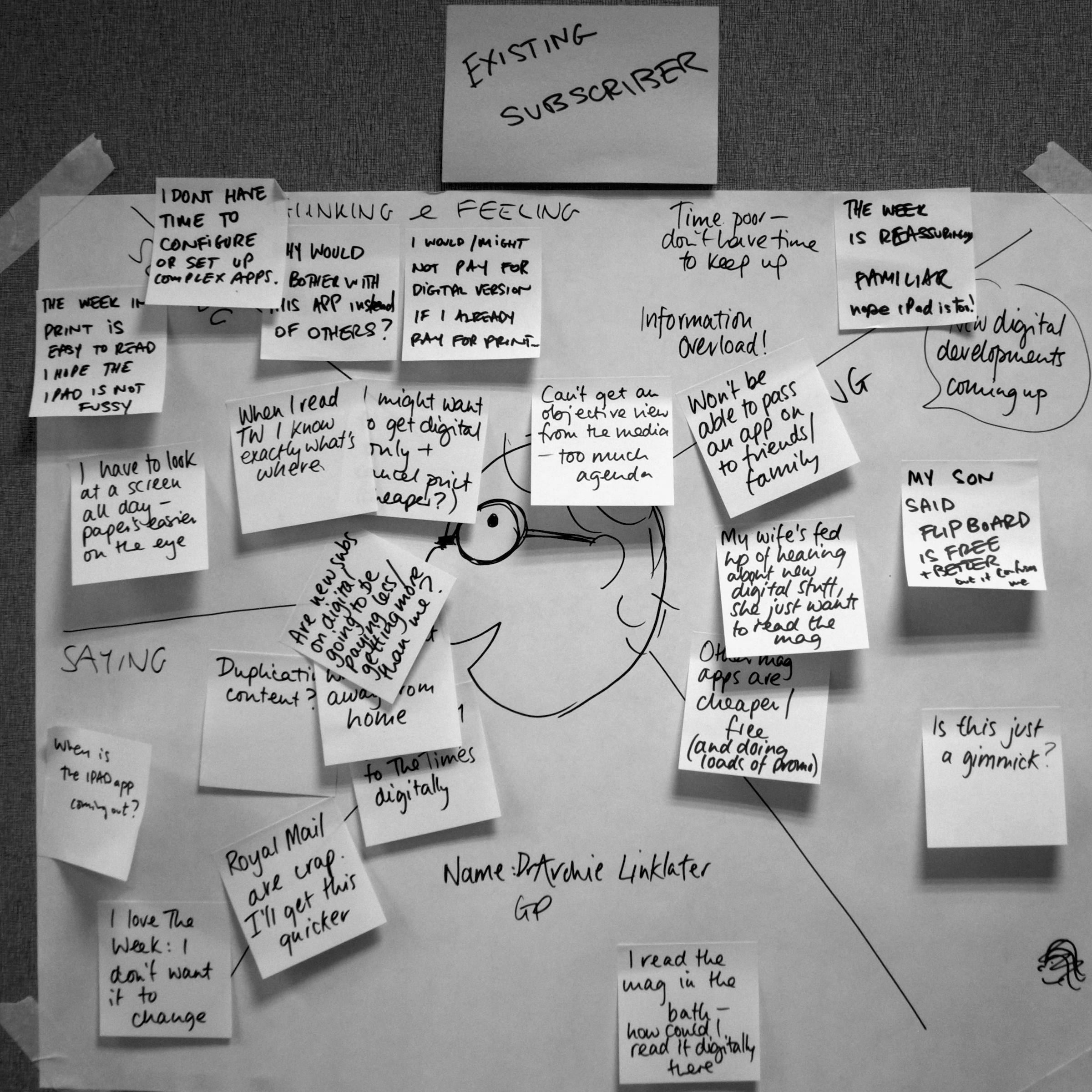
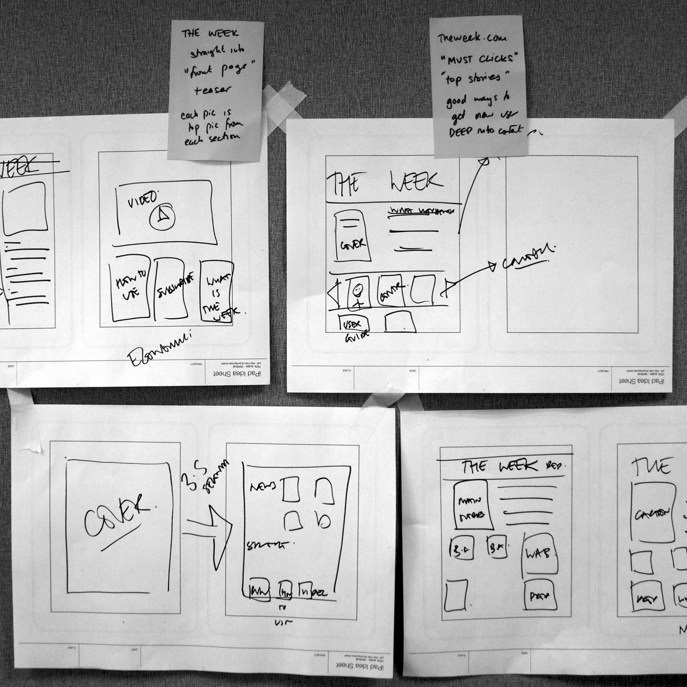
Output from our workshop with key stakeholders included empathy maps for key users, and sketched ideas for important sections of the magazine
Creating a page turner
With a readership not looking for rich interactivity, we chose to focus on creating an app that was intuitive and easy to navigate. We experimented with a number of different design approaches, with usability testing proving an invaluable means of validating our final proposal.
The predictable IA of the magazine was retained by creating overview pages for each section that linked though to individual articles. From both section and article pages, users could quickly swipe though the magazine, replicating the skimmable nature of the printed version. This model also allowed for the inclusion of full-screen interactive advertising, inserted at modest intervals, much like in the magazine.
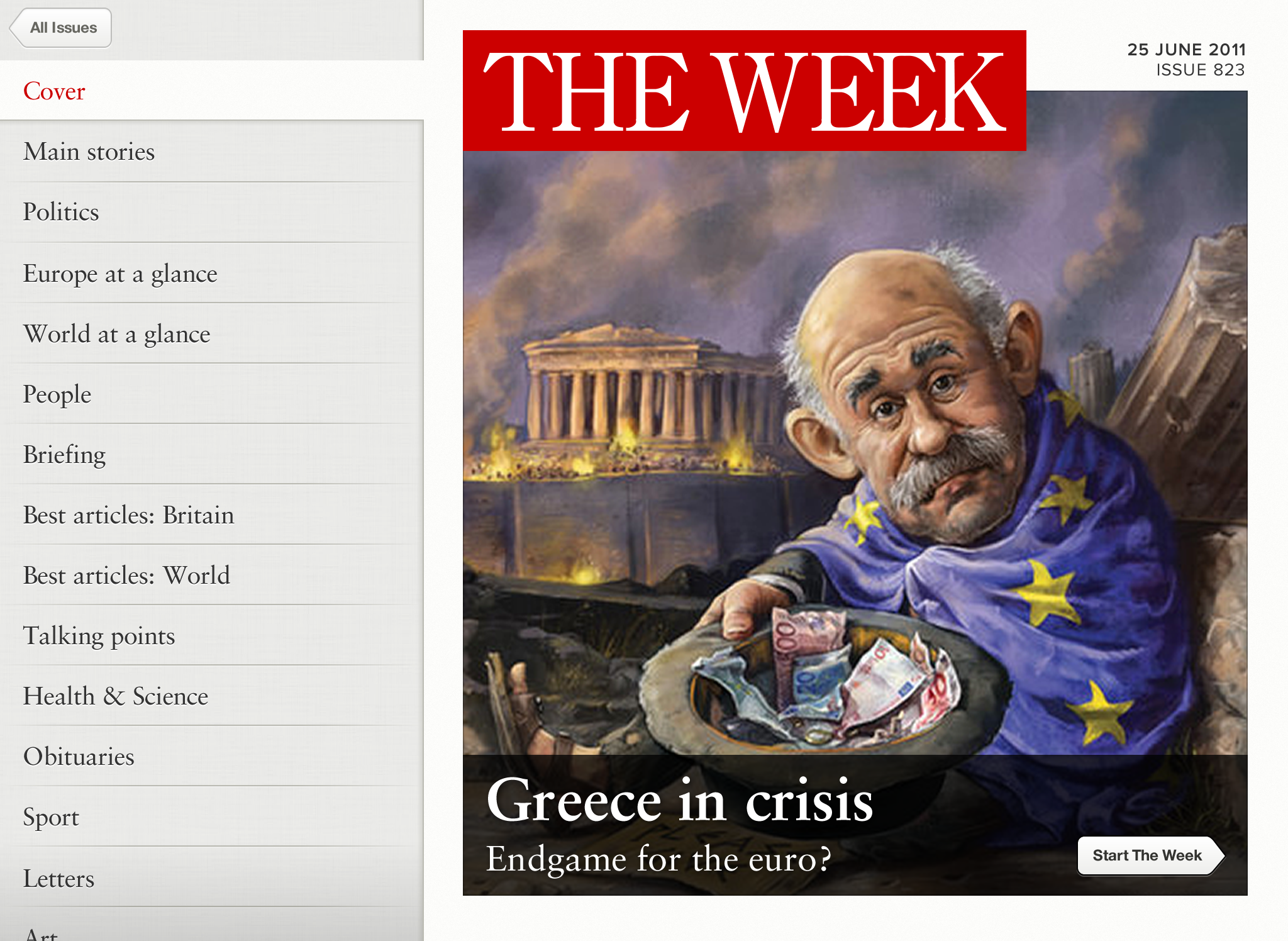
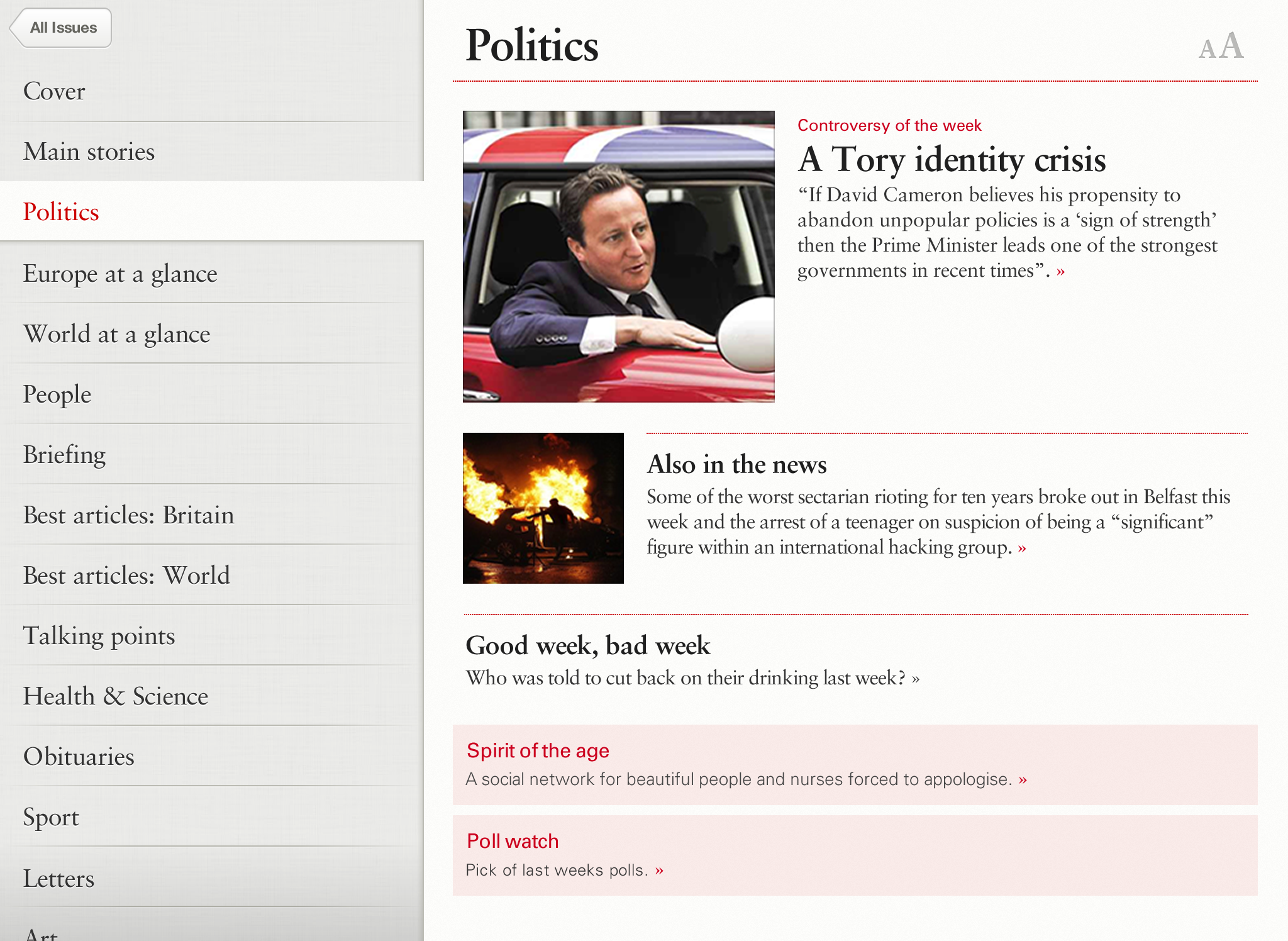
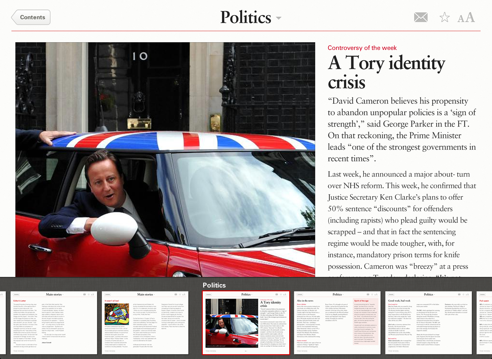
Progression through an issue of the magazine; from cover, to section to individual article. Double tapping on an article screen would bring up the ‘scrubber’ enabling users to quickly advance through an issue
A challenging aspect of this project was conveying the familiarity of the magazine within the confined space of an iPad, which is physically smaller, and with a lower resolution. Simply transferring the content of one page to a single screen would not be an option. While competing products often used pinch and zoom, we created bespoke layouts for both portrait and landscape device orientation.
A key feature of the magazine is it’s marginalia, short summaries, excerpts, quotes and cartoons that appear alongside longer passages of text. These were retained, appearing alongside larger articles and linked from section fronts.
Collaborative development
Working closely with the development team at Kaldor, we honed the gestural interface, navigation and page templates. Building upon their hybrid PugPig framework, the application could take advantage of native iOS features while also utilising HTML and CSS for precise layout and typographic control for each article. This was possibly the most enjoyable aspect of the project, especially as their team had an appreciation for design and where open to last minute design tweaks that would improve the overall experience.
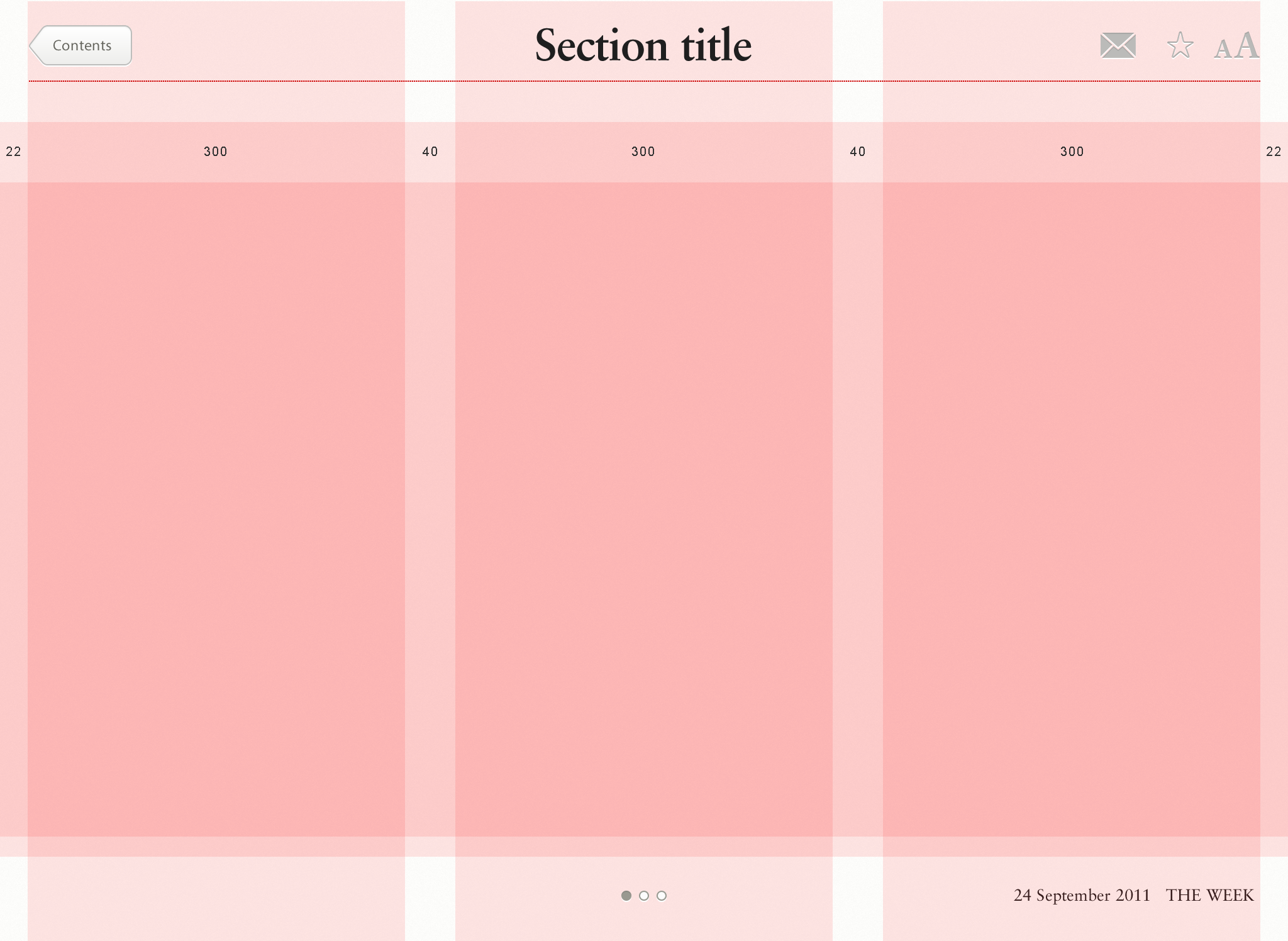
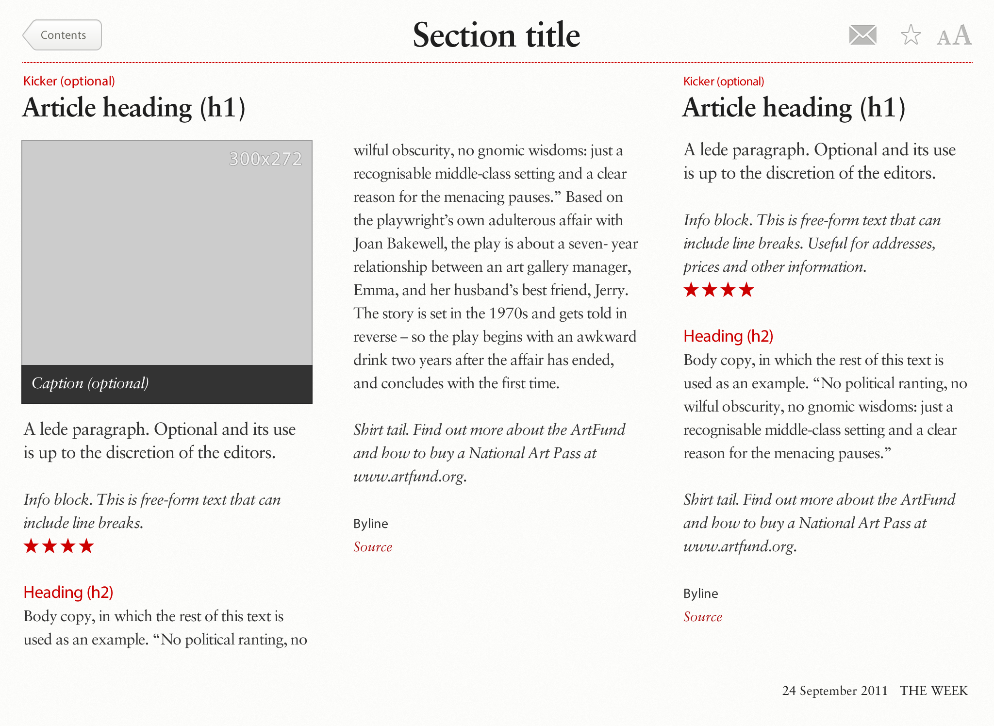
Example of the assets handed over to the team at Kaldor to aid development of the application
The app was far more successful than anticipated, spending a number of weeks in the top grossing Top 10 News and Newsstand categories of the UK App Store. The editors of the US and Australian editions were so impressed, they decided to use the same infrastructure and user experience, thus bringing an additional economy of scale.
This was the most technically complex software project we’ve ever attempted, yet in its first year it’s been a real success. We’ve found new readers, increased revenue from existing readers and gained the title lots of exposure.