Matter
Beautiful reading experience for publisher of unmissable journalism
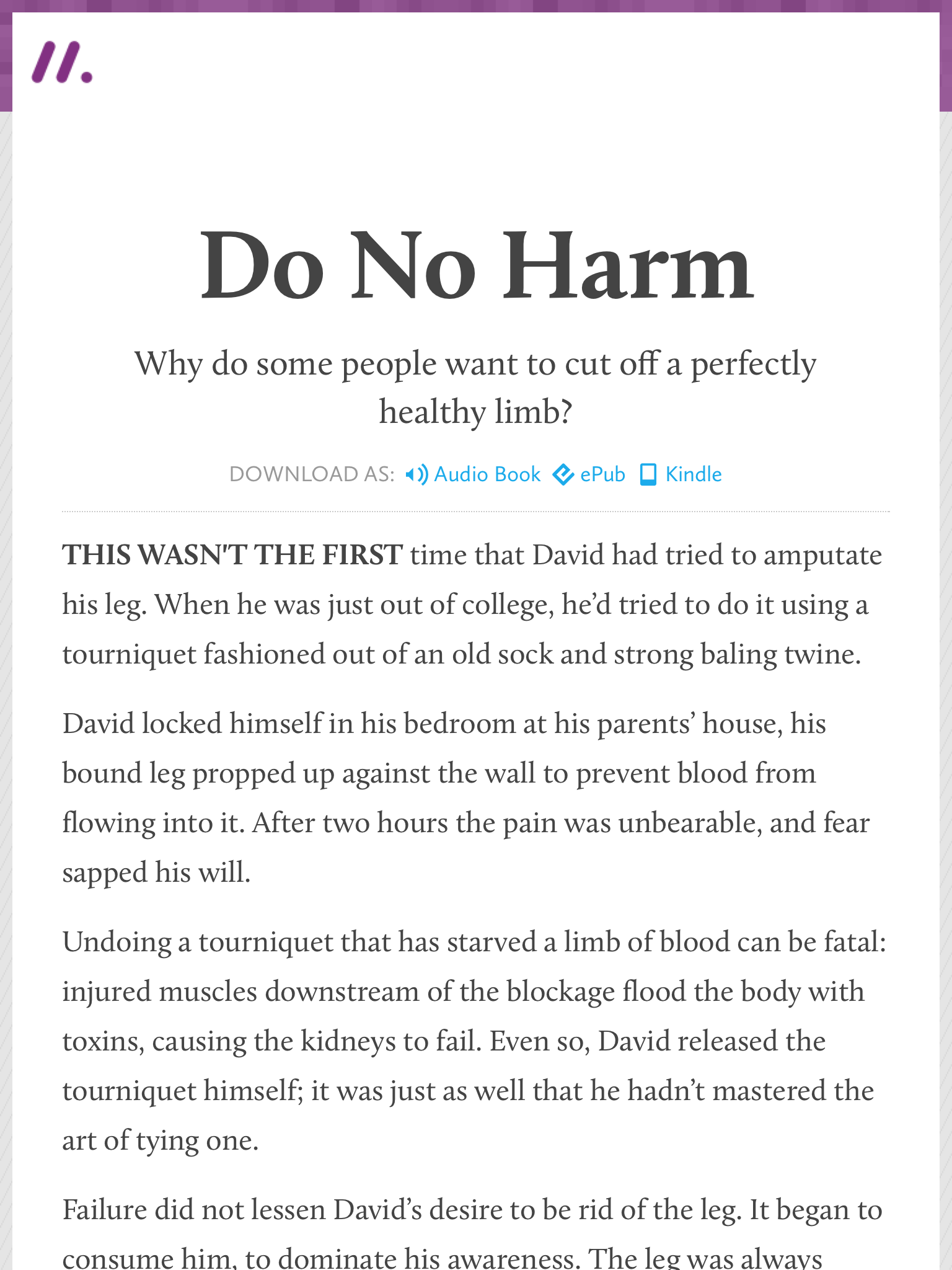
The brainchild of journalists Bobbie Johnson and Jim Giles, Matter is home to in-depth journalism about the ideas shaping our future. Stories cover everything from corporate misdeeds and untold environmental scandals to radical new scientific discoveries and the people behind them.
After an enormously successful Kickstarter campaign proved there was a real desire for high-quality, focused, long-form writing, Bobbie and Jim asked Clearleft to envisage the user experience and visual design. I worked alongside Jeremy Keith who did the front-end development, and Phil Gyford who handled the Django-based back-end.
Identity
Early logo sketches
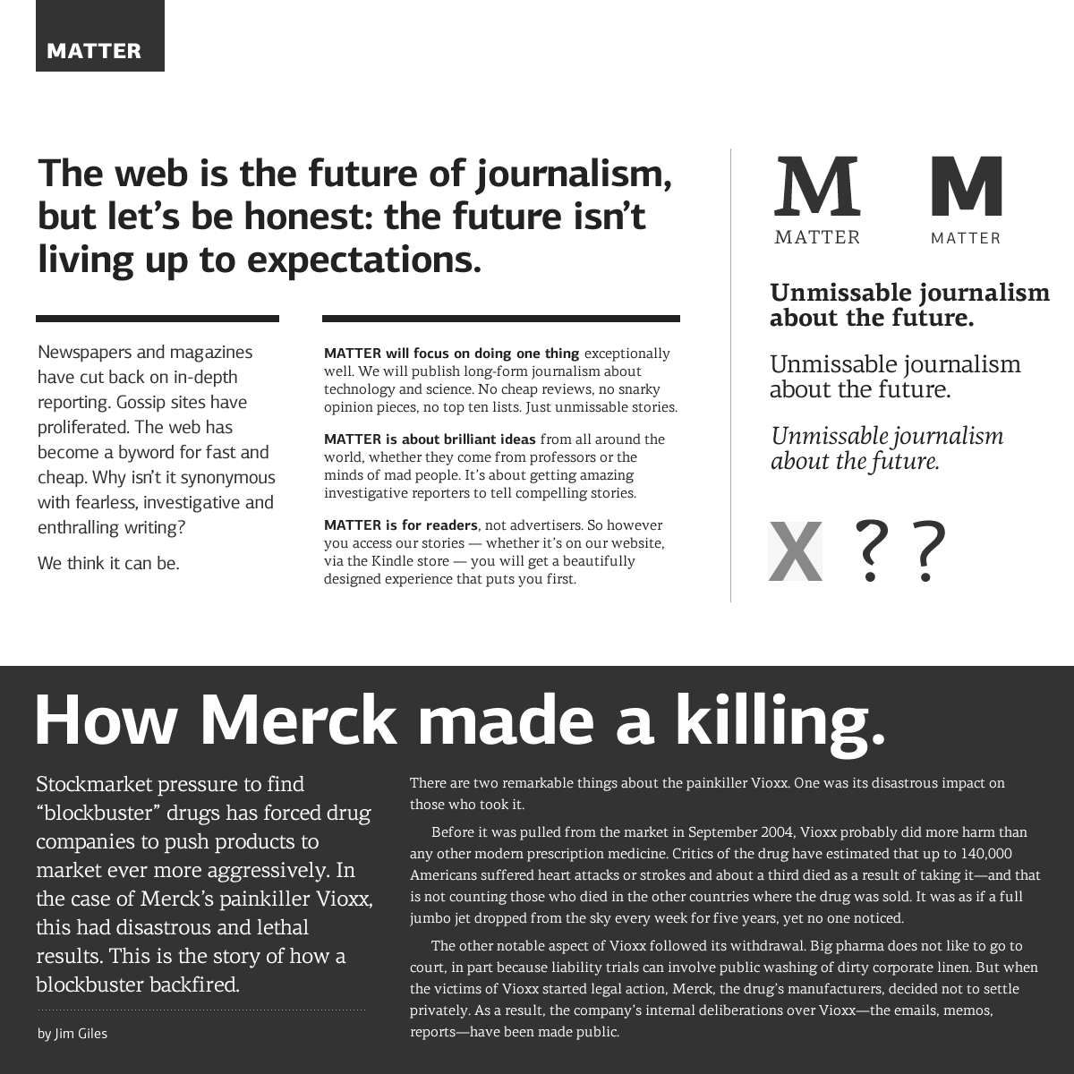
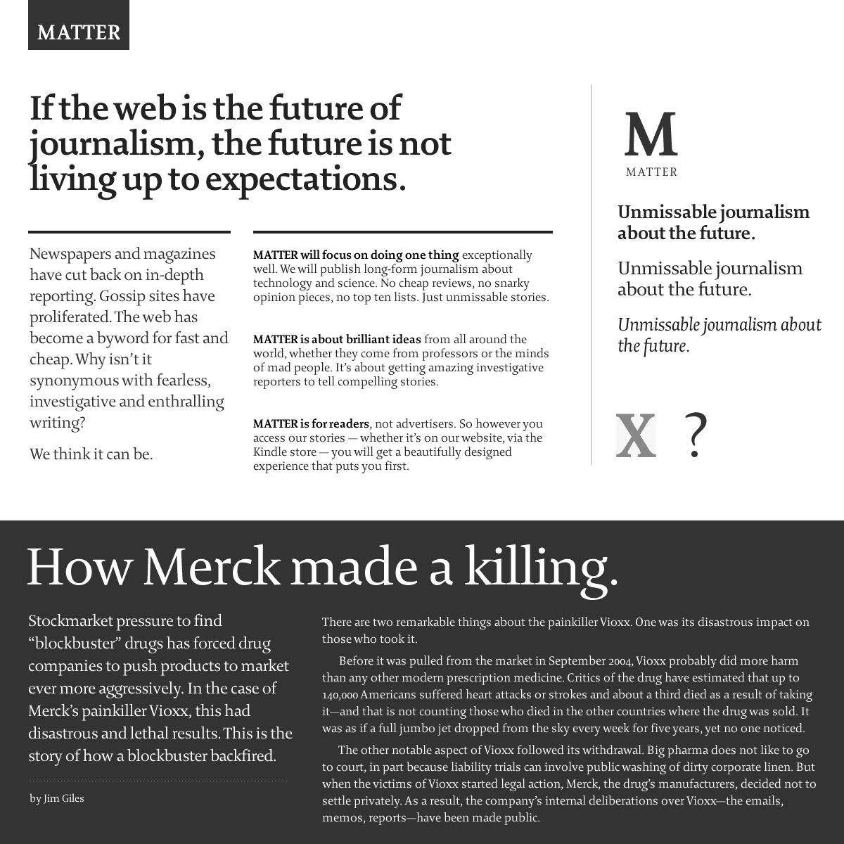
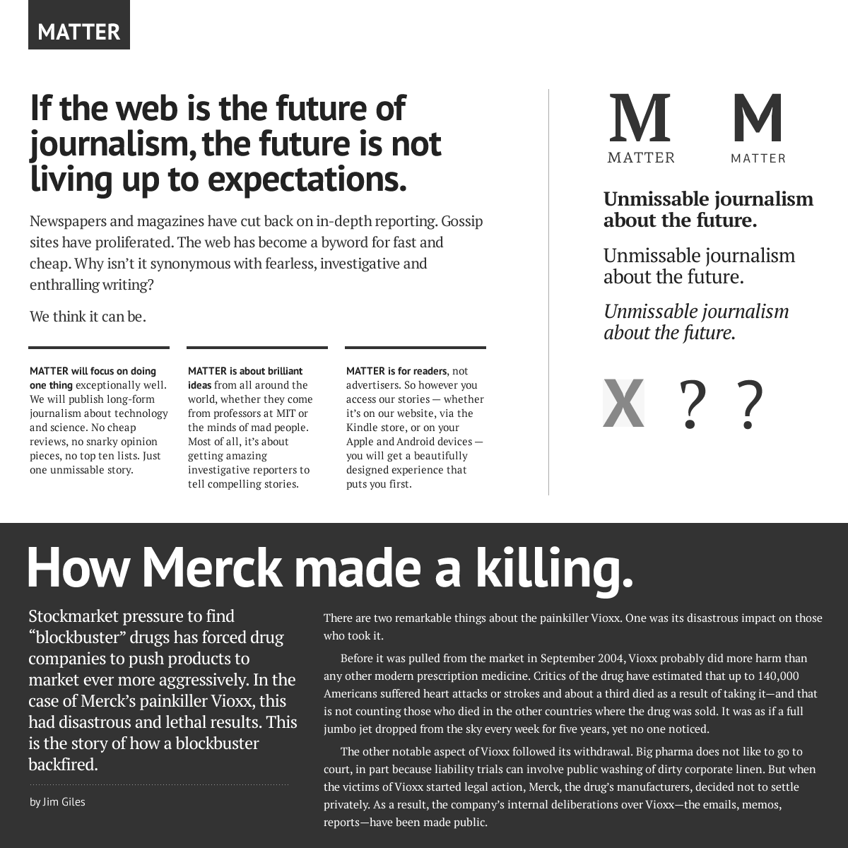
Much of my work for Matter focused on its visual identity. I thought a lot about how readers would recognise its publications in ebook stores, how articles might appear on the web and how these might be bookmarked on smartphone home screens. As the identity would play a supporting role to the articles being published, I envisaged the logo as a hallmark, one that identified an article as one meeting the high standards of journalism that Matter aims for.
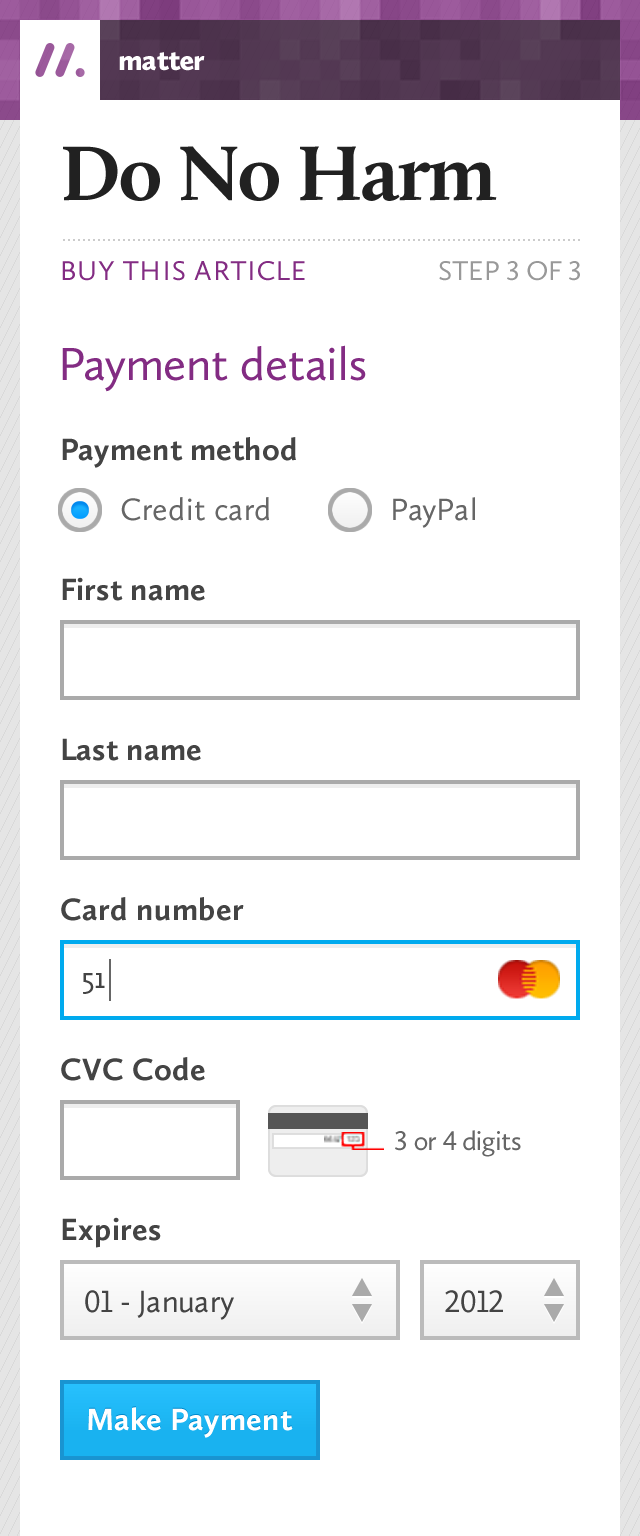
Painless payments
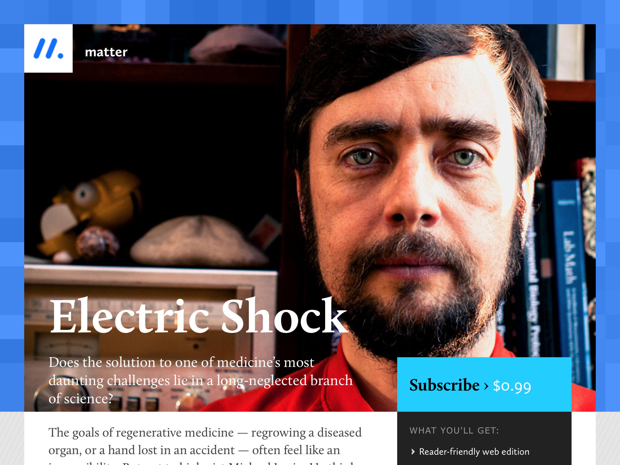
As well as being able to purchase individual articles as ebooks via Amazon and iTunes, subscribers could get access to all the stories on the website. Crucial to making this work was creating a frictionless payment flow. A guided two-step flow kept form fields to a minimum, and made subscribing a painless experience.

Payment flow
Typography
One of the guiding principles established early on was to privilege the reading experience. This meant articles needed to be legible and enjoyable to read on any device. To meet this purpose, and after extensive device testing, I chose Calluna and Calluna Sans.
Type samples/experimentation