Fontdeck
Distinctive lead design for purveyor of the finest web fonts
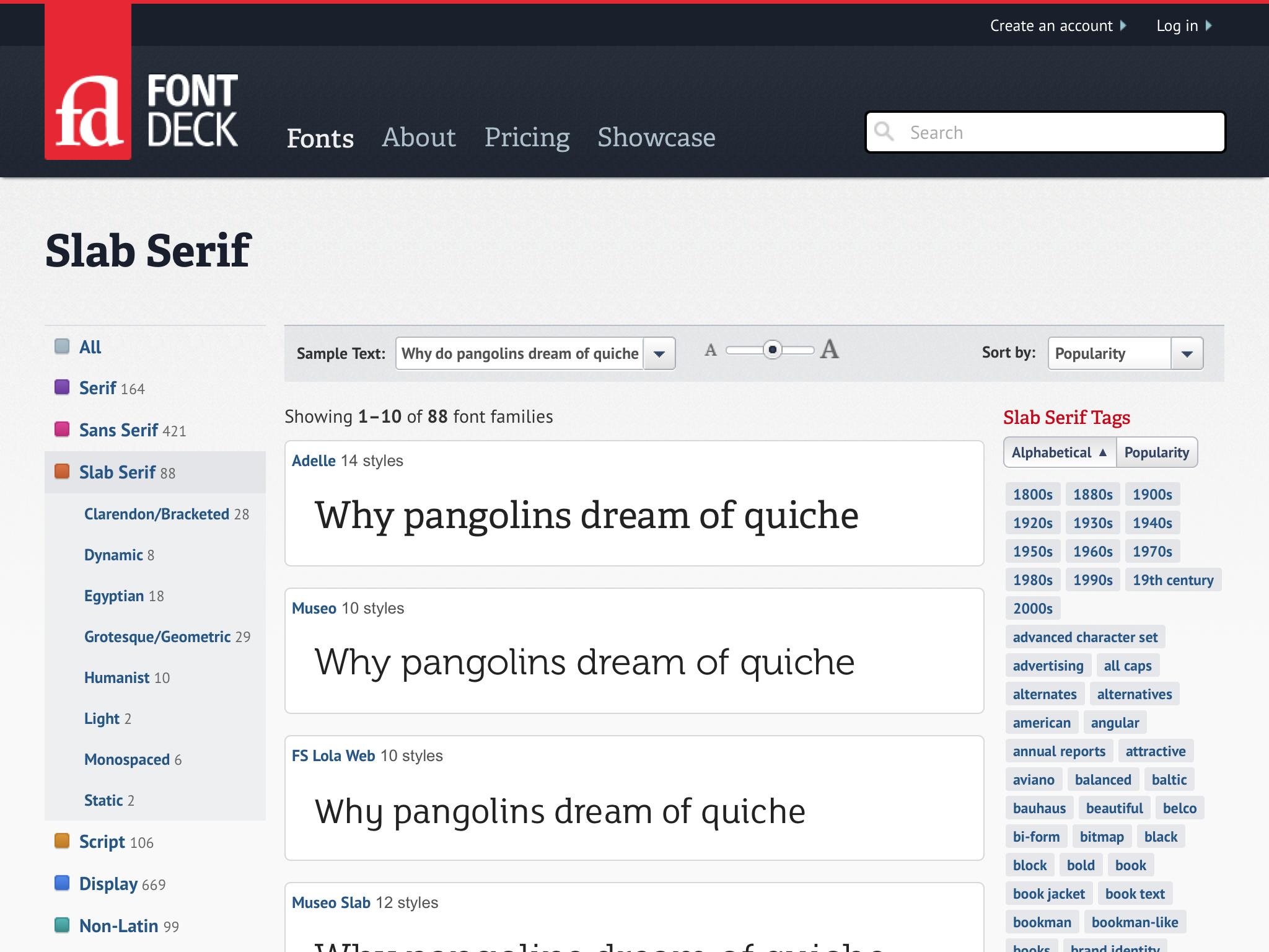
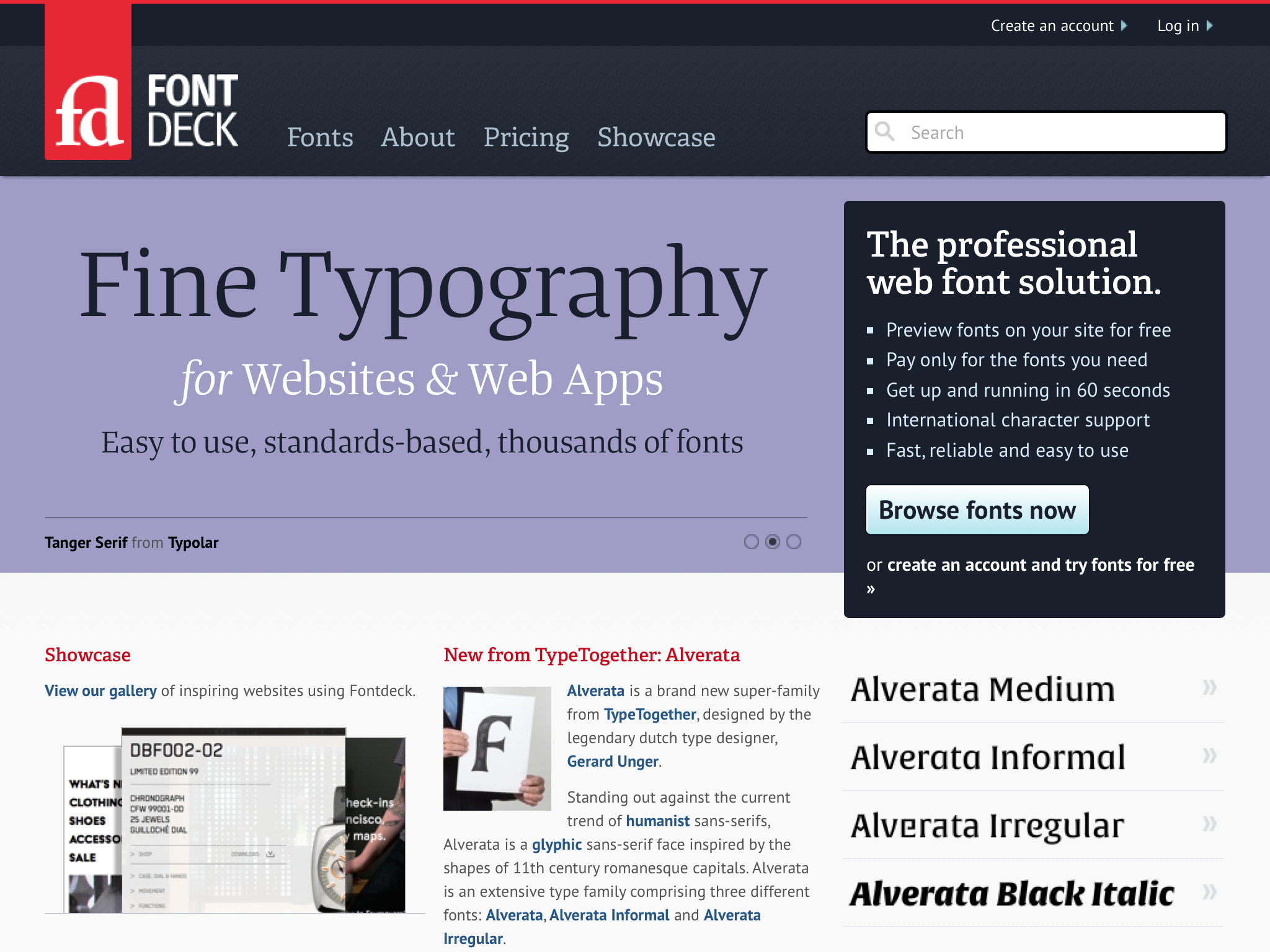
Fontdeck is a professional web font service that lets designers and developers to choose from hundreds of web fonts and easily embed them in their websites.
A unique concept when founders Richard Rutter and Jon Tan conceived the idea in 2009, by the time the service launched in beta a year later, a number of competing services had entered the market. The site needed to rapidly evolve, and better explain how this service differed from others.
Hack day
I was part of a small team that convened over one weekend to devise a strategy for improving the site. A series of quick wins were identified, but it was agreed that the homepage needed a thorough overhaul. The existing, text-heavy page failed to communicate the benefits of the product, or explain how it was different to the other services on the market.
Working on Fontdeck with Paul was a pleasure. He brought his usual meticulous attention in redesigning the site, resulting in a far more consistent and harmonious feel, along with numerous small yet significant improvements in usability. Ultimately Paul added the finesse the site was missing.
The key values of the product were distilled into a compelling proposition: ‘purveyors of the finest web fonts, Fontdeck is the professional web font solution; easy to use yet flexible enough to meet the real needs of designers’. This became a lightening rod for the design direction that followed.
Improving the product in discreet stages sounded appealing, but beyond a few technical items, making substantial changes soon became difficult. We knew where we wanted to be, but it was difficult to get there without a vision of what the service might look like. I devised a holistic design for the product that would serve the following goals:
- Communicate professionalism of the service and the quality of our library
- Better explain how the service works and how much it costs to use
- Give greater prominence to foundries and type designers
Brand refresh
The design used during private and public beta phases of the product roll-out no longer aligned with this redefined proposition, so a new approach was needed. Elements of the previous design were retained, and formed the basis of what followed.

The original brand font was FF Info, but as this wasn’t in our catalogue it didn’t make sense to use it. In its place, I paired Adelle (lots of character at different sizes) with PT Sans (legible at small sizes). Where web-safe alternatives were required (e.g. HTML newsletters), Georgia and Lucida Grande were chosen as fallbacks. The colour palette required only subtle changes; the signature dark blue colour was made slightly dustier, the saturated font category colours more muted.
Holistic design
Page layout was more considered, making heavy use of the underlying grid, line rules and a clear typographic hierarchy. The number of rounded corners used in the design was reduced, while the playing card device was limited to account and project pages, where users managed their font ‘decks’.
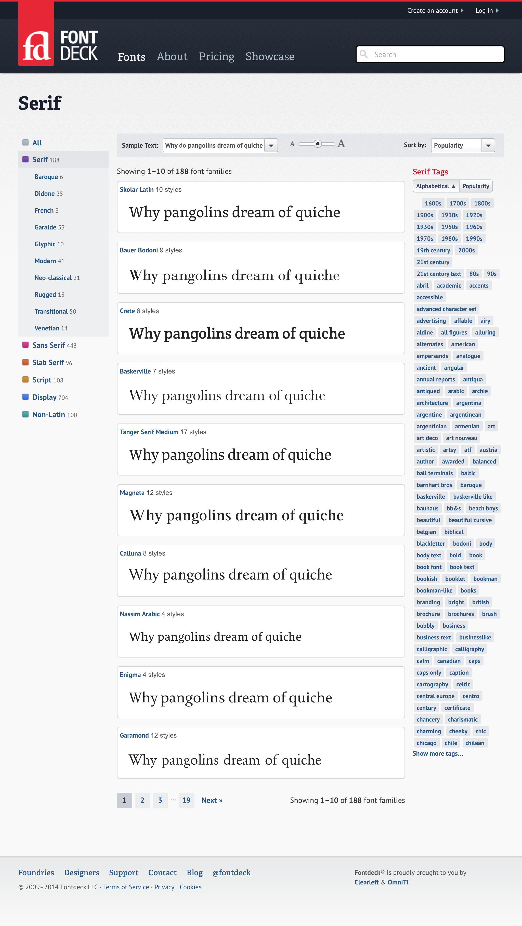
Exposing different means of discovery made it easier for users to browse Fontdeck’s catalogue
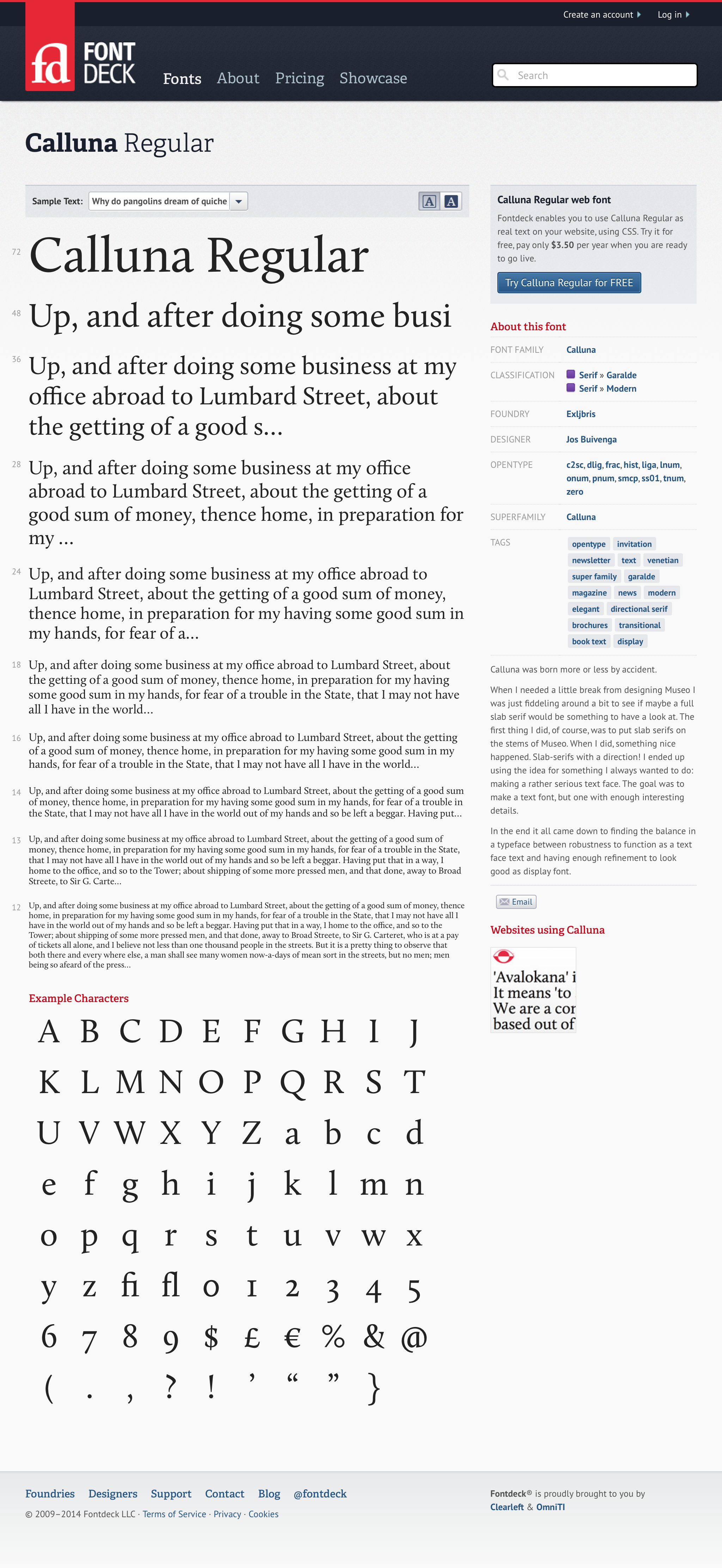
Information about an individual typeface was available on one page, with consistent presentation of meta data in the sidebar
Selling the service
The previous text-heavy about page was replaced by an expanded about section. This included a video narrated by Richard, the story of the product’s development, and introduced members of the team working behind the scenes. A dedicated pricing page was linked to from the main navigation which concisely explained how the various pricing tiers worked.
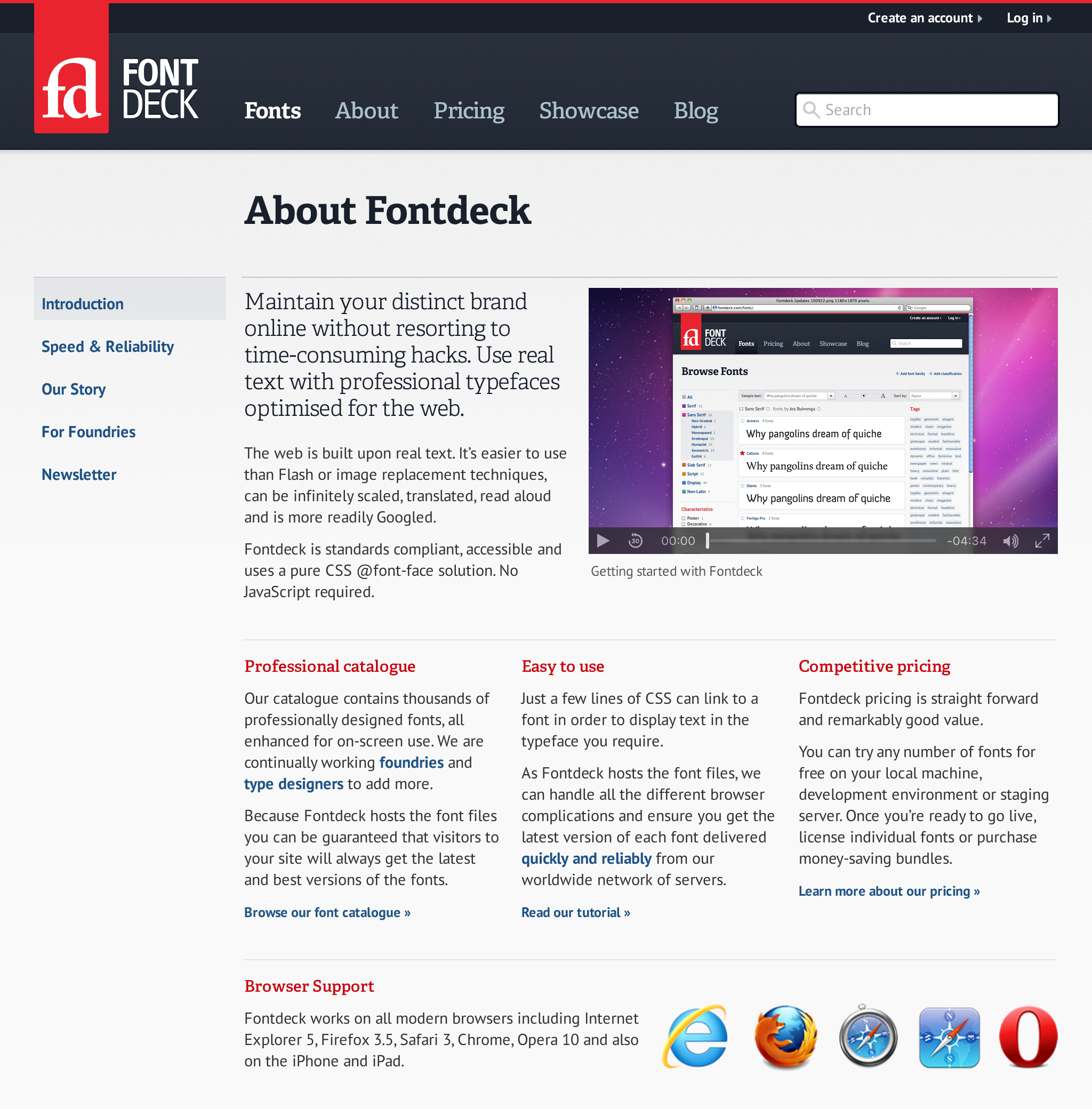
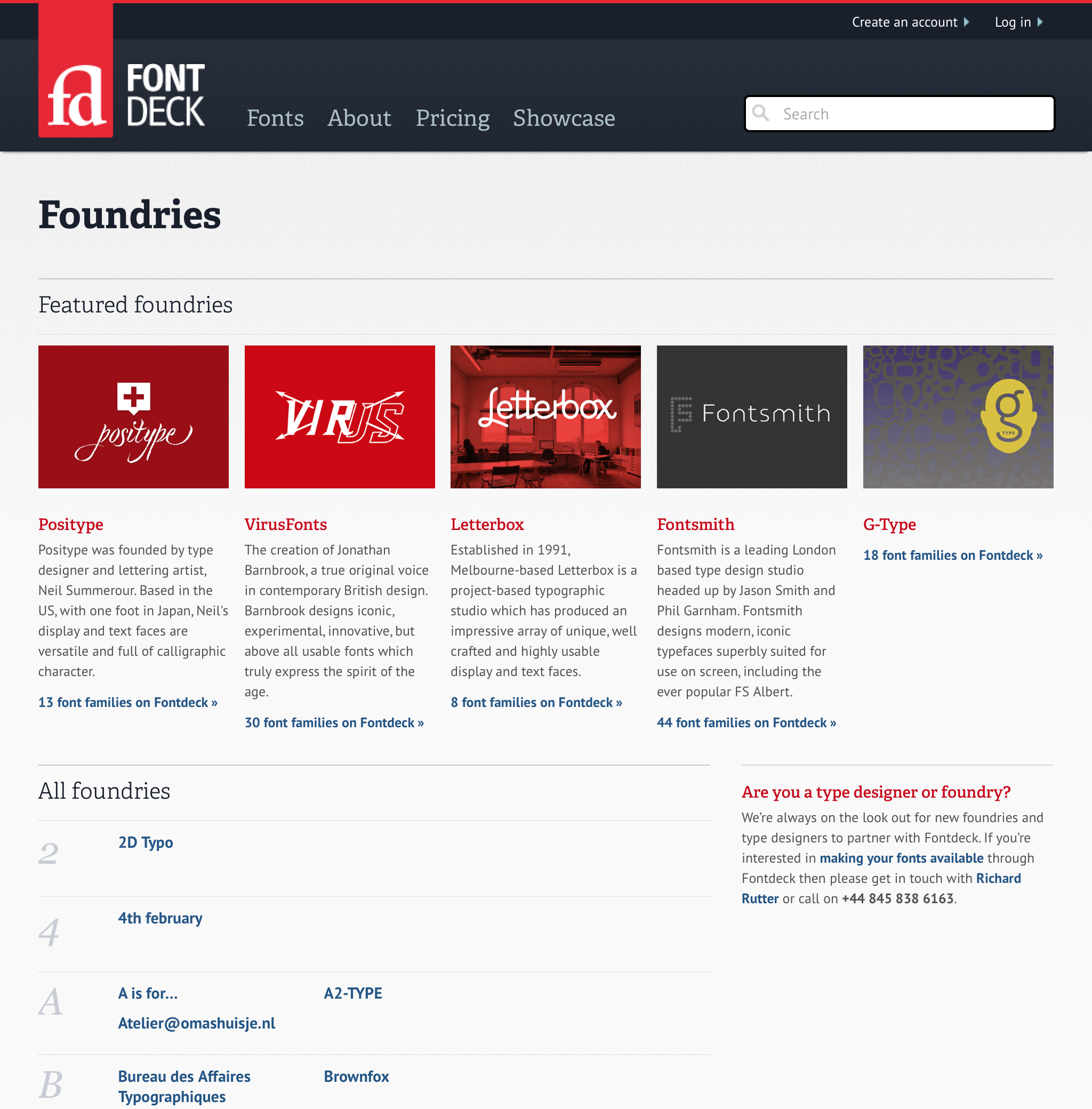
About page and foundry directory
Type designer and foundry pages previously consisted of alphabetical indices of names, but I saw this as an opportunity to make those responsible for the font library the heroes of the service. Individual foundry and designer pages now featured a photo or logo and short bio alongside a list of the fonts they had created.