dConstruct
Collaborative design for grassroots digital conference
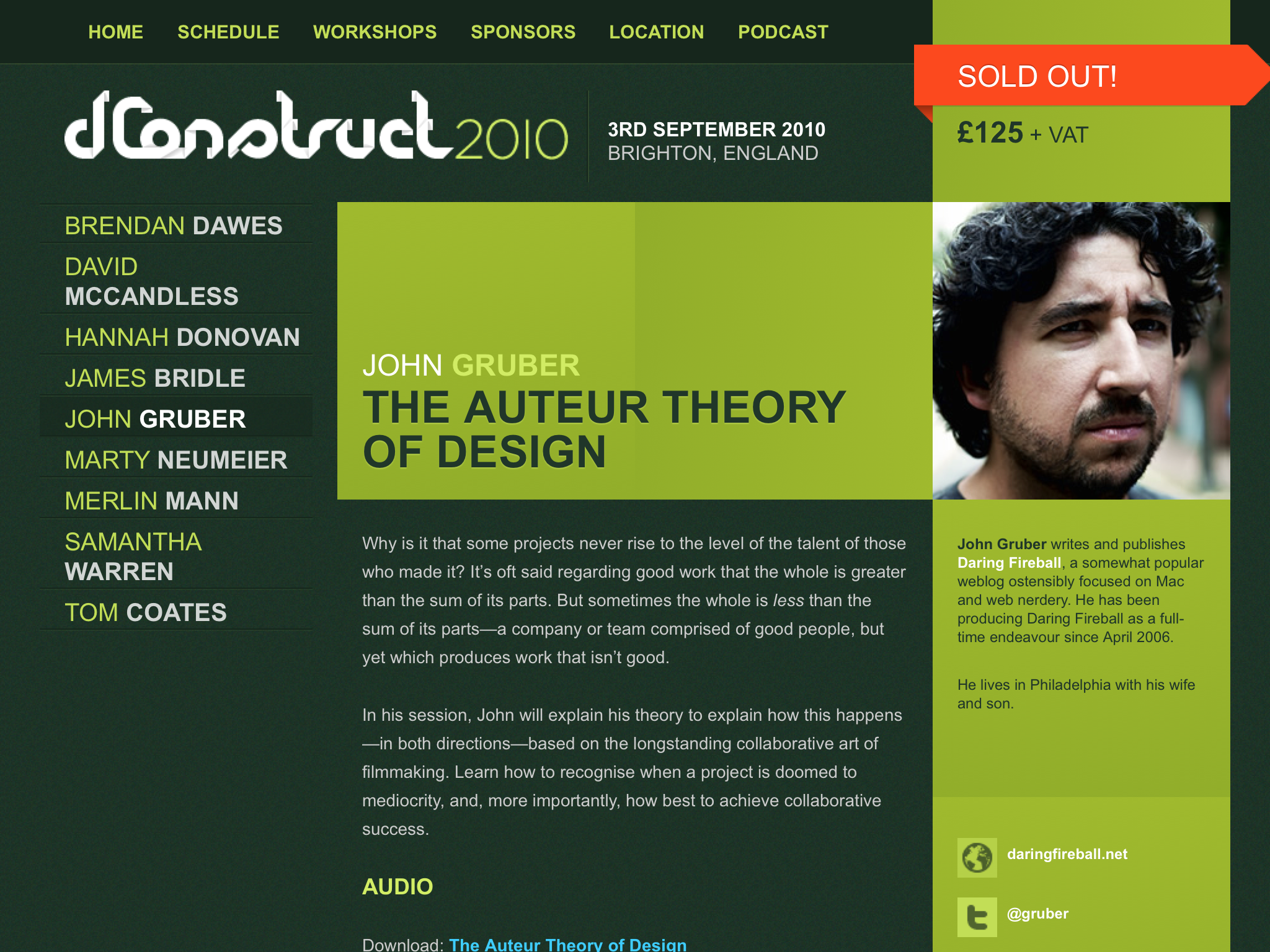
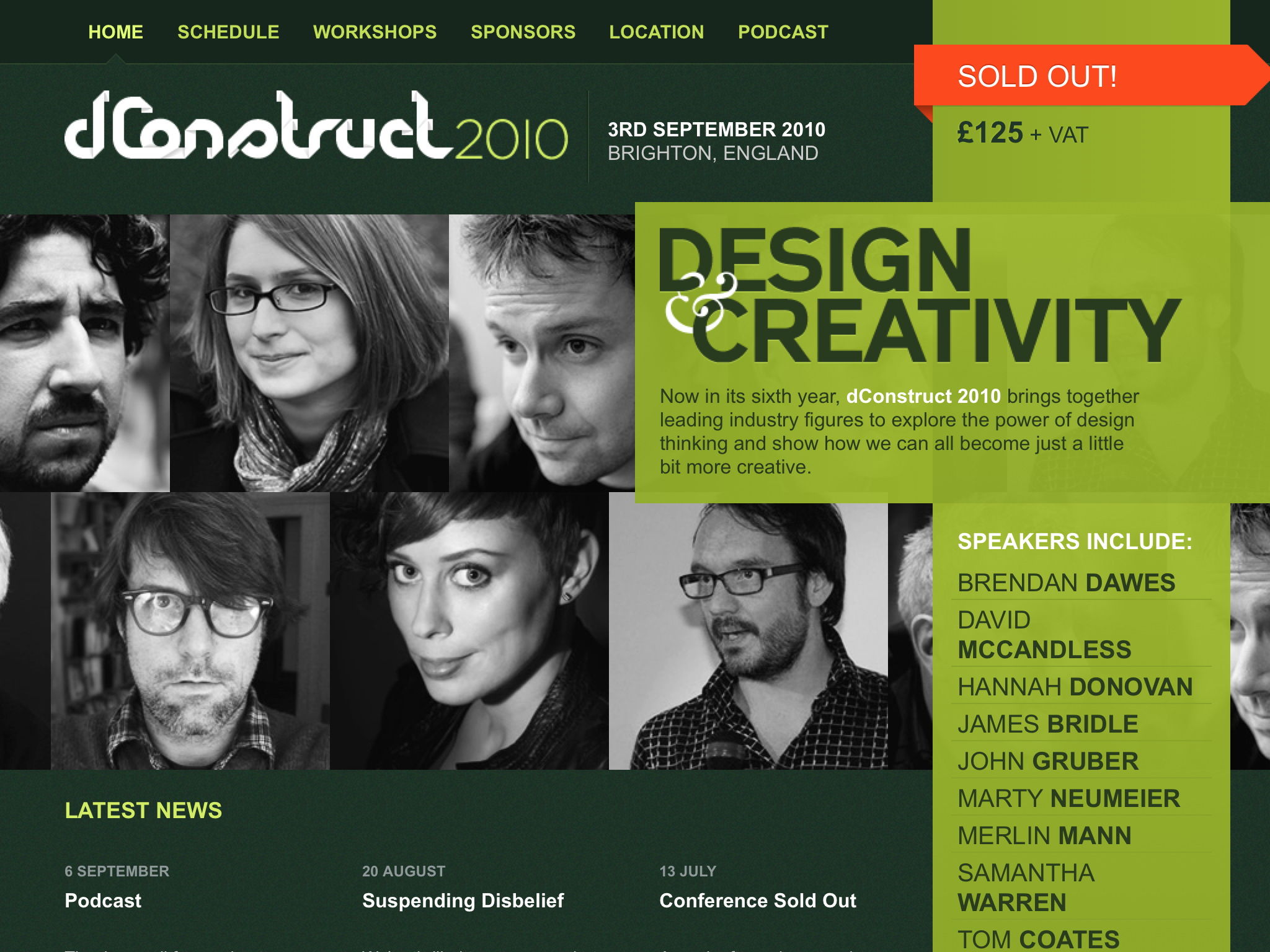
On the first Friday of September, Brighton plays host to an annual one-day conference called dConstruct. Each year explores a different theme, with topics covering design, culture, technology and everything in-between.
To reflect the changing theme, the site is redesigned each year. I was responsible for the design over three years: 2010, 2011 and 2013.
2010: Design and Creativity
The theme for 2010 was fairly broad so I decided to make a feature of the speakers. The design referred back to an original dConstruct brand asset – the opened cube net – which was placed in different positions across the site to affect the layout of each page. Developed before responsive had entered the lexicon of web design, this was one of the first sites to make use of media queries, with a mobile-orientated layout delivered to users viewing the site on smaller screens.
A greener badge
Prior to this event, Clearleft used plastic wallets to hold the combined conference programme and name badge. I advocated a different approach, one that would omit plastic, create less waste and be cheaper to produce.
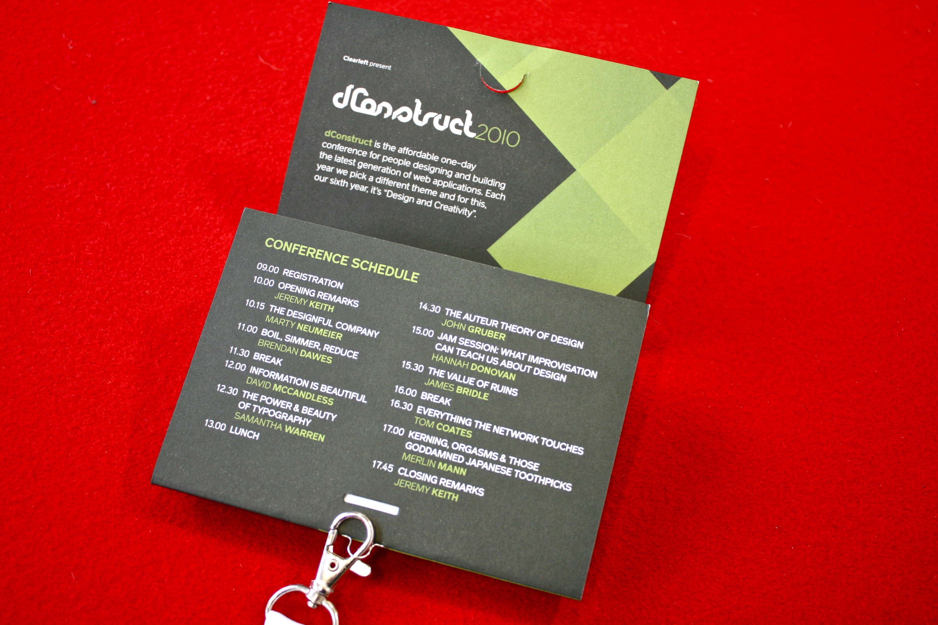
Conference badge for dConstruct 2010. Photograph: James Box
After extensive prototyping, and with help from Gareth Jones at Jack Design, this event featured a greener, paper-only conference badge directly attached to the lanyard by loop staples. This design served as a model for successive conferences run by Clearleft and other conference producers.
2011: Designing Digital Products
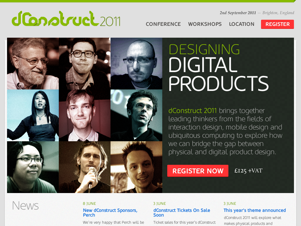
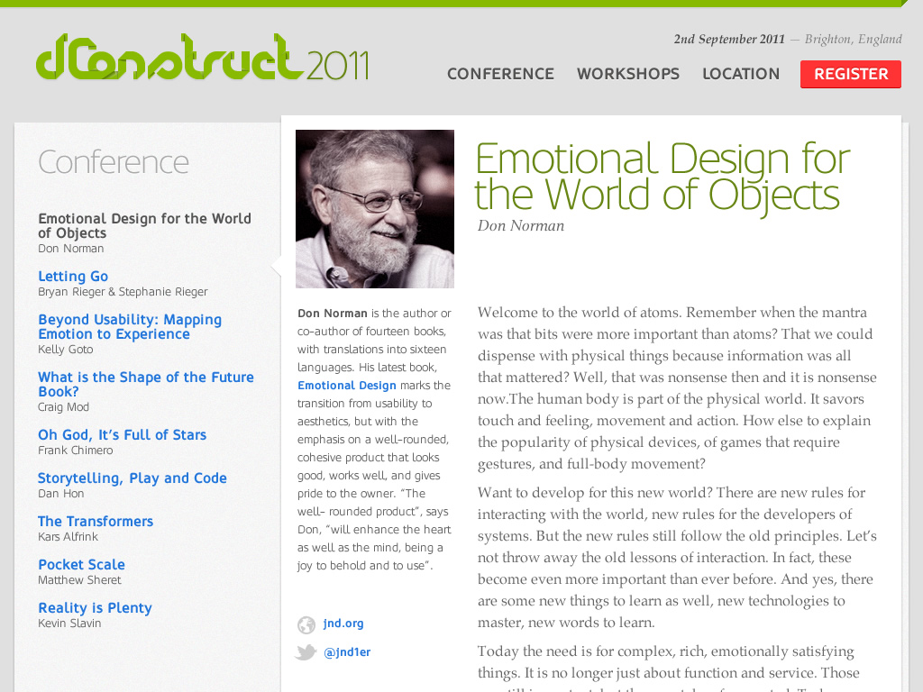
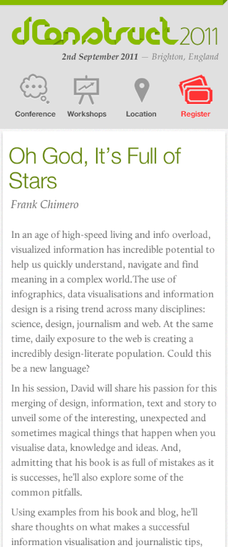
Home page, speaker page on mobile device
Like the previous year’s design, the homepage featured prominent images of the speakers. The design process involved close collaboration with Andy Hume, which was needed for us to build a highly responsive website that would work well across devices. With this in mind, the main navigation was simplified to just four items (Conference, Workshops, Location and Register) with an alternative navigation method shown when browsing speaker pages on smaller screens.
2013: Communicating with Machines
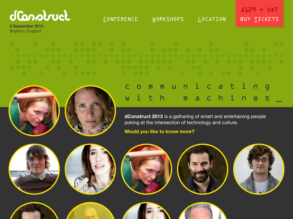
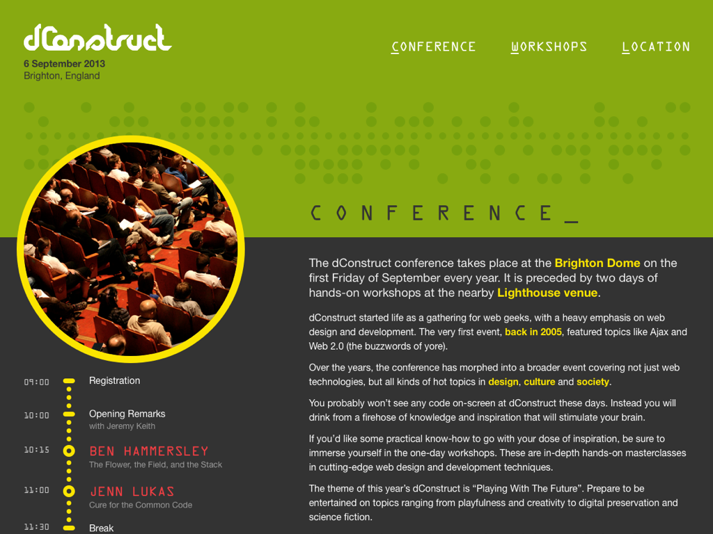
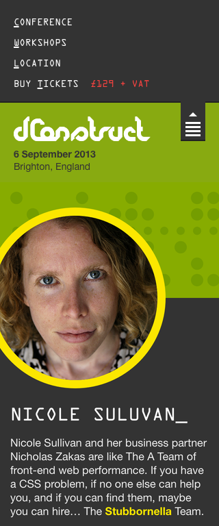
Home page, speaker page on mobile device
Referencing the theme of communicating with machines, I researched different ways humans have tried to direct machines through history. Punch cards became the unifying motif, providing an interesting textural patterning on the website and associated marketing and conference material.