DACS
Responsive redesign for non-profit artists’ rights organisation
DACS (the Design and Artists Copyright Society) is a non-profit organisation that aims to protect the legal rights of artists through education, royalty-related legal services and government lobbying.
The previous website was packed with legalese: language written by solicitors with an intimidating level of detail. DACS realised it needed to replace this with a site that could deliver this content in a more inspiring and persuasive way. I worked with Harry Brignull and Richard Rutter at Clearleft to produce a website that would achieve these goals.
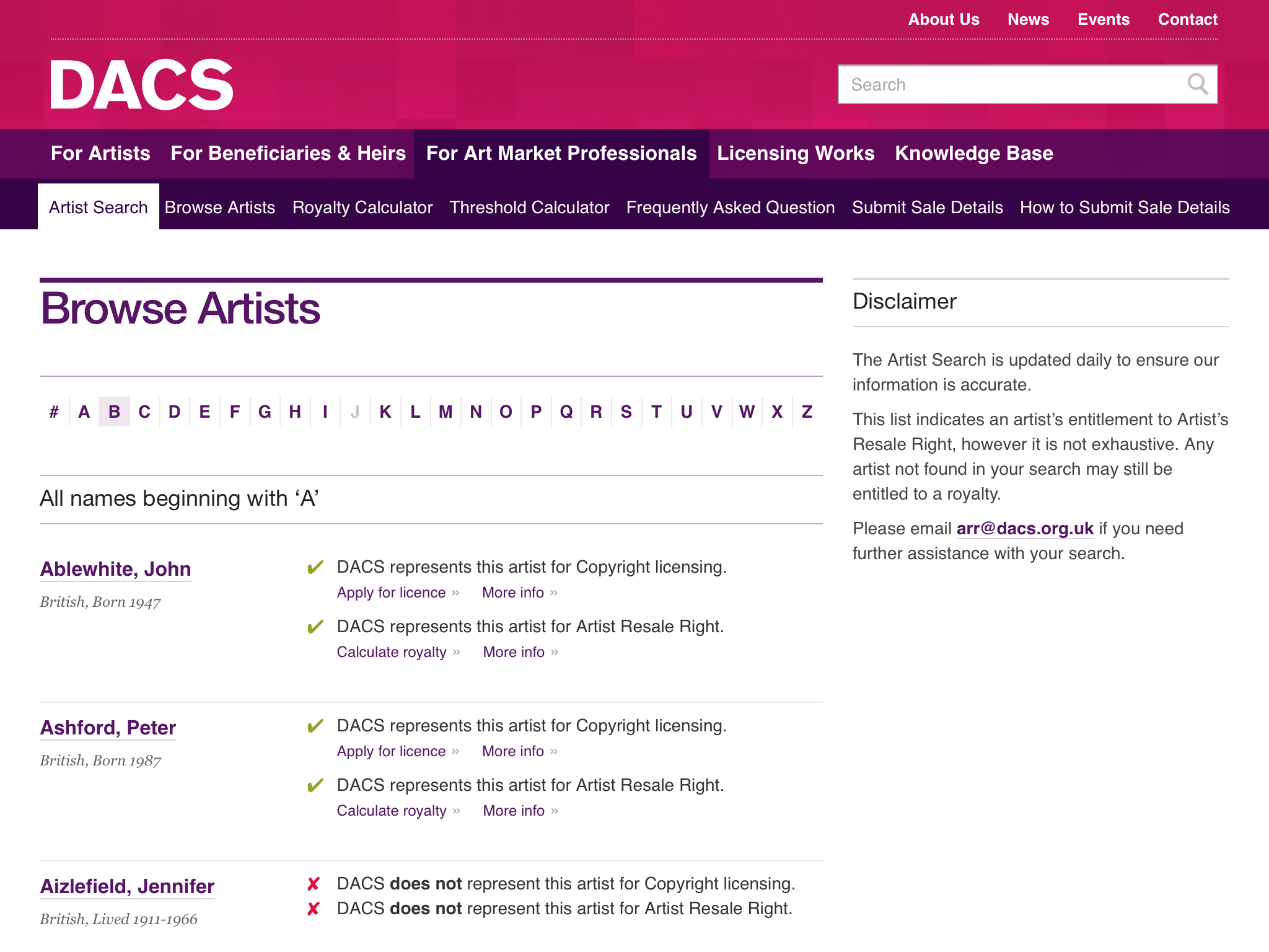
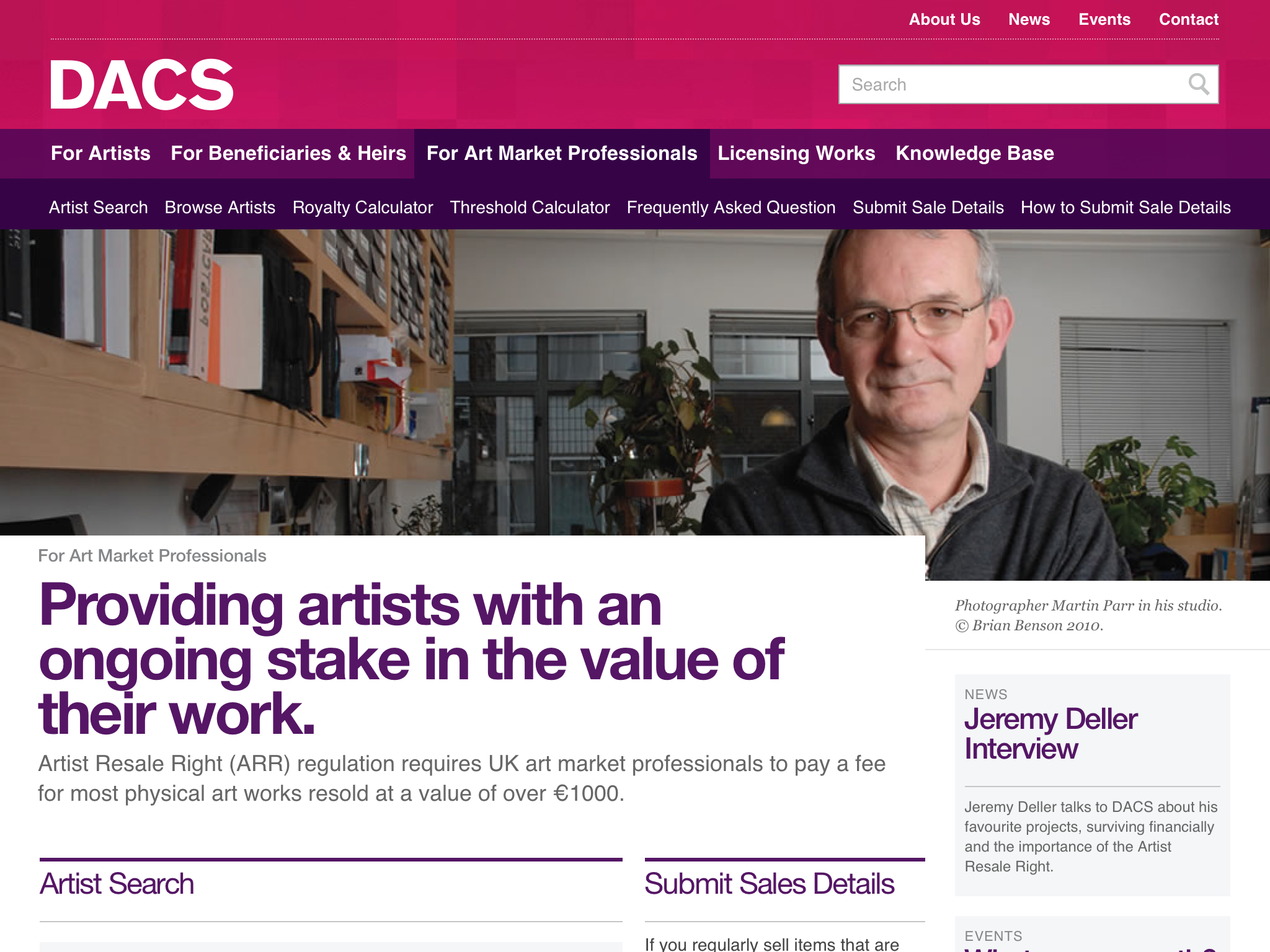
After a period of analysis and prototyping, we realised the website needed different areas for each user type that could quickly triage users into the correct places. Once in the right place, users could then be shown content with an appropriate perspective, tone of voice and calls to action that matched their needs.
Translating a print-orientated brand
DACS had already undergone an extensive rebranding exercise for print but it needed assistance translating this into a suitable web aesthetic. To understand the reasoning behind the different brand elements, I spent time with Simon Kennedy who was responsible for DACS’s identity and brand strategy. During this process, we deprecated the use of Didot online; while it worked well in a print context, the typeface was ill-suited to screen, and few areas on the website needed to reflect the discursive tone for which it was intended.
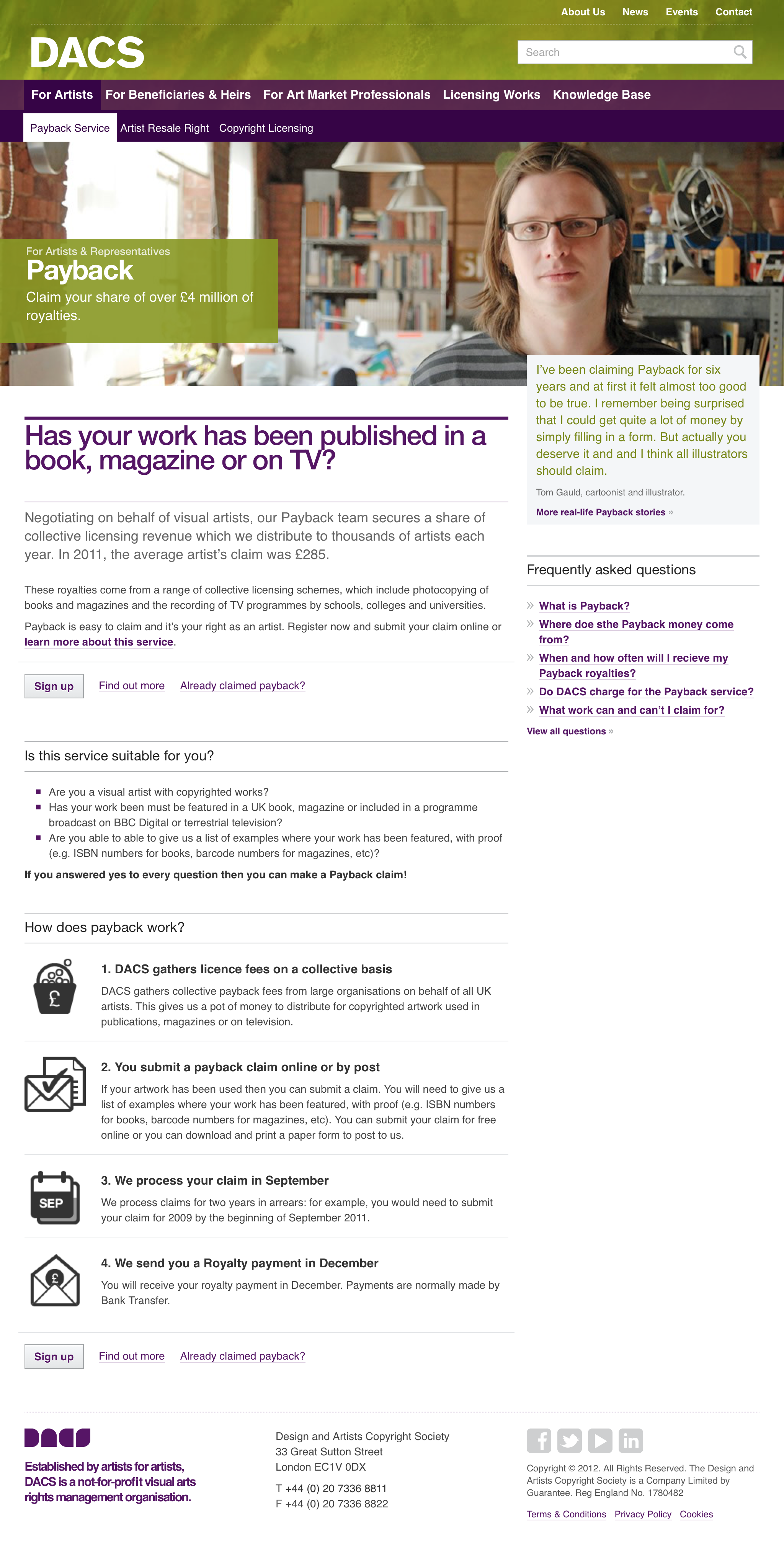
Artist photography shown front and centre on a page describing DACS’ Payback service
I drew on DACS’s photographic library of artists to give a human face to the organisation. These were combined with a restrained typographic pallet to ensure legibility and visual consistency. Finally, I introduced a selection of monochromatic patterns that could be used to differentiate sections of the site.
It looks beautiful! The feedback so far has been great – and it’s just such a vast improvement on what we had before. Thank you so much for your hard work and general genius!
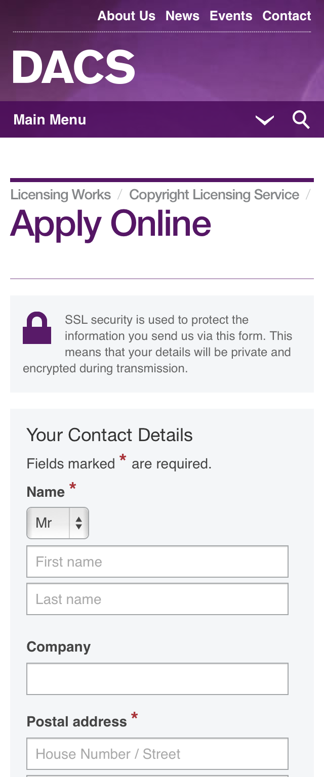
Responsive design was used to deliver the same content to different devices, regardless of the display size or capabilities. I created a pattern portfolio to ease handover to the development agency Cognite. Towards the end of the project I worked at their offices, helping them integrate these design patterns, making adjustments where necessary given the constraints of the CMS.