24 ways
Award-winning redesign for popular web geek advent calendar
Each December, Drew McLellan and his small team publish 24 ways, a daily dose of design and development goodness that delivers a little Christmas cheer to the web community.
The previous website was designed by Tim Van Damme in 2007. His innovative design pushed the limits of the medium, but six years later, and with an accumulated archive of hundreds of articles, it was fraying at the edges.
I’m in the fortunate position of knowing lots of really great web designers – many of whom have been authors for 24 ways over the years. I figured I’d start with my top-choice dream person, and work down the list until I found someone who’d be prepared to do it. So I started by asking Paul Robert Lloyd, and he said yes.
Furthermore, the site failed to reflect the best practices its authors advocated, such as advanced web typography, colour contrast and CSS3 techniques. The layout was responsive (thanks to some retrospective hacking) but a fresh approach was needed to effectively deliver content to the broadening range of devices accessing the site.
Typography and layout
24 ways is not a commercial venture, and with little budget to spend on web fonts, I sought out open source typefaces. Lato, used for much of the interface as well as body copy, offered a contemporary take on the Swiss-inspired design readers were accustomed to. Headings and standfirsts were set in Merriweather, which gave the articles a more scholarly tone and a provided a degree of typographic contrast.
Where the previous design used a rigid template across all sections of the site, which often dominated the content, I created a series of responsive templates each suited the task in hand. These were supported by application-like navigation conventions.
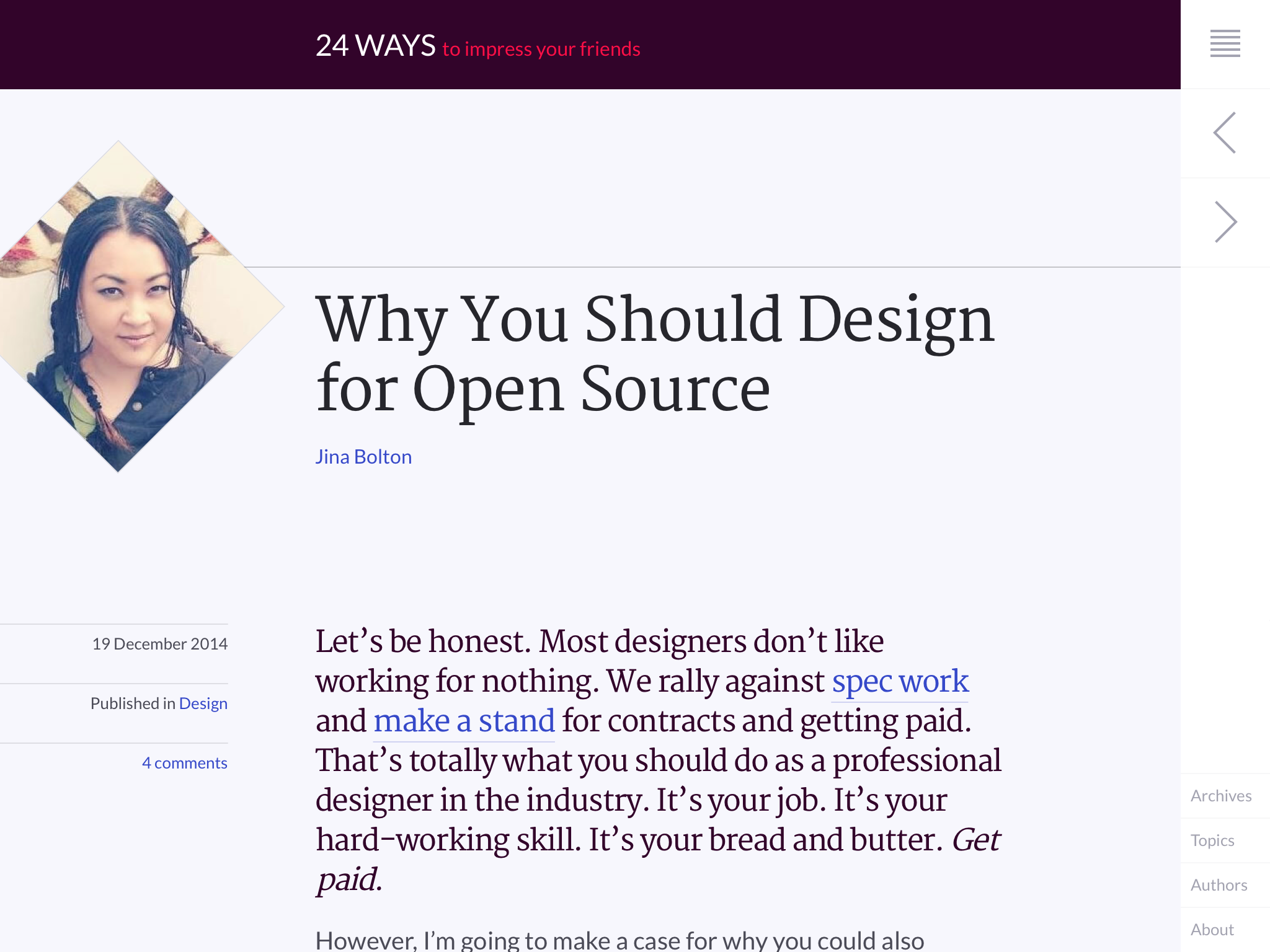
Article page. The interface is recessed to help readers focus on the content. Note also the diamond crop around author photos, which helps create a visual tension on the page.
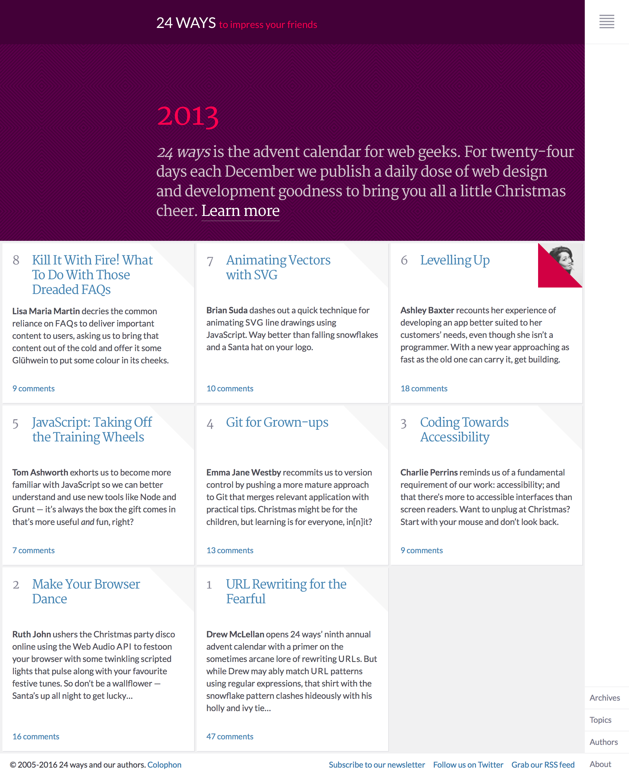
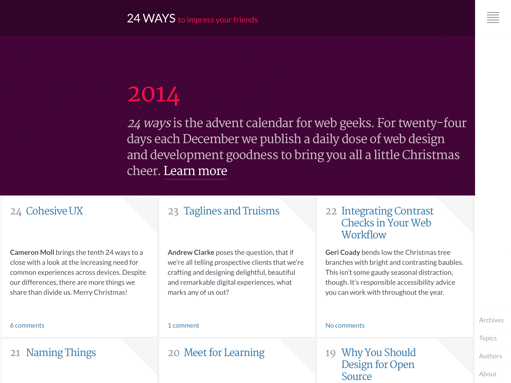
Home page. This, as well as index and collection pages, showcases articles by placing them within a grid to evoke the feel of a calendar.
Keen to exploit the very idea of 24 ways – different articles, written by different authors, published over twenty-four days for almost nearly a decade – I created a palette based on the publication’s signature red, that subtly changes over time based on both day and year variables.
Beyond the visual aesthetic, I was keen to employ best practice with regards to the front-end implementation. This included the use of BEM-like class names, modular components and conditional loading of non-essential page assets, such as comment threads. This improved the performance on the site, especially on mobile devices where bandwidth is more constrained.