Graphic Design on UK Terrestrial Television & the Effects of Multi-Channel Growth
Influenced by the launch of Britain’s first new television station in almost 20 years, Channel 4, television design in the eighties saw experimentation with computer originated graphics. The graphic style during the nineties was also influenced by the launch of new channels – this time hundreds. The advent of multi-channel television meant the traditional terrestrial broadcasters, who for years had little competition, quickly needed to re-invent themselves, and branding played a key role.
The last ten years or so have seen rapid growth and fundamental change in the television landscape. Once a medium limited to transmitting only five channels to the majority of the UK, the 1990’s saw significant advances in broadcasting. This was a decade that started with the launch of satellite and cable television offering scores of channels, and ended with the development of digital television achieving hundreds of channels via satellite and meaning even the standard rooftop aerial could receive around 50. Digital television also brought with it a far more graphical form of Teletext, and interactivity within programmes – thus blurring the boundaries between television and the Internet.
It is because of these advances in technology and the increasing number of channels (and therefore competition) they brought, that I have singled out the nineties to analyse any changes and differences in design styles on those channels broadcast terrestrially (through an aerial) in analogue form – these being BBC1, BBC2, ITV (as a whole and in the regions), Channel 4 and Channel 5. I am looking at these channels in particular as these were around before ‘multi-channel’ television. This is perhaps less true for Channel 5, but still provides an interesting case study as it had to achieve good market penetration only a year before the launch of digital television.
I will be investigating those areas of design that are directly responsible for giving channels their identity, such as idents or ‘stings’ (the breaks shown at the junction of programmes) as well as overall presentation style (menus, captions etc.). I will also look at the presentation of news programmes as I feel that that this is one area of programming that defines a channel, and their appearance often reflects this. (This is especially true in some ITV regions where the local news is all that differentiates it from another owned by the same media group, for example in two Carlton owned regions: Central News and London Tonight). By doing so, I will see how their business, marketing and branding strategies have been developed visually on-screen.
To properly analyse the reasons for any changes to graphic design on television, I will be looking at the broadcasting environment in terms of competition, consolidation, regulation and also any advances in technology used by the designer.
Chapters
The visuality of television
Graphic design is used in a range of situations throughout television: titles and end credits for programmes, programme content (stills, captions, animated sequences etc.), on-screen promotion, channel identities as well as all graphic ‘props’ for programmes such as dramas or sitcoms, designing signs, newspapers, product packaging etc.
Graphic design and television have gone hand in hand from the very creation of the medium:
Contemporary descriptions of [John Logie] Baird’s 1926 experiments with television broadcasts reveal that he used a variety of graphic forms to test legibility, including type script. Graphics and television were thus linked from the point of inception.
However the biggest visual change to television graphics since colour, was the introduction of computer technology and the ability to manipulate television images in an electronic space, rather than just leaving them as purely photographic images reduplicating three-dimensional spaces. The first years of television saw a graphic style heavily influenced by that of cinema being the only existing medium with similarities to television (indeed many of ITV’s first regional franchises were owned by companies with interests in cinema such as Granada and ABC). However, although television gradually developed its own style, it was with televisions growing use of technology that it started to contrast strongly with that of cinema.
Cinema uses digital image technologies to simulate realities and extend the range of its illusionism. Television uses images as the raw material for a process of work, transmuting, combining, changing and layering them in a way that can only be described of as graphic. While cinema remains triumphantly photographic, television has found itself as a graphic medium.
Brain Eley, Creative Director at Lambie-Nairn – a leading brand consultancy that has its roots in television graphic design – has been quoted as saying:
Sophisticated on-screen graphics have become part of the quotable culture, part of the language of television. They’ve gradually become established on the landscape of domestic TV and people now expect an incredibly high level of craft.
Perhaps where television graphics have been used to greatest effect is within news. In what can be a chaotic world where footage isn’t always the best quality (with an items relevance and newness of most importance), news graphics play an important role in striping stories down to the bare essentials. Wars become maps, economies become graphs, political arguments turn into graphical conflict, press releases are presented as an ordered list of bullet points, and these enable television to carry on more effectively the activity of speculation. Such graphics became so commonplace that they were the subject of their own kind of graphic satire – the most notable being The Day Today.
What went before?
Early graphic design in television
Television in the United Kingdom for a large part of its history consisted of three channels run by two networks – the BBC (British Broadcasting Corporation) and ITV (Independent Television). The BBC was the world’s first television service dating as far back as 1936 – a public service paid for by a licence fee. ITV followed in 1955 with a network of regional television companies that unlike the BBC was a commercial service supported by advertising.
This was a comfortable duopoly, where each network competed through its programming, meaning a lack of consideration and under investment in graphic design for much of televisions early history. In fact it wasn’t until 1953 that the BBC appointed Richard Levin as its first Head of Design, who quickly realised the need for a graphic designer. A year later, and almost 20 years after its first broadcast, the BBC employed its first full-time graphic designer – John Sewell – and even then this position was under the control of Scenic Design. It was probably no coincidence that independent television was being established at this time, meaning an end to the BBC’s long standing monopoly. Up until this time, sign writers and commercial artists met most of televisions graphic needs.
The quality of television broadcasts at this time were crude to say the least. Limited to black and white and with a low resolution, television was worsened by the quality of the receivers that tended to suffer from poor definition. Furthermore 20 percent of the screen was considered unusable due a lack of focus around the screens edge, and different television sets cropped the picture at different points. This restricted the graphic designer somewhat and resulted in large and bold lettering with strong tonal contrast, and illustrations with heavy lines and little detail. It’s not surprising that ‘op’ and ‘pop’ art themes were in common use throughout the fifties.
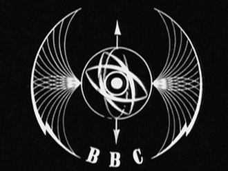
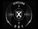
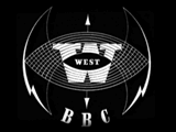
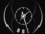
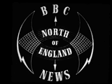
The ‘Bat’s Wings’ symbol for the BBC Television Service. Also shown are regional variants for Scotland and the West of England, a clock and a non-animated ident for a news programme in the North of England. (BBC/Abram Games, 1953)


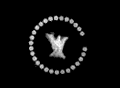
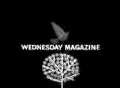
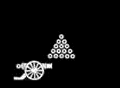
Title sequence from Wednesday Magazine. (BBC/Bernard Lodge, 1958)


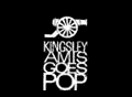

Title sequence from Kingsley Amis Goes Pop. (Associated Rediffusion/John Tribe, 1962)
The launch of BBC2 in 1964 saw the introduction of 625-line higher resolution broadcasts and three years later colour, both of great benefit to the designer although not straight away. BBC1 and ITV only began colour broadcasts in 1969 and the improved 625-line transmissions were still broadcast alongside those using 405-lines, which even with their low quality, weren’t suspended until early 1985. It was up to the audience to upgrade their sets, and sales of colour receivers were unexpectedly low when colour television broadcasts began. Before the majority of viewers had 625-line colour receivers, the designer still had to consider those watching on older sets. However, typical graphic design during the sixties saw a greater use of photography, more detailed illustration and a more apparent use of calligraphy.

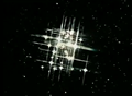
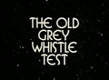
Title sequence from The Old Grey Whistle Test. (BBC/Roger Ferrin, 1968). Watch on YouTube
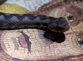
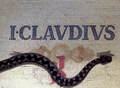
Title sequence from I, Claudius (BBC/Richard Bailey, 1976). Watch on YouTube
Graphic design was also starting to become more automated with an increasing knowledge of the effects a film rostrum camera could achieve. This was a vertically mounted camera that was able to move up and down above a bench on which artwork was placed, the bench providing the majority of the movement. Used mostly during the filming of animated title sequences, it was also used for filming compilations of stills (photographs, paintings or prepared artwork) and shooting cells a frame at a time ready for animation. Later computers became involved in order to control the rostrum camera and allowed complicated moves and techniques such as ‘slit-scan’ and ‘streak-timing’ to be achieved.
The 1980’s saw the introduction of digital paint systems such as the Quantel Paintbox, enabling the graphic designer to assemble collages and montages as well as adapt images. Lettering, first drawn by hand, later using Letraset and character generators, could now be composed in a mater of seconds. The computer had become so versatile, that it could even be used to create whole title sequences or station promotions – green monitor output and wireframe graphics being extremely fashionable at the start of the decade.
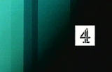
Channel 4
The launch of Channel 4 in 1982 saw the first new television channel since BBC2, and heralded in a whole new era of television. Channel 4 was to be a channel aimed towards minority and neglected interests, would take risks and unlike the other channels at that time, was to commission programmes from independent programme makers – acting more like a publisher than a broadcaster.
It wasn’t only the channel that was to be new and original however. Its identity and presentation style devised by Robinson Lambie-Nairn, was to have a profound effect on graphic design in television throughout the eighties.
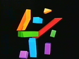
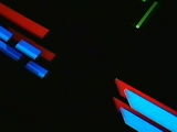
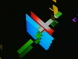
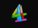
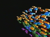
Taking into account that Channel 4 was to commission its programmes from independent programme makers, Robinson Lambie-Nairn devised a logo that reflected this, and in its on-screen implementation flying coloured blocks set against a black background came together to form a figure four in the centre of the screen. However, instead of just a single animation, four variations were produced that aimed to keep the channel fresh and surprising, and give it a unique personality that could be developed over time.
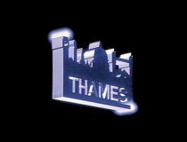
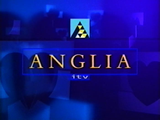
Although it was expensive to implement, it was radically different to its competitors, all of which returned to a single on-screen ident, be it BBC1’s revolving globe, Anglia’s revolving knight or Thames’ London skyline.
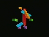

Round and Back. (Channel 4/Robinson Lambie-Nairn, 1982). Watch on YouTube
Implosion. (Channel 4/Robinson Lambie-Nairn, 1982). Watch on YouTube
Interlock. (Channel 4/Robinson Lambie-Nairn, 1982). Watch on YouTube
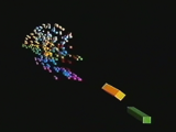
Space Squad. (Channel 4/Robinson Lambie-Nairn, 1982). Watch on YouTube
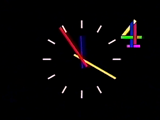
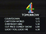
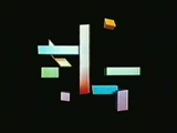
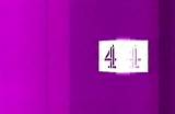
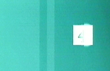
The idents were part of a consistent presentation style across the channel. Shown here is the clock, programme menu and two presentation slides.
Idents were paired with Fourscore, a four-note signature tune composed by David Dundas that, like the figure four, could be adapted to suit a particular mood or theme. Compared to its rivals, Channel 4 used bright colours, movement, ground breaking technology with a consistent image both on and off screen. In turn, Channel 4 became the first channel to have ‘a brand’, a visual property to hang on to – something very important to a channel that was going to find it hard competing against three well established channels and a lot of bad press initially.
The launch identity has since been lauded as the most innovative corporate solution of the eighties.
Robinson Lambie-Nairn encouraged the channel’s presentation department to follow in the same lines as the programme makers and commission other artists to produce promotional pieces for them. This saw seasonal campaign sequences designed by the likes of Oscar Grillio, Blink and Terrance Donovan which by doing so, saw Channel 4 perceived as a centre of design innovation and excellence.
The success of the Channel 4 identity caused immediate resentment from various ITV regions, which considered the new channel to be its ‘poor relation’ (Lambie-Nairn, 1997, p85), yet it had an identity that was a talking point amongst both industry and public. They concluded that it was successful due to the fact that its idents were computer animated (apposed to its consistent and well applied design) and ordered their graphic designers to computerise their logos.
The face of television across all channels became increasingly similar. Here are shown idents for BBC1, BBC2 and Thames (an ITV region serving London during weekdays).
The viewer was suddenly confronted with an array of flying logos. Thames for example took its familiar London skyline image and turned it into a metallic looking slab and flew around the screen. Of course this had no effect on viewing figures or the popularity of the channels, as the identities bore no relationship to the values of the channels (if anything it made them all look the same). It was just a fascination with a technique.
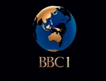
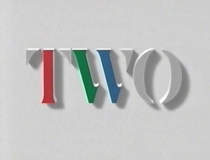
The BBC for some part, also jumped on the computer generated bandwagon. In 1985, its famous globe became what it termed a COW (Computer Originated World) – a blue and gold revolving globe on a black background with ‘BBC 1’ in large gold letters beneath. Its second channel BBC2 used a stenciled serif TWO that rose out of a grey background, with three portions coloured red, green and blue – the primary colours used to produce colour imagery in television.
The growth of branding
ITV and BBC – first attempts
As in other areas of contemporary marketing, the idea of “the brand” replaced older models of production and sales. Television companies saw a key role in the development of brands as having identities that were different to competitors which could be recognised and valued by their target audiences.
The first real attempt to create a brand to rival Channel 4’s came in 1989 when the Independent Television Association decided to create a new ITV corporate brand for its fragmented network, that would provide a consistent image across its regions with a stylish and meaningful design.
English Markell Pockett had to come up with a new logo that could incorporate fifteen regional variations into a single corporate image to counter the strong national images of new satellite stations like BSB.
This was achieved by developing a generic ITV logo alongside regional variations where the ‘V’ was changed from a blue triangle with three cut outs, to highly stylised, almost heraldic imagery, loosely based on each regions own logo. A single but regionally adapted ident was created alongside a musical score composed by the same man responsible for Channel 4’s – David Dundas. This was played as a regions logo was stretched and blurred sideways to launch into an animation featuring images of Big Ben (representing current affairs and politics), dancers (entertainment), a couple in an embrace (drama), an athlete (sport) etc. before recombining to show the appropriate regionally adapted ITV logo.
Theme specific identities were also created for sport, drama and children’s programming. Although a nice idea in theory, some regions refused to use these idents and for those who did, it wasn’t long before many adapted them to suit their own tastes. To accept the common logo and identity was seen to be dubbing down their own for which was relied on as a link with their viewers. Furthermore, 1992 saw three regions lose their franchises, and those that replaced them launched with their own idents.
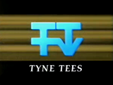
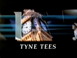
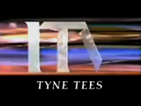
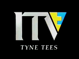
Channel ident for Tyne Tees Television. (ITV Network/English Markell Pockett, 1989)

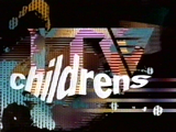
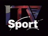
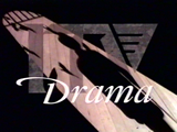
The generic ITV logo, shown alongside variations for sport, drama and children’s programming
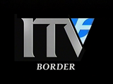
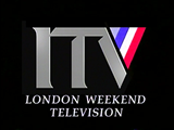
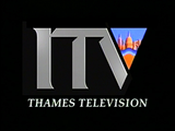
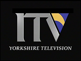
Regional logo variations, shown here for Border, London Weekend Television, Thames Television and Yorkshire Television
With both Channel 4 and ITV having modern idents, the BBC’s two channels were starting to look outdated and dull. The BBC has a special place in broadcasting, as it does in the nations cultural fabric (sometimes affectionately referred to as ‘Auntie’ Beeb).
Being a public television service paid for by the people and so not littered with advertising, as well as an institution with a rich history entwined with the nations, it is seen as impartial and trustworthy, innovative and the gold-standard in television. The image it projects is in some ways, a reflection of us and our country and this importance means it has an image that is not to be meddled with lightly.
Whilst BBC1’s slightly wooden and stayed COW ident was popular, BBC2’s hadn’t managed to keep pace with the changing programming of the channel and was perceived as boring and snobbish, and summed up with a predominately grey ident. Furthermore, the two channels had no consistency between them or any of their own promotions, and their identities didn’t transfer well to print.
In 1990, Martin Lambie-Nairn – a former employee of the BBC’s in-house graphics department during the 1960’s – was brought in to refresh the identities of both channels.
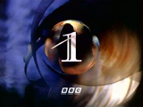
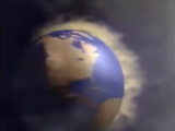
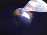
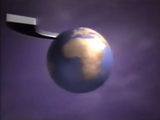
The identity for BBC1 retained a globe as the central element, reminding viewers of the BBC’s self-appointed role as a kind of super-national messenger.
The new ident was given a more contemporary feel making it more colourful, warmer and gave it an almost mystical quality. Designed by Daniel Barber, the new globe was created by lighting model globes from different positions and resulted in a swirling one minute sequence with nine different looking points of entry.
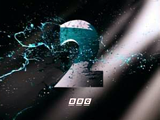
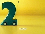
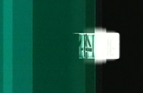
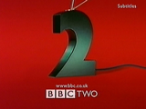
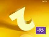
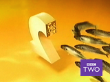
For BBC2, Lambie-Nairn used a far more radical approach by creating a family of idents based on the numeral 2 (hand drawn but based loosely on the Gill Sans ‘2’) which used a viridian colour branding. The family included idents that could be programme specific, and some that were purposely aired on an occasional basis to give them air of rarity. To give BBC2 more credibility, BBC1 was also given a numeral, although more classically styled. By doing so each channel mutually supported each other.
Whilst BBC1’s image was designed to endure and remain graphically appealing, BBC2’s identity would be developed over time. Consistency was also brought to each channel, with all promotional material carrying the channel logos in fixed positions on screen, and all other information such as programme start times, menus, apologies etc. set in the Futura typeface.
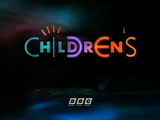
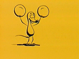
The BBC’s branding was consistent across both channels and also its children’s programming. Shown here are idents for BBC One, BBC Two and Childrens BBC.
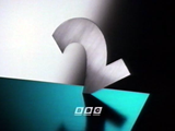

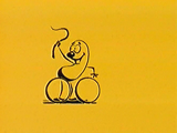
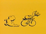
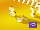
BBC2 had a variety of idents that were added to over the following years. Shown here are the idents Blade, Dog, Car and Garden.
After what Lambie-Nairn described as a ‘repositioning’ of the two channels, both were seen as more up-to-date and accessible, without destroying BBC1’s already strong image. The BBC2 identities became a particular hit, both with the public and within the design industry. With no change to its programming, BBC2 was now seen as sophisticated, witty and entertaining. The ‘2’ figure was developed further over the following years with idents such as ‘Fluffy Dog’ in which an excitable figure two leaps into the air and summersaults, and ‘Car’ in which the 2 becomes a remote controlled car that whizzes around the screen, both becoming firm favourites with the audience. Alan Yentob, controller of BBC2 at the time, was quoted as saying:
It has received lots of fan mail and correspondence. We will definitely be renewing its contract.
Indeed 11 years since they were first aired, the 2’s can still be seen onscreen, albeit recently updated.
Within two years, the face of television in the UK was now akin to that of a supermarket shelf with the viewer able to chose from three separate yet distinct brands. Whilst BBC’s 1 and 2 now had a consistency between them, BBC1 still maintained its sense of quality, whilst BBC2 had a flexible yet familiar identity more appropriate to its changeable programming. ITV had a new corporate personality and (some) consistency across the regions, yet kept its popular programming outlook, and Channel 4’s identity – unchanged for 10 years was still appropriate and popular. Whilst BBC1 relied on its familiar globe identity, backed by variations of the ‘1’ numeral for seasonal and programme promotions, ITV had to seemingly remind its viewers what it strengths were as a channel within its idents (most programme promotion was dependent upon region).
Whilst the flagship channels had dark idents with subtle hints of colour, BBC2 and Channel 4 clearly became slightly alternative viewing matched with two colourful figures competing against each other for wit and personality (BBC2’s being a more modern treatment) and both figures had the flexibility to match the varied programming of each channel.
Give me 5
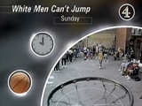
The general presentation and look of television remained largely unchanged until the arrival of Channel 5 – the UK’s fifth and final terrestrial television channel – created with the sole purpose of stimulating competition and increasing airtime available to advertisers.
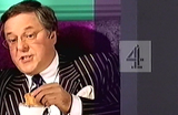
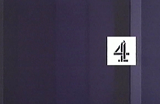
A year earlier, and anticipating the new channels launch, Channel 4, still using its original idents decided to assess its on-screen image and came up with ‘Connections’, a new identity produced in-house, but with early input from Tomato.
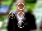
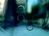
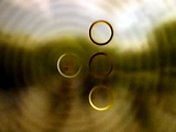
This new identity consisted of four circles presented in various static formations or in motion linked by lines, representing the channel (shown by a circle containing the retained stenciled 4 figure from 1982), its programmes, its viewers and society at large. A large part of the channels identity rested with its programmes with many idents featuring the channels celebrities speaking straight to camera “You’re watching Channel Four” before going out of focus and overlaid with the four circles. Other idents and break bumpers saw the circles overlaid blurred images of urban locations such as streets and airports, and featured people about their daily business.
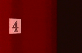
The circles theme extended to programme captions, where again one circle contained the four logo; one contained an analogue clock showing start time, and two further circles of varying size contained programme related imagery. All titles were set in a sans serif typeface, with larger programme titles bolder and italicised, although the placement of all these elements was quite random. However for a channel once vibrant and full of movement, it was now drained of its multiple colours and also became a little static.
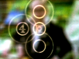
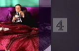
Channel 4’s ‘Connections’ identity. This particular example featured the comedian Harry Hill from The Harry Hill Show – a popular show on the channel at the time.
The ‘Connections’ theme was extended across all on-screen promotions and captions
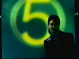
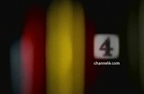
Channel 5 eventually launched on Easter Sunday 1997, but prior to this, the channel was responsible for retuning television sets in 9 million homes to avoid interference with video recorders. Not only did the channel need to inform the public about its arrival, but also about the need to get their video equipment retuned. As an unknown entity, Channel 5 had to quickly build awareness of its name and brand, only a few months before the launch of the channel (and only 18 months before the launch of digital satellite).
The company responsible for building this awareness was Wollf Olins, the company responsible for BT and Orange corporate identities but this was their first venture into television. They devised an identity that worked in two parts. The first part involved the creation of a ‘retuning brand’ using the slogan “give me 5” and featured five vertical bands of vivid colour – blue, orange pink, yellow and green, and a logo which was a 5 inside two thin circles, taking design cues from that of test cards. This visual imagery was:
…deliberately bright and straight forward – it reflects the tone of the programming which will be optimistic and unashamedly populist.
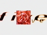
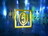
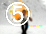
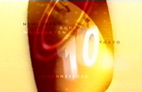
As it turned out, the success of the retuning campaign led to Channel 5 using the same identity on screen, with only a minor modification to the logo, simplifying it to one slightly thicker circle for better clarity on screen. However, Channel 5’s first selection of idents was a mixed bag and didn’t seem to match the vivid pre-launch campaign. Many consisted of manipulations of the 5 logo and the word five, as well as involving images of flowers, drops of water and clouds – somewhat American in flavour.
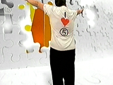
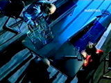
A sequence from one of the first idents for Channel 5
Four separate stills from other idents in the set
As a sign of things to come, Channel 5 controversially launched with a DOG (Digital Onscreen Graphic) – the channels logo constantly displayed in the top left hand corner of the screen. A device heavily used on cable and satellite channels, this was new to terrestrial viewers and irritated them. It was decided to use such a device so that people could find the new channel, but only served to irritate them. However it still remains today, yet with a higher level of transparency than when first seen.
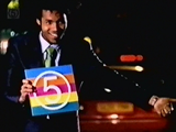
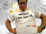
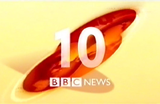
The original set of idents lasted for two years before being replaced with arguably more appropriate idents that used the 5 logo and colours more consistently. Upon their launch Jim Hytner, Marketing Director at Channel 5 said:
The launch itself was successful in establishing it as a big brand or a big channel but I’m not sure that we the channel had a good enough feeling about what our programming was going to be, and therefore it was quite hard to express that to viewers.
Later revisions of the channels identity were more consistent with its off-air brand
The new idents involved channel personalities and celebrities taking the mickey out of the channel or themselves which tried to express a confidence to the viewer that the channel had about itself. These were updated again a year later but retained the same themes.
A more appropriate image for Channel 4
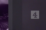
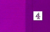
Channel 4’s logo now looked embarrassingly similar to that of Channel 5 – both having a numeral inside a circle (Channel 4’s logo was often simplified to using just the one circle).
As a new look “to underline Channel 4’s position as a network that will remain relevant and innovative into the millennium” (Mistry, 1996), the connections identity proved to be too formulaic and constraining, especially off-air were the circles were no longer working in a meaningful way.
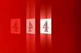
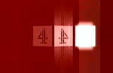
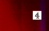
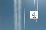
In 1999, a new image for the channel was created by consultancy Spin and the channel’s in-house team. This saw the return of colour and movement to the Channel 4 identity, and like the original, was designed to break a lot of television rules. Again, the original stenciled ‘4’ logo was retained but in this implementation it was reversed out of a white square which both on and off screen was placed right of centre.
The original set of idents featured straight vertical bands of colour – sometimes containing non-specific imagery such as roads, tunnels, swimming pools within these bands, which moved from left to right behind the logo. Again versions were created depicting the channel’s personalities, and this time involved showing their apparent habits as they watched the channel – Richard Whiteley dunking biscuits into his tea, whilst on his bed watching 15 to 1 for example.
The idents proved extremely versatile with variations for children’s programming and its teenage stand T4 continuing the theme – slanting the bands slightly to the right and using bright and vibrant consistent colours such as blue, yellow and orange. All promotional material also maintained the square logo’s position as seen on screen.
Richard Whiteley. (Channel 4/Spin, 1999)
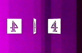
The first reworking of the idents, designed in-house and by Static 2358, played about more with the logo, moving it horizontally across the screen whilst flipping it about, spinning it around, blurring or distorting it before returning it to its standard position – reminiscent of the launch idents of 1982.
Red. (Channel 4/Static 2358, 1999)
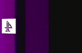
Purple. (Channel 4/Static 2358, 1999)
Green. (Channel 4/Static 2358, 1999)
New captions for programme start times were introduced, where four squares were centred on screen, the first three containing an image relating to the programme, whilst the last contained the 4 in its square. It was also around this time that idents for use during daytime were introduced, and saw the square coloured to complement its background (an orange square on blue, and red on green).
All presentation carried the logo in the same position on screen
The latest update saw some narrative elements added, with the vertical lines being created by vapour trails, the movement of water, the beating of a heart, coloured lights and sound waves. Again the logo became more involved within the ident, and whilst still remaining in the same position on screen, it mimicked the action taking place behind it.


Ripples. (Channel 4/Spin, 2002)
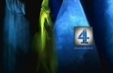
The latest update to Channel 4’s on screen image shows the versatility of the original lines concept. Shown here are the idents Waveforms, Slots, Vapour Trails and Film.
In retrospect, Channel 4 made a mistake in some ways with its over eagerness to compete with Channel 5, a channel that had a very populist output at odds with Channel 4’s. It was admitted later that the connections identity was rushed out ahead of the Channel 5 launch, and by the end of the decade returned to an identity close to that of 1982 with a strong involvement of colour and movement.
Although the connections identity was well put together, it wasn’t that innovative, but its replacement was completely different to anything else seen on television. For its part, Channel 5’s original on-screen identity was one that didn’t fit the channel’s personality, or its off screen identity – and it wasn’t until two years later that a more appropriate one was aired.
BBC comes together…
With no corporate guidelines, the BBC had ‘zillions of logos’ and was generating new ones at a rate of two a week. With the advent of digital and the launch of more channels and services, its brand was being increasingly weakened.
In 1997, the BBC’s corporate identity across all divisions was updated, with the previous slanted underlined logo designed in 1986 far simplified. According to Lambie-Nairn, who was selected to oversee the branding of the corporation, the existing logo was dated, expensive to print and didn’t work on screen. Whilst the new logo still contained the initials BBC inside three boxes, they were now settled on their upright with the type set in Gill Sans. Lambie-Nairn described the new logo as “robust and elegant and solving all the technical problems in one hit” (Gilgrist, 1997). With guidelines that dictated that a channel, directorate, regional and other names should run to the right of the logo and also be set in Gill Sans, meant it all looked like it came from the same organisation.
It followed that with a new corporate identity, most elements of the corporation would have to be redesigned or altered to work alongside it. On television, BBC2 kept the popular 2’s and although some idents were discontinued, for those that remained only the 2 was slightly enlarged and new BBC logo and channel name added, with further idents added to the collection over the following years.
BBC1 retained the globe, however it was given a new twist by using an orange air balloon styled as a globe, and floating it above different landmarks and regions across Britain, Lambie-Nairn again aiming to reposition the channel. The use of bright orange for the balloon was in strong contrast to the earthy browns, greens and yellows as well as the blues within the sky.
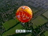
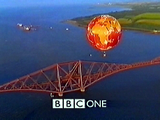
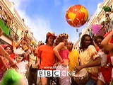
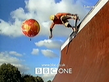
BBC1’s image was given a new twist with an identity featuring an orange balloon flown over Britain. Later additions to the ident set showed images of people skateboarding, bungee jumping, in carnivals and at a market. Shown here are the idents English 11, Scottish 6, Carnival and Skateboarders.
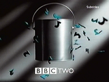
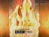
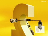
BBC2’s idents were left pretty much untouched. A new addition to the collection at this time, Paint Pot, showed the strength of the identity. This featured a simple paint-pot that mimicked one of the first idents Paint. However with more and more idents being added to the collection – some no longer featuring the viridian colour – such as Kebab shown above, the brand was becoming increasingly weakened.
Mouse. (BBC/Lambie-Nairn, 1997). All of the BBC’s children’s output was given a new look, using just the colours yellow and black and drawn animations.
Both channels kept the consistency seen in the last makeover, but this time all onscreen promotional material carried ‘BBC ONE’ or ‘BBC TWO’ centred at the bottom of the screen – this placement more suitable for the upcoming widescreen format used in digital television.
…while ITV grows apart
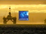
By the mid-ninetees every ITV region was back to using individual identities – with only Grampian using the original 1989 idents and graphics. At the same time, the ITV network was entering a period of consolidation and mergers amongst the franchises, threatening its regional identity.
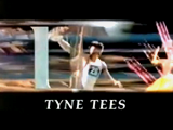
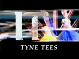
A few years after Yorkshire and Tyne Tees Television merged, the Managing Director of the combined group, Bruce Gyngell, decided to place the two stations under a single ‘Channel 3’ umbrella brand. The board at Yorkshire Television weren’t keen about re-branding their station, but agreed to experiment with the idea at Tyne Tees, which was renamed Channel 3 North East. Its ident featured a large gold numeral ‘3’ from which the words North East emerged, and was put together by a design company in Leeds. It was nothing new or original, in fact it was pretty bland, and reportedly created in an afternoon. An extended ident was also produced, that sometimes featured before the local news, in which various landscapes from the region where intertwined with groups of three (three swimmers, three kids on swings etc.) as well as local personalities from the channel.
However this was as far as the brand went, and viewers were confronted with pretty much of what went before. It also caused confusion with continuity announcers often presenting the channel as “Tyne Tees Television, broadcasting on Channel 3 in the North-East” or similar mouthfuls, matched with an ident including both Channel 3 North East, and Tyne Tees names. As a result it wasn’t well received by the public and only lasted a year. The Yorkshire version of the ident was more faithful to the original ‘Chevron’ identity, with the gold ‘3’ only seen at the beginning of its ident. When Yorkshire Tyne Tees was taken over by Granada, the Channel 3 brand was scraped and the Tyne Tees name reinstated.
Central was also another regional company to be taken over, this time by Carlton Communications, holder of the London weekday franchise, in 1994. In its first attempt at consistency across the two franchises in late 1996, both Central and Carlton in London used a set of idents designed to complement the networks programming. Here either the word CARLTON or CENTRAL (both visually similar) set in Gill Sans, morphed into rows of houses (Coronation Street), had their letters rearranged (for use before game shows), were spelt out with the phonetic alphabet (The Bill) or had footballs struck at them, and many other such treatments. Usually set in white against bright colours, this was based more on Carlton’s brand history than Central’s, but at least the Central name was retained.
However this only lasted two years, before the inevitable happened and all three regions now owned by the group were simply named Carlton, and used a new common identity. This contained Carlton’s logo that had originally been designed to warm viewers to the name when it took over the London weekday franchise in 1992, with the placement of the ‘T’ within the ‘L’ to hint at LON for London.
Yet again, the ITV network was divided and segregated. Almost ten years after English and Pockett designed its first identity, ITV now wanted an identity that “better reflected the channels mass appeal and unique position in British TV as the channel closest to peoples heart” and one that “moved away from a distant, corporate image to a more consumer friendly brand” (Futurebrand.com, 2002). English and Pockett was again the company responsible for this new image, and saw a new logo with yellow lowercase ITV initials set inside a blue rectangle. These colours were chosen to reflect the networks heritage and took colours predominating in the logos of most regional companies. A year later, its onscreen implementation was introduced, and again a dual branding system was devised for nine of the 14 regional companies. 16 different street level sequences were created showing activities of ordinary people in Britain – such as moving house, hanging out the washing, painting a floor – that revealed the heart motive at the end of the sequence.
Plan It. (ITV Network/English and Pockett, 1999). In this ident, a group of architects are seen working around a table, before the heat motif is revealed, followed by a regions name and logo
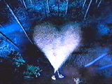
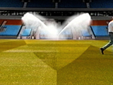
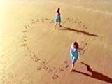
16 heart sequences were created in total. Shown here are the idents Search Lights, Funfair, Football Pitch and Beach.
That is not to say that the hearts identity was universally appropriate, as was proven in the LWT region. With a long-standing reputation as the region for producing the majority of the networks weekend entertainment, and in London exclusively seen as an identity for the weekend, the hearts theme in its original format just didn’t fit. A more appropriate version was devised in which a camera panned across a video wall showing clips from the pervious hearts idents as well as LWT branding. The music was also changed to be far more upbeat.
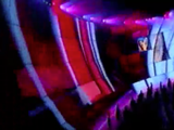
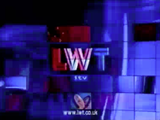
Videowall. (LWT, 2000). The heart sequences weren’t appropriate for the LWT region, where it was given a more livelier treatment.
Only nine of the 14 regions used these idents. Ulster Television (UTV) had by now developed a completely separate identity to that of ITV, and the Scottish regions (Scottish and Grampian), both owned by Scottish Media Group, opted out and had a separate identity created involving a blue square and images of Scots of all ages in daily activities. Also, the three Carlton Communication owned regions (Central, Westcountry and Carlton) since renamed Carlton used an alternative – though still based on the hearts theme. The Lambie-Nairn produced idents indicated that Carlton was the star of the ITV network and was reflected on-screen with animations of various hearts that have a star in the corner before ending with a standardised Carlton title. In effect, ITV was now seemingly four different regions: UTV, and those owned by Carlton, Scottish and Granada media groups.
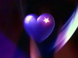
Ident for franchises owned by Carlton Communications in 1999.
In 2000, the two Scottish franchises introduced a separate identity which made no reference to ITV.
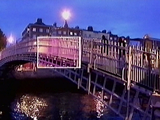
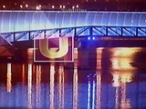
In Northern Ireland, UTV opted to use a different brand identity as well.
Whilst the BBC tried to reflect its public service image (bringing the world to every corner of Britain), it brought with it a recognition of the rest of Britain. Indeed, it was the first time that BBC1 had used such strong regional elements in its identity. ITV was also trying to display its credentials as not only Britain’s most popular channel, but as that closest to peoples hearts. But this was at a time when many regional names and identities were disappearing, each providing a strong link with viewers. It turned out that whilst the BBC was becoming more regionalised (a fact reflected in its programme scheduling and budgets), ITV was becoming more centralised, both on and off screen.
The effects of multi-channel competition today
Unlike their analogue variants, digital satellite and cable services introduced a new method of browsing their greater number of channels: the Electronic Programme Guide (EPG). This allowed the viewer to browse channels and gain information about other programmes being shown, as well as browse channels by genre i.e. entertainment, sport, arts etc. Now audiences could watch television on a programme by programme basis rather than be dictated by channel schedules.
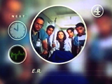
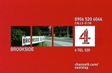
This saw idents, end credits and other programme junctions being increasingly used to promote programmes. Channel 4 was the first to do so, using the right hand quarter of screen displaying the channel’s logo with information about forthcoming programmes or programme related material that could be purchased whilst the end credits rolled.
This information in the past tended to be shown at the end of a programme. In addition, late 2001 saw channels start to use programme junctions and their associated idents to not only display information about what channel you were watching, but also contained menus (before only seen in separate promotions, or when there had been schedule changes), detailing up-coming programmes.
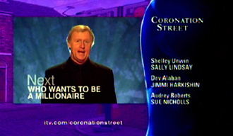
End Credit Promotions (ECPs) became a new trend in keeping viewers tuned to a particular channel. Shown are ECPs from ITV and Channel 4.
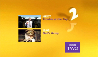
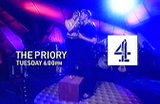
Menus shown prior to programmes. Shown are menus from Channel 4 and ITV.
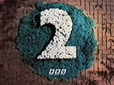
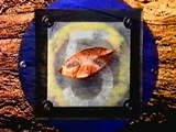
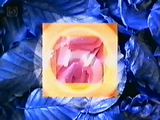
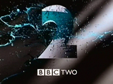
In November 2001, BBC2 updated its ten-year-old idents, for which such menus were an integral part. Although the original and subsequent sets of idents contained the viridian colour branding, it was not compulsory, and later idents started not to feature the colour – for those that did the colour appeared in different places. The new idents involved giving the channel consistent co-ordinated colours – a white 2 on a deep yellow backdrop, as well as a single four note jingle that could be subtly adapted. Also nation specific idents have been designed – currently in Northern Ireland only, were part of the evening schedule is changed from the rest of the UK’s to suit its local audience. The channel insignia was changed also to a purple rectangle positioned in the bottom right of the screen.
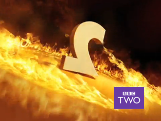
The BBC2 identity was radically changed after 10 years, using a standard and unaltered set of colour ways. Shown here are the idents Fire, Bounce, Domino, Logo and Fish.
This was all aimed to give the channel a more contemporary feel “retaining and reinforcing the wit and personality the 2s have already established, whilst presenting a new and refreshed image for BBC2” (Wilkes, 2001). The first batch of idents featured the 2 bouncing, scaring of a shoal of mackerel, falling over like a domino, and growing a pair of robotic arms to turn round a portion of screen to reveal the BBC2 logo. There was also a change to the way junctions were handled with the idents including now, next and later information to guide viewers through what they might like to watch.
News presentation
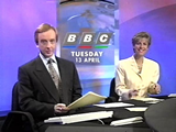
The state of news presentation in 1990
The computer techniques introduced during the eighties also made a strong impact on the graphics used within televised news.
By the early nineties comedy shows such as The Day Today made light of this, with heavily computer generated animated titles with clichéd images of globes, eyes, similar urgent sounding music etc. This wasn’t far from the truth as both ITN (who provided news for the commerical channels) and the BBC were using such material.
The BBC’s Breakfast News had titles involving a globe at the centre of a clock face which turned back on itself before the ‘C’ in BBC spun out and around the globe, all to the music of horns and chimes. Similar themes were expressed later its One O’clock news programme. Later bulletins at six and nine had much heavier music, but still carried images of globes and maps of the world.
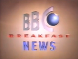
Title sequence for BBC Breakfast News. (BBC, 1989)
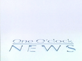
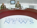
Title sequence for BBC One O’Clock News. (BBC, 1986)
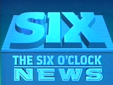
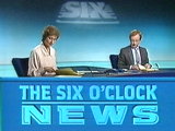
Title sequence for BBC Six O’Clock News titles. (BBC, 1984)
As for ITN, these images were used much less, preferring to use purely computer animated sequences involving the programme titles or in the case of News at Ten, a computer rendered London skyline before closing in on the familiar clock face of Big Ben.
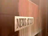
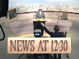
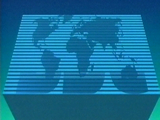
Title sequence for ITN News at 12:30. (ITN, 1989)
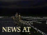
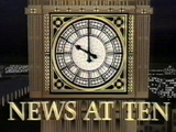
Title sequence for ITN News at Ten. (ITN, 1988)
However both the BBC and ITN started their bulletins in exactly the same manor – their large initials being placed centre screen before launching into their respective animations, presumably as an indication of authority.
The first real change to come to this clichéd and computer orientated world was again in the habitual shape of Martin Lambie-Nairn, who produced new titles for the BBC’s Nine O’clock News in 1988. These were based on a range of graphical elements with long-standing BBC associations such as the figure Jupiter from its coat of arms.
Conceptually, we attempted to communicate an idea of how a news programme actually functions: disparate information comes in, is collected, ordered then broadcast.
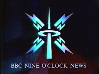
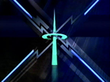
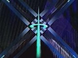
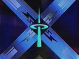
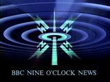
Title sequence for BBC Nine O’Clock News. (BBC/Lambie-Nairn, 1988)
This resulted in a dark, yet subtly colourful animation featured lightning bolts and strong geometric lines and shapes criss-crossing the screen, before ending with radiating concentric rings beaming out from a mast, reminiscent of old newsreel footage. However Lambie-Nairn had no control over the music that was used, and again a traditional and urgent sounding score only served to emphasise the harsher aspects of the animation.
Branding news
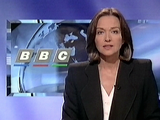
Although all the BBC’s news programmes contained similar elements and musical scores, there was no consistent branding across the programmes. With each having its own editorial staff and defined personalities meant graphics were drawn many times over, following different styles and conventions used for each bulletin. As a measure of cost cutting, as well as the benefits of a single united brand, all news output was unified in 1994.
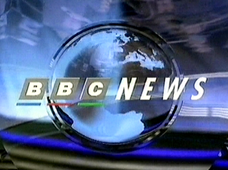
The centre piece of this new unity was a ‘virtual studio’ that was almost completely computer generated and was the main feature of programmes titles. For these a virtual glass pane depicting the BBC’s coat of arms was set in the foreground, with the news desk in the background with studio lights above lighting it. The start of the bulletins now began with the BBC logo alongside the word NEWS, creating a sub-brand of the BBC.
The music from the individual bulletins was retained, but updated and modified to fit in with the new presentation style. Individual bulletins also used different window keys (the graphics shown behind the presenters showing an image relating to the current news item).
The sets background also varied its colour through the course of the day – starting with light pinks and blues at breakfast, darkening through the day to dark blues and oranges for the Nine O’clock bulletin, reflecting the time of day.
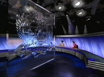
The BBC’s virtual news studio took pride of place at the start of its bulletins
Window keys for Breakfast News and the One, Six and Nine O’clock bulletins. Variations here, and with the opening musical scores, maintained a degree of individuality.
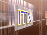
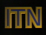
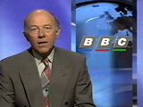
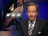
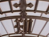
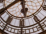
ITN followed suit a few years later with a generic brand again designed by Lambie-Nairn. An original ITN logo from the 1970’s was brought back into use (the current incarnation having been heavily tampered with by computer using chrome and three-dimensional shadowing), and other familiar elements from ITN’s visual heritage such as the shot of Big Ben and the ‘bongs’ were used for all its programmes.
New titles were created which exclusively featured the clock face of Big Ben, with close up shots before pulling away to show the appointed hour. Thirteen differently lit versions were shot to reflect the time of day and the changing seasons. As for the set:
Our belief was that a news programme should communicate honesty, transparency and plain dealing… ITN’s new Grays Inn Road building provided us with a marvelous opportunity to get this impression across.
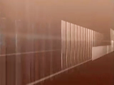
The modern building nearly all of glass provided the backdrop for all ITN’s bulletins, with modifications only needed to prevent reflection and allow the set to be undisturbed by weather conditions.
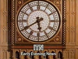
Title sequence for ITN Early Evening News (ITN, 1996)
In 1999 however, news programmes on ITV, like those on Channels 4 and 5, no longer used the ITN name or branding, and used the ITV name instead – reinforcing the channels brand rather than ITN’s own.
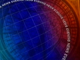
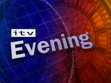
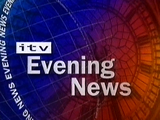
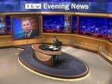
Title sequence for ITV Evening News (ITN, 1999)
Up until the launch of Channel 5 in 1997 and its news offering 5 News, the actual presentation of news had remained much the same. Aimed at a younger and perhaps less news-interested audience, and with a more tabloid agenda, it was set in a bright and colourful newsroom and involved the anchor sitting on a desk rather than behind one. Individual reporters for different sections of news (i.e. politics and sport) had their own sections of the set in which souvenirs and mementos were set onto shelves (politics having three mugs from each of the main parties, rosettes, pictures of MPs etc. whilst sport had a football, scarves and other memorabilia).
This was radically different to anything that had been seen on television in the UK before, and was loosely based on a news programme from Canada. Its title sequence had a fast pace matched by its musical score, bright colours and quick cuts between news type images.

Channel 5’s fast paced and colourful titles, as well as its presentation style, were to change the face of television news in the years to come
Although Channel 5 News has never challenged its better established rivals in the ratings, its colourful breezy approach to explaining stories to its viewers prompted changes to Newsnight, BBC1’s bulletins and Channel 4 News.
The first to change was Channel 4 News, and although this time the anchors were sitting, they were sat next to low level desks, meaning you could see what colour socks Jon Snow wore! Its set and titles used bright colours, but not in such an overbearing way as in 5 News – made more somber with a heavy use of black. The set also featured a large video wall, in which the anchor or reporter could stand in front off whilst graphics were displayed behind them.
The BBC similarly followed also with the use of a large plasma screen in which a correspondent could stand in front of to help explain his or her item, but this was introduced as part of wider transformation to the look of the news across the whole of the BBC. As mentioned before, the BBC now used the same graphics package and set for its main bulletins on BBC1, but now with a 24-hour news operation (both in the UK and globally) and an online news site, BBC News as a brand didn’t really exist. Furthermore, its regional news programmes were seen as second division against the national news bulletins.
Once again, Lambie-Nairn was chosen to create an identity for all of BBC’s news output and develop a brand that would re-assert its position on the British news landscape, and echo the values of ‘truth well told’.
This was done with the creation of a set of similar elements: concentric radiating circles in the style of transmitting signals, globes, maps and clock faces as well as a consistent use of type, giving the brand consistency yet flexibility across its many different applications. BBC News was also given a proprietary colour palette of Ivory and China Red (news programmes often use blue) which meant its presentation had a much warmer and approachable feel.
The main bulletins on BBC1 shared similar but varied titles in which maps of first Britain then the world interacted alongside the spelling out of major capitals, overlaid with clock hands, radiating rings and globes. Towards the end of the sequence the hour of the programme (be it 1, 6, 9 and later 10) were brought in, spinning on their axis before resting in a straight position. BBC News 24 and BBC World (the BBC’s 24-hour rolling news channels) continued these themes – with News 24’s graphics package having a closer resemblance to those titles seen on the BBC’s domestic output.

Title sequence for BBC Ten O’Clock News (BBC/Lambie-Nairn, 2001)
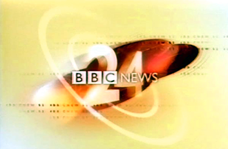
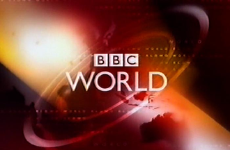
BBC News 24 and BBC World, the corporations 24 hour news channels, carried the branding
As for the BBC’s regions, they again took the BBC News elements, whilst adjusting their colours – the English regions used oranges, yellows and light blue for example – and adding local elements such as map shapes and place names. All this was to increase viewers to the regional programmes, with the use of similar elements suggesting to viewers that they were essentially watching the same programme from the same people.
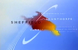
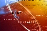
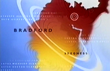
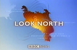
Title sequence for BBC Look North (BBC/Lambie-Nairn, 2001)
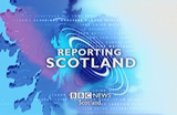
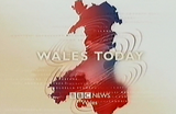
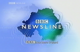
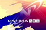
The BBC News brand was applied to all national output, including its bulletins for the Welsh forth channel S4C. Shown here the titles for Reporting Scotland, Wales Today, BBC Newsline and Newyddion.
All bulletins on BBC1 shared the same set, with the nations and regions using similar sets based on the same themes. Even the 24-hour news channels borrowed elements, creating a unified brand across every area of the departments presentation. Music again followed the ‘same but different’ theme, using upbeat yet punchy scores based on the famous beeps heard on radio to mark the hour.
Conclusion
The introduction of multi-channel television at the beginning of the nineties saw a distinct visual change from that of individualism and variation across channels and networks, to conformity and consistency through the use of branding. Although Channel 4 had realised the power of a brand as means of creating effective competition, it wasn’t until the launch of both satellite and cable television services that both the BBC and ITV saw the benefits that recognisable brands could bring.
Whilst this saw BBC1’s identity being updated twice during the nineties, the image it portrays has remained pretty much unchanged to that of 50 years ago. As Britain’s first channel, and paid for by the viewer, it is seen as the place to find quality programming. Here branding was only needed to reinforce this image. For BBC2 however, a brand was needed to remodel peoples perceptions of the channel whilst still being flexible enough so as to be able to change to suit the channels varied programming. Now that this brand has been established, it has remained largely unaltered for over 10 years. The same is true of Channel 4, where its original idents were in use for over 14 years. Their strength was perhaps only realised when they were replaced with a less suitable identity which only lasted for 2 years, before the channel returned to an image that has many similarities to its original.
As for ITV, it’s never really been sure of its brand, mainly due to its regionalised structure. The need however to create a successful umbrella identity has lead to sometimes uncomfortable compromises. Even the use of dual-branding systems was sometimes not enough to persuade all its regions to adopt the ITV brand, or even name. Perhaps if and only when ITV becomes a single company, will it be able to create a brand strong enough to rival that of other broadcasters. However this would no doubt lead to the destruction of its strongest asset – its regionality – something the BBC is starting to make its own.
Once the strength of branding was realised, it wasn’t soon after that other areas of programming began to use this device – most notably news bulletins – the BBC creating a distinct sub-brand, and ITN’s being replaced with that of ITV’s.
It’s interesting to note throughout the development of graphic design in television and the introduction of brands, the influence of just one man – Martin Lambie-Nairn. Responsible for the BBC and Channel 4 identities, as well as the innovative titles for the BBC’s Nine O’clock News, and later the branding of ITN and all of the BBC’s news output. His solution for Channel 4 in 1982 was way ahead of its time, and yet when the rest of television has now tuned into branding, he and his company still remain at the forefront of the field.
The introduction of digital television towards the end of the decade bringing with it the EPG, has seen the use of visual devices other than that of branding, with details of forthcoming programming displayed at every opportunity – even during programmes. With future technologies such as video recorders that can practically create your own schedules for you, as well as the ever growing digital convergence between television and the Internet, it will be interesting to see what broadcasters will do next – will we still see a need for channel idents?
One thing’s for sure; broadcasting brands will need to be as strong as ever.
References
Books
- Crook, G. (1986). The Changing Image. Television Graphics from Caption Card to Computer. London: Robots Press
- Ellis, J. (2000). Seeing Things. Television in the Age of Uncertainty. London: I.B. Tauris
- Lambie-Nairn, M. (1997). Brand Identity for Television. With Knobs On. London: Phaidon Press
Press
- Aldersey-Williams, H. (1993). The different path of British broadcast design. Print, 47(1), 48-54.
- Davies, J. (1997). Strength in Numbers. Design, Spring 1997, 26-31.
- Gilgrist, A. (1997). £5m BBC logo ‘will save cash’. Design Week, 12(19), 3.
- McClellan, T. (1990). TV in the age of eye candy. Eye, 1(1), 22-31.
- Mistry, B. (1996). Has Channel 4 made the right connection? Design Week, 11(32), 7.
Online
- Gibson, J. (1999, October 23). Face of five set for ITV perch. MediaGuardian
- Lambie-Nairn.com (2002). BBC ONE, Lambie-Nairn.com. Archived from the original on
- McGonagle, M. (2002). Channel 5 Idents 1999. TheTVRoom.com
- Wilkes, N. (2001). BBC Two gets new on-screen look. DigitalSpy.co.uk