Redesigning 24 ways
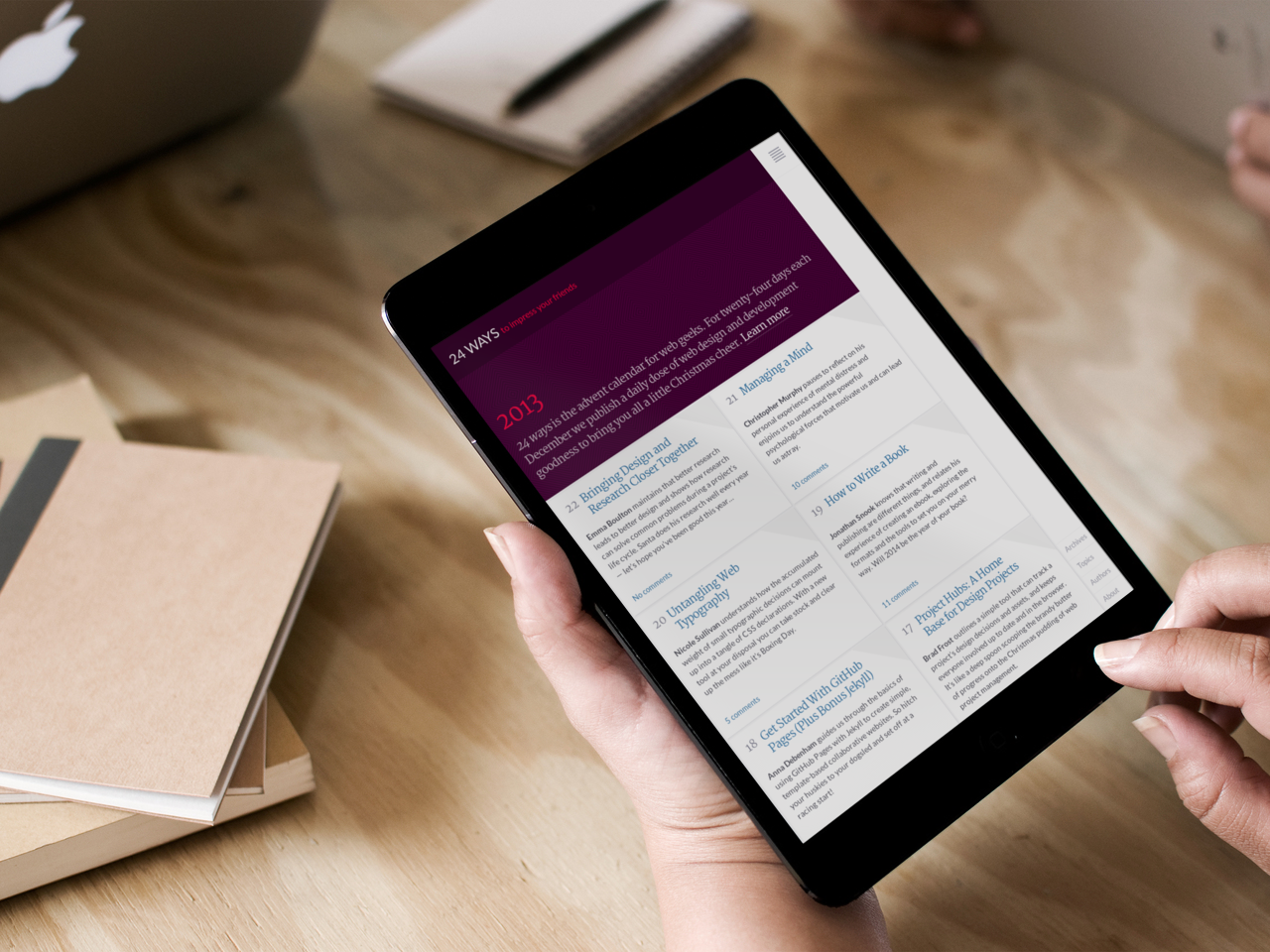
24 ways viewed on an iPad mini
The tail end of this year has been rather hectic. If moving house and changing jobs weren’t enough to be getting on with, I was also busy redesigning 24 ways.
For the uninitiated, 24 ways is an annual advent calendar for web designers and developers. Published by Drew McLellan since 2005, the site boasts hundreds of articles that impart wisdom and teach new skills.
Following Drew’s post on how he rebuilt the site, I thought I would describe the process behind the accompanying redesign.
The brief
The last major redesign was produced by Tim Van Damme in 2007. His innovative design pushed the limits of the medium – notably in its use of RGBA CSS colour properties – and set expectations for any redesign that would follow.
Few designs remain timeless, and after six years it was showing its age. Approaching a ninth season, the archive was struggling to accommodate more than 200 articles; navigation was breaking down and it had become difficult to explore the range of topics covered.
The design was also failing to reflect the best practices now being promoted. For example, when Geri Coady wrote about colour contrast, her words were presented as grey text on a grey background. The site was responsive (thanks to some retroactive hacking) but a fresh approach was needed to effectively deliver content to a broadening range of devices accessing the site.
Approach
Beyond these considerations, I was given free rein.
Red has long been the site’s signature colour, so while this would be retained, I was keen to explore how other colours could be chosen algorithmically. Since articles feature few images – most are screenshots or diagrams – a heavily typographic, European-flavoured approach was mooted. Although the underlying IA was sound, the addition of topics would improve the discoverability of content.
Still, how could this redesign continue the tradition of pushing against the edges of the medium?
In The Web Aesthetic, I urged designers to move beyond traditional print-inspired layouts, and instead look more to digital software – all while being true to the universal nature of the medium. Could this be an opportunity to make those ideas real?
A torturous design process
How I design: tenacity, panic, happy accidents and fast-approaching deadlines.
Given the brief in June, every time I sat down to work on the project, I couldn’t get started. A breakthrough came when I thought back to something Dan Mall had said about creating element collages: “I start by putting elements on the page for which I have an idea in my mind for”. Having an idea for the display of comments, and with a little alcoholic lubrication, I took to Sketch and started there.
Diamonds quickly became a unifying motif throughout this exploratory stage. Not only did this shape produce interesting crops and create a visual tension on the page, it also hinted at the season without going to the lengths of adding stars or Christmas trees.
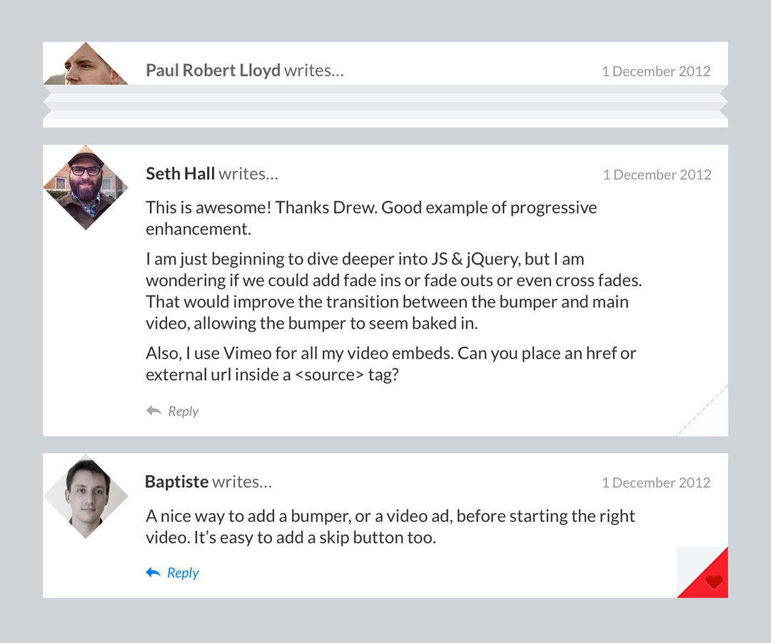
The design concept started with commenting
For the typography, I settled on a pairing of Lato and Merriweather. For similar reasons discussed in an earlier post, I opted to use freely available fonts, with budget and ease of implementation at the forefront of my mind. This choice helped me typeset articles to a reasonable standard, yet using typefaces from different designers and with different metrics meant I was unable to mix them together inline. I looked at pairing Merriweather with its sans serif counterpart, yet its tracking was too loose for body copy.
Know your fonts… using a typeface whose name means ‘summer’, for a website based around Christmas.
Awkward.
All the while, Jessica Hische’s advice was in the back of my mind: could I have found a better pairing with more time? If confirmation were needed, nearing completion of the design I discovered that Lato is Polish for Summer! Hopefully this is something we can revisit next year.
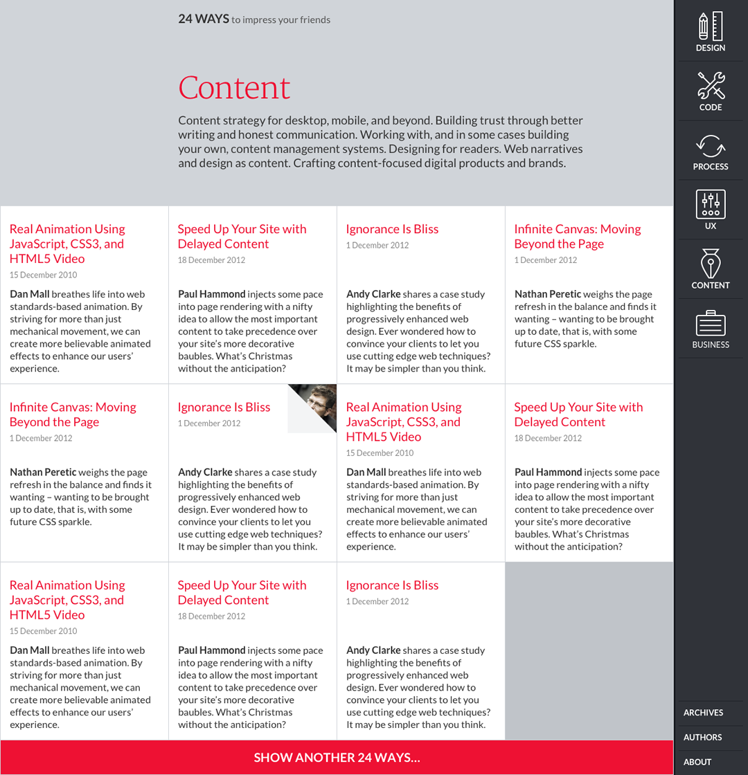
Initial design concept for 24 ways home page
Moving to code
By the time dConstruct arrived in September, I had enough elements to present an initial direction to Drew and the rest of the 24 ways team. They loved what they saw, but frustratingly, I couldn’t progress beyond this stage. I had a clear idea for index pages (inspired in part by the design of the New York Times skimmer), yet few ideas for how this might translate to other pages.
With the deadline fast approaching, I abandoned Sketch and headed for the browser. Having already marked up the site (using Barebones to provide generic styling) I introduced elements of the new design and observed how it cascaded down and throughout pages. Soon enough, the design was informing the markup, which in turn was informing the design. A visual language was developing in front of me.
Sometimes you have to work with a design system to truly understand it.
Content first, navigation last
While innovative and strongly conceptual, the previous design dominated the content. This was something I wanted to avoid; nothing should get in the way of being able to comfortably read an article. Setting aside traditional notions of layout, I explored different ways to navigate, inspired in part by mobile and tablet applications.
As the boundary between desktop and mobile continues to blur, I felt encouraged to keep the main navigation recessed regardless of device. Beyond an article, users may want to discover related content, or catch up with other articles from a particular season: onward links that could be easily linked to from within the page. This suggested a navigation menu that needn’t be persistent; just because you have space to display navigation, doesn’t mean that you should.
Without user testing, this is all conjecture of course. I’d be interested in hearing how readers have found navigating the site.
Even so, the design of the navigation changed quite a bit during the build process. By prototyping early on, I was able to test the ergonomics across different devices; the persistent right-hand position of the menu icon is one decision that resulted from such testing.
“I don’t want doors!”
That’s what Drew said when we first talked about the redesign. He was fairly clear about this, but I was certain there should be an element of hiding and reveal.
Earlier this year Benjy Stanton gave a talk at Port80 about animation on the web. He pointed out that although we have the tools (or at least the technology) to achieve richer animation, it’s often neglected. Beyond transitioning between menu states, a small flap in the corner of each article summary that pealed open to reveal the author might add this extra layer of engagement.

Keyframes in flap animation
Running short on time, I asked my friend (and SVG guru) Josh Emerson for help. I imagined the resulting animation would use SVG, but it turns out there were significant issues with such an approach. Instead, Josh recommended I use CSS keyframe animations and background positioning with just a touch of JavaScript. Genius!
Since the site launched, I’ve continued to tweak transitions and their values. This has been a frustrating exercise, sometimes having to forgo smoother transitions in order to avoid bizarre rendering bugs.
The pragmatist awoken
As much as I wanted to create an opinionated design, I also wanted to make a statement about progressive enhancement.
While many subscribe to the notion that websites don’t need to look the same in every browser, they still include many lines of prefixed CSS, determined to make sure that any browser that can render a feature – regardless of the code required – does so.
I wanted to implement the design in such a way that if a browser didn’t support a certain feature unprefixed – gradients, transitions, translations etc. – then a fallback would be seen instead. Users of the latest version of Firefox might see animated flaps yet not diamond shaped avatars, WebKit users the opposite.
This thinking was found wanting. I had already built much of the site using a customised version of normalise.css (which addresses browser inconsistencies using prefixed properties) and besides, those diamond avatars, while an enhancement, were integral to the design.
Pragmatism got the better of me, as it should. After all, what is front-end development if not a dance on the line strung between idealism and pragmatism?
Modularity
I was keen to introduce more modularity into my code, do more with a CSS preprocessor, use a BEM-like approach for markup patterns and not require jQuery for any JavaScript functions. This last one got the better of me – at least in the short term – although Zepto did help me keep page weight down.
Although I didn’t employ strict adherence to the BEM methodology, I found the underlying concept incredibly useful in helping me name patterns.
It’s finally happened… I’m seriously considering using a .list--item class name.
Sky, meet flying pigs.
As 24 ways is entirely content-based, HTML5’s semantic elements were used extensively, all while making sure they generated a sensible document outline (something that’s often forgotten). Class names took inspiration from these elements, as terms like article, summary, header, footer and main mapped closely to the smaller patterns required.
Taking inspiration from BEM, I used single word root classes, suffixed with a modifier if required. Child elements would use this root class, followed by an underscore and a description of that element. A additional layer of semantics was provided using Microformats 2 class names, although these were not referenced in the CSS.
Sidenote: If you’re unconvinced about the need for methodologies like BEM, I’d encourage you to read Nicholas Gallagher’s thought provoking article on semantics and front-end architecture.
This naming system produced markup patterns like this:
<article class="summary summary-article h-entry day-15">
  <header class="summary_header">
    <h1 class="summary_title p-name"><a class="u-url" rel="bookmark" href="#">Real Animation Using JavaScript, CSS3, and HTML5 Video</a></h1>
    <p class="summary_meta">
      <time class="dt-published" datetime="2010-12-15T00:00:00Z">15 Dec 2010</time>
      <a class="summary_comments" href="#comments">6 comments</a>
    </p>
  </header>
  <div class="summary_main">
    <p class="p-summary"><a href="http://danielmall.com/">Dan Mall</a> breathes life into web standards-based animation. By striving for more than just mechanical movement, we can create more believable animated effects to enhance our users' experience.</p>
  </div>
    <footer class="summary_footer">
    <p class="summary_author p-author h-card"><a class="u-url" href="#"><img class="u-photo" src="danmall160.jpg"/><span class="p-name">Dan Mall</span></a></p>
  </footer>
</article>
If you’re interested in learning more about the front-end code behind 24 ways, you can view the repo on GitHub.
Designing in the dark
It has been three weeks since the redesign was unveiled, and thankfully to a largely positive audience. It’s funny to think that just a week beforehand some of the design’s signature features still hadn’t been conceived. I really took it to the line!
Indeed, if providing a critique, it’s important to recognise the constraints under which it was delivered. Working evenings and weekends meant I had little time to noodle on any particular design direction. Having left Clearleft and started working in London meant I no longer had easy access to a device lab. Waiting for my phone line to be installed meant I was unable to download and install the virtual machines needed for cross browser testing.
Developing a responsive website without these resources can be a risky proposition, and what I’ve developed is largely a best guess. Once I have these tools in hand, I will likely revisit many of my design decisions.
What next?
Sadly, aspects of the design discussed earlier in the process were never addressed. For example, there was a desire to look at ways of surfacing archived content on the homepage between seasons, yet this was lost in the rush to get the site launched in time. Images – both in terms of art direction and their delivery in a responsive context – clearly need more thought.
However, I’m a big believer in iteration, and not treating a website as ever being finished. I hope what’s been released this year can act as a foundation, and that the design will evolve in the years to come.